Bear’s Eye View (BEV) Tutorial


Occasionally, for the benefit new followers of my market commentary that come my way, I must write a tutorial on the Bear’s Eye View (BEV) plotting system.
First thing I need to answer is; why even bother with a BEV plot? Since the Federal Reserve was legislated into existence by Congress, and signed into law by President Wilson in 1913, the dollar the Federal Reserve was supposed to manage, went from being defined, in terms of gold, by $20.67 for an ounce of gold – no more or less than $20.67 per ounce of gold, into an abstraction, best imagined in the minds of the academics, who now dictate “monetary policy” at the Federal Reserve.
Thanks to the best efforts of politicians, bankers, and academics, who’ve managed US “monetary policy” for over 100 years, the dollar doesn’t buy what it used to. Far from it, because the dollar’s “monetary policy” for over 100 years, has been one of massive monetary inflation.
I’ve covered this topic; the growth in dollars circulating in the economy many times in the past, and will do so many times in the future. However, this is a tutorial for the Bear’s Eye View. Why I like using a BEV plot for looking at historical market data, can be seen in the plot of the Dow Jones below, using the dollars it was published in, since January 1900.
Looking at the Dow Jones in dollars below, there isn’t much going on until after 1985. Where is the Great Depression’s Market Crash? The October 1987 Flash Crash? They are not to be seen in the Dow Jones’ dollar chart posted below.
The 2007-09 Sub-Prime Mortgage Crash (Red Circle #2), was the Dow Jones’ 2nd deepest percentage crash in its history. Yet below, this massive market decline appears only as a correction, within a massive bull market, that began in August 1982 (Green Triangle).
So, plotting the Dow Jones in the dollars it’s been published in for over a century, while accurate, and useful when charting the market for a decade or less, gives market watchers a distorted view of the history of the stock market. Why? Because the dollar is a very flawed, nonsensical unit of measurement for anything economic.
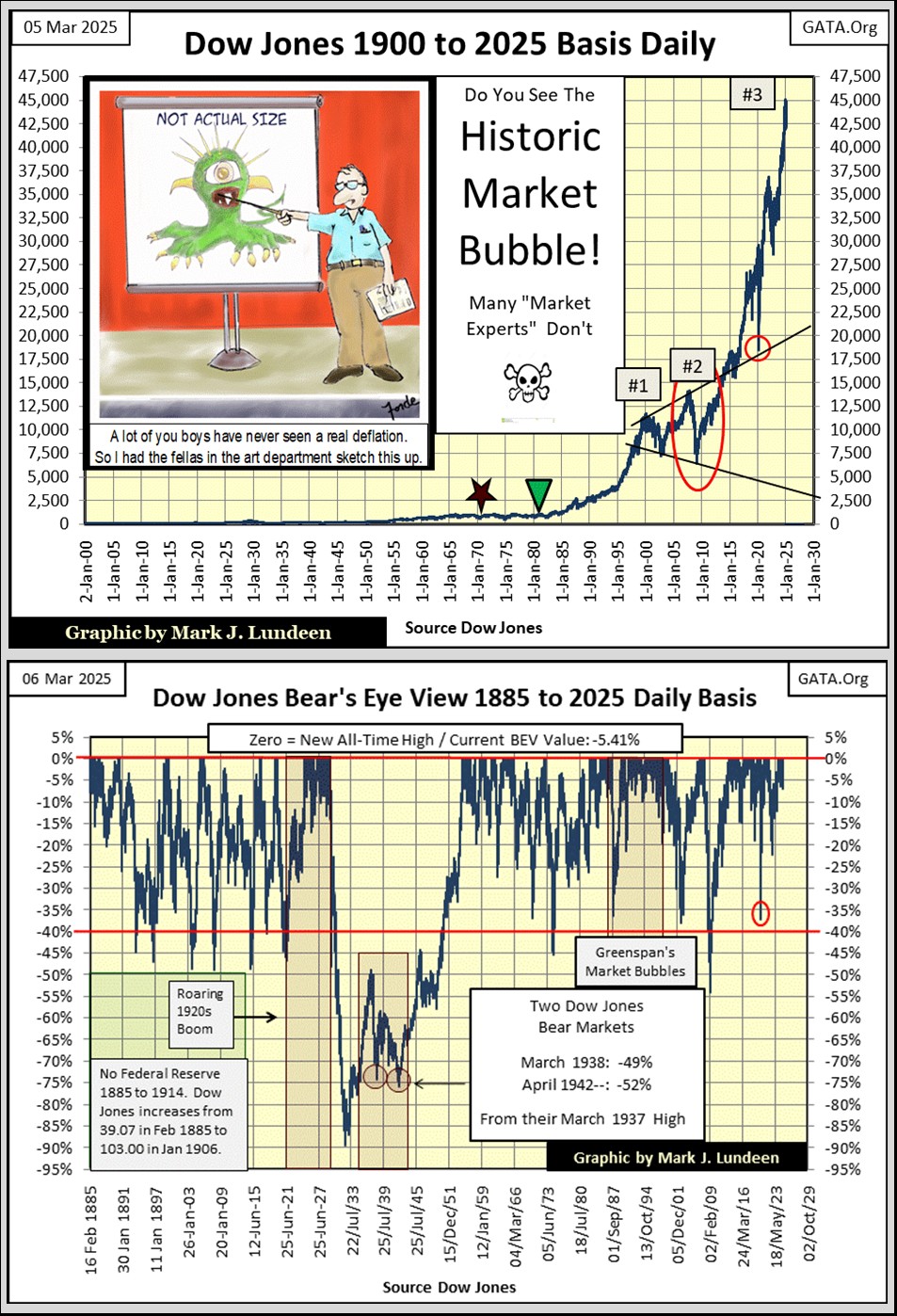
Above is the Dow Jones in Bear’s Eye View format, the view of the market as Mr Bear sees it.
Mr Bear ignores dollar valuations, choosing instead to focus on new all-time highs (BEV Zeros = 0.0%), and percentage claw backs from those new all-time highs. Simply stated; a BEV plot is the compression of dollar data into a range of only one hundred possible percentage points;
- 0.0% = BEV Zero, new all-time high,
- -100% = total wipeout in valuation.
As Mr Bear sees the Dow Jones, its last BEV Zero of 04 December 2024; 45,014, is no more significant than its all-time high seen on 05 August 1886; 54.06. Both are equal to a big-fat Zero% in the BEV chart above. And most importantly, as far as I’m concerned, both these BEV Zeros, separated by 138 years, can be seen on the BEV chart above, on its Red BEV 0.0% line.
The most informative aspect of a BEV plot, is seen in the percentage claw backs from these new all-time highs. During a bull market advance, that may last many months, or even years. The BEV plot will remain mostly in what I call “scoring position,” less than 5% from the last all-time high of its advance.
In the BEV chart above, each bear market bottom is seen, in precise-percentage terms, since 1885. Using the Bear’s Eye View data seen above, the table below lists the nine major Dow Jones bear markets; bear markets whose decline was greater than 40% from an all-time high, since 1885.
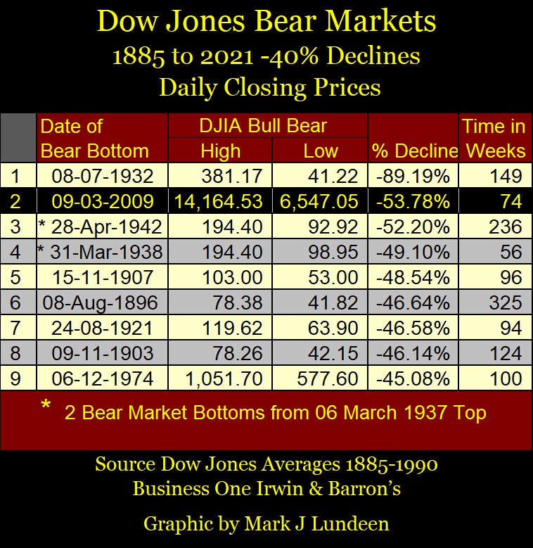
That a major bear-market decline is approaching a bottom, can also be inferred above; when the Dow Jones’ BEV plot drops below the BEV -40% line. Since 1885, a 40% market decline in the Dow Jones was a solid signal an investor had best begin looking for reasons to buy, as the worst of the bear market had passed. The only exception to that rule was the Great Depression’s Market Crash, an 89% market claw back. A market event clearly seen in the Dow Jones BEV chart above.
The table below illustrates why buying when the Dow Jones is down by 50% during the Great Depression Crash, proved to be a disaster to one’s net worth.
On 17 October 1930, the Dow Jones closed at 187.37, 50% from its last all-time high of 381.17, from the year before. For the only time in Dow Jones history, so far, returning to the stock market when the Dow Jones was down by 50% proved to be a disaster, as two years later, the Dow Jones bottomed at 41.22.
This was an 89% decline from the Dow Jones last all-time high. However, it was also a 78% decline from the 187.37, seen when the Dow Jones was down by 50%.
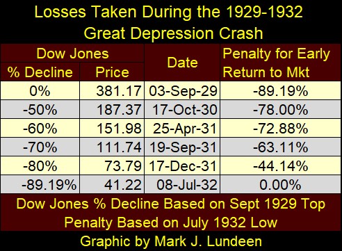
When the stock market is in a deflationary market collapse, such as the 89.19% market bust seen during the early 1930s, bear-market mathematics become quite grizzly.
Below is a table for Dow Jones, should it again see a similar 90% market collapse from its current all-time high of 45,014. How likely could such a collapse be? I don’t know. I hope not likely at all.
But take a moment to once again look at the Dow Jones chart above, the one plotted in dollars. That is a huge inflationary bubble in the stock market. Every inflationary boom, is followed by a deflationary bust, with the greater the boom, the greater the bust.
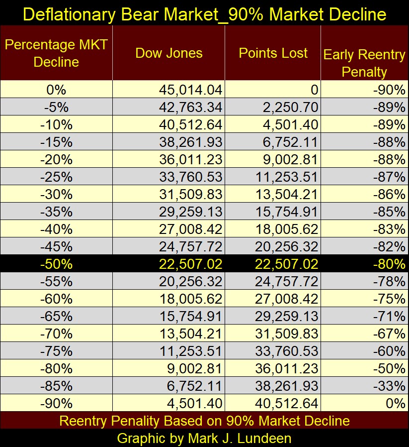
Following the massive “injections-of-liquidity” the financial system has seen since Alan Greenspan became Fed Chairman in August 1987, and considering the massive levels of debt now weighing down governments, businesses, and individuals, come a major economic disruption, waves of debt default will devastate the financial system. This is exactly why the early 1930s were so depressing; massive waves of debt defaults, as the Dow Jones crashed.
I’m not predicting a similar 90% market decline seen by the Dow Jones in July 1932, but I can’t rule it out either.
And then, come the next major market decline, the idiots at the FOMC can always implement a QE to “stabilize market valuations.” But doing so for the 5th time since the 2007-09 mortgage crisis, may come at the cost of the destruction of the dollar itself, as a viable economic asset, one useless for domestic and international commerce.
This would be a world where being a billionaire would no longer be a big deal. A billion dollars multiplied by the little to nothing each dollar would be worth, is worth exactly what?
This is so depressing. Let’s get back to the Bear’s Eye View.
Using the Bear’s Eye View data for the Dow Jones, it’s possible gauging just how bullish (inflationary) any period in the stock market was, by looking at the volume of daily closes in the;
- 0.0% row = daily closes at new all-time highs plus,
- -0.001% row = daily closes inside scoring position (BEVs of -0.001% to -4.99%),
in the frequency tables below.
In the table on the left; all Dow Jones’ daily BEV closings since 1885, or 39,354 NYSE trading sessions. Of which, the Dow Jones closed;
- At a new all-time high (0.0% = BEV Zero) 1,569 of those daily closings,
- In scoring position (-0.001% to -4.99%) 8,568 of those daily closings.
During any bull-market advance, the Dow Jones, gold, or anything else, for the most part will remain within 5% of its last all-time high, for the duration of that advance. Though all market advances of any length, will see corrections that will take its BEV plot below its BEV -5% or even below its BEV -10% lines.
By adding the percentages of total days for the 0.0% and -0.001% rows in the left table, it’s possible estimating the percentage of days the Dow Jones was advancing in a bull market. Since February 1855, for 26.99% of the total days trading at the NYSE, Dow Jones was advancing in a bull market.
On August 1971, the United States took its dollar off the Bretton Woods’ $35 gold peg, allowing it, via the Federal Reserve System, to issue as many paper and digital dollars as it wished.
To see the effects of removing the monetary restrictions a $35 gold peg imposed on the US dollar, via the stock market, the middle table lists the Dow Jones’ BEV from February 1885 to 13 August 1971, when gold had some role in the dollar’s “monetary policy.” The table on the far right is from 16 August 1971 to this week, when the only thing backing the dollar was the; “full faith and credit of the United States’ Federal Government.”
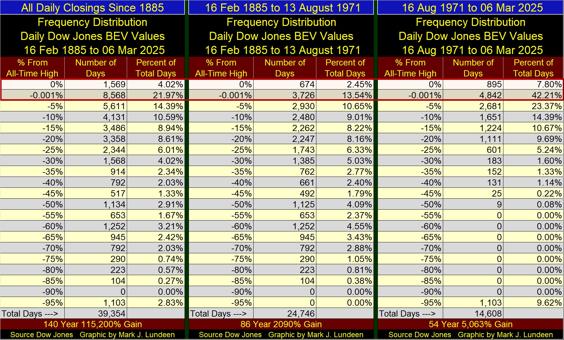
Simply by adding the daily closes in the 0.0% (new all-time highs), and -0.001% (daily closes in scoring position) rows, how bullish these strands of time can be seen. Keep in mind, the table above from 1885 to today, also includes the BEV data for the post August 1971, which pushes the data towards being bullish.
To best see the stock market’s performance, when gold was a part of the dollar’s monetary policy, I use the data seen in the middle table. How the stock market performed with a dollar freed from the restrictions of a gold standard, is seen with the table on the right.
Here are the results of how bullish each period was, looking at new all-time highs, and daily closes in scoring position;
- All Daily Closings Since 1885 = 25.99% of total days,
- Daily Closings from 1885 to August 1971 = 15.99% of total days,
- Daily Closings from August 1971 to this Week = 50.01% of total days.
Looking at the two tables, split by August 1971, before August 1971, only 15.99% of the Dow Jones daily closes were in a bull market. That is one day out of each 6.25 days for these eighty-six years, the Dow Jones was in a bull market.
Following August 1971, 50.01% of the Dow Jones daily closings were in a bull market. That is every other day for these fifty-four years, the Dow Jones was in a bull market.
What does this all mean? The stock market’s valuations are grossly over inflated. I believe the market is approaching the top of a massive inflationary bull market. At the top of all market advances, market risks approach maximum, as the potential of profiting from assuming those risks, approaches zero.
This is no time for new money to enter the stock market. The same goes for the debt markets, which includes real estate.
For money already in the stock market, as long as the Dow Jones closes above its BEV -10% line, let your winnings ride, as we may see additional new all-time highs. But should (when?) the Dow Jones close below its BEV -10% line, I’d recommend locking in whatever profits your portfolio has, by selling, and not be in a hurry to come back into the market.
Maybe it would be best to wait until the Dow Jones once again closes with a BEV of something greater than -45%, and seeing its dividend yield increase to something above 6%, before once again risking your money in the market?
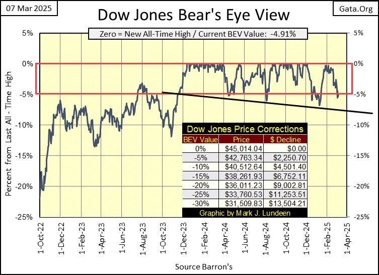
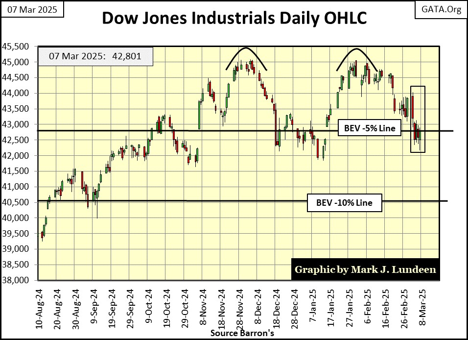
Okay, that is my tutorial for my Bear’s Eye View. Let’s now look at the Dow Jones BEV chart for this week. This week, the Dow Jones fell below scoring position on Thursday, by just a tad, but closed the week with a BEV of -4.91%, just within scoring position.
Taking a good look at the BEV chart below. The Dow Jones has closed in scoring position since November 2023 (for fifteen months) with daily BEV closings above the BEV -5% line. Since November 2023, on three occasions the Dow Jones broke below its BEV -5% line, with the fourth break down below scoring position, happened for one day this week.
A market series, like the Dow Jones, can stay in scoring position for several years. However, fifteen months in scoring position is a long time. How much longer can the Dow Jones (my proxy for the broad stock market) keep this up? And should the Dow Jones break below its BEV -10% line (40,512), what happens then? Does it bounce back like it did in October 2023 below, and go on to new all-time highs? Or will the Dow Jones continue going down?
I don’t know the answer to that question. But I recognize this is a market with growing risks to invested funds, making this a time to start looking for reasons to sell, not buy.
Next is the Dow Jones in daily bars. This chart is in dollars, and is a good chart as it only goes back to last August. In it, we see the two peaks of a very bearish double top formation. The first top is from last November, the second in January.
For you bulls out there, this chart doesn’t look good; in fact it looks horrible. Horrible, but not fatal. So, the possibility of the Dow Jones turning around, and making new all-time highs far above 45,000 is there. But this advance will soon, if it hasn’t already entered its geriatric stage, its terminal stage of an advance that began off the bottom of the March 2020 Flash Crash, five years ago.
How much more do you expect from the old-geezer advance seen below? As an old geezer myself, looking at this chart, it makes me want to take a nap! Getting up, and running around the block a few times isn’t something I’m thinking of when I’m studying this chart, and I suspect the Dow Jones knows exactly what I’m talking about!
But then, all it would take to change the Dow Jones,’ and my opinion on the market, would be a little “injection of liquidity” from the idiots at the FOMC, to “stabilize market valuations.”
How likely is that with Trump and Musk making plans for an audit at the FOMC, whose books must be an embarrassment, from “monetizing” Wall Street’s toxic waste for decades?
Representative Thomas Massie (R-Ky) has entered a bill in the House to “End the Fed.” It most likely will not pass. But the idea of taking a hard look at the Federal Reserve now sits in Congress.
That isn’t going to make the FOMC happy. Maybe an engineered market crash by these idiots, a banking crisis where they can “save the financial system” once again, will make the voting public understand the need to keep this parasitic organization in control over the banking system, and the US dollar.
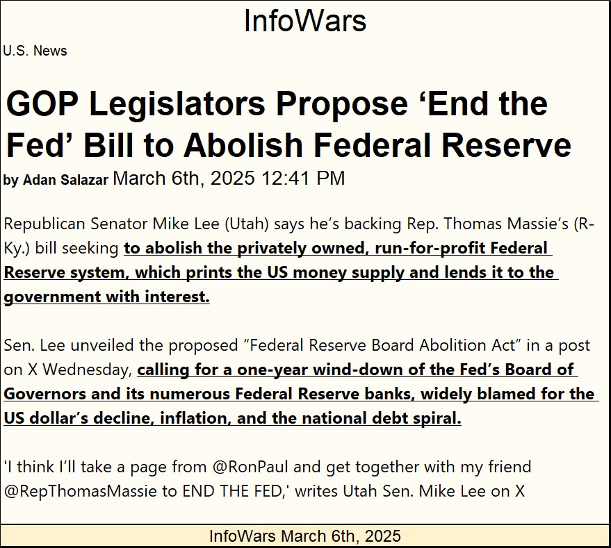
https://www.infowars.com/posts/gop-legislators-introduce-end-the-fed-bill-to-abolish-federal-reserve
Next is my weekly table listing the major market indexes I follow, using their BEV values. Looking at this data in the dollars it’s published in, lacks any relevance between the twenty indexes listed below. That is not so, when looking at these indexes’ BEV values.
This week, none of these indexes saw a BEV Zero; a new all-time high. And the week ended with only three indexes closing in scoring position. Last Friday, ten of these indexes closed in scoring position.
I also note an increasing number of these indexes sinking below their BEV -10% lines. Last Friday, only three of these indexes closed below their BEV -10% lines. On Friday’s close this week, there were five indexes with BEV values below -10%.
It seems the flows of inflation’s tide is going out, and with it, these indexes are going down.
Another item worth noting, the NASDAQ Banking index (#20), and XAU (#21), appear to be swapping pole positions. How long before this banking index become tail-end Charlie, and the XAU begins climbing in these rankings?
Also, look at what the NYSE Financial Index (#2) did this week. Last Friday, the NYSE Financial Index was at #1, only 0.08% from making a new all-time high. This week, these financial companies took this index down almost 4.5% in only five trading days. If you’re are a bull, this can’t be good. What is good, is how much information about the stock market can be gleamed, when studying these indexes’ BEV values.
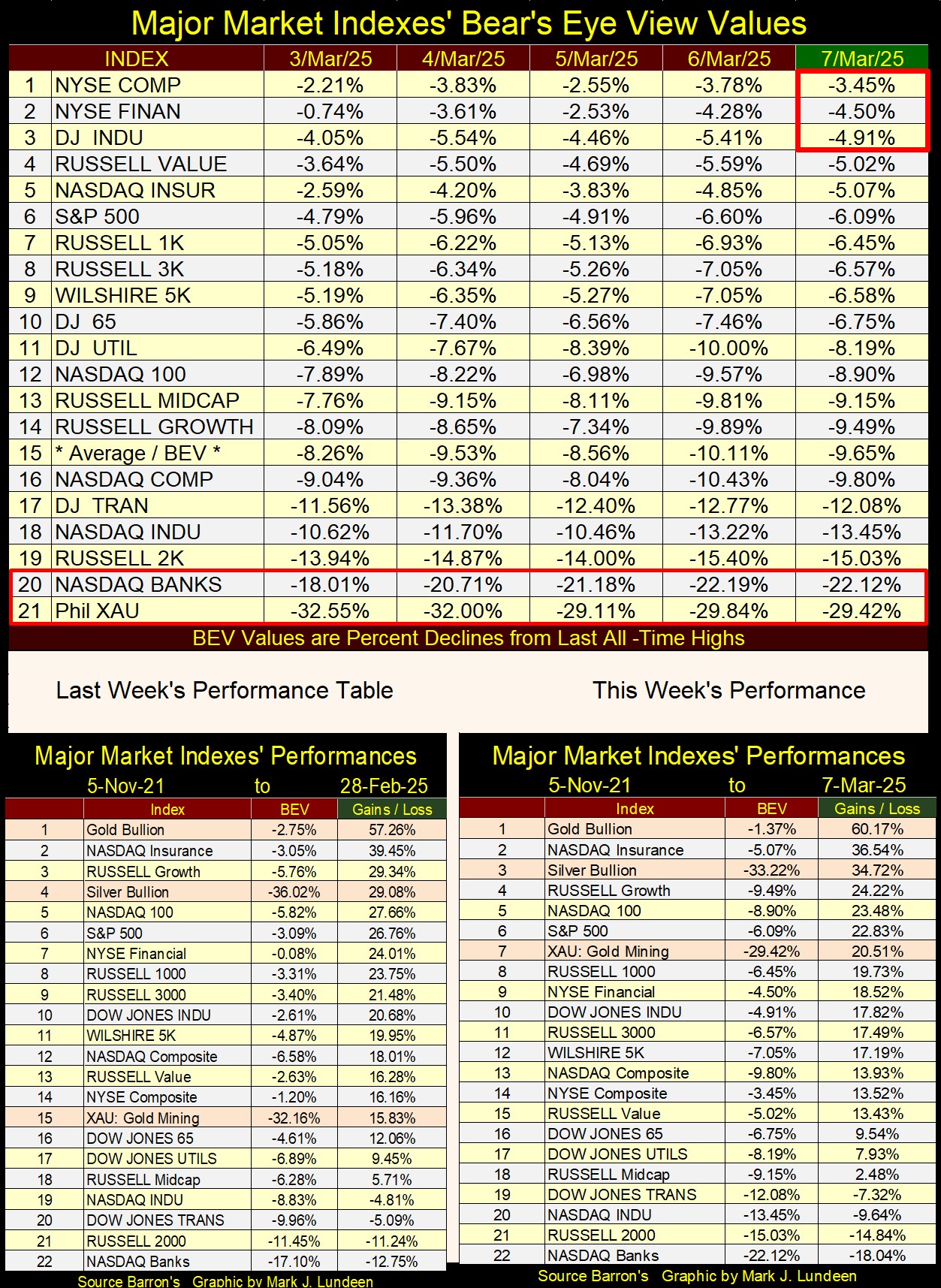
Looking at this week’s performance table above; gold, silver and the precious metal miners in the XAU were all up this week, by a nice amount from the week before. Taking a quick look at the other indexes above, they were all down.
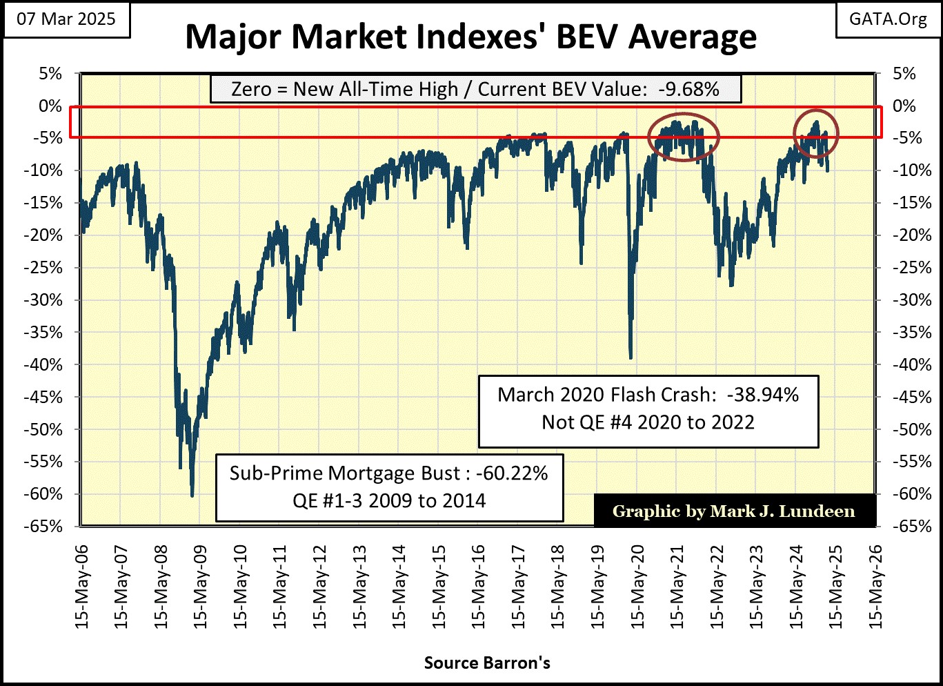
Below is a chart for the average of the BEV values for the Major Market Indexes, listed above (#15 in the top table). On Thursday, it dipped below a BEV of -10%, something it hasn’t done since last June. This is no reason to begin a panic. But looking at this chart, I’m thinking it’s a real possibility that the best days of this fifteen-month market advance are coming to an end. You do realize this advance must end, and when it does, this metric will look something like this.
This was certainly the case in 2021 (left Red Circle). When this average broke below its BEV -10% line, the market began a correction that took this average almost down to its BEV -30% line.
What will happen now is something we’ll have to wait to see. But as each week now passes, I get less and less bullish on this market. All it would take for the market to change my mind, would be for it to begin to see more BEV Zeros in the Major Market Indexes seen above, but will that happen?
Here is gold’s BEV chart, a chart I like much more than anything the Dow Jones can now generate. There isn’t much excitement in the gold and silver markets. Yet gold looks as if it will soon rise above $3,000 an ounce.
Why would that be? At market tops, market psychology is such that everyone is afraid to sell. Sad but true, that investors hold on tight as Mr Bear begins clawing back years of capital gains sitting on their brokerage accounts! This is very different from market psychology during the early stages of a bull market, where everyone is afraid to buy an asset that is ordained to rise to much higher levels in the months, and years to come.
Most people don’t make the big money investing in the market, and this is why; they never learn when to buy, or when to sell.
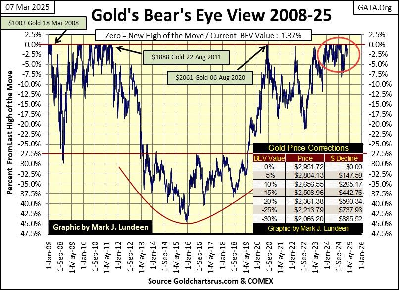
In gold’s step sum table below, gold’s overbought condition (15-count of +7) is being worked off by seeing down days overwhelming up days. This week closed with gold’s 15-count at a -3, which is a neutral value, but far from the +7 seen a few weeks ago. Yet for all that selling, the bears failed to get gold to sell off below $2900 at this week’s close, as its BEV value closed on Friday at a -1.37%.
This is good, very good.

Look at all those down days for the Dow Jones, in its step sum table above. Its step sum on January 31st was 1661, the same as on Friday’s close. Meaning since January 31st, the Dow Jones has seen about as many down days as up days, thirteen down days in this twenty-five-day sample.
But for the Dow Jones, those down days are having an effect on its valuation, taking it down by 1,743 points since January 31st. And on Thursday, the Dow Jones closed outside of scoring position, with a BEV of -5.41%. Looks like the stock market is leaking “liquidity.” If this continues, someone may have to plug this hole in the market, or things may start getting serious.
Mark J. Lundeen
********


