A Comprehensive Look At Gold..Another Brick In The Wall?
In this Weekend Report I would like to show you gold from the short term perspective to the long term look and everything between. As you know gold made a bottom back in June of this year that is still the low point for this two year correction. The question on everyone’s mind is this THE BOTTOM? There is never a way to know absolutely for sure until time passes but we can use some Chartology and see what it is showing us.
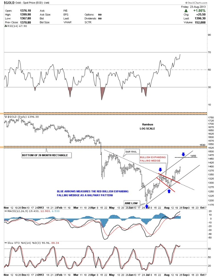
This first chart is a daily look that shows the June low and the price action that gold has made trading off that bottom. You can see a black dashed down slopping trendline, Support and Resistance rail, that held gold in check. It wasn’t until the little red bullish expanding falling wedge developed that gold was able to takeout that S&R rail. Right now I’m looking at that little red bullish expanding falling wedge as a halfway pattern that projects up to the 1456 area as measured by the blue arrows.
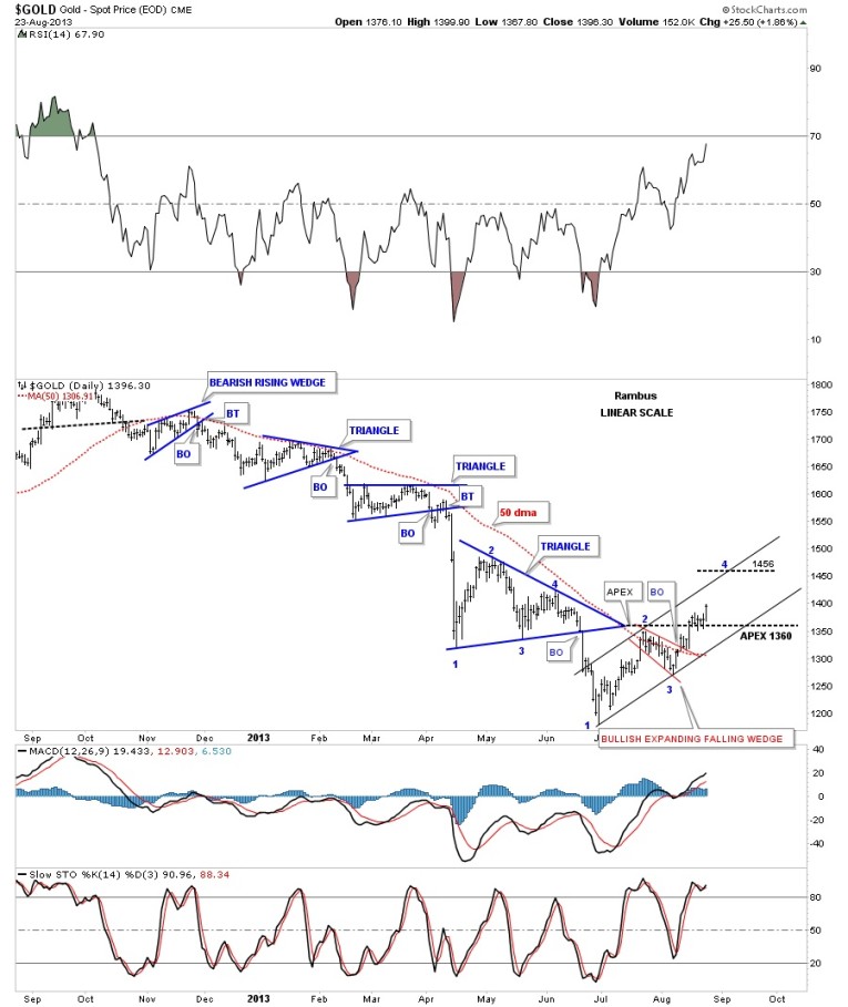
Lets look at another daily chart that shows all the smaller consolidation patterns we’ve been following since last falls high. When I talk about following the price action this chart shows you exactly what I’m referring to. As you can see each blue chart pattern was a consolidation pattern to the downside with no signs of a bottoming or reversal pattern. Gold made lower lows and lower highs all the way down with the 50 dma working as overhead resistance. Since the June low you can see a change of character as gold has now put in a higher low and a higher high and is now trading above the 50 dma. It may seem subtle but this is the first step in creating an uptrend. How long this new uptrend will last is anybodies guess but I have a few charts that I will show you that may shed a little light on how gold may progress from here.
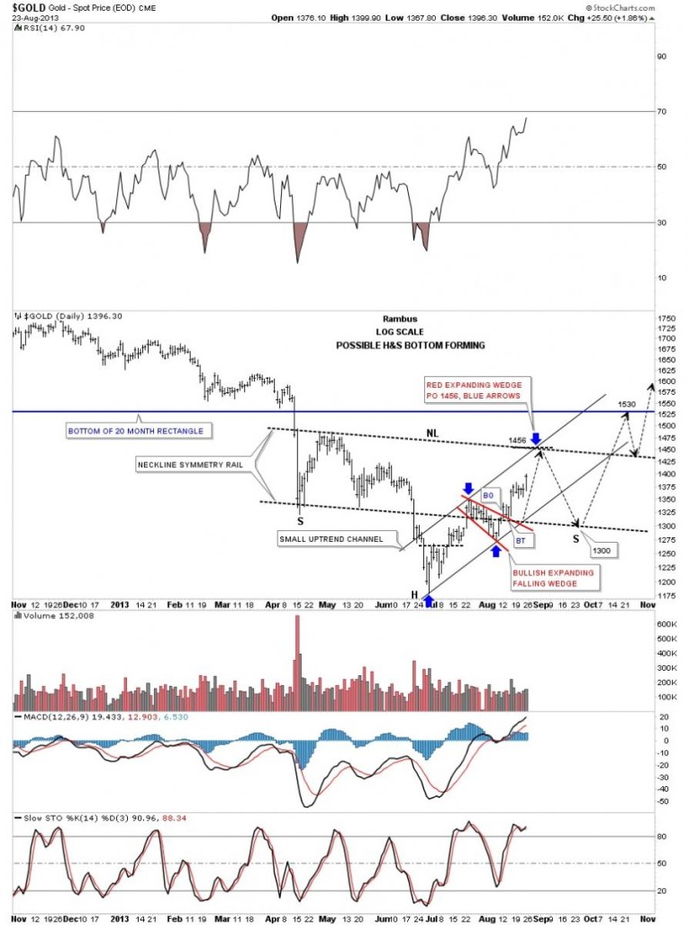
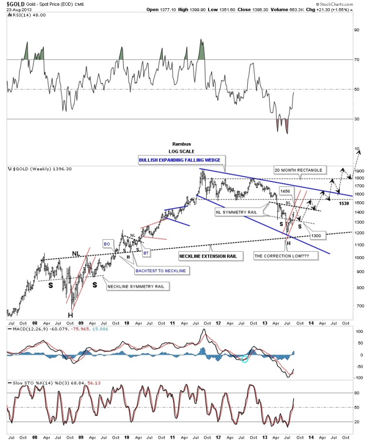
Trading the markets is a lot like playing Chess. One always has to be thinking several moves ahead, trying to anticipate your opponents next move, so you don’t caught with your pants down. This next daily chart shows you what I think may develop over the next month or two that makes sense to me from a short term perspective to the long term look. From the short term look you can see the small rising channel, on the two charts above, with the bullish expanding falling wedge that has a price objective up to the 1456 area. That is an important area as it will setup a possible bigger pattern that I would like to see if the June low is going to be the bottom. On the chart below I’ve drawn in a possible neckline that runs from the counter trend rally in May after gold broke out of that 20 month rectangle. The 1456 area would be a perfect place for a possible neckline to be drawn in. The black arrows shows how I would expect a H&S bottom to form based on the Chartology of this area. I’ve added what I call a neckline symmetry rail which is just a parallel rail to the neckline that many times can give you a spot to look for a low for the right shoulder. Using this method the bottom for the right shoulder could come in around the 1300 area. The main reason I would like to see a H&S bottom form down here is because of the bottom rail of the 20 month rectangle that will act as resistance when it is approached. Many times when there is an important resistance rail a stock will form a consolidation pattern just below, that will then give the stock the energy it needs to absorb all the sellers and finally break through the resistance zone. In our current situation, if we in fact do build out a H&S bottom, that would be the perfect setup to then takeout the bottom rail of the massive 20 month rectangle. Keep in mind everyone who bought inside that 20 month rectangle are underwater right now and will be looking for a place to get out. So its going to take a lot of buyers to absorb all the sellers as the price action gets closer to the bottom rail of the big rectangle. The horizontal blue trendline is the bottom of the 20 month rectangle that comes in around the 1530 area. This chart below is just a possible scenario that may have to be tweaked once we know exactly where our current move stalls out. It maybe a little higher or lower than the 1456 price objective but this chart gives us a game plan to follow until it’s broken.
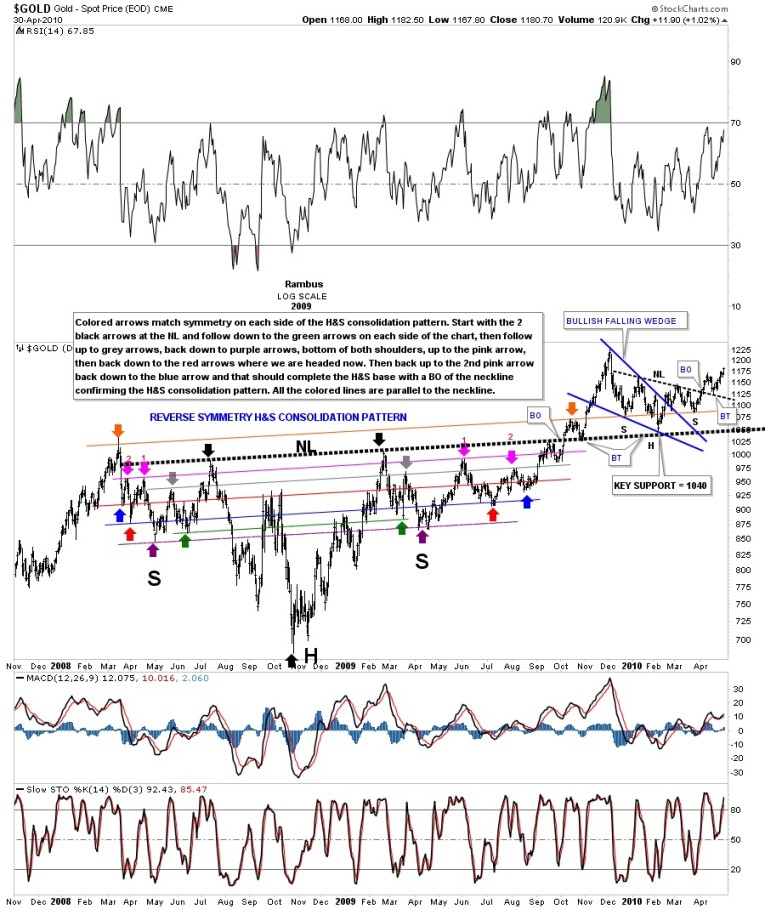
Now that we’ve covered this possible low in gold on the daily charts lets look at the bigger picture and see how the chart above fits in. We are going to go all the way back to the 2008 – 2009 bottom which was the most important bottom for the bull market at that time. As you will see there are some striking similarities between then and now. First, notice the H&S consolidation pattern that formed back in 2009 that was one of the finest H&S patterns I’ve ever had the pleasure to chart in real time. Let me show you what I mean. The chart looks busy but its all colored coordinate. If you divide the chart in half starting at the NL going straight down to the head that will leave you a left and right side to the H&S consolidation pattern. Start with the black arrows on each side of NL. On the left side follow the price action down to the green arrow. Then do the same thing on the right side of the chart following the price action down from the black arrow down to the green arrow. The do the something following the price action up from the green arrow up to the grey arrow on each side of chart. Next follow the price action down from the grey arrow to the purple arrows that made the low for the left and right shoulders. All the colored symmetry rails are parallel to the neckline. The symmetry continued on up to the pink arrows #1. Note the clean breakout and backtest to the big thick neckline.The reason I’m showing you this chart is that it maybe playing a very big role in locating our current June low. I’ve really darkened the neckline so there is no doubt what you are looking at.
Below is a long term weekly chart that shows the beautiful H&S consolidation pattern we just look at on the chart above. Notice how the neckline symmetry rail called the low for the right shoulder in 2009. I’ve extended the neckline all the way to the right side of the chart so you can see how this neckline extension rail has played a very important role in locating our possible June low. You can also compare the H&S consolidation pattern that was made back in 2009 to our possible H&S bottom that I showed you on the daily charts above. The black arrows shows how the price action may evolve in a perfect world. The black arrows are just a guide line based on where support and resistance resides. I’ve only shown the possible Blue expanding falling wedge one time, about 2 weeks ago, that could be the next consolidation pattern is a string of consolidation patterns that have been the hallmark of gold’s bull market.
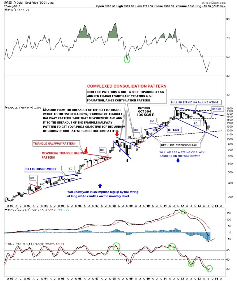
This next chart is a long term monthly look that shows the 2009 low was actually made up of three separate chart patterns. There was the blue bullish expanding falling wedge, a red triangle that created the H&S consolidation pattern. Again notice the neckline extension rail made off the 2009 H&S consolidation pattern that extends to our June low. Another important feature of this chart is the black and white candles. As you can see when gold is in an impulse leg up it forms a string of white candles and when it’s in a downtrend, most recent decline to the June low, there were a string of black candles. If the month of August can end on a positive note for gold we will have our first two white candles that could be the start of the next impulse leg up.
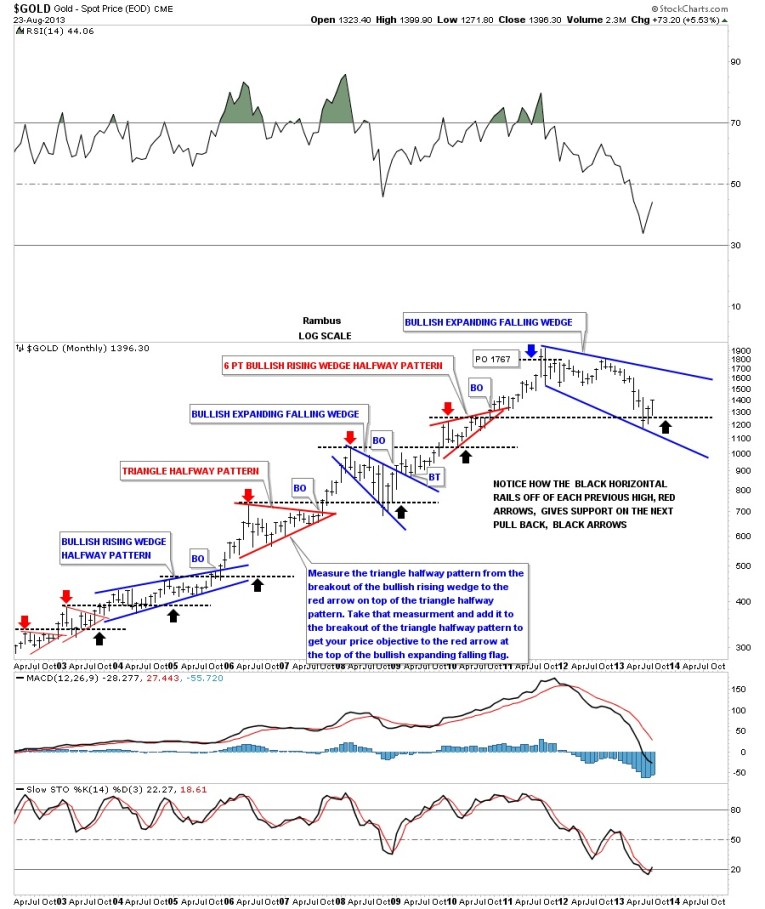
Below is another monthly look at gold that shows the horizontal black dashed lines that are taken off the previous consolidation patterns highs that reversed their roll form resistance to support, black arrows.
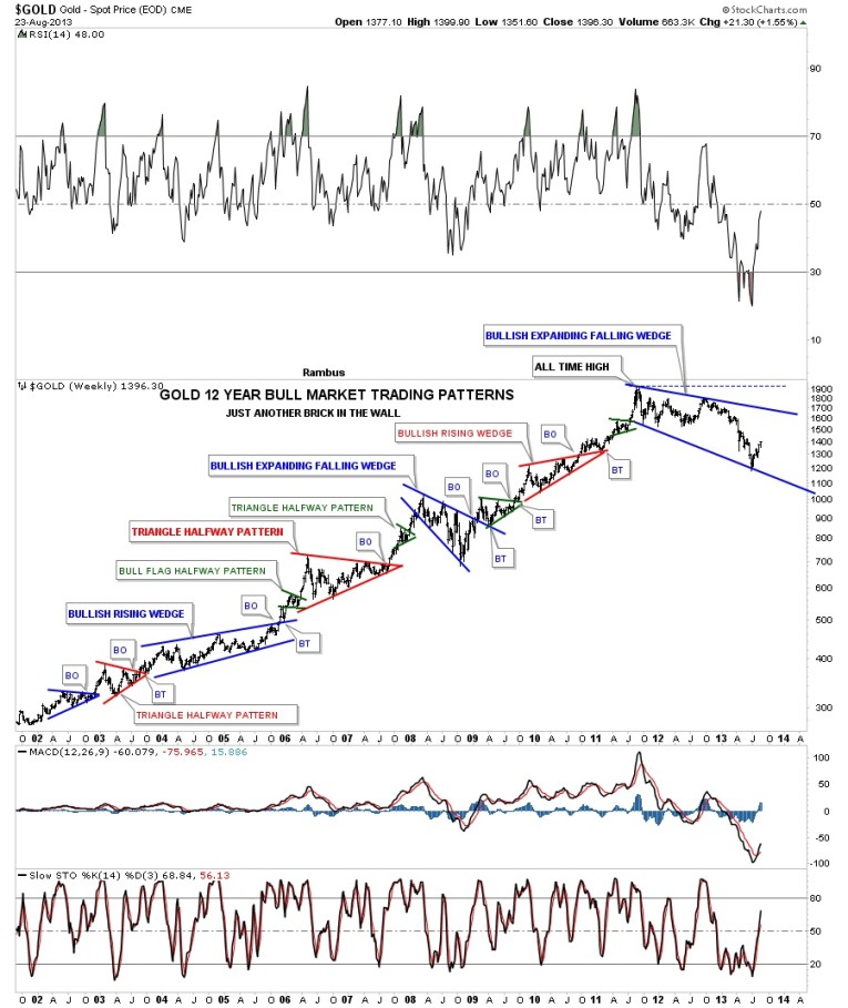
Below is a chart I call just another brick in the wall. This chart shows you every consolidation pattern that gold has made since the beginning of its bull market. The $64,000 question is is our latest consolidation pattern, the bullish expanding falling wedge, just another consolidation pattern or brick in the wall. Stay tuned as things are starting to finally get interesting again after a two year consolidation period that maybe coming to an end. All the best…Rambus
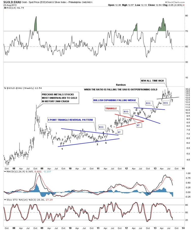
PS: I forgot to add one more chart that compares gold to the XAU. This chart shows you how far out of whack this ratio is. You can see the spike made back in 2009 that was the all time high for this ratio. Now look to the right side of the chart and you can see this ratio went even further to the extreme. Note the little topping pattern and the breakout gap that occurred two weeks ago. This could be a very significance development as it shows the Precious Metals stocks may now revert back to the means where ever that may be. This is what we need to see if a new bull leg is being born.


