Cracks are Forming in the Stock Market
 share
share
 share
share
 share
share
 share
share
 share
share
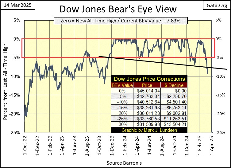
This was a bad week for the stock market. A week that saw the Dow Jones break decisively below its BEV -5% line, and almost did the same for its BEV -10% line on Thursday’s close. What is there to say? For the bulls, what is seen below is a bad chart. Then again, maybe this is a great chart, a chart that would enable a bull to sell within 10% of a market top, by exiting before the Dow Jones breaks below its BEV -10% line.
Keep in mind; any investor who sells within 10% of a market’s top, and then buy within 10% of the following market-decline’s bottom, is doing better than most professional money managers.
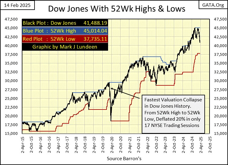
Another bad chart for the stock market, is the Dow Jones with its 52Wk Highs & 52 Wk Lows lines (below). At week’s close, the Dow Jones was about as far from its 52Wk High line, as it was from its 52Wk Low line. So, what comes next? I wish I knew. However, looking at the chart below, the Dow Jones, except for a few brief periods, has been pushing its 52Wk High line up since the summer of 2016.
Nine years of the Dow Jones doing the same thing, pushing its 52Wk High line up, seems like a long time to me. And how many points has the Dow Jones pushed up its 52Wk High line? From 17,500 in 2016, to over 45,000 last December. That is a nine-year, 27,500-point advance, a double plus a half in less than 10 years.
I don’t know what the next nine years will look like, but I doubt it will look like the last nine years seen in the chart below. Hey you bulls out there; how much more do you think the stock market will do for you in the years to come?
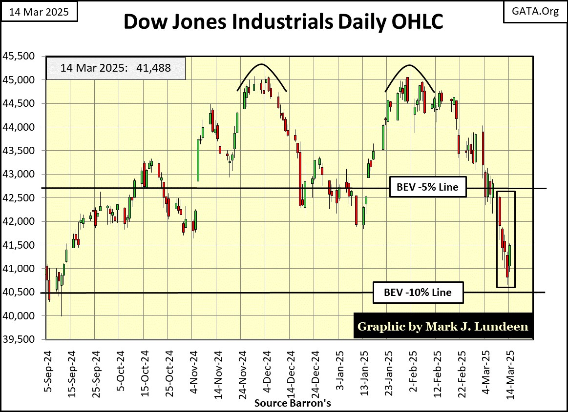
For the Dow Jones in daily bars below, look at the double top formation, with one peak in December, the other in February. I’m always amazed when a technical pattern, like a double top, or head and shoulders top, calls a top in the market, as seen below.
These chart patterns don’t always get it right. But do frequently enough where it’s wise not to be too hasty in dismissing a topping pattern as a bearish harbinger of what is to come.
However, the truth be told, what is seen below is less than a 10% correction from the last all-time high of last December. If this is it; the full extent the Dow Jones will decline in 2025, what is seen below isn’t much of a correction in the market.
I’m not a bull or a bear on this market, but a coward who has been out of this market for years, sitting high above the market action in the market’s peanut gallery. If someone has doubled, or tripled their original investment in the past ten years, maybe this is a good time to join me sitting this market out, and lock your profits in by selling.
Okay, what is next for the Dow Jones? About me becoming bullish anytime in the near future, that’s looking doubtful. Unless the idiots at the FOMC “inject” some meth into this geriatric bull’s rear quarters, I think the Dow Jones’ last all-time high of December 4th, will prove to be exactly that for this advance, aka, Terminal Zero, or TZ in BEV lingo.
If the Dow Jones is fated to go down for the next few months, it won’t do so in a straight line. That isn’t how a market sees a major market declines from its final all-time high. It does so in steps; two steps down, one step up, then repeat the cycle.
The last four weeks for the Dow Jones have seen it do little but go down. We’ll call this decline; the two steps down. So, my guess would be that the Dow Jones will soon bounce off its BEV -10% line (40,500), or thereabouts, and then resume going up. A one step up to get the bulls feeling confident again, before Mr Bear comes back to show them the error of their bullish ways, with another two steps down move, that cost them dearly.
Next is my table for the Bear’s Eye View values of the major market indexes I follow. We haven’t seen a BEV Zero (0.00% = new all-time high) for about a month, and last week, and again this week, this table hasn’t seen any of these indexes close in scoring position; less than 5% from their last all-time highs. On Thursday’s close, only six of the indexes closed above their BEV -10% lines, though things recovered a bit on Friday’s close.
What is seen below, is how it looks when the tide is going out on the market.
I don’t see into the future, but you don’t need a weatherman to know which way the wind blows. My best guess would be that most of these market indexes’ BEV values over the next six months, will be much lower than they are now in March.
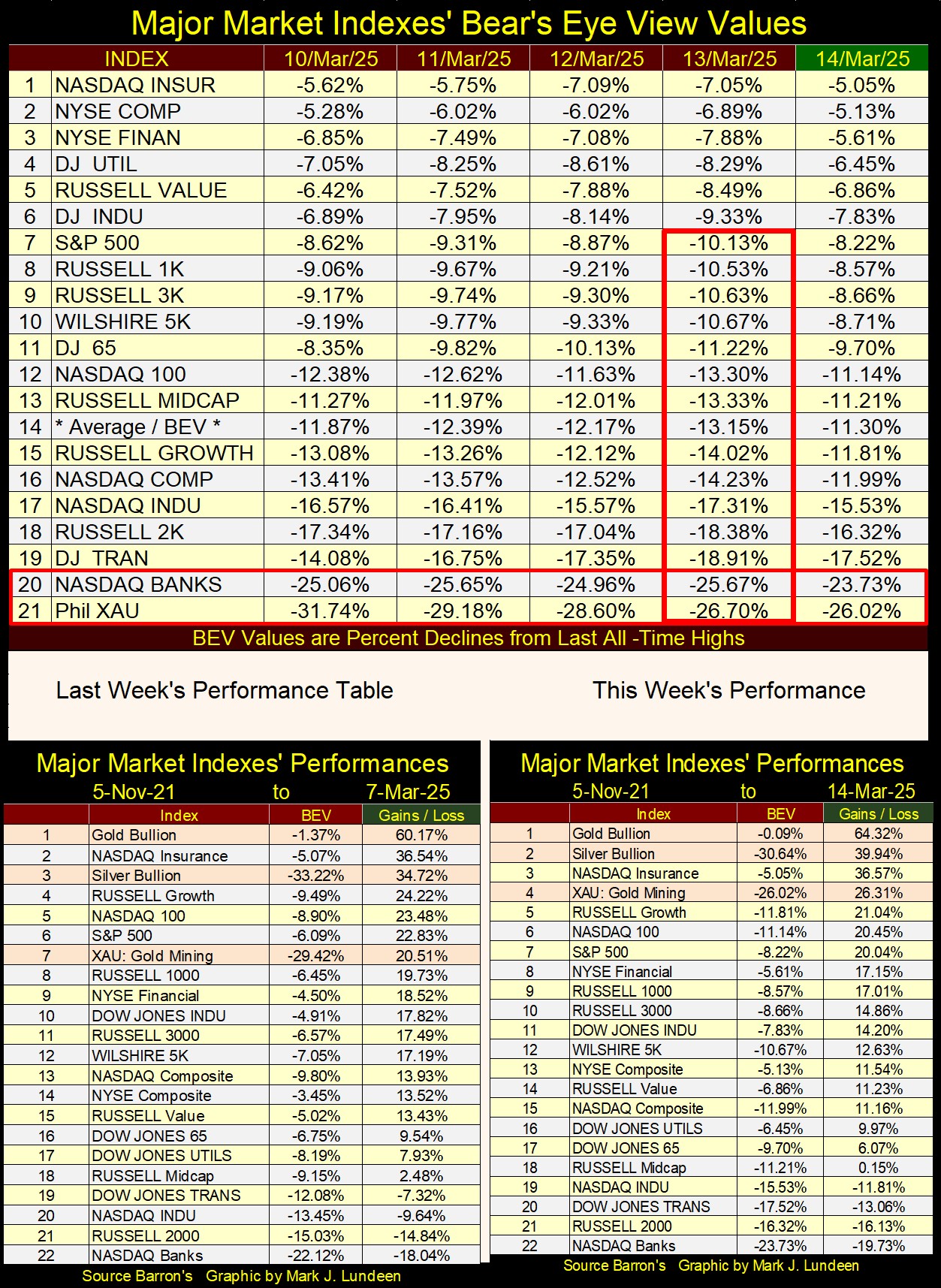
In this week’s performance table above, gold, silver and the mining companies in the XAU are outperforming the broad-market. The big question I have at the end of this week is; what in the heck kind of insurance companies are in the NASDAQ Insurance index (#3)? Seeing the NASDAQ Banking Index at the bottom of the table isn’t a good sign, so why are the insurance companies, and the NYSE Financial Index (#3&8) doing so well? Someone is wrong.
Cracks in the stock market are becoming more apparent. This is a good time to take a critical look at how the “bull market” is holding up – not as good as some would have it. On Monday, the Dow Jones saw a day of extreme market volatility, a 2% day, as it closed 2.08% below where it closed the Friday before. During bull market advances, the Dow Jones rarely sees 2% days. It can happen, but almost never does. But in the last six months, the Dow Jones has seen four 2% days.
That isn’t necessarily a big thing, but it is something I’ve noticed, and don’t like. I don’t like as the Dow Jones has begun building a cluster of 2% days (Red Square) in the chart below, something it does during market declines.
If the Dow Jones’ last all-time high of 45,014, seen on December 4th, is this market’s advance last all-time high, ahead of us is an increase in market volatility, and many more 2% days for the Dow Jones. That will not be bullish.

The above-mentioned Dow Jones 2% days are influencing the Dow Jones Daily Volatility’s 200D M/A, seen below. Every bull market top since 1973, and before, has topped at, or near this chart’s 0.50% line. The following bear market declines began as this plot rose above the 0.50% line, market declines that then terminate with this plot somewhere well above the 1.00% line.
Keep in mind, as a 200 Day Moving Average, it will be a lagging indicator when directly compared to an actual top or bottom of the market. Still, I find this data series very useful in my studies of the stock market.
Looking at this chart’s recent history, since August 2023 within the red circle, the plot has bounced off the 0.50% line, and is now rising towards its 1.00% line. Looking at the market history recorded in the plot below, once this plot begins its rise in earnest from the 0.50% line, it continues rising, as a bear-market develops in the stock market.
Will this happen once again? Maybe not. But odds are that it will, as stock-market declines, historically have always high volatility markets.
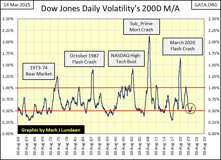
What kind of daily volatility will the Dow Jones see as a bear market develops? It will see more, and increasingly more extreme 2% days, as the bear market approaches its bottom.
The March 2020 Flash Crash was a particularly nasty market decline, from a new all-time high on 11 February 2020, the Dow Jones crashed 37%, only twenty-eight trading days later. This was a sharp, 37% market decline not seen even during the Great Depression’s Market Crash of 1929-32. During the Great Depression Crash, from its last all-time high of 03 September 1929, the Dow Jones took forty-seven trading days, before its valuation declined by 37%.
Keeping in mind this 200D M/A volatility indicator, is a lagging indicator, now look at the volatility spike for the March 2020 Flash Crash in the chart above; it went straight up, from 0.05% to 1.25% in a matter of weeks – Wow!
During bear market declines, when Dow Jones 2% days become daily occurrences, I publish what I call Mr Bear’s Report Card (left table below), where I record days of extreme market breadth, and days of extreme volatility. Look at the insane market volatility the Dow Jones saw in March 2020, daily moves of much greater than 2%, for weeks.
Now look at the NYSE 52Wk H-L data on the right table below. On February 21st, the NYSE saw 87 new 52Wk Lows. Fourteen NYSE trading days later, on March 12th, 52Wk Lows had exploded to 2,377. Geeze Louise, on March 12th 2020, the NYSE had 3,068 issues trading, and 77.5% of them saw a 52Wk Low on that day!!
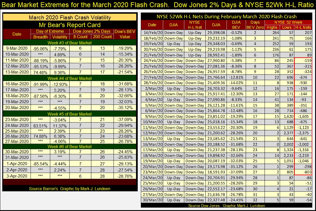
I don’t know, but I doubt the Great Depression Market Crash saw four weeks of volatility, as seen during the March 2020 Flash Crash above.
This is why FOMC Idiot Primate Powell “injected” two trillion dollars of “liquidity” into the market, during March and April 2020. He feared the Dow Jones wouldn’t bottom with only a 37% decline, but would continue going down to levels unthinkable. Had he not poured trillions of dollars of monetary inflation into the market, to do what no one else was willing to do with their own money during this market crash; BUY, how much lower would the stock market have crashed?
The problem today, is the same as it was in early 2020; the stock market is grossly overvalued, only more so today than it was five years ago. This is a stock market Mr Bear has big plans for, and you and I don’t want any exposure to what he has in mind for the bulls.
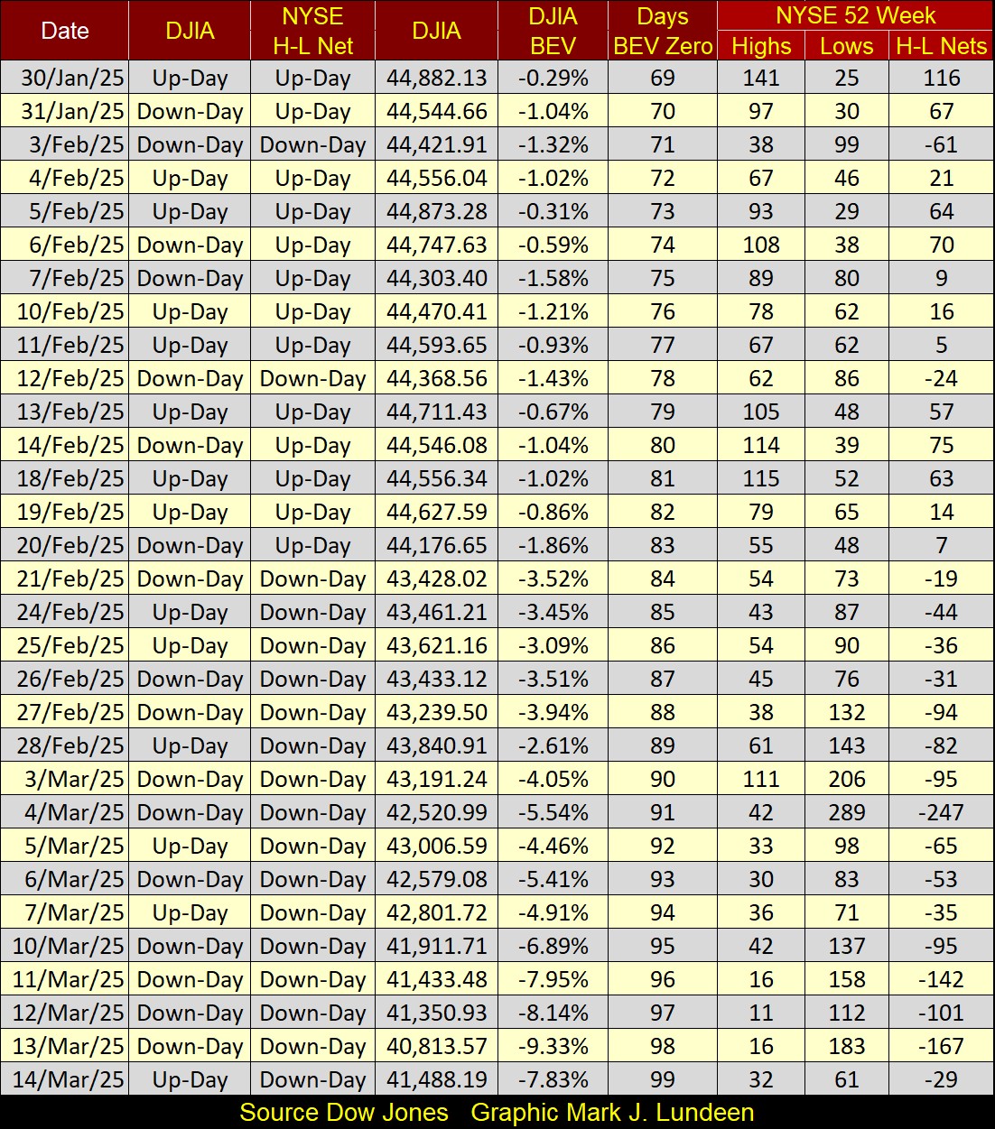
Not seen for the past six months, here is my table for the NYSE 52Wk Highs and Lows. Let’s focus on the 52Wk Highs and Lows themselves at the far right of the table; specifically, the H-L Nets column. In bull markets, 52Wk Highs outnumber 52Wk Lows, as 52Wk Lows outnumber 52Wk Highs during market declines.
But since January 30th, the H-L nets haven’t seen any excitement; no net’s greater than +/- 300. So, if the stock market is in market decline, it is still early in my supposed bear market decline, as during a big market decline, these H-L nets will exceed -1,000, as seen above.
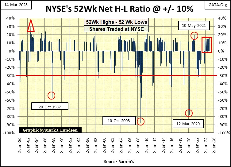
Let’s look at the NYSE 52Wk H-L Ratio in the chart below, covering forty-five years of market history. So, what are we looking at? Using the data seen above, for each day the NYSE was trading, NYSE 52Wk Lows are subtracted from 52Wk Highs, which is then divided by the number of issues traded that day at the NYSE. This daily ratio is then passed through a filter, where only those days where the ratio was equal, or greater than +/- 10% are plotted in the chart below.
This +/- 10% threshold eliminate the noise from daily trading, while highlighting those days where the market saw some excitement, either to the upside for the +10% days, or to the downside for the -10% days. When the NYSE 52Wk H-L Ratio sees a 10% day, up or down, it is an exciting day in the stock market, that everyone takes note of.
The big picture observation of the plot seen below, in a world (the market) driven by greed for gain, and the fear of loss, fear is the stronger emotion.
That is an important observation, knowing when the market is experiencing a day of terror, three of them seen below;
- 20 October 1987 (Flash Crash of October 1987),
- 10 October 2008 (Subprime Mortgage Debacle),
- 12 March 2020 (Flash Crash of March 2020).
For those still in the market during these selling panics, there is little room for logical thinking, as survival psychology at such times demands selling. At such times, buyers are few. So, the few buyers can dictate prices to the many sellers, who want out of the market at any price.
Of course, to be able to buy at a market bottom, one must have money to buy for a dime, what someone else paid a full dollar for, a few years before. Which is why it is wise to sell within 10% of a market’s top, so one can buy within 10% of the following market’s bottom.
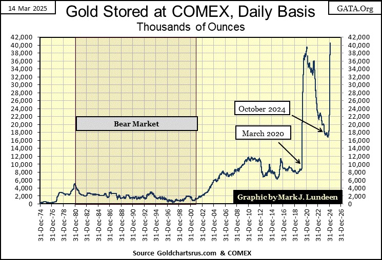
A few weeks ago, I reported on the large inflows of gold and silver into the COMEX storage facilities. This week I found a possible, a likely reason for this inflow of gold into North America, in the video listed on the article below.

Martin has been around for a long time, has done business with many influential groups, individuals, and governments. If he claims the tremendous inflows of gold coming into the COMEX facilities, is because wealthy Europeans want to remove their private gold holdings from the grasping hands of the European Union, before the EU imposes capital controls on European wealth. I believe that.
This is a huge amount of gold now held at the COMEX’s storage facilities, over 40 million ounces of gold held by wealthy, private people and institutions. Look at the spike in gold inventories at the COMEX since last October, over 20 million ounces in five months. Central banks too are buying gold by the ton.
When the public once again sees the logic of buying gold as a hedge against what is coming their way, they will discover that most of the available gold is already held by people and financial institutions, who will have Zero interest in selling their gold to the public, at any price.
For people thinking of buying gold and silver bullion, now is the time to do so.
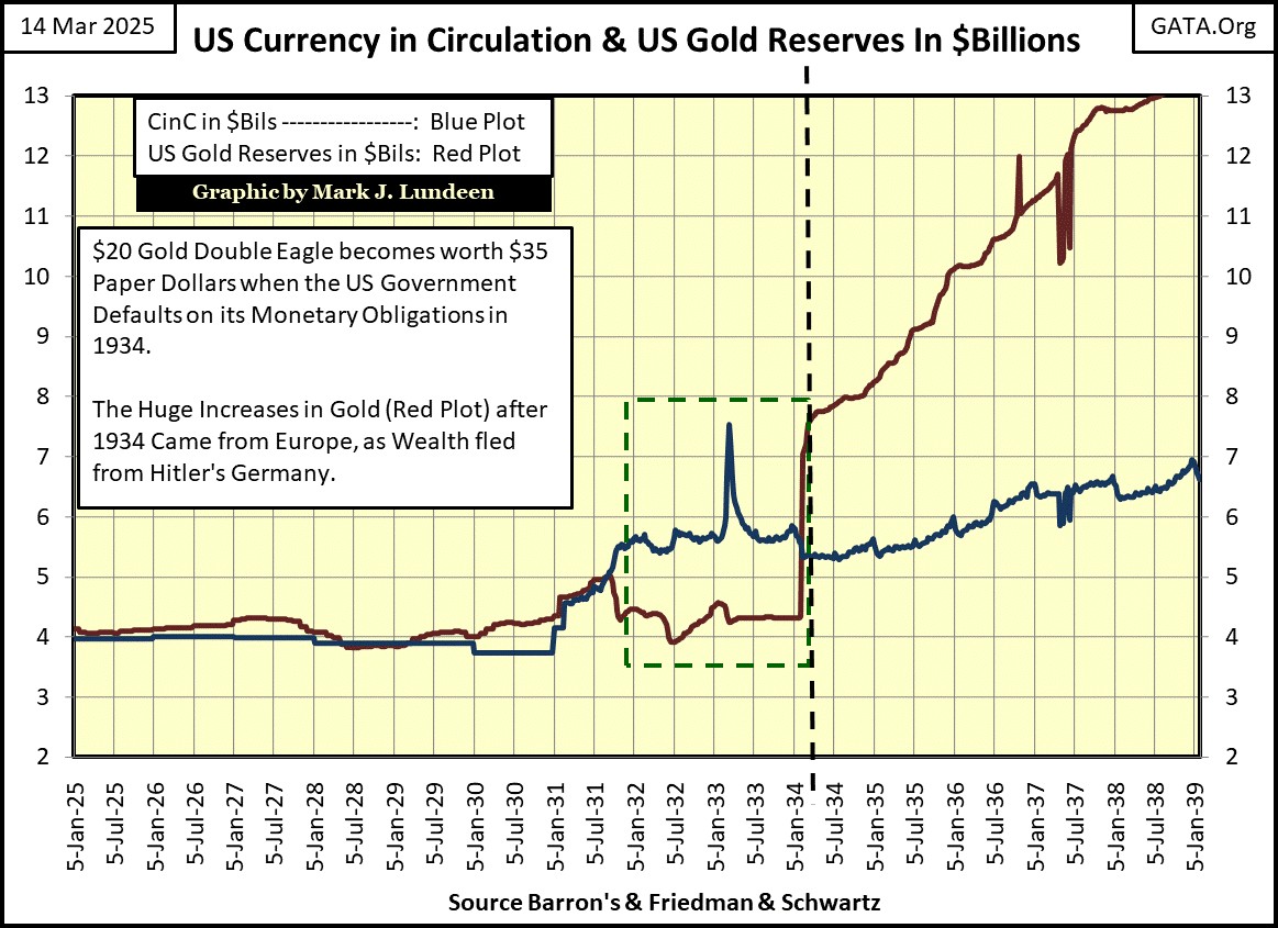
As a historical note; the same thing happened before WWII. War fears drove European central-bank gold into the NY Federal Reserve Bank, see red plot in chart below, post 1933.
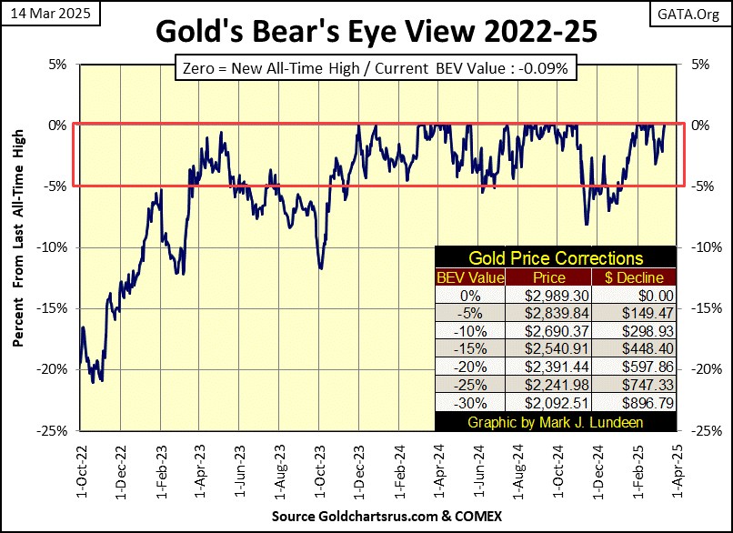
Next is gold’s BEV chart, and what a beautiful chart it is too.
This week on Thursday, gold made its 54th new all-time high, since entering scoring position in November 2023, and I’m expecting more new all-time highs in the coming weeks and months. As gold closed the week only $14 below $3,000 an ounce, we may see some excitement in the coming summer. Because $3,000 is a big number, so many dollars for one little ounce of gold. Far more than the $35 for an ounce gold from many decades ago.
Gold moving on to $3,500, or $4,000 an ounce as 2025 matures, should at some point, catch the public’s attention. Possibly starting a BUYING PANIC in the gold and silver market? But, most likely that isn’t going to happen, unless the stock market is crashing, which would motivate dollars fleeing the NYSE and NASDAQ, into assets with zero counter-party risk; gold and silver bullion. What is going to happen during 2025, we’ll just have to wait to see. But for 2025, I’m anticipating good things for gold and silver, and their miners.
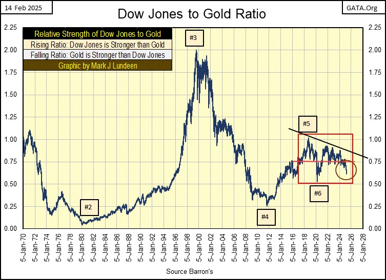
Here is my plot of the Dow Jones to Gold Ratio. I indexed the Dow Jones and the price of gold to 05 January 1970 = 1.00, and then divide the indexed value of the Dow Jones, with the indexed value of gold. See table below.
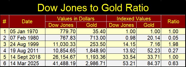
The Dow Jones and gold are counter-cyclical to each other. Typically, when one is doing good, the other isn’t. So, when this ratio is rising, the Dow Jones is outperforming gold. When this ratio is declining, gold is outperforming the Dow Jones.
Box #2 is the top of the 1970 to 1980 bull market in gold. Box #3 is the top of the NASDAQ High-Tech bull market. From Box #3 down to Box #4, valuations for both the Dow Jones and gold went up, but gold outperformed the Dow Jones, until August 2011, or Box #4.
From Box #5, to this day, this ratio has oscillated between 1.0 and 0.5. In other words, since 2019 (Box #5), within the red box, there hasn’t been a clear leader between the Dow Jones and gold. But recently, (Red Circle), rising gold prices, and declining Dow Jones valuations, has seen this ratio begin to fall. Will it once again break below 0.50 line?
If it does, that is only possible because gold, once again is outperforming the Dow Jones.
Looking at gold’s step sum table below, gold worked off its overbought 15-count of +7 from a month ago. Gold last week saw a 15-count of -3. To work off the overbought +7s of February, took many down days in the gold market. Yet after all those down days in the gold market, gold still made a new all-time high on Thursday.
How is that possible? There are thirteen trading days between gold’s last two new all-time highs, seven were down days, six were advancing days. However, the six advancing days took the price of gold up higher, than the seven down days took the price of gold down. It’s a game fish that swims against the current.
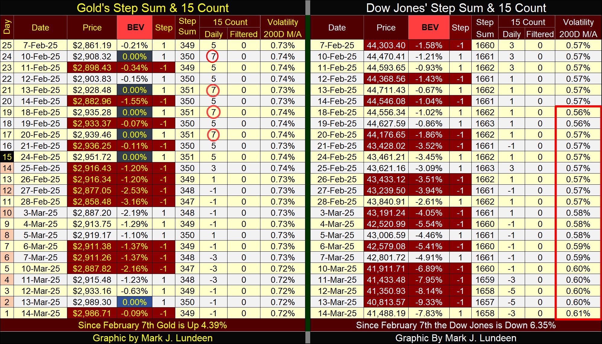
For the Dow Jones (right table), it too is seeing more daily declines than advances, but the daily declines are taking down the Dow Jones’ valuation. Not good for the bulls. Also bad for the bulls, the Dow Jones daily volatility’s 200D M/A (as seen earlier, charted in this article), broke above 0.60% this week.
This isn’t a reason to begin a panic, but this rising trend in the market is one worth following. Should it rise above 1.00%, you won’t need to read my articles see how things have changed in the stock market.
Mark J. Lundeen
*******
share
share
share
share
share