The Dow Jones and Gold are Countercyclical. Really?


I have a publishing note; next week I’m having one of my kneecaps replaced. That means surgery, after which, I doubt I’ll want to write an article for a few weeks. Hopefully, I can also get the other kneecap replaced before Christmas. This is something I have to get done, I’m so tired of being a cripple.
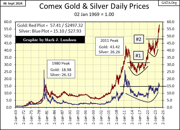
This week, the Dow Jones seems to have gotten lost, it’s beginning to go the wrong way – down. The question on my mind at such a time as this is; did the Dow Jones close in scoring position in its Bear’s Eye View chart below? With it closing the week with a BEV of -2.93%, which is midway in range of values I call scoring position (-0.01% to -4.99%), I note that yes it did, close in scoring position.
I would rather the Dow Jones have closed this week at a new all-time high (BEV Zero = 0.0%). But with it closing above its BEV -5.00% line this week, this is a promise, if not a commitment of new all-time highs to come.
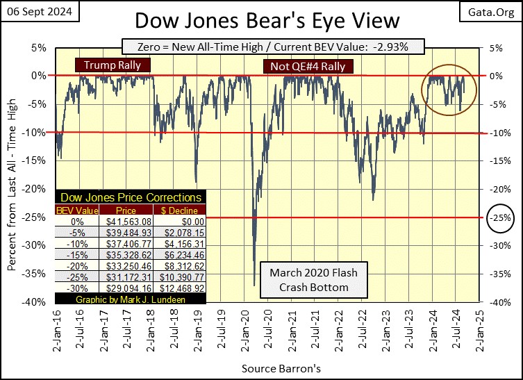
Of course, with any advance in a BEV chart, there always comes the last all-time high of the advance; its Terminal Zero (TZ). In the Dow Jones BEV chart above, we see a few TZs since 2016, the last BEV 0.0%, before the Dow Jones breaks below its BEV -5% line, from where the Dow Jones then fell below its BEV -10% line, and then more.
Is the August 30th BEV Zero (the 33rd of this advance) this advance’s TZ? Only time will tell.
But let’s wait until the Dow Jones does break decisively below its BEV -5% line, before we start considering a Terminal Zero for our current advance. There are some excellent examples to study above, as how our current advance will – Terminate. Until then, I’m continuing to assume the Dow Jones has additional new all-time highs coming its way.
Next is the Dow Jones in daily bars. Sure, the Dow Jones closed the week in scoring position, above its BEV -5% line at 39,484, but another week like this, and it won’t. Two such weeks in a row would be very unusual, unless the bulls feel the hot breadth of Mr Bear on the backs of their necks. I don’t see any bear sign in the market yet. So, I’m going to assume the selling pressure we see below, will abate next week.
One thing the bulls have going for them, is none of the big down days seen below, are Dow Jones 2% days; days the Dow Jones closed 2%, or more from its previous day’s close. When the Dow Jones begins seeing multiple 2% days, up or down, that is a good indication Mr Bear is on the prowl, looking for some beef on the hoof to feast on.
But that didn’t happen this week. On Monday, the Dow Jones was down by only 1.51% from last Friday’s close. This Friday, the Dow Jones was down by only 1.01% from Thursday’s close. I don’t like it; these oversized down days seen this week in the chart below. But there is nothing I see below, that would make me want to panic out of being short-term bullish on the stock market. Until the Dow Jones closes below 39,484 (its BEV -5% Line) by a good amount, that is my story, and I’m sticking to it.
One thing to keep in mind in the chart below; is the BEV -5% line has drifted up with the advancing Dow Jones, and always will. Last March, the Dow Jones’ BEV -5% line was at 37,791, as that was 5% from the last all-time high of 39,781, seen on March 21st. I draw the current BEV -5% line across the entire chart because; well, I just do.
Just keep in mind, the BEV -5% line seen below, is 5% below the Dow Jones’ last all-time high, which is currently 41,563; the Dow Jones’ last BEV Zero seen on August 30th. The same goes for the BEV -10% line seen below. It too shifts upward with the rising Dow Jones.
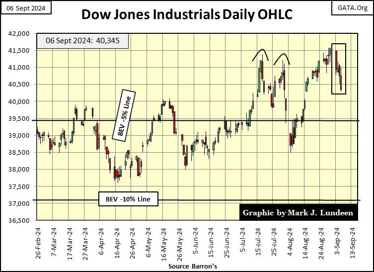
Had we seen two big Dow Jones 2%-days this week, days the Dow Jones was down by 3% or 4%, or more from the day before, I’d be concerned about the pending financial health of the bulls. As it is, I’m going to continue assuming the Dow Jones has more new all-time highs coming in the weeks and months to come.
Below in my table for the major-market indexes’ BEV values. Last Friday saw some new all-time highs (Pink BEV Zeros), but no BEV Zeros this week. Though the week closed with twelve of these major indexes closing in scoring position.
Looking at the BEV average for these indexes, #13 in the table, it went from -5.26% to -8.93% at the close of this week. That is a big move down, but nothing alarming when looking at this metric in the chart below. Keep in mind, this plot is the average of the BEVs for the major market indexes I follow. Unless they all close with a BEV Zero, you’ll never see this plot rise to a BEV Zero.
In 2021, this plot of BEV Zero averages did rise above its BEV -5% line, and for almost a year, stayed there. But that is what happens when a bunch of idiots at the FOMC, “injects” a few trillion dollars of monetary inflation into the financial system, in a matter of a few months, to “stabilize market valuations” during the March 2020 Flash Crash.
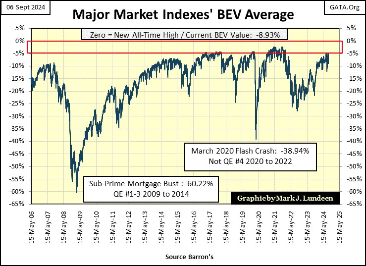
As it is, at this week’s close, what would alarm me in the chart above? A clearly defined down trend, something I don’t see forming just yet.
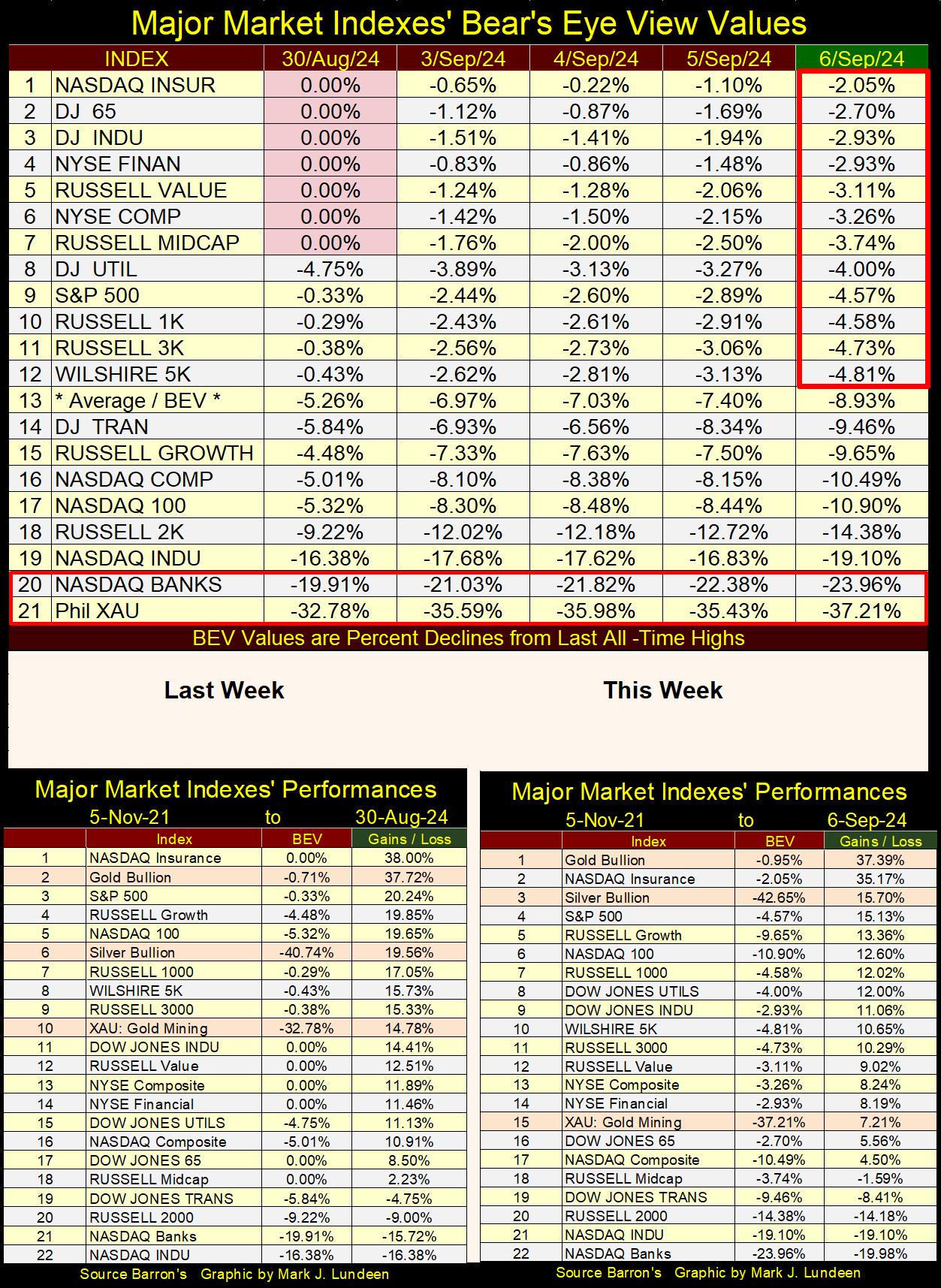
In the performance tables above, gold and silver bullion regained their positions at the #1 & #3 spots, not by going up this week, but by going down less than the major market indexes in the table. The XAU went from #10 to #15 this week.
All and all, it was a difficult week for all concerned, but that is what sometimes happens in all market advances – a bad day, week, or month. So, I’m not yet ready to give up on this market going to higher levels, just because of one bad week.
Is Gold, and the Dow Jones countercyclical to each other? Yes, they are! Then, how so?
I did some work delving into that question this week, and I came up with the chart below. Sorry, far below, so you may want to skip down and take a quick look at it.
What are we looking at? I first constructed the indexes of the daily closes for the Dow Jones, and gold, indexed to 1.00 = 05 January 1970. By using the indexed values of these two-market series, they have equal weight in the ratio. I then used the daily ratios for the Dow Jones index / gold index, to plot the resulting ratio below.
I placed numbered boxes at key turning points in this ratio for the past fifty-four years. Key turning points in the ratio, * NOT * for a bull or bear market in the Dow Jones or for gold. Though, looking at the ratio over the decades, its easy seeing when the Dow Jones, or gold was in a bull or bear market. However, the major turning points in the ratio do now always align with the major market turns for the Dow Jones or gold.
The table below the chart, lists the dates for the numbered boxes, as well as the values for the Dow Jones and gold, both dollar and indexed values, plus the value for the ratio. I didn’t include a box for #1 on the chart, for 05 January 1970, as the first day of the ratio, was by mathematical necessity; a 1.00 – the plot’s starting point. Including a box for the obvious made the chart appear clumsy.
Note; when the ratio below:
- is increasing, the Dow Jones is outperforming gold,
- is decreasing, gold is outperforming the Dow Jones.
Outperforming is the key to understand this plot, as in a bull or bear market for one, may also be in a bull or bear market for the other. * BUT IF * someone was in the stock market when the plot was rising, and in gold when the plot was declining; they would have maximized their profits.
- From box #1 to #2: the ratio decreases, as gold entered its first bull market, rising from $35.4, to over $800 ten years later. During these ten years, the Dow Jones lost $12. Yep, the Dow Jones lost $12 from 05 January 1970 to 07 February 1980.
- From box #2 to #3: the Dow Jones appreciated by 1,336.55%, as gold declined by 64.44%, during its two-decade long, bear market, taking this ratio from 0.05 to 1.98. The massive increase in this ratio, is an impressive display of the countercyclicality of these two markets.
- From box #3 to #4; the Dow Jones declined by 1.59%, as gold appreciated by 629.34%.
- From box #4 to #5, the Dow Jones appreciated by 141%, as gold declined by 34.45%.
- From box #5 to #6, the Dow Jones appreciated by 55.82%, as gold doubled that, by appreciating 110.8%. Note: both the Dow Jones and gold appreciated from box #5 to #6, but gold appreciated more than the Dow Jones, taking this ratio down.
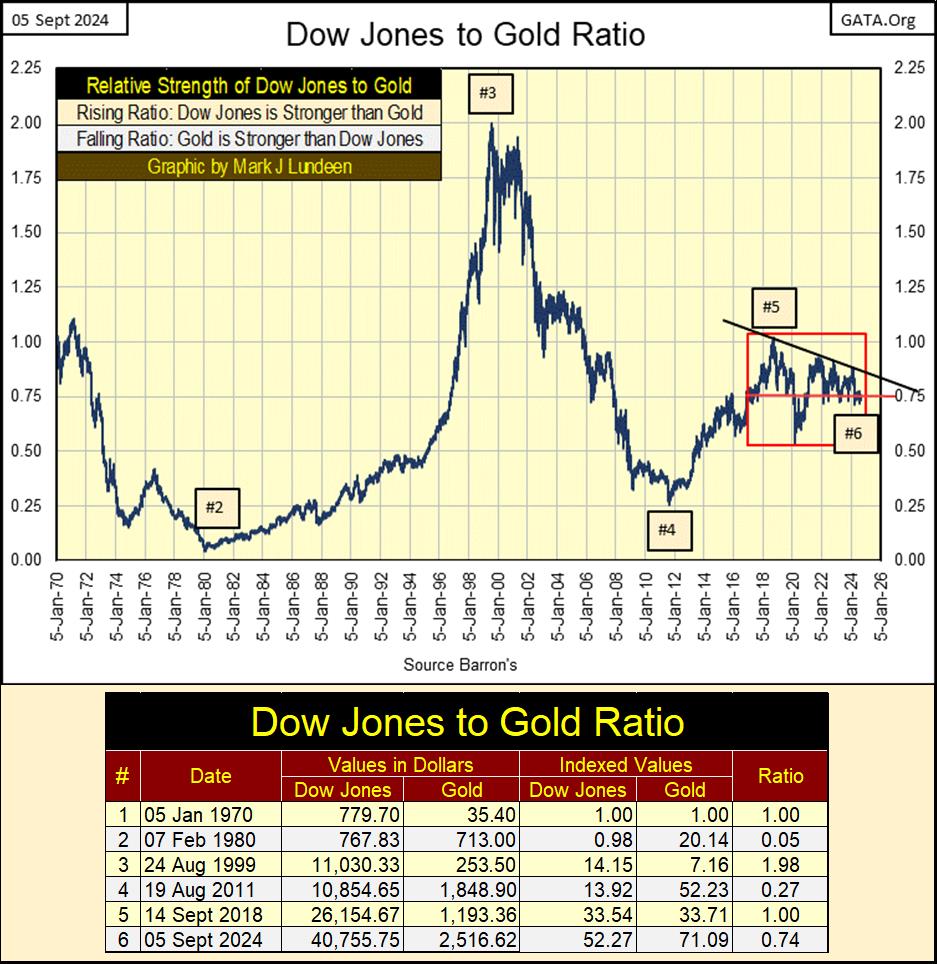
The table above contains the data used for the boxes, marking the turning points in the chart above. It’s notable how since January 1970, a year and a half before the dollar was taken off its $35 gold peg, gold has advanced by a factor of 71.09, while the Dow Jones increased by a factor of only 52.27. That gold has been a tremendous long-term winner in the investment world, is a little-known fact my readers should be aware of.
For us baby-boomers, just buying an ounce of gold in 1970, and holding it until 2024, beat the stock market by a good amount. For younger people, I’m sure the same will be true in the decades to come. Though like from 1970 to 2024, gold had its bad times too, some lasting decades. It won’t be any different for the next fifty years. And yes, I know it was illegal for Americans to own gold until 1974, but you see my point.
Looking at the chart above, we see the sweeping moves this ratio has taken, some taking decades to complete. Some with no, others with a few corrections in the plot seen above.
But since 2017, this ratio’s sweeping moves have been constrained within the red box, confined between 1.00 and 0.50 for the past seven years. I note when this ratio saw its 0.50, it was during the March 2020 flash crash’s selling panic on Wall Street. Otherwise, this ratio has been oscillating between 1.00 and 0.75 these past seven years.
This ratio’s behavior since 2017, has been atypical of the many decades before it. And why would that be? As best as I can understand it, unlike before 2017, since 2017, both the Dow Jones and gold have been advancing for the past seven years, so the ratio hasn’t really been going up, or down, just oscillating within the red box.
I placed a declining trend line over the peaks in this ratio for the past five years. This suggest this ratio wants to go down; that the gold market is building strength, as the Dow Jones is becoming weaker as time go by.
Should this ratio break out of its red box, below the 0.50 seen during the March 2020 flash crash, you won’t need me; to tell you, the Dow Jones is breaking down, as the price of gold soars into new all-time highs.
Next is gold’s BEV chart. Gold closed the week only 0.95% ($23.90) from its last all-time high. That is encouraging, so, I’m anticipating more BEV Zeros for gold in the weeks to come.
This is such a pretty chart. The cluster of BEV Zeros, 29 new all-time highs within the red circle. The cluster that began last December is gorgeous, simply gorgeous, something not seen in the gold market since 2011.
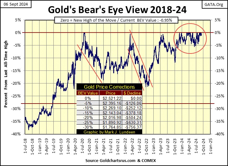
Now let’s compare the Bear’s Eye View for gold and the Dow Jones below, both markets have had very similar BEV charts for the past two years. Their current alignment is something very unusual. This is especially so when we consider that both these markets went into scoring position last November, and have remained there since. Since then, gold has seen 29 new all-time highs, and the Dow Jones seen 33 new all-time highs, these past ten months.
How long will this go on? I haven’t a clue when one, or which of these markets will first fall out of scoring position, and begin declining deep below their BEV -10% line. But one day that is going to happen, and then what does the other market do?
I’m thinking it will be the Dow Jones; my proxy for the stock market, that will break below scoring position, and then keep going down to far below where it closed this week. As the Dow Jones does that, gold will continue adding new BEV Zeros into its cluster of new all-time highs.

That is what I’m thinking. But what actually is going to happen, like me, my readers will just have to wait to see.
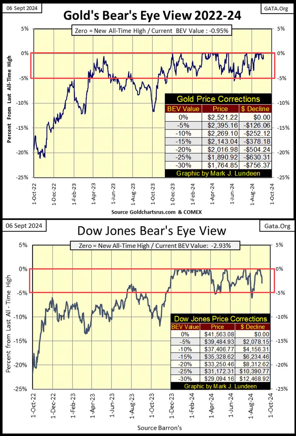
Right now, at first glance it appears the Dow Jones above is ready to break below its BEV -5% line in a big way. It could. But in this Battle of Scoring Position, between gold and the Dow Jones, where since last November, the Dow Jones has scored 33 goals, while gold has only seen 29, I don’t believe Team Dow Jones is ready to leave the field, and head towards their locker room just yet.
Here is something I’ve not published for a while, a chart for the Silver to Gold Ratio (SGR). This week, the SGR closed at 89.41 ounces of silver, for one ounce of gold, making silver cheap, and cheap is good when one is buying.
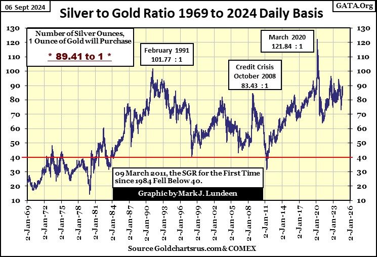
The problem with cheap silver, is that silver has been cheap when compared to gold for a heck of a long time, as you can see in the chart below, the indexed values of gold and silver going back to January 1969.
In a precious metals bull market, we should expect to see the SGR decline below 40 (Red Line in Chart Above), but to make that happen, silver (Blue Plot Below) must once again advance towards gold in the chart below.
As it is now, silver is happy wallowing in the mud around the 15-factor line. However, one fine day, silver will once again advance aggressively upward, towards gold in the chart below. And what a happy day that will be. But when this will happen, I haven’t a clue.
Not much has changed on gold’s side of the step sum table below. Thursday closed with gold just short of a new BEV Zero by only $4.60, just 0.18% away from gold’s last BEV Zero, a week ago, last Thursday. Then came Friday, where gold lost less than $20, which is no big deal.
As mentioned before, what the gold market needs is a big increase in daily volatility. Currently, gold’s daily volatility’s 200D M/A closed Friday at 0.68%, which is low. Meaning the gold market as of now, isn’t an exciting market, and excitement is what a big bull-market in gold is all about.
As this advance in gold continues, if it continues, gold will once again see some 3% days, days where the price of gold moves in excess of 3%, up or down, from a previous day’s close.
This is when the public, and managed money once again becomes aware of gold, and its miners, as a source of capital gains. Maybe we’ll have to wait until the Dow Jones is once again declining, far below its BEV -5% line before gold once again becomes an exciting market.
As it is, I’m impressed how well gold has done in the past few years, with so few 3% days, and chronic low volatility. In 2020, a good year for gold, the gold market saw eight, 3% days. In the four years that followed, gold has seen only seven, 3% days in total, and that is a problem.
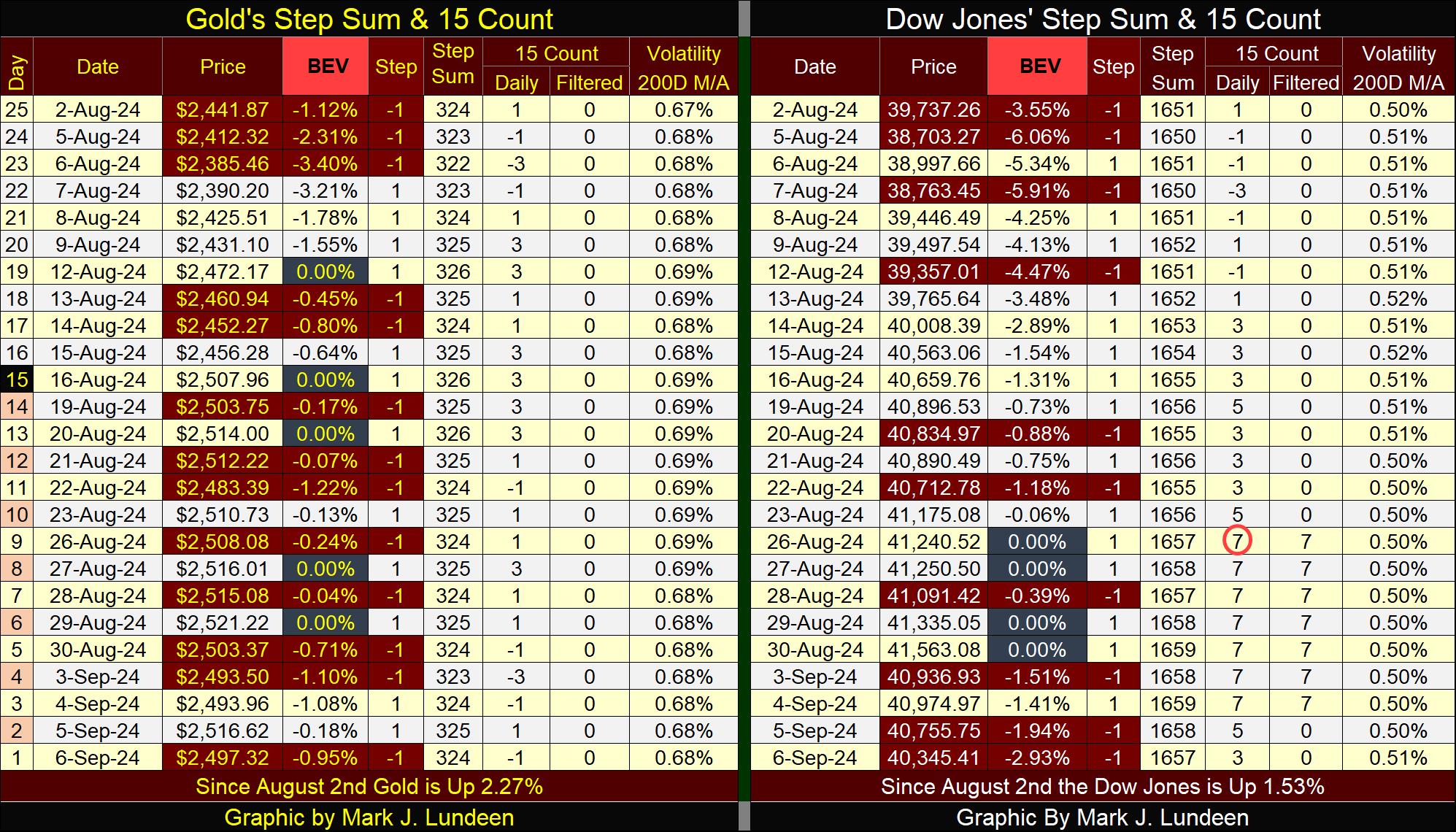
On the Dow Jones side of the step sum table above, the Dow Jones is working off its overbought condition; having a 15-count of +7. Looking at the Dow Jones table, its daily declines have increased, and that is placing some selling pressure on the Dow Jones. If the Dow Jones can keep its BEV values above its BEV -5% level as its 15-count continues to go down, most likely in to negative values, that would be an impressive indication of market strength.
I’ll be gone for the next few weeks, due to my surgery. It will be interesting to see how these step sum table evolve from this week’s close, when I come back. Most likely by Friday, September 27th.
Eskay Mining had a press release last week, updating this summer’s exploration program.
https://eskaymining.com/news/news-releases/eskay-mining-updates-summer-exploration-program-an-9407/
Sorry, there was no drilling this year. The company has about $2.5 million in the bank, and Mac wisely decided not to risks the company’s financial position on a small drilling program this summer, that may not produce what the company needs.
Eskay Mining’s problem is that currently; anything concerning gold and silver mining, and precious-metals exploration, is totally ignored by money managers, and the public at larger. The XAU contains the big mining companies, and these big companies are suffering in this market.
Mac’s plan is to keep control over the company’s mining claims in British Columbia’s Golden Triangle, keep the lights on in the company’s offices, and wait out the current crappy market. Seeing gold trade over $3,000, and silver finally trading $10 to $20 over its last all-time high of January 1980 ($49), would do much to advance the current low share price of Eskay Mining, as well as everything in the XAU!
Still, the company sent its team of geologists out this summer, to grab some surface samples to be assayed. This is important work, as it enlarges the data used in future drilling programs. The assays of these grab samples have yet to be completed, so they are unknown as of the time of this article. Maybe they’ll be out when I write my first article after my surgery.
I check out Eric King’s King World New at the close of every trading day. A couple of days ago I saw an article by Gerald Celente that left me a bit sad; the Generation Xers are reaching 60, and many of them will not be able to retire.
https://kingworldnews.com/gen-x-due-to-retire-but-cant-afford-to/
What is the problem? Gerald was clear on what their problem is; monetary inflation, and debt. In other words; the Federal Reserve System’s open market operations’ “injecting” bank credit, at attractive rates, into the balance sheet of an entire generation, has consumed the retirement prospects of many young people.
Well, no one forced the Gen Xers to live with a large debt load for the past forty years. But then, their Baby-Boomer parents weren’t the best at communicating life skills to their kids; “best to send the kids to college, and let the professionals do that.”
And so it was, with clueless leftist-college professors stressing the wisdom of taking on debt to finance one’s journey from the womb to the tomb. For instance, the wisdom of taking on massive debt to finance a college education, an education that will pay off the excessive debt used to obtain it, with some difficulty.
The problems associated with debt have been long known. Shakespear in his Hamlet warned about debt long ago:
What does “borrowing dulls the edge of husbandry” mean? For the Gen Xer who the Wall Street Journal interviewed, apparently it means to service their debts to the Federal Reserve System, they will have to work to the day they die.
The above is a hard lesson to learn when someone is approaching their 60th birthday.
Mark J. Lundeen
********
More from Gold-Eagle


