Gold and the Dow Jones Continue Looking Good
This week, actually these past two weeks have seen the Dow Jones’ valuation deflate under some selling pressure. What’s with that? That is what happens sometimes in a bull market; the market sells off a bit and people begin doubting the advance. Maybe they should, and then maybe they should not.
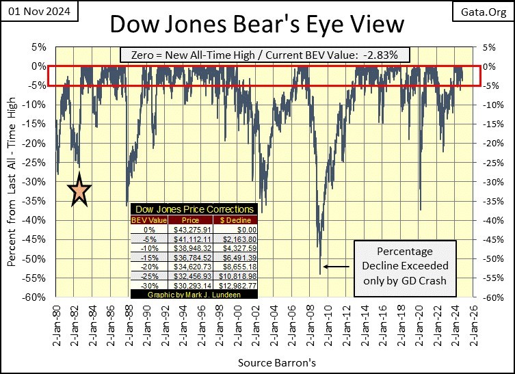
The question I asked myself at the close of every day’s trading for the past year, since the Dow Jones first closed in scoring position is; did the Dow Jones close in scoring position today, between the BEV 0.0% and -5% lines, as seen below.
For the past two weeks, the answer to that question has been yes. An answer that then allows me to stop worrying whether, or not the Dow Jones will continue with its advance, because I’m going to assume it will continue generating new all-time highs in the weeks and months to come. That is how it will be until the Dow Jones once again breaks below its BEV -10% line in the chart below, at which point, I suspect it will be best to sell everything, and get the heck out of the stock market.
Why would I assume something like that? Maybe if you too take a moment to study the Bear’s Eye View chart above, at the frequency the Dow Jones has since 1980, remained mired between its BEV 0.0% and -5% lines, realizing when the Dow Jones is thus forming a cluster of BEV Zeros, it was making market history by going from one new all-time high, to another. These clusters of BEV Zeros can go on for years, while ours is only one year old.
I don’t want people to think I’m accepting the above as normal. It’s not. What it is, is this is what happens when a bunch of idiots at the FOMC decide to “inject liquidity,” (monetary inflation) into the financial system for decade after decade; market valuations become grotesquely inflated.
The star noting August 1982 above, notes the last time the Dow Jones traded under 800. Last week, “monetary policy” inflated the Dow Jones’ valuation to over 43,000. How high can the Dow Jones go? All the way to the moon, if need be, should FOMC Primate Idiot, Powell thinks it is necessary.
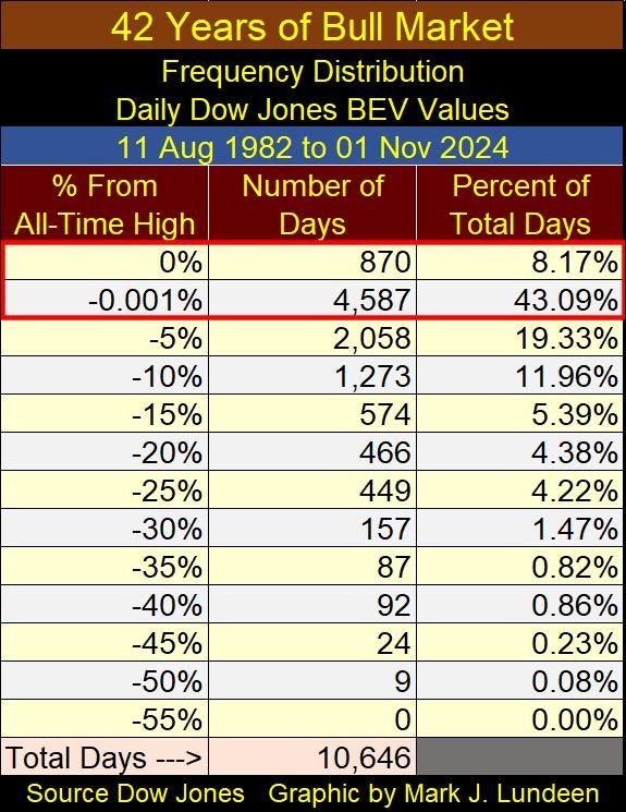
Here is my problem with the Dow Jones, my proxy for the broad stock market; looking at its Frequency Distribution table below, in the top two rows where;
- 0% = BEV Zero / new all-time highs,
- -0.001% = daily closes in scoring position / -0.01% to -4.99%,
since August 1982 (the star above), the Dow Jones has made 870 new all-time highs, or 8.17% of all daily closings have been at a new all-time high for the past 42 years. That is a lot! It gets worse. Since August 1982, the Dow Jones has closed in scoring position for 43.09% of all daily closings for the past 42 years. Take a moment and think of that.
Adding up the daily closings in the 0.0% and -0.001% rows in the table below; since August 1982, the Dow Jones has either made a new all-time high, or closed in scoring position, for 51.26% of its 10,646 daily closings since August 1982. That looks mighty bullish to most people.
I have a different opinion on this bull market, that long ago it became a bull-sh#t market, a market advance separated from any economic reality, except for the reality of a constant flow of monetary inflation flooding into it, courtesy of a gaggle of idiots, at the FOMC.
Yeah, yeah, yeah; Mark, you’ve been talking about that for years now, and nothing bad, something like the Great Depression Market Crash has yet to happens in the stock market after all these decades of inflation flowing into Wall Street.
I know. But one of these days!
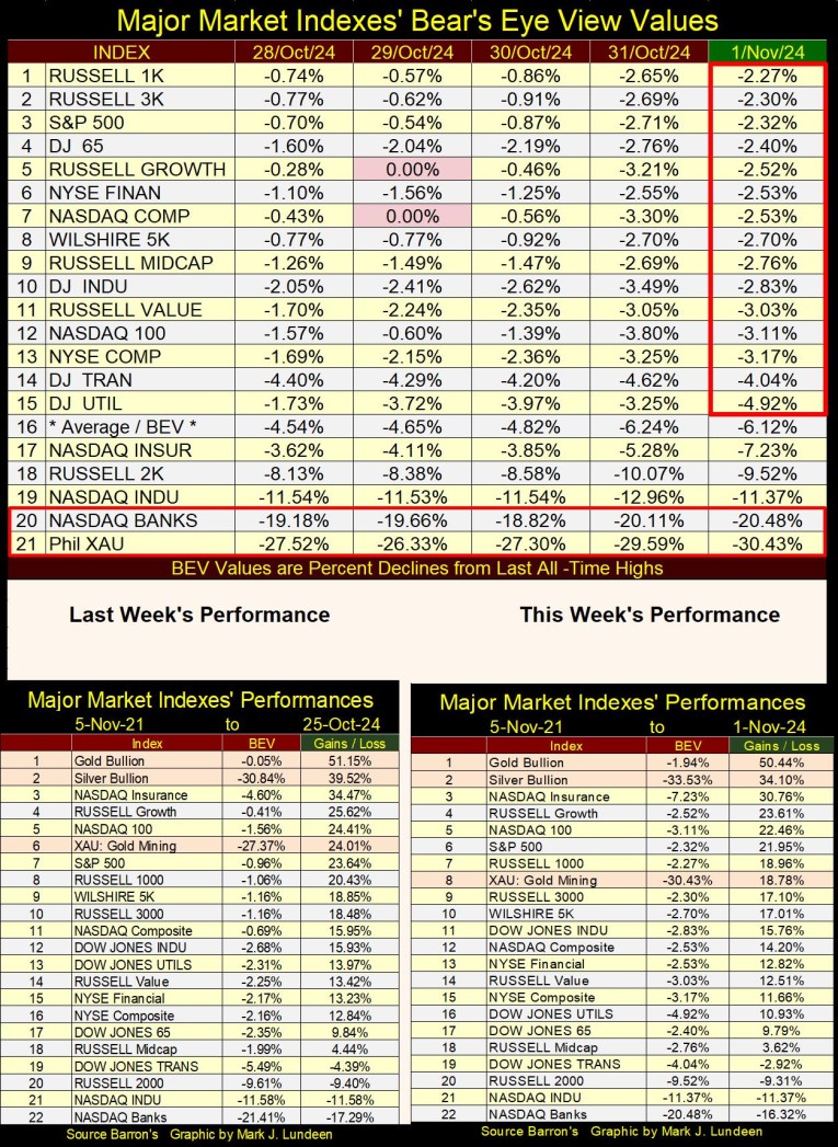
Until then, let’s just keep our eyes on the Dow Jones, and the other major market indexes’ Bear’s Eye View values, in the table below. The market saw two BEV Zeros on Tuesday this week. That is a bit of a pullback from the volume of BEV Zeros in weeks past, but this week closed with fifteen of these indexes in scoring position. So, I remain bullish on the stock market for the weeks and months to come.
Of course, the American Presidential Election is on Tuesday next week. Should these indexes’ BEV values at next week’s close, all close below a BEV of -5%, with a growing number of these indexes posting BEV values of -10% or more, don’t get between me and the exit door for the stock market, because you may get hurt if you do.
I’ll give you another; It’s the End of the World as we Know it trigger to be seen below; should the NASDAQ Banking Index #20, and the XAU #21, currently 10 BEV points away from each other, swap their positions in the table by next Friday. I’m not predicting that. But should that happen, I may just go to my bedroom, lock the door, and turn off the lights.
In the performance table above, the market saw a pull back this past week, but gold and silver bullion kept their #1&2 positions in the table. The XAU, down from #6 last week to #8 this week, was down about 6%. I don’t care. Except for gold and silver bullion, everything else but the XAU is wildly overvalued, and have been for a long time.
I was going through my files this week, and found some charts on Consumer Credit I haven’t used since 2012. Twelve years is a long time, so I thought I’d cover them again this week.
In January 1943, consumer debt for the US was only $6.55 billion dollars, a value that was much reduced from where it was in the 1920s, though that is only a guess on my part. I’m assuming that, as I know the Federal Reserve System following WWI, made it a policy to encourage corporations, individuals and governments to take on what the Federal Reserve System was putting out – debt.
Growing levels of debt funded the Roaring 1920s Bull Market on Wall Street, as seen in the chart below plotting the Dow Jones (Red Plot) with NYSE Margin Debt (Blue Plot) below, coming from the Federal Reserve.
When “liquidity” from the Federal Reserve was flowing into Wall Street from 1926 to 1929, Wall Street enjoyed a historic bull market. However, when the Federal Reserve began withdrawing its “liquidity” from Wall Street, as speculators began defaulting on their margin debts to their brokers, the Dow Jones began a historic crash, that is still remembered to this day.
As seen at the top, right hand side; the Federal Reserve withdrew 95% of its margin debt from October 1929 to July 1932, resulting in an 89% collapse in the Dow Jones’ valuation. This process of creating a boom via credit creation, followed by an economic bust when this credit is withdrawn, is precisely what happened in American Real Estate too during the 1920s and 1930s, as with consumer debt.
That so many banks failed during the first few years of the depressing 1930s, is because they extended credit (made loans) to people and businesses in the booming 1920s, that could not service these loans during the bust that followed.
By March 1933, when President Roosevelt declared a banking holiday, to reorganize the banking system, I’d expect consumer credit and business loans had seen similar declines, as seen in NYSE Margin Debt seen above, a reduction of greater than 90% from where they were in 1929. This massive reduction of illiquid credit during the early 1930s, is what made the Great Depression, so great.
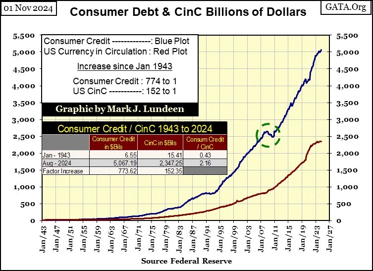
In the chart below, plotting Consumer Credit (Blue Plot) and Currency in Circulation (CinC / Red Plot) in dollars, it’s amazing how Consumer Credit is up by a factor of 773 since January 1943, while CinC is up by a factor of only 152. So, over the decades, consumer credit expands by seven dollars for every one dollar increase in CinC.
Things like that happen when the monetary system isn’t stabilized by gold or silver, things like the banks encouraging consumers taking on massive levels of debt, to fund the stuff they buy, stuff consumers used to, but no longer pay cash for.
Did you know if someone were to pay cash, paper money for a new car at a dealership, or to pay cash for an airline ticket at the airport, chances are reports are being filed on them for their potential criminal activities. The authorities really don’t like cash, would like it if paper money went away. It’s too private. Having consumers use credit cards for their consumption leaves a record our authorities can follow.
Here is another thing a banking system can do, freed from the constraints of a gold or silver standard. Go back to my chart for the Dow Jones and NYSE Margin Debt during the 1920s and 1930. During the 1920s, margin debt continued increasing, until the bubble in the stock market went bust in autumn 1929. Margin debt then contracted by 95% in the next three years.
Now look at the blue plot of Consumer Credit above; it too increased from 1943 to 2007, when a massive bubble in single family homes went bust (Green Circle). I realize this data isn’t for home mortgages. However, the people who could no longer service their mortgages, are the same ones having difficulty servicing their credit-card debt. So, I can use this data to note what didn’t happen from 2007 to 2010 – consumer credit didn’t contract during the sub-prime mortgage crisis, as did NYSE margin debt during the Great Depression.
Why that was, can be seen in the chart below, plotting the monthly changes in the Federal Reserve’s balance sheet. To prevent a tsunami of credit defaults from the mortgage, and derivative markets, and the banking system itself, FOMC Idiot Primate, Bernanke implemented the first of his three QEs in early 2009, to “reliquefy” the financial system.
See chart below. Where before 2007, the FOMC used to monthly “inject” $2.98 billion dollars on average, of monetary inflation into the economy. In early 2009, the FOMC began “injecting” over $100 billion dollar of monetary inflation a month.
In March 2020, in a single month, FOMC Idiot Primate, Powell’s Not QE#4, “injected” * $1.37 TRILLION DOLLARS * of monetary inflation into the financial system, to “stabilize market valuations.”
At the time, “market experts” were blaming the Covid-19 scam-demic for a mini-crash in the stock market, and a growing panic in the corporate bond market, a panic that ultimately forced the FOMC for the first time in its history, to begin buying corporate bonds to “stabilize valuations” in the bond market.
But the problems of March 2020 ran deeper than the Covid scam. The American financial system, after decades of having monetary inflation “injected” into it, has become unstable, prone to catastrophic valuation collapses. Proof of that is seen in the use of QEs seen in the chart above; massive “injections” of “liquidity,” QEs required to “stabilize” the financial system.
Come the next bout of valuation deflation, as seen during the sub-prime mortgage crisis, or the March 2020 flash crash, we can depend on the idiots at the FOMC to implement a QE#5, to once again “stabilize market valuations,” and prevent a collapse in credit, as seen during the Depressing 1930s. Of course, this will prove to be inflationary, and some people will object to another QE.
I almost forgot to post my chart of the Dow Jones in daily bars, so here it is. This week was the second down week for the Dow Jones, but it still closed the week in scoring position, above its BEV -5% line. I think this sell-off is near its bottom.
Or so it seems to me on the weekend before the American Presidential Election. What I’ll think of this chart next week, on the weekend after the American Presidential Election, I can’t yet say.
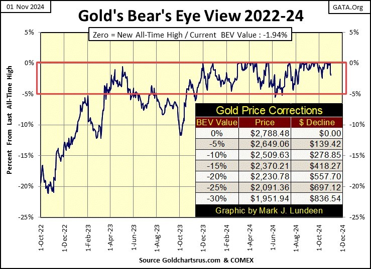
Gold in its BEV chart below is looking good. Like the Dow Jones, gold too has been in scoring position for a year now. So, for that reason, and for that reason alone, I’m anticipating additional new all-time highs in the weeks and months to come.
Of course, that assumes following next week’s election, should Trump win, the Democrats don’t take it to the streets, as they did in the summer of 2020. Next week could be very interesting, and have a big impact on the financial system, and the price of gold and silver.
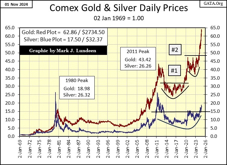
Gold’s advance since January 2023 have been impressive, from an indexed value of 36 ($1811) three years ago, to just short of 65 ($2788) in the past month in the chart below.
Silver? I like it more than gold. But since silver and gold topped in 2011, silver has lagged gold, by a huge measure. Looking at the chart above, I expect silver has some catching up to do with gold. The days when a single ounce of gold can be exchanged for over eighty ounces, for over FIVE POUNDS OF SILVER are coming to an end. But when will that be? That I don’t know.
Here is my step sum table for gold and the Dow Jones. As it’s getting late, time for an old guy like me to be going to bed, I’m going to allow my readers analyze it for themselves. I’ll give you guys a hint; both gold and the Dow Jones looks very good in their tables below.
Mark J. Lundeen
********


