Gold And Silver Charts Looking Most Encouraging...
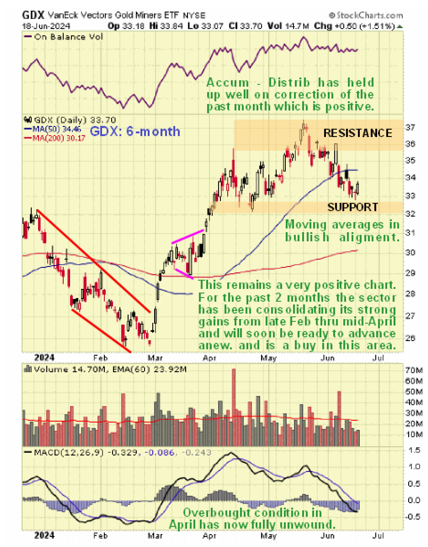
The charts for gold and silver continue to look very positive and this looks like a good point to buy the sector after the correction of the past month that has caused quite severe reactions in a number of PM stocks. This update features 6-month charts for gold, silver and GDX (stocks ETF) and probably the most important point to observe on them is the way that the Accumulation line for each of them has held up very well on the correction and remarkably the Accumulation line for gold has been making new highs despite gold being still some way below its highs and silver looks strong in this regard too. This is viewed as very bullish and a sign that the corrective phase has run its course and a new intermediate uptrend is likely to begin soon. Another interesting point to observe on these charts is the recent strength of silver relative to gold – gold has been in corrective mode since April but silver forged ahead in May making another upleg within its uptrend. Note also how the earlier overbought condition on all these charts has now fully unwound, as shown by their respective MACD indicators, which means that upside potential has been fully restored.
The conclusion is that we are at a very good point to buy the sector or add to positions especially in the better stocks that have corrected.
********


