Gold & Silver Good - Stock Market Bad


The Dow Jones closed this week with a Bear’s Eye View of -7.62%, meaning the Dow Jones closed 7.62% below its last all-time high, seen on 04 December 2024; 45,014. Okay, so what? Well, since the first of November 2023, when it first entered into scoring position, the Dow Jones has seen fifty-five new all-time highs, advancing the venerable Dow Jones by 11,739 points, or by 35.28% in the past sixteen months. That is a very nice advance.
Looking at the Dow Jones’ BEV chart below, from the timeline for 02 January 2024, to January 2025, its BEV plot remained mostly in scoring position; between the BEV -5% and 0% lines. Looking back to 1980 below, there have been many times the Dow Jones remained in scoring position, for well over a year. And while doing so, the Dow Jones was generating new all-time highs.
In a BEV chart, where price data is compressed into a range of only 100 possible percentage points;
- where each new all-time high is equal to 0.00%, and never more,
- and a total wipeout in valuation is equal to -100%,
seeing a market series entering, and staying in scoring position for weeks, months, or years, is how you can recognize a bull market is pushing that market series to new all-time highs.
It's easy seeing when Mr Bear is having his way with the bulls; clawing back any capital gains they had, when the Dow Jones’ BEV plot, first slips below its BEV -5% line, below scoring position, to then plunge below its BEV -10% line.
So, logically, looking at the BEV Chart below, its best to exit the stock market soon after the Dow Jones closed below scoring position, before it sees a double-digit BEV value. This week, the Dow Jones closed with a BEV of -7.62%, not far from breaking below its BEV -10% line.
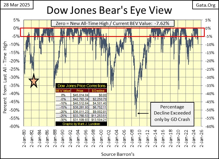
Since 1980, the Dow Jones has enjoyed its most prolific period of generating new all-time highs in its history. Why that would be can be debated. I believe the idiots at the FOMC, have been funneling their flow of inflationary dollars at Wall Street, greatly inflating market valuation, as well as prices seen in grocery, and shoe stores.
Another way of understanding the above BEV plot, is looking at the Dow Jones’ BEV Frequency Table below. The 0% row, since January 1980, it has seen 878 daily closes at a new all-time high, or 7.70% of all daily closes for the past forty-five years, have been at a new all-time high. That is a lot!
The next row down, the -0.001% row is for daily closings in scoring position, daily closings not at a new all-time high, but also not below a BEV of -4.99%. Since January 1980, 4,677 daily closes for the Dow Jones, were in scoring position, or 41.01% of all daily closes for the past forty-five years, the Dow Jones closed in scoring position.
By adding the percent of total days for the 0%, and -0.001% rows, we can see how often the Dow Jones, my proxy for the broad stock market, has been advancing in a bull market since January 1980; 48.71% of total daily closings.
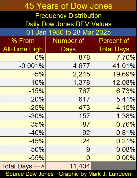
This table scares me, as any inflationary driven market boom seen at this scale, that has endured for almost a half of a century, is going to end in a massive deflationary market bust. Still, I recommended that anyone making money in the market, should stay in the market, for as long as the Dow Jones’ BEV plot remained in scoring position; between its 0.0% and -5% Lines.
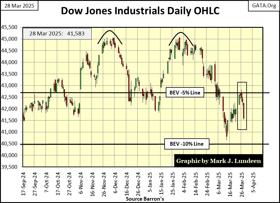
As 2025 now flows into spring, something is changing in the stock market. The Dow Jones has slipped below scoring position, as seen below with my chart of the Dow Jones in daily bars.
In early March, the Dow Jones attempted to break below its BEV -10% line, but failed. It then attempted to close once again in scoring position, but failed. Then this week, the Dow Jones is making a second attempt at breaking below its BEV -10% line. Will this attempt to close below the BEV -10% succeed? Maybe, and then maybe the Dow Jones will begin seeing more new all-time highs in April.
I’m not a fortune teller. I’m only a market enthusiast who enjoys looking at charts. Looking at what I see in the market, I think we’ve arrived at the point where growing risks to invested funds in the stock market, far outweigh any potential for profits. Which is a good time to lock in any profits, by selling, and patiently waiting for a good opportunity to come back in, when market valuations are much lower than they are today.
Where should someone move some of their funds into? I like gold, silver and their miners. Let’s compare the Dow Jones BEV plot, with gold’s, in their BEV charts below.
This Dow Jones’ BEV plot looks bad. Its last all-time high (BEV Zero) happened on December 04th. Following that, it closed below scoring position for a few days in January, before attempting to make a new all-time high in early February (Black Circle) – BUT FAILED TO DO SO.
Following that failure, the Dow Jones then closed below scoring position, almost closed below its BEV -10% line. Then this week, it attempted to close within scoring position – BUT ONCE AGAIN, FAILED TO DO SO.
I don’t like it when a market index begins developing a pattern of technical failures. So, if since January, the Dow Jones has failed to make a new all-time high, and now has failed to close in scoring position; what can it do? I’m thinking, maybe it now wants to go down, something I want no part of.
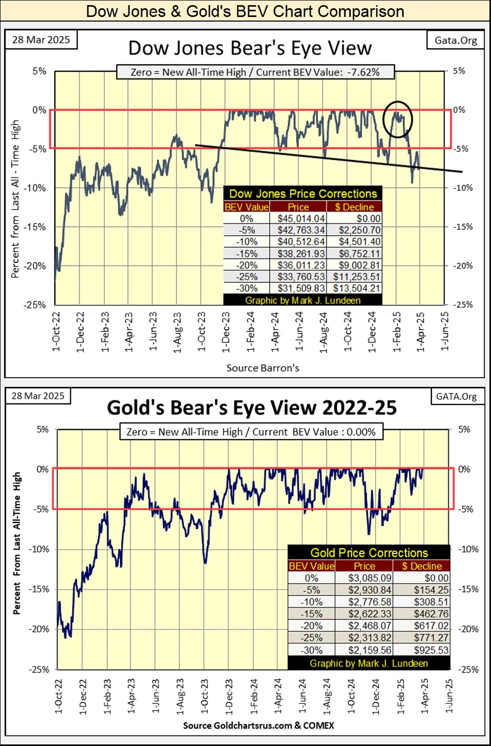
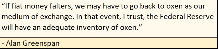
Gold’s BEV chart above is easy to describe; it’s solidly inside scoring position, and in the past five weeks, has seen Seven New BEV Zeros in its BEV chart above. I give gold a solid buy.
Of course, one could remain in the stock market. So, how is it going for the other major-market indexes I follow? As seen in the table below, things could be better. This week closed with only three of these indexes in scoring position, and a growing number of them closing below their BEV -10% line. This is not good for the bulls, now running wild, and free on Wall Street.
Also, for the first time in over a decade, the XAU is no longer tail-end Charlie at #21 in the table below. What took the gold and silver miners place at the bottom? The NASDAQ Banking index is now at #21. That isn’t good! What is good, is seeing the XAU begin to rise in the rankings seen below, a development I believe will continue in the weeks, months, and years to come.
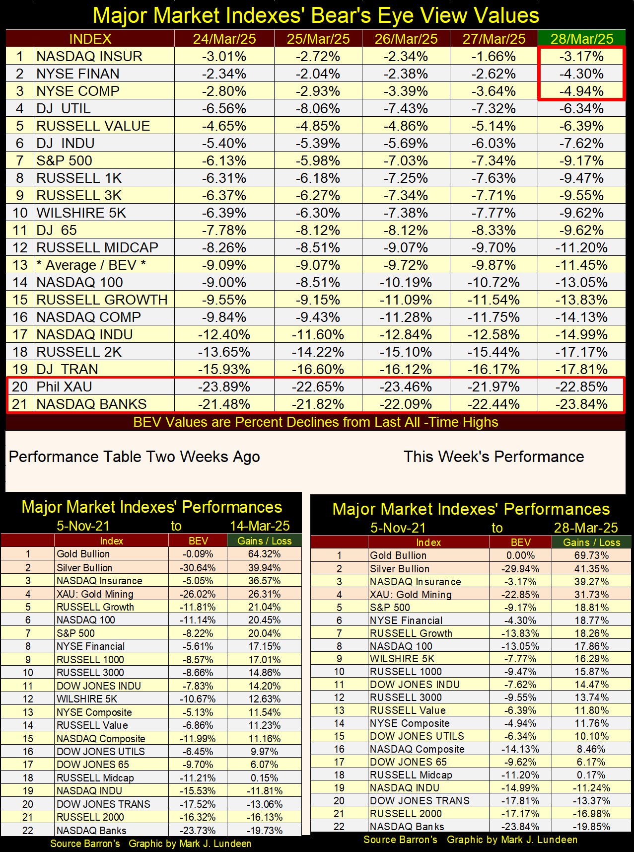
In this week’s performance table, above right, precious metal assets; #1,2&4 continue advancing, in a major bull market most investors have yet to recognize, as the other indexes have done little for their owners, for months now.
The remarkable thing to me is, how little attention this tremendous advance in gold has garnered in the minds of the investing public. I’m not saying that most investors are unaware of this advance in gold. I’m sure many are aware of gold’s advance. But for most investors, after seeing gold go on from one new all-time high, to another, for over a year now, have so far been indifferent, have no interest in buying a few ounces of gold to take home. Why would that be? For fears of a nasty pullback, from the price they bought their gold at.
I know what their problem is. It’s a problem most investors have early on in any major bull market; I call it the “Battered Bull Syndrome.” The vicious 45% bear market decline gold investors endured from August 2011 to December 2015, is still weighing on the minds of potential investors in gold. That, or gold has been out of the mainstream world of investing for so long, they want nothing to do with risking money on something so esoteric, as one of the old monetary metals; gold or silver. So, deep down inside, they remain bearish, or indifferent during the early stages of a bull market in gold.
As this bull market in gold develops, these Johnny-come-latelies will eventually enter the gold market; but at much higher prices than we see now.
Same thing happened with our current bull market on Wall Street, that began in August 1982. Forty-three years ago, the stock market hadn’t done anything for investors for decades, except paltry returns, or actual losses on any time, or money wasted buying stocks.
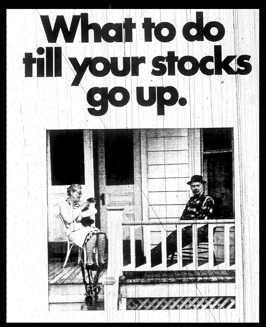
Below is an ad posted in Barron’s during the commodities bull market of the 1970s. The Chicago Board of Trade wanted everyone to know what a waste of time, and money, investing in stocks had become. Fifty years ago, one could make good money, speculating on soybeans or corn at Chicago’s CBOT. The stock market? With chants of “beans in the teens” coming from the floor of the soybean exchange, forget about the stock market!
“What to do till your stocks go up?” Grow older and poorer, was the answer to that question in the 1970s.
Below is a chart for the Dow Jones from 1924 to 1986. From 1966 to 1982, five times the Dow Jones attempted to break above, but failed to stay above 1000. Following its third attempt at 1000, in January 1973, two years later in December 1974, the Dow Jones saw its first 45% bear-market decline since 1942 – ouch!
By August 1982 (Red Star), with the Dow Jones trading below 800, investors refused to risk their money in the stock market. Too bad, as August 1982 was a historic moment in the stock market, the start of a bull market that continues to this day.
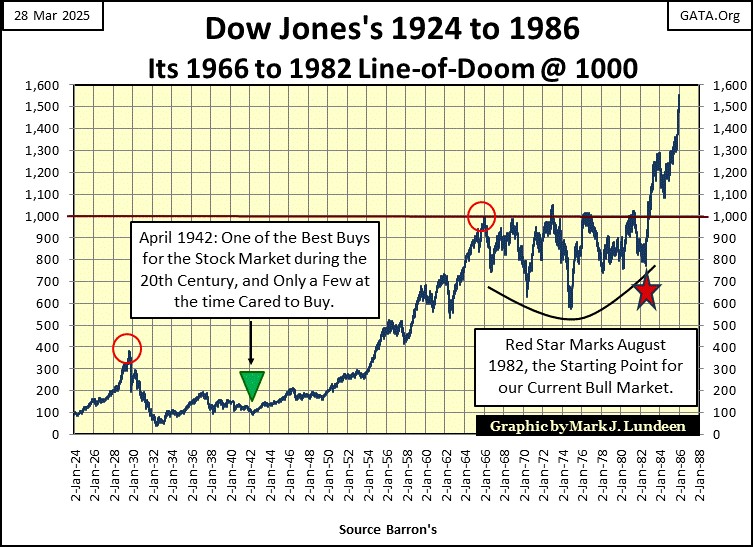
In 1982, people preferred keeping their money in a bank, yielding over 10%, rather than buying anything Wall Street was offering them.
It wasn’t until the 1990s, a decade into the bull market, before most people became willing to risk their money in the stock market. Now in 2025, growing risks to invested funds in the stock market are discounted. Being in the stock market is expected by anyone saving money for a rainy day, or for their retirement.
Banks in 2025? Today, banks are for providing credit card debt and mortgages to “consumers.” No one today saves money at a bank. Why would they when banks are offering a yield of only 0.44% (taxable) for a money market account.
Such wide public participation in the stock market, as seen today, is a classic sign of a market top.
We’ll know when the public finally catches “Gold Fever,” when once again volatility in the gold market increases to the point where daily moves of +/-3%, or more become daily occurrences, as seen in the chart below, during gold’s bull market of the 1970s.
These days of extreme volatility, gold’s 3% days, unlike the Dow Jones 2% days, which are always bearish for the stock market, happen whenever exciting things are happening, be they bullish or bearish, with the price of gold. Seeing a cluster of gold 3% days below, indicates that money is either flooding into gold (bull market), or rushing out of it (bear market).

Then there are times, where the gold market doesn’t see days of extreme volatility. When 3% days in the gold market were few; 1984 to 1999, it was bearish. But since 2016, gold has seen few 3% days, as a historic bull market advance began.
Why this inconsistency in gold’s 3% days seen below? Well, this is only so if one is looking for a connection between 3% days, and valuation trends in gold’s bull and bear markets. However, as I see this data below, it seems the gold market sees frequent 3% days, when massive flows of money are either flowing into, or out of the gold market.
Using that logic, it becomes apparent that broad-based public-participation in the gold market has yet to develop, as seen in the dearth of 3% days seen in the gold market for the past decade.
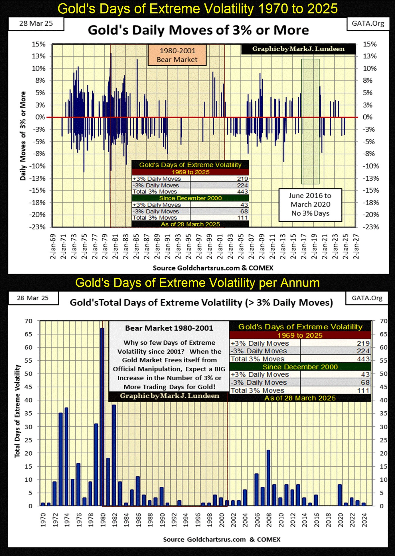
In the chart above, I tallied gold’s 3% day by year. The flood of money coming into gold during the 1970, and the panic to flee from gold during the early 1980s can be seen. During the NASDAQ High-Tech bull market of the 1990s, gold saw very few 3% days, as gold’s bear market approached its 70% bear-market bottom in July 1999. In 1999, no one cared gold was down 70% from its highs of January 1980, as everyone was buying high-tech at the NASDAQ.
Looking at the data above, gold was becoming an ever more attractive investment, from 2006 to early 2008. But the big spike in gold’s 3% days in 2008, happened during a sharp 30% correction in the price of gold. In 2008, excitement for investing in gold and silver saw a peak seventeen years ago, that has yet to be exceeded.
Gold had a good year in 2020, generating a handful of new all-time highs in August, as seen in a jump in gold’s 3% days. But since then, 3% daily moves in gold have been rare, as the price of gold has risen from one new all-time high to another, because the public has yet to catch gold fever. But someday they will, for the same reason they did in the 1970s; the idiots at the FOMC have mangled their “monetary policy” to the point where the dollar is at risk.
That is just my opinion, an opinion not shared by FOMC Idiot Primate; Alan Greenspan, when he testified before Congress that gold wasn’t necessary as a reserve for the US dollar.
What a pompous ass Greenspan was. He’d say ridiculous stuff like this, and the Congress, and financial media would just eat it up.
Next, let’s look at gold’s BEV chart. I really like this chart, especially that at this week’s close, gold closed at a new all-time high, a BEV of 0.00%.
Gold is really in a strong position. The 45% bear market bottom of December 2015, was a very hard bottom in the gold market. A hard bottom, meaning a bottom that broke the hearts and morale of the gold bulls that came into the market since 2001, to early 2008.
Many gold bulls in December 2015, cursed the day they bought their gold, and haven’t been back since. Yet, the advance in the price of gold has been relentlessly bullish since then, especially so since November 2023, as seen in the cluster of BEV Zero forming since then. This week, gold saw its 58th and 59th new all-time high, since November 2023. That is a lot! But things like that happen in bull markets.
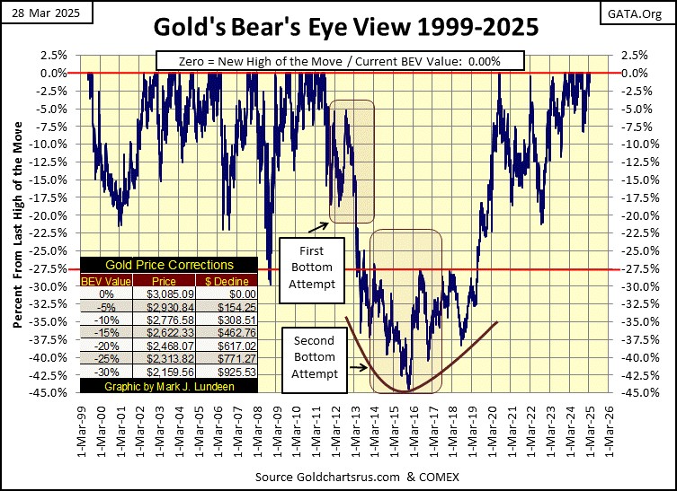
Below is a chart for the indexed values for gold and silver going back to 1969. Gold is on a tear! It has advanced from 47 to over 70 over the past sixteen months. Usually, seeing such a powerful upward spike in valuation, would suggest a price correction is due. I’m sure there are people waiting for a pullback in the price of gold before they buy.
But there are odd things happening in the world of gold, such as the immense inflows of gold and silver into the COMEX’s storage facilities. Nothing like this has ever happened before. What does it mean? I can’t say, but I doubt the ultimate answer to that question will be; to sell gold in April 2025.
Silver is underperforming gold, as seen above. Since 1969, gold is up by a factor of 70, while silver is up by only a factor of 18. Well, if one of the secrets of accumulating wealth by investing, is to buy cheap, then in terms of gold, silver is DAMN CHEAP.
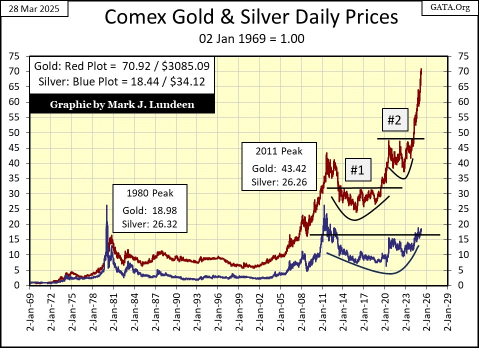
Looking at the silver to gold ratio (SGR) in the chart below, this week closed with a SGR of 90.42, or 90.42 ounces of silver for 1 ounce of gold. At the close of March 2025, one ounce of gold can buy 5.65 pounds of silver!
There is something to be said about forgoing an ounce of gold, and going for the 5.65 pounds of silver. Of course, that bit of wisdom goes along with the wisdom of waiting for the day when silver finally catches up with the advance in gold. When that may be is unknowable, but I believe will be inevitable.
Looking at gold’s step sum table below, we see the seven new all-time highs in gold, highlighted BEV Zeros in blue and gold. Gold’s 15-count closed the week at a +5. I’d like to see some down days for gold in the following weeks, to keep the market from getting overbought, by keeping gold’s 15-count under +7. Gold’s daily volatility’s 200D M/A is trending down, as its valuation is trending up. That is a bit odd, but I’ll take gold’s advancement anyway it comes.
This low daily volatility indicates the potential demand for gold remains very low. When the public, and money managers once again begin buying gold and silver, we’ll see this metric for daily volatility for gold, spike well above 1.00%. Frequent 3% days in the gold market will do exactly that.
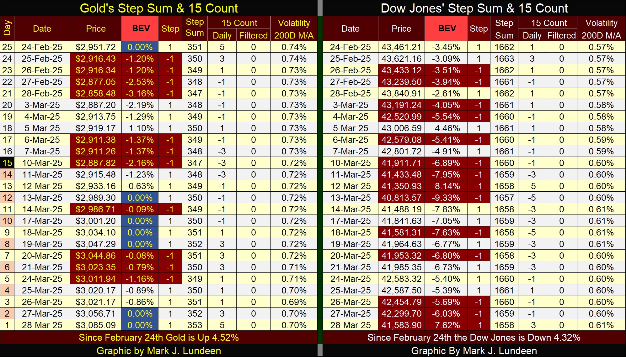
For the Dow Jones’ step sum table, the Dow Jones is seeing more daily declines than advances, and these declines are having an effect on its valuation. Since February 24th, the Dow Jones is down 1,900 points.
However, keep in mind; EVERY bull market sees price corrections during their advances. Maybe sometime in the next few months, the current weakness seen in the stock market today will prove to be exactly that.
And then, maybe not.
Mark J. Lundeen
*******


