Good Week for Gold, Not So for the Dow Jones


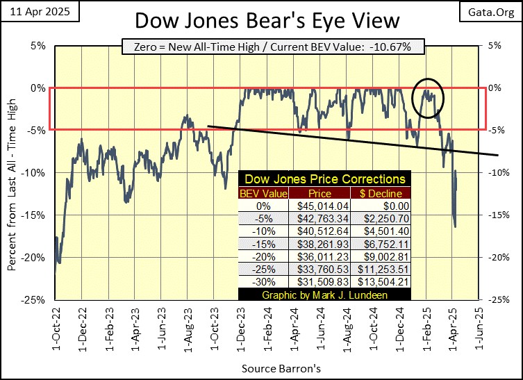
What a week! Last Thursday, the Dow Jones had yet to break below its BEV -10% line, as seen below. Then this week came into play, with its huge daily swings. Monday saw the Dow Jones down by over 2,200 points, no doubt because of Trumps tariffs. Thursday saw the Dow Jones up by 2,900 points, also on news of Trumps tariffs, or the pending lack of them. After all was said and done, the Dow Jones closed up from last week, by 1800 points, or 4.22 BEV points, after much excitement for all.
But market excitement like this, is the stuff of bear markets. Oh, I know; “market experts” are all saying these huge daily moves this past week were due to the stock market’s reaction to news on Trump’s tariffs. Whether or not the market was up or down, on this day or that, that may very well be true.
But these huge daily moves, four Dow Jones’ days of extreme market volatility (Dow Jones 2% days) as seen in Mr Bear’s Report Card later in this article, are the stuff of an over-inflated market’s attempt to shed its unwanted valuation. Failing to do that this week, I’m expecting we’ll soon see a return of Mr Bear.
One issue all bear markets have is, after the preceeding bull market, where banks were generous with under-capitalized debtors, and Wall-Street speculators, there is a lot of bad debt, debt that can never be repaid, or serviced by the diminishing prospects of these debtors. Nontheless, this debt needs to be attended too.

In the old days, before the 1970s, such debtors were forced to default, and went bankrupt. Creditors then took their losses, maybe becoming bankrupted in the process too. But at the bottom of the bear market, balance sheets everywhere were purged of dubious debt, and inflated market valuations were deflated.
This process of deflation is brutal. The Great Depression was one such episode of deflation, where the credit excesses of the Roaring 1920s was corrected for. Following a big bear market, the financial system once again became painfully aware of the dangers of extending credit to speculators, dealing in the dodgy doings on Wall Street.
But since the Carter Administration’s bailout of Chrysler in the 1970s, and then the Reagan Administration’s bailing out Chicago’s Continental Bank in the 1980s, the financial system no longer expects loosers to take their lumps when they go bust. Not when the looser in question has the proper political connections.
Not when the idiots at the FOMC, are more than willing to “stabilize market valuations,” by buying garbage assets no one else wants, at full face value, using monetary inflation as their source of funding. The correct way of understanding Quantitive Easings by the FOMC is; everytime Wall Street gets into trouble, the idiots at the FOMC trash the dollar to bail out the big banks.
Isn’t that what a central bank, like the Federal Reserve, is supposed to do during a financial panic? In April 2025, looking at what $20 now purchases at McDonalds, or anywhere else, I’m thinking I don’t like the idea of having a gaggle-of-idiots trashing my dollars, for the benefit of Wall Street’s insiders, everytime they get themselves in trouble.
If Elon Musk’s DOGE ever gets the chance to audit the Federal Reserve’s assets, assets that back the dollar, they may find a half century of financial garbage stacked high, somewhere in the Federal Reserve System. Many trillions of dollars of dodgy assets no one else would buy, that is now worth nothing.
A old-time reader of mine; Bob Fitzwilson of the Portola Group, sent me something on the Treasury bond market. Underneath its surface, far from the public’s eyes, the T-bond market is selling off. Yikes!
I looked around to see if I could find anything to post on this, and I did at the Eurodollar University. So, here is a 21 minute video on this topic, the goingons at the over-night repo markets that supports the financial system. This is a topic not currently being discussed in the mainstream financial media. As usual, the media doesn’t care about a pending crisis in the financial system, until it can no longer be denied. Thanks for the tip Bob!
https://www.youtube.com/watch?v=P5MfrH0hH_A
Something to note about the video above; in past stock market declines, flight capital from the stock market, flowed into the T-bond market, for protection agains deflation on Wall Street. Gold and silver? They’d mostly do nothing. But notably, this time it’s the T-bond market doing mostly nothing, or actually going down, as it did this week as Wall Street sold off. This time, it’s gold going up as Wall Street goes down.
Here is a T-bond I follow, it matures in February 2050. This T-bond has lost half of its market value since August 2020, as bond yields have increased.
Remember why banks were failing in May 2023? Rising bond yields, were deflating bond valuations, as seen below. These banks’ depositors were demanding their money back, but the banks couldn’t raise the money to pay them back. To raise cash, they sold their bonds in the open market. But their bonds lost a significant percentage of the money these banks paid for them, with their depositors’ money.
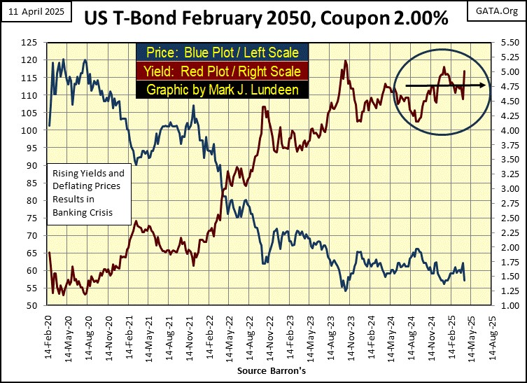
Looking at the yield plot above (Red Plot), the yield for this bond (and all other bonds) spiked upward this week. Note, how this bond’s valuation (Blue Plot) also went down this past week. This is how debt, like bonds work; increases in yield = decreases in valuation.
Speaking as a former US Navy electrician, Bob, this doesn’t look like much. Let’s see what comes of this in the next few months. It could be something big. The big market crash of March 2020, was preceeded by similar problems in the overnight repo market, in October 2019.
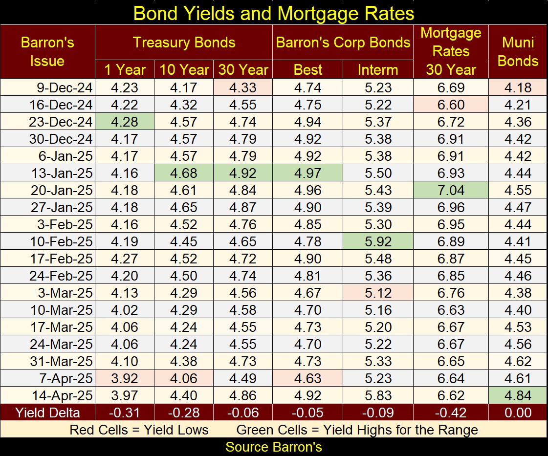
Here are the bond yields I follow, going back to early December. If there is a panic in the bond market, so far it hasn’t shown up in these bonds’ yields. But then, I’m not an expert on the bond market. This may just be early in this new trend of rising yields.
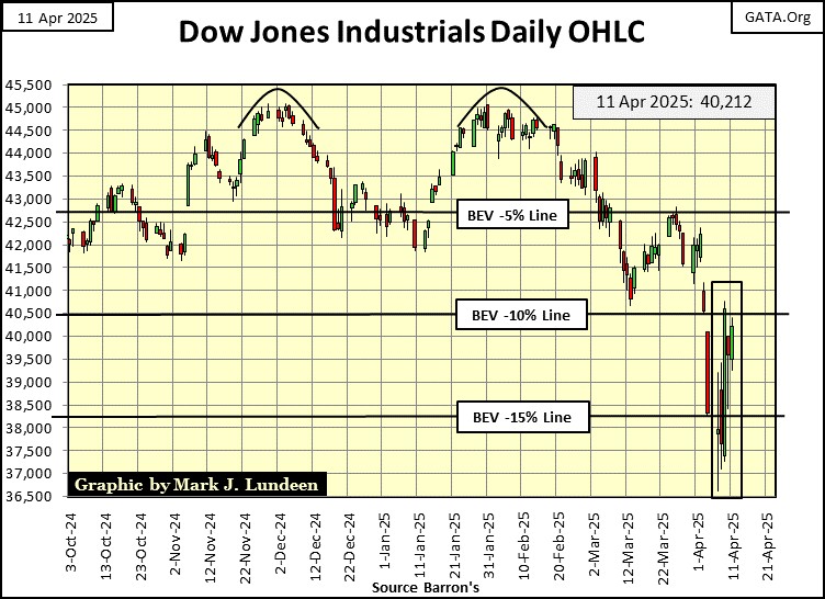
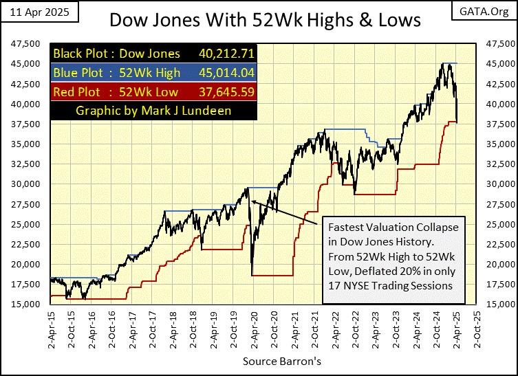
Let’s go back to the Dow Jones, and see what its daily bar chart below looks like after this week. Yep, the Dow Jones saw some action this week, as its valuation hyperventilated from one day to the next. Market action, as seen below, isn’t what happens in a bull market. However, when Mr Bear is clawing back the bulls’ capital gains, a pound of flesh at a time, this is what it looks like.
There are still plenty of bulls running around; people happy to “scoop-up” all the bargains these sell offs are presenting them. However, sometime in 2025, the stock market could begin upchucking dollars. That is when the Earth beneith the New York Stock Exchange opens up, and swallows these bulls.
How can I know that? Well, I don’t. But, looking at these charts, its obvious, to me anyways, that something has changed on Wall Street, something I don’t like. And that is enough to make me one Big Bear on this market. If someone wants to see some bullish market news, they need only go over to CNBC or CNN.
As it is, I’m only calling it as I see it. Like the following fact; the for the first time since October 2022, this week the Dow Jones pushed down its 52Wk Low Line, in its chart below.
It goes without saying, the Dow Jones could rebound from here. But, if we are early in a Big-Bear Market, one of the things that must happen, would be for the Dow Jones to stop pushing its 52Wk High Line up, and begin pushing its 52Wk Low Line down. Beginning this week, this bearish development happened.
Here are the BEV values for the major market indexes I follow. On Monday and Tuesday, every index below deflated below their BEV -10% lines, more than 10% from their last all-time highs. The market rebounded later in the week, and we may see these indexes advance next week, and in the weeks to come.
But as 2025 flows on to 2026, I expect to see these indexes’ valuations continue to deflate to ever deeper levels, as Mr Bear takes his pound of flesh from the stock market.
Hey! Look at the XAU!! It closed the week at #18 in the table below, as its BEV value increased from -30.18% at Monday’s close, to -17.88% on Friday’s close. That is huge.
It’s about time these gold and silver miners began acting as if Wall Street was in a big bear market. And if Wall Street is in a big bear market, investors will be very happy to have their money invested in gold and silver miners.
The XAU was Tailend Charlie (#21) in the table below, for over a decade. So, who now is last on this list? The NASDAQ Banking Index. If there is a pending liquidity problem in the Treasury bond market, how would that impact the share prices of these banks? In April of 2025, indications of decay in the financial system are there to see, if someone is looking.
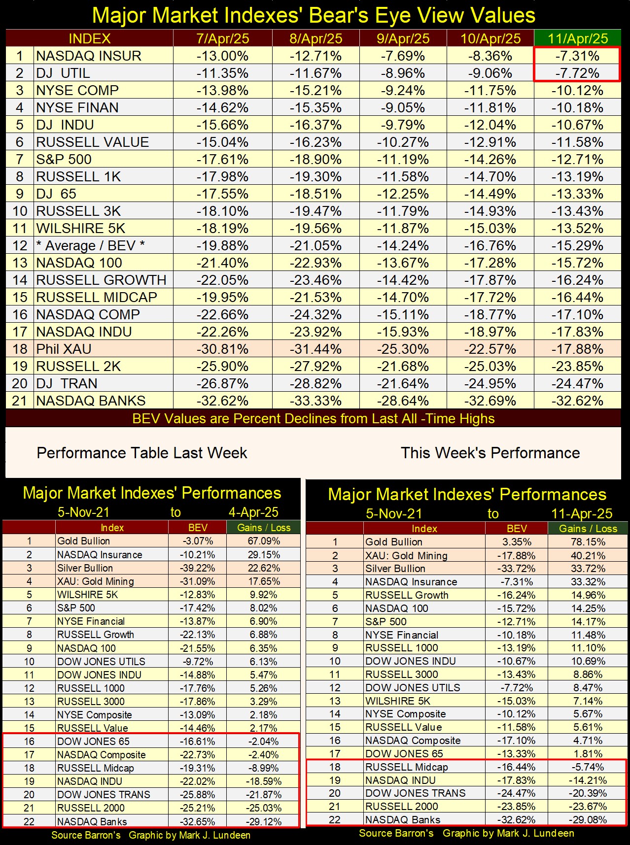
Looking at this week’s performance table, above right, gold, silver and the XAU, #1-3 saw some excellent gains from where they were last week. Keep in mind, gold and silver bullion are the only financial assets that have zero counter-party risk. They are wealth, pure and simple, unlike stocks and bonds.
If my buddy Bob is right about the T-bond market selling off, beneath the surface, outside the view of the public, what the old monetary metals may do this year could be astounding, when this bad news in the Treasury market becomes common knowledge. Will the FOMC Idiot Primate Powell implement his QE#5 in 2025?
Is the stock market now a bear market? Some people won’t be able to say whether it is, or is not, until market valuations have fallen to the point, where it can no longer be denied, that the bull market is now long gone. Which by then, it does little good selling, when one is only willing to sell near the bottom of a massive market decline, a time when one should be buying.
I expect the problem with such investors is, it never occurred to them that a time must come, when it’s time to sell, and take profits. So, they hold on to their positions, hoping the now long-gone bull market will once again come to their rescue. It won’t.
For myself, I like selling as near to the top as I can, as near to the point, where a bull market on Wall Street turns into a bear market. Keeping in mind, selling within 10% of the top is something most professional money managers fail to do, so I don’t expect to exit the market at the absolute top.
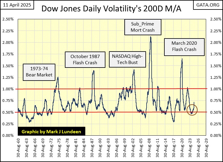
I’ve covered how best to have a reasonable assessment of when the top of a bull market is at hand, for example, seeing the Dow Jones’ daily volatility’s 200D M/A declining near to 0.50%. When this metric of daily volatility for the Dow Jones once again * BEGINS * rising toward its 1.00% level, on its way to 1.50%, it’s best to exit from the market, and not come back until market valuations are much lower.
Looking at the sixty-five years of market history (chart below), where;
- Bear markets occur as daily volatility rises from 0.50%, to percentages well above 1.00%.
- Bull markets occur as daily volatility declines from the peaks in these volatility spikes, back down to 0.50%.
A perfect example of such a turn in market volatility for the Dow Jones, is seen since January this year, in the chart below (Red Circle). Note; similar volatility spikes developed from the 0.50% line, had preceded the five major market declines since 1960.
Yes, there have been false signals, times this indicator bounced off the 0.50% line, but failed to develop a volatility spike seen at the bottom of all Dow Jones’ bear markets. Welcome to the wonderful world of market watching, where market events, and market valuations, are never as predictable as we would like them to be.
Maybe that is so, but that baby volatility spike seen in the red circle below, looks like it’s the real deal. It’s best assuming we are in a bear market, and get out of the stock market.
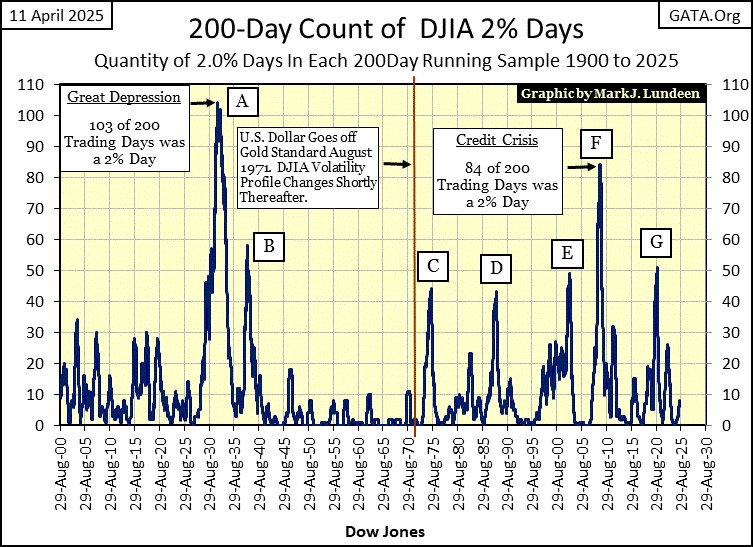
Look at this; Mr Bear’s Report Card below. As you can see, Mr Bear has been a bad bear these past two weeks, where we see eight extreme market events;
- 4 Days of Extreme Breadth (NYSE 70% A-D Days),
- 4 Days of Extreme Volatility (Dow Jones 2% Days).
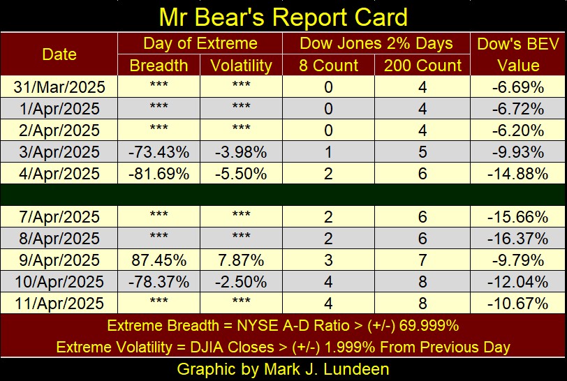
During market advances, these extreme market events are rare market events, years can pass between one to another. However, seeing eight such extreme market events, in only two weeks, is what happens during bear markets.
Note the Dow Jones 2% Days in the table above, the most extreme day was a positive day, where on Wednesday, the Dow Jones * Advanced * by 7.87% from its close on Tuesday. Big Daily Advances, greater than 2% from one day to the next, are things that happens during bear markets.
What are the Dow Jones 2% Days’; 8 & 200-Day Counts? The number of Dow Jones 2% Days in running 8- or 200-day sample. The 8-count is a short-term indicator, where any day of extreme market volatility, is in the count for only eight days, before it is out of the count. An 8-count of 4, or more, in an 8-day sample, typically occurs when the stock market is seeing a very violent patch of extreme market volatility. Exactly as we saw these past two weeks.
The 200-count is the sum of every Dow Jones 2% Day, for the past 200 NYSE Trading Sessions, which currently includes every trading day since 24 June 2024. The 200-day count of 2% days, for the Dow Jones at the close of the week, was an 8.
Below is a chart for the Dow Jones 200-Count, since January 1900. Every spike in the 200-count, (A to G) identifies the big market declines of the 20th and 21st centuries.
To make money in the market, buy when these spikes begin to decay. That won’t get you in the market at the absolute bear-market bottom, but you’ll be buying long before the crowd comes into the market. To keep from losing money in a bear market, sell after the count hits a Zero, * AND * begins to climb, like now with the 200-count at an 8.
If this really is a bear market, we’ll see this count increase aggressively in the months to come, as Mr Bear claw-backs the capital gains from the bulls who don’t know when to call it quits.
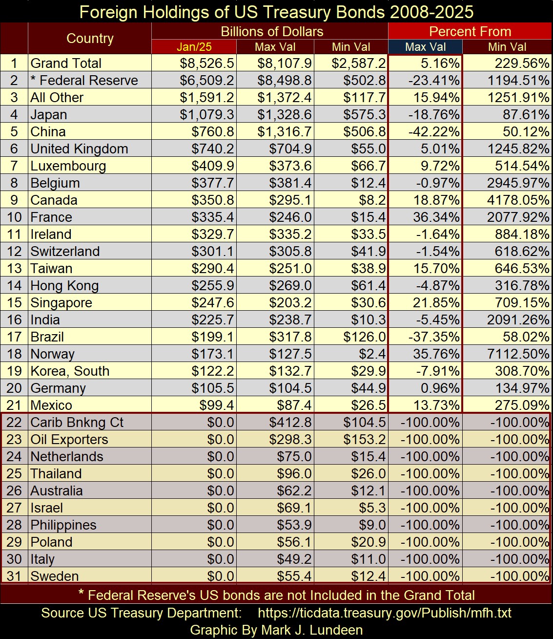
Speaking of selling Treasury Bonds, let’s look at the Foreign Holdings of US Treasury Bonds below. Data from the US Treasury, which only goes up to January of this year.
Items #22, and below, are countries the Treasury Department no longer reports on, for reasons they don’t explain.
The absolute values of T-debt held by these countries are interesting, but I direct your attention to the Max Val Column, beneath the red “Percent From” header. China has sold 42.22% of its Treasury Debt. The Federal Reserve itself has sold 23.41% of its holdings of T-debt.
These are vast sums of bonds being sold. We know who is selling, but who is buying?
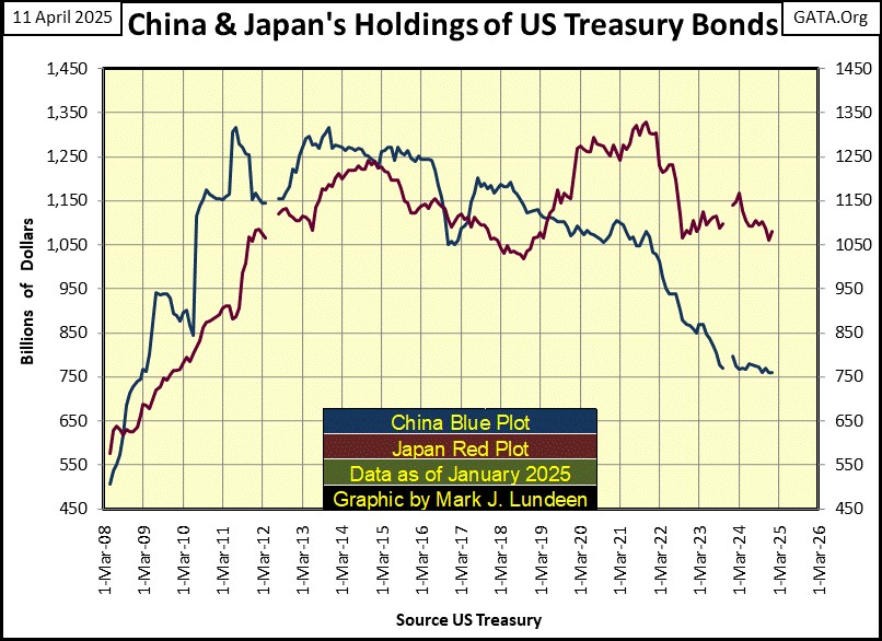
Next is a chart plotting the holdings of US Treasury Debt, held by China and Japan, going back to March 2008.
China (Blue Plot) is selling their T-debt, and maybe not for nefarious reasons of international power-politics. Sometimes, countries, like people, just need money. So, they sell what they have to raise cash. Maybe the big selloff in T-debt by China, is an indicator of internal-financial problems China has.
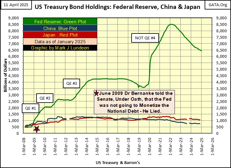
Next is a chart plotting the T-bond holdings of not just China and Japan, but also the Federal Reserve. Look at the data for 2008. Seventeen years ago, both China and Japan held more T-debt than did the FOMC.
Look at the four QEs the idiots at the FOMC have bloated their balance sheet with. Since 2009, sacrificing the dollar to save Wall Street has been the order of the day for the idiots at the FOMC. How long before we see their QE#5?
I like President Trump. But when I see data, as displayed below, I wouldn’t care to be him. I don’t believe he can overcome the many decades of fiscal, and monetary abuse career bureaucrats and Washington’s political class have done to the United States. They have had their way with us, and most likely at no expense to themselves.
But should the economy crash, along with the stock and bond markets, Washington and Wall Street, the real villains in this story, will blame it all on Trump. Of course, the mainstream media will cheerfully take up this phony narrative, and most people will believe the lie.
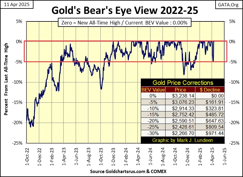
Here is something to cheer everyone up; gold’s BEV chart below. On Monday and Tuesday of this week, the Bears attempted to force gold below its BEV -5% line. They failed to do so. Gold then bounced off its BEV -5% line on Wednesday, and went on to make two new BEV Zeros (two new all-time highs) on Thursday and Friday.
Things like this happen in bull markets. If you want to see what a BEV chart looks like in a bear market; go back and review the BEV chart for the Dow Jones above.
Next is my chart for the indexed values for gold and silver below. Since its breakout from its bowl #2, gold (Red Plot) has launched itself into low Earth orbit.
One would expect seeing gold correct from this astounding advance, pull back to its 60, or 65 line. Something it tried to do this week on Monday and Tuesday. But then came Wednesday, Thursday and Friday, and gold closed the week with an indexed value of 74.44 / $3,238.14.
Don’t doubt that a day is coming, when gold will see a significant pullback in this advance. But if it does from much higher levels, that is fine with me.
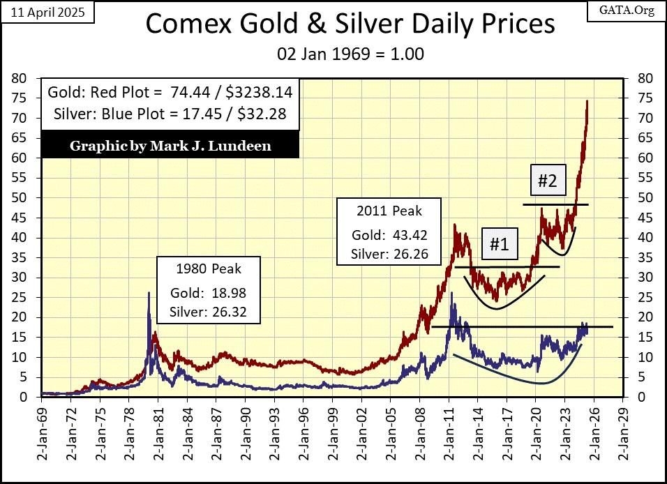
What is with silver? It can’t break above its indexed 20 level, and hasn’t since 2013. Well, this is a situation that can’t go on forever. One day, silver will put gold to shame when it comes to advancing in a bull market, because silver bullion has to be the CHEAPEST Asset anywhere in the solar system. Seriously, it has to be!
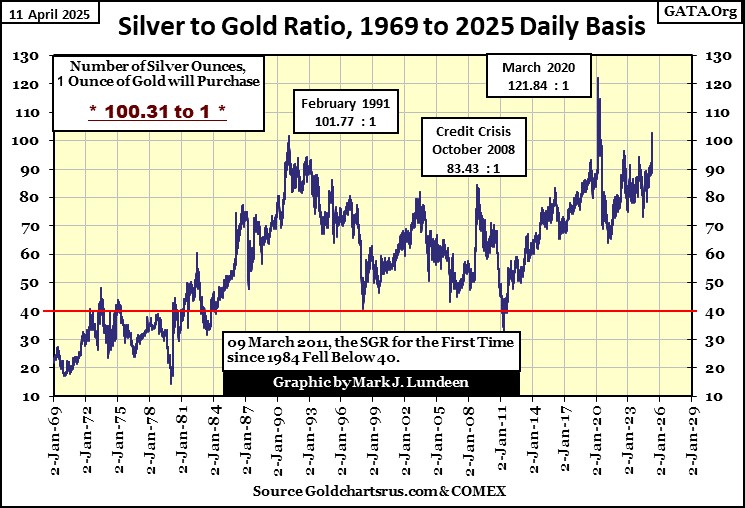
Look at the silver to gold ratio (SGR) chart below. This week closed with the SGR at 100.31 ounces of silver, for one ounce of gold, or 6.27 pounds of silver for one ounce of gold.
A deal this good isn’t going to last forever. When silver finally does break above its indexed 20-line, things could get crazy in the precious metals markets. It shouldn’t take the SGR long before it drops below 70, when silver finally does what it should have been doing for months now; advancing with gold, in a historic bull market.
Last, but not least, let’s look at gold’s and the Dow Jones’ step sum tables below. Gold’s table is a beautiful thing to see. Of the past twenty-five trading days, ten of them saw gold close at a new all-time high. Gold’s 15-count closed the week at a neutral +3, indicating that gold, following all those new all-time highs, isn’t an oversold market, a market ready for a pullback. That is a good reason to expect additional new all-time highs for gold in the weeks to come.
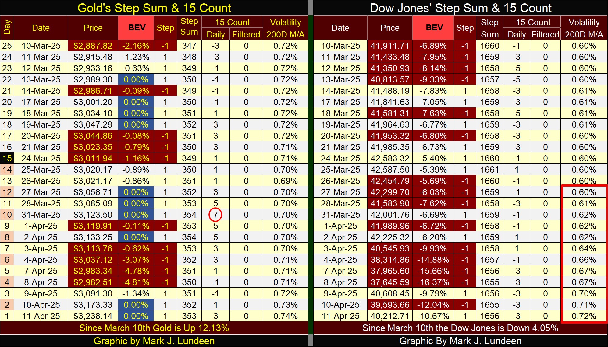
On the Dow Jones side of the table, the Dow Jones is finding it easier going down, than up, as seen with all those red down days. The Dow Jones also closed the week below its BEV -10% line. It could rebound from here, and then maybe not.
Look at the Dow Jones’ daily volatility’s 200D M/A. In the past twelve NYSE trading sessions, this metric of daily volatility has spiked from a 0.60%, to 0.72%.
That doesn’t happen in a bull market, and that is all I have to say for this week.
Mark J. Lundeen
******


