Impulse Power: How to Spot Gold's Next Breakout
 share
share
 share
share
 share
share
 share
share
 share
share
Most of the time, when you see a large consolidation pattern under construction, it can seem like an eternity before you actually get to see the breakout. Sometimes, a year or two can pass by with no sign in sight that the breakout you’ve been looking for is going to take place, but then you see a subtle low form and think, “Is this going to be the rally that finally completes the consolidation pattern?”
Tonight, we’ll look at a few very important breakouts that led to a strong impulse move, finally completing the large consolidation pattern. There are generally some clues leading up to the breakout, which sometimes can be very subtle and other times in-your-face clues.
Let’s start with one of the most recent breakouts taking place right now, before our very eyes.
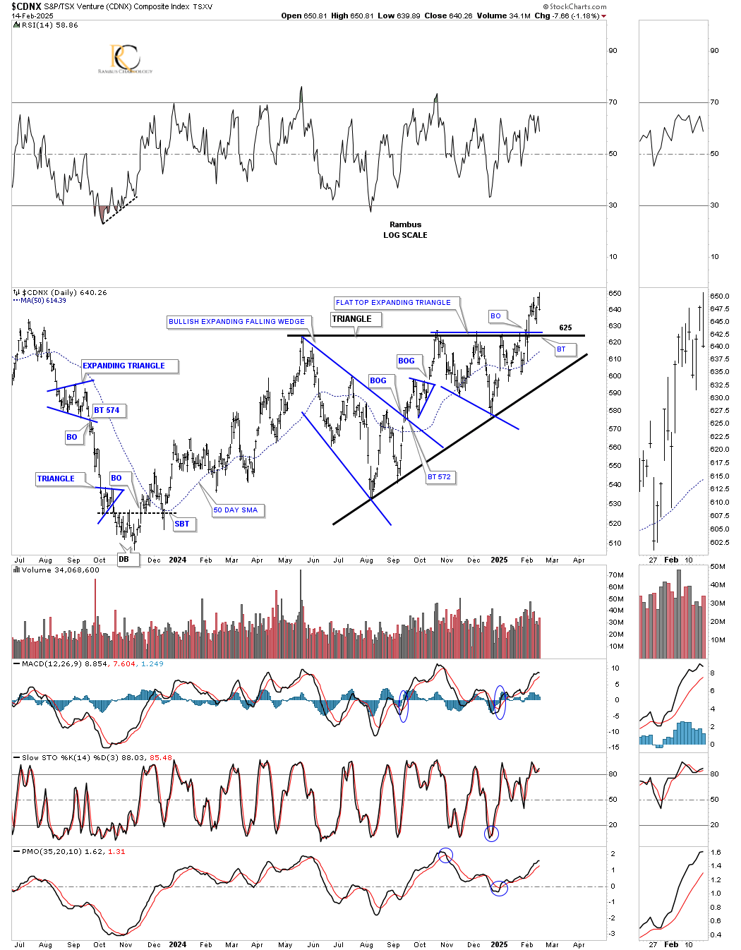
Starting with this daily chart for the CDNX, Canadian Venture Index, which has many small and microcaps in it, you can see the breakout of the black flat-top or ascending triangle finally took place on February 4th. Keep in mind that we began following this consolidation pattern during the formation of the blue expanding falling wedge, which at the time could have been the standalone consolidation pattern, but that wasn’t the case. It reached its minimum price objective, which is where the expanding falling wedge began to form – the first reversal point high.
Note the small blue triangle that formed during the rally up to the top of the triangle, which formed close to the middle as a halfway pattern. The rally hit the previous high for the second time and started to decline once again, this time creating another small blue consolidation pattern – the flat-top expanding triangle – which we know is a very bullish chart pattern because of its psychological makeup.
If you recall, I mentioned that as the price action was rallying up to the top rail of the much bigger black triangle, I asked the question, “How many bears were left on the other side of the trendline to defend it on another attack?” As you can see, they weren’t ready to give up yet, as the price action declined down to the 50-day SMA, rallied back up to the top rail, then declined one more time, making its last higher low. As you can see, that last rally finally broke through the top rail of the ascending triangle; the bears were finally defeated, as the bulls finally took charge. It’s still a bit early in the breaking out and backtesting phase, but it’s still possible we see a backtest to the top trendline around the 625 area, which would represent a very good low-risk entry point if that were to occur.
I apologize for going into so much detail, but it’s important to understand how patterns are formed and what it means for the main trend they form in. Also, a modest triangle, like we see on the CDNX, can often be just a part of a much bigger pattern.
Rambus Chartology is a reader-supported publication. To receive new posts and support my work, consider becoming a free or paid subscriber.
The triangle I just spent so much time describing in terms of its structure is just the right shoulder of this three-year inverse head-and-shoulders bottom. As you can see, when the top trendline on the triangle above was broken to the upside, the price action also broke the neckline in a 2-for-1 breakout move. Also, note how the neckline symmetry line showed us where to look for the possible right shoulder low, which makes this a very symmetrical inverse head-and-shoulders bottom.
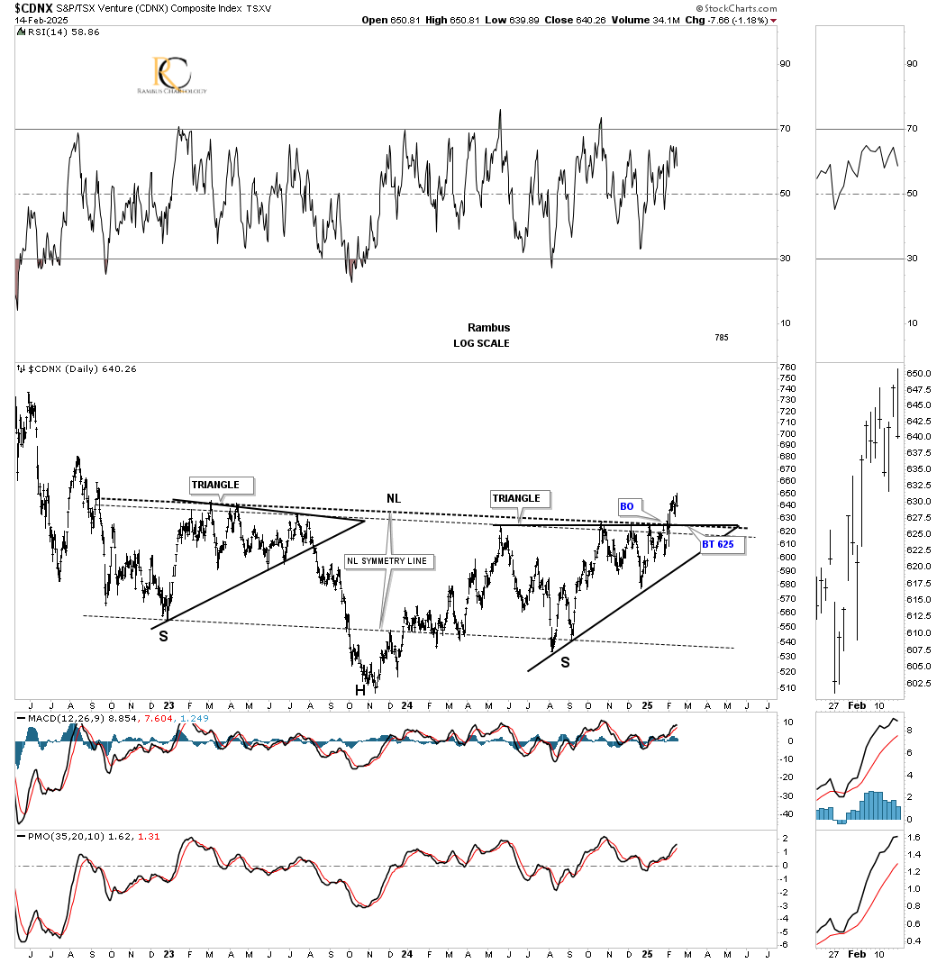
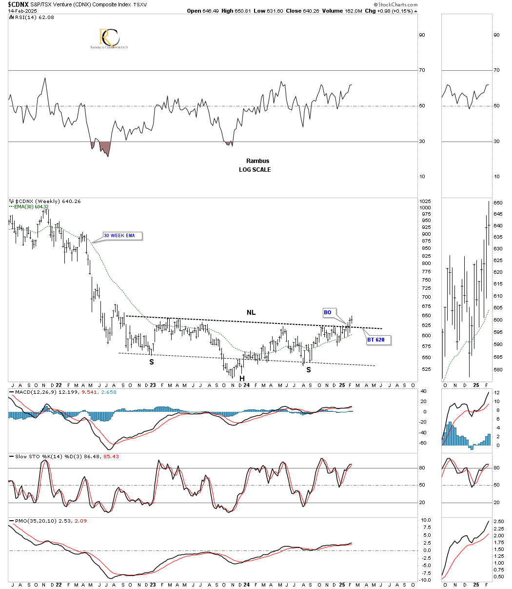
Looking at this weekly chart of the CDNX, the price action has just completed its second week above its neckline. Again, we should expect to see a complete backtest to the 625 area, but it’s not necessary.
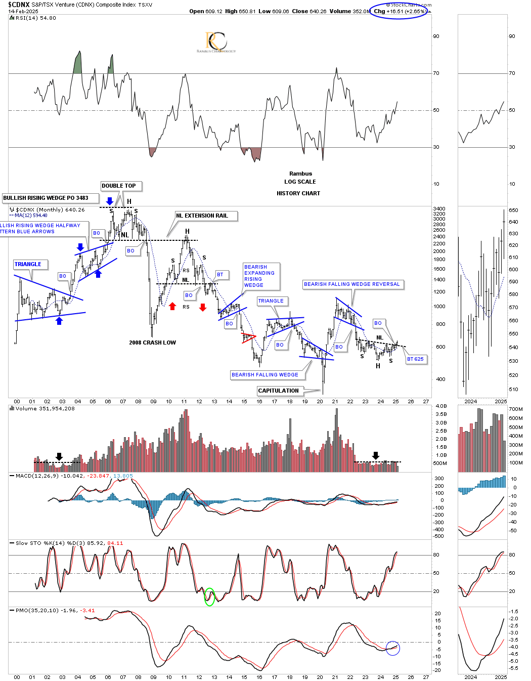
Let’s take that first daily triangle chart one last step. Below is the history chart for the CDNX, which now puts the 3-year inverse head-and-shoulders bottom into perspective, with the right shoulder being that daily chart above, which is hardly imperceptible. But now we can finally see the breakout above the neckline from the monthly perspective. Please keep in mind what that breakout looks like, as we’ll look at several more.
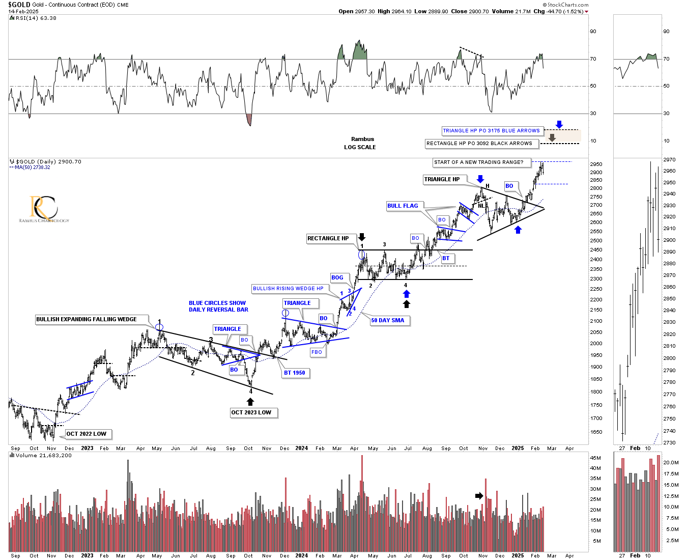
Let’s turn our attention to this daily chart for gold, which shows you classic Chartology since the October 22 double bottom low. The black consolidation patterns are the large ones, while the blue ones are the small ones that form in the middle of the impulse move between the black consolidation patterns.
I’m going to use this chart, one of several I have, to show you how gold can get over $3000 using the impulse measuring technique to get a price objective. We’ll start with the 2023 black bullish expanding falling wedge, which shows a black arrow at the last reversal point at the October 2023 low. This is actually where the first short-term impulse move begins, which ends at the first reversal point in the black rectangle. Note the smaller blue consolidation patterns that make up that impulse leg.
We then take the distance from the last reversal point in the black bullish expanding falling wedge to the first reversal point in the black rectangle and add that distance to the last reversal point in the black rectangle to get a price objective up to the $3092 area, as shown by the black arrows.
Since we have another black consolidation pattern, the recent triangle, we can do another measured move using the same technique. This time, we use the last reversal point in the black rectangle (blue arrow) and measure up to the first reversal point in the triangle. We then take that measurement and add it to the last reversal point in the triangle to get a price objective up to the $3175 area, as shown by the blue arrows.
Keep in mind that $3000 is a big, round psychological number, at which a lot of profit-taking usually takes place. Before we get to $3000, I’m expecting to see a small blue consolidation pattern start to form, as shown by the horizontal thin black dashed line, as a possible area of consolidation. What type of pattern forms makes no difference; just a pause to refresh.
Do you still have that weekly chart for the CDNX in the back of your mind, which shows the current breakout from that three-year inverse head-and-shoulders bottom? Back on March 11, 2024, I wrote the Weekend Report with the title, “Gold’s Confirmed Breakout.” Note the breakout that was just beginning on the monthly chart below. This is what I wrote:
March 11, 2024:
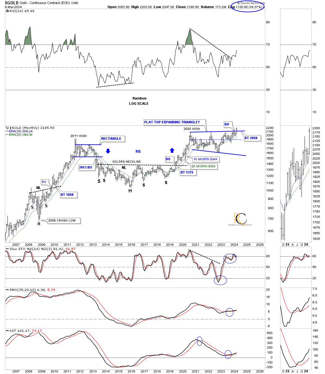
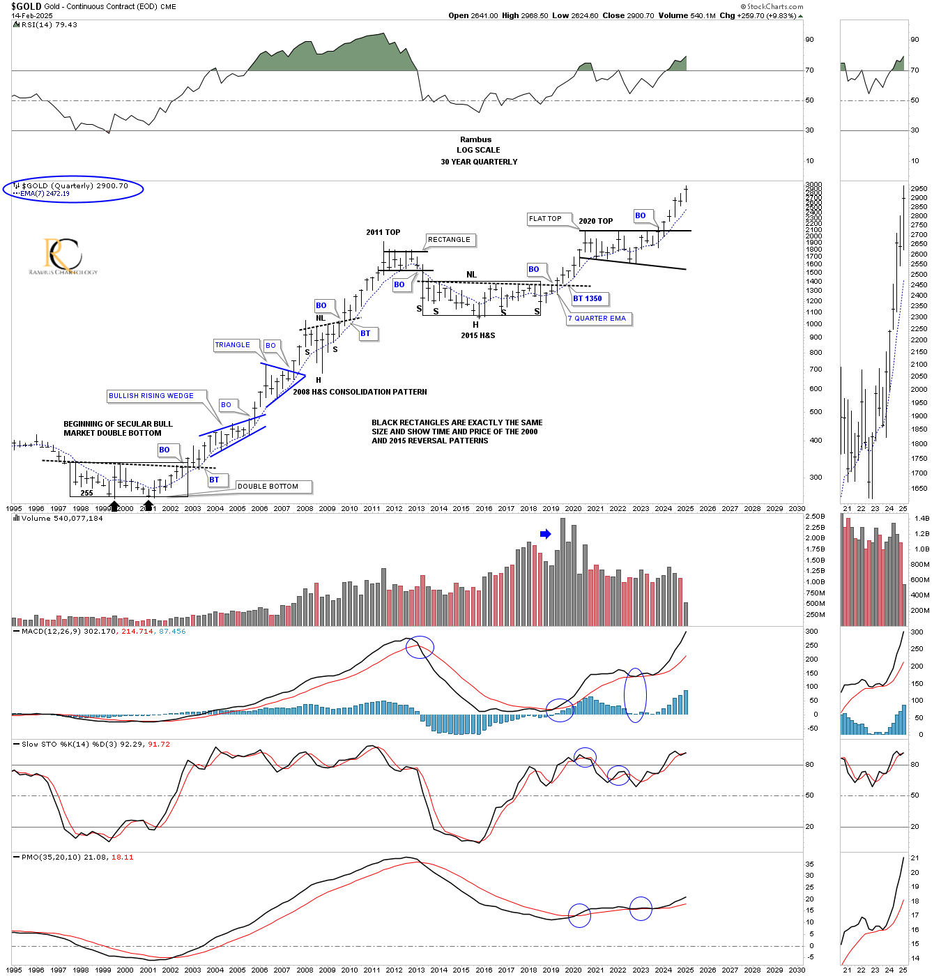
Next is a longer-term monthly chart, which puts the 2020 trading range into perspective. This chart starts at the 2008 crash low, where gold formed a beautiful head-and-shoulders consolidation pattern, which launched gold on its way to the 2011 all-time high. Next came the bear market, which bottomed in 2016, creating the head of the very large 2016 head-and-shoulders consolidation pattern. The breakout from the 2016 head-and-shoulders consolidation pattern led to the next important impulse move, which topped out just above the 2011 high in 2020.
Keep in mind that the job of a consolidation pattern is to sow doubt in your mind about the validity of the bull market, and after 4 1/2 years, many will have a hard time adjusting to the new paradigm shift that is now taking place from consolidation to impulse. Also, the bigger the consolidation pattern, the bigger the impulse move.
Today, February 16, 2025,
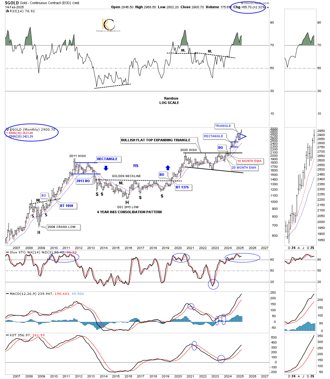
It’s not been quite one year yet, but the rally we were looking for from the breakout point on the monthly chart above has been playing out just as we were expecting. Gold has completed the two small blue consolidation patterns so far, which is fairly normal in a strong impulse move out of a big consolidation pattern. There is a chance we could see a total of three small blue consolidation patterns before this leg is exhausted, at which point it will be time to build another larger consolidation pattern that could take a year or longer to complete. But for now, just enjoy the current impulse move.
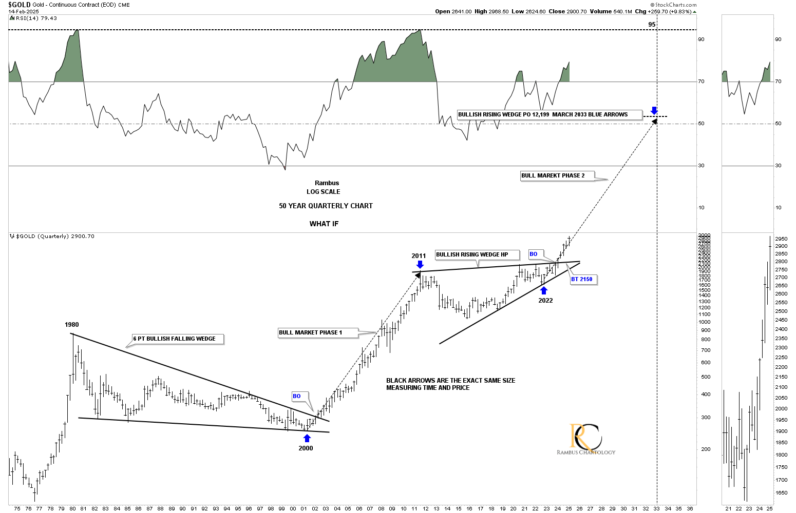
In that same Weekend Report, we looked at this 50-year quarterly chart for gold, comparing the big base that formed the bear market low in the late 1990s to the 2016 head-and-shoulders consolidation pattern, using the thin black rectangles to measure time and price. This is what I wrote:
March 11, 2024:
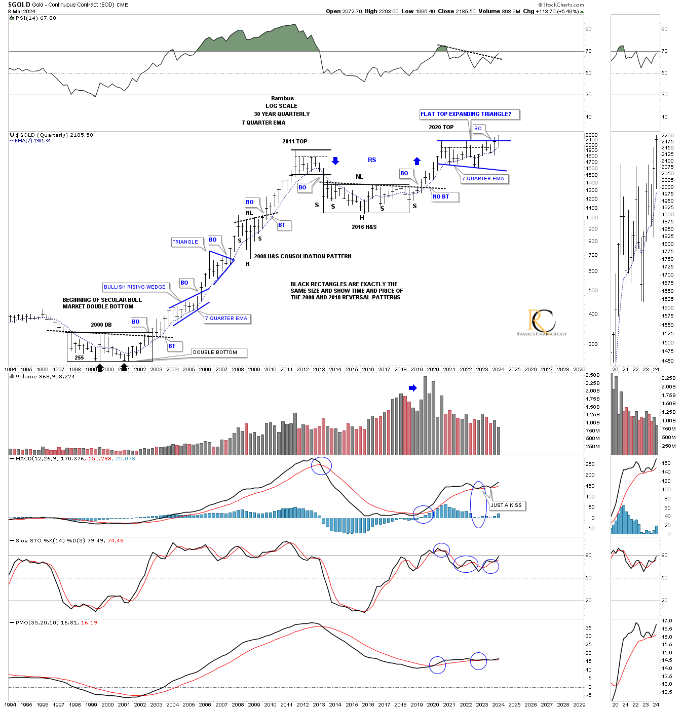
This 50-year quarterly chart compares the 2000 base to the 2016 base, with both rectangles being exactly the same size, measuring time and price. If the 2000 base was large enough to launch an eleven-year bull market, it would make sense that the 2016 base should be big enough to launch a similar bull market. The first consolidation pattern that formed when gold broke out of the 2000 double bottom base was the blue bullish rising wedge. The first consolidation pattern to have formed since the breakout from the 2016 base is the 2020 blue flat-top expanding triangle. Note the impulse moves that occur when a consolidation or reversal pattern is complete.
Today, February 16, 2025:
As you can see from this quarterly perspective, which is the exact same chart as the one above, the 2016 head-and-shoulders base, which actually took two more quarters to complete in time versus the 2000 base, has been playing out just as well as the initial start of the 2000 bull market.
Keep in mind that we are looking at a quarterly chart, but when you look at a shorter-term weekly chart, there was one more consolidation pattern that formed above that very symmetrical 2008 head-and-shoulders consolidation pattern, for a total of four large consolidation patterns completing the first leg of the secular bull market before the cyclical bear market took hold in 2011.
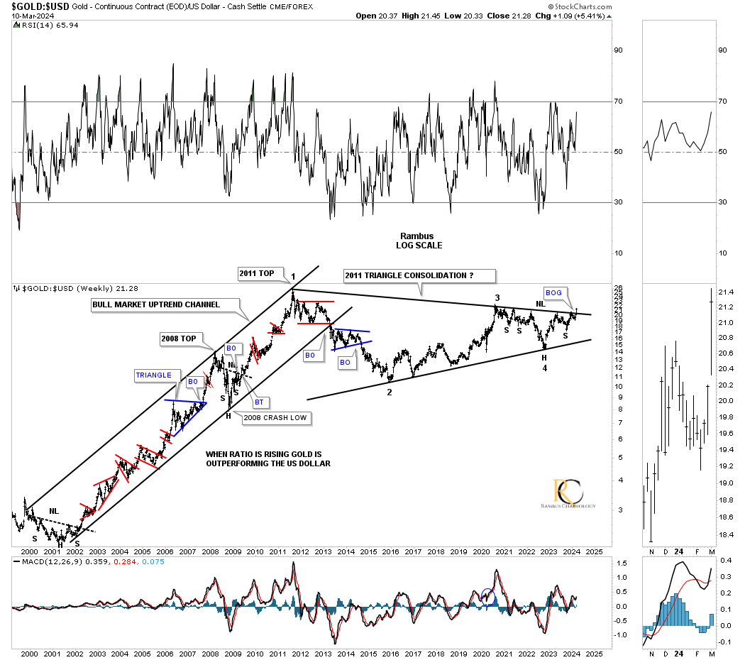
Let’s look at another critical chart from that March 2024 Weekend Report, which was the Gold:US dollar 25-year weekly ratio chart.
March 11, 2024:
Let’s take the Gold:US dollar ratio a step further and go all the way back to the 2000 low. As you can see, gold outperformed the US dollar for eleven years, with only small consolidation patterns forming along the way.
Once again, look at the thumbnail on the right sidebar, which shows the breakout gap from last Monday’s breakout move above the 2011 triangle consolidation pattern. We’ve literally been following this massive triangle for several years, and to finally see it come to fruition is pretty rewarding. Big patterns lead to big moves.
Note the head-and-shoulders consolidation pattern on the chart above. You can see how it fits into the apex of the 2011 triangle, which was strongly suggesting that the top trendline was going to give way.
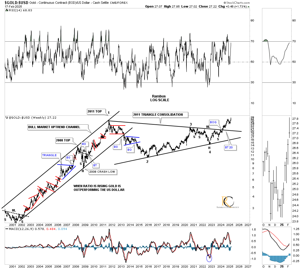
Today, February 16, 2025:
As you can see, that 2011 triangle breakout held on the weekly chart above, and the Gold:US dollar ratio hit a new all-time high this month, meaning gold is outperforming the US dollar.
I would like to finish up by looking at one more chart from that March 2024 Weekend Report titled, “Gold’s Confirmed Breakout.” I had been following this scenario for gold for some time, but I finally posted it in the 2024 Weekend Report. This is what I wrote:
March 11, 2024:
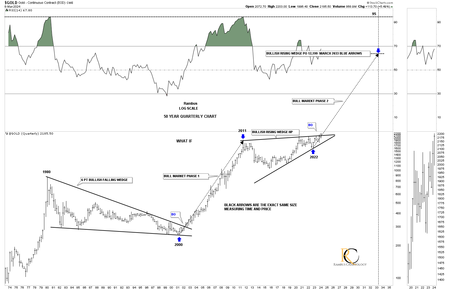
We’ve looked at some long-term charts tonight, so let’s look at one more I’ve been following for some time, but was waiting for the right time to post it. Through the years, we’ve heard analysts calling for $10,000 gold or $20,000 gold, which I thought were crazy price objectives. If you go back up to where I posted the Gold:USD ratio chart, which shows the 2011 triangle consolidation pattern, that’s the chart that gave me the idea for this possible scenario below, which I know will sound ludicrous.
If we start at the 1980 all-time high to the 20-year bear market low in 2000, you can see a nearly perfect 6-point bullish falling wedge. How do we know it’s a 6-point bullish falling wedge? Just look at the eleven-year bull market that followed the breakout. Just about every gold analyst knows about the 2020 trading range, with each giving the consolidation pattern their own name. I took it a step further and connected the 2011 high to the 2020 high to get the top trendline, and then the two lows for the bottom trendline, which shows a bullish rising wedge with the breakout taking place this month.
Again, markets are fractal in nature, so if the 2000 to 2011 bull market is one massive impulse move, and the 2011 bullish rising wedge is the halfway pattern, we can measure the price objective that I like to use, as shown by the blue arrows, the impulse method. I’m not saying this is absolutely going to play out, but it is something that I can now watch to see how the second leg of the secular bull market tracks the first leg up into the 2011 high.
From a Chartology perspective, I’m strongly suggesting that the next impulse move higher is now underway, where there will be consolidation patterns that form along the way, but they will be buying opportunities. As they say, we’ll know in the fullness of time.
Today, February 16, 2025:
Here it is, almost one year later, with another six weeks to go to complete the next quarter on this 50-year chart. So far, what we were looking at back in March 2024 is playing out perfectly and is even a bit stronger than the 2000-2011 bull run, as the current price action is sitting on top of the angle arrow, compared to the 2000 angle arrow.
There are going to be consolidation patterns that form along the way, which keeps a bull market healthy, but they aren’t any fun. There is something about this current leg of the bull market that suggests there is a long way to go, because there are so many very large consolidation patterns that have formed, not only in the indexes and metals but also in the individual precious metals stocks.
Enjoy the day off tomorrow, and all the best…Rambus
********
share
share
share
share
share
 Meet Rambus, a seasoned trader and technical analyst renowned for his unbiased and insightful chart work. Through his website, Rambus Chartology, and Substack newsletter, Rambus shares his expertise with a global community of subscribers, providing daily updates, commentaries, and hands-on training in the art and science of chartology. With his calm, humble, and down-to-earth approach, Rambus demystifies complex market trends, helping his followers navigate the challenges of today's volatile markets. Join the Rambus Chartology community today and discover a unique blend of technical analysis, trading expertise, and time-tested protocols. Subscribe now at www.rambus1.com or https://rambuschartology.substack.com/