A Long Term Look At What 2022 May Bring
 share
share
 share
share
 share
share
 share
share
 share
share
According to many commentators on the markets, we stand at the cusp of a major change in US and global markets and therefore in the condition of the US and the global economies. A look at the longer term charts of some key US markets opens a window on the possibilities held by the future – for the individual US markets. And by exploring the correlation between them, also of the future of the US economy.
The main text contains quite a number of charts. The usual set of daily charts in this report therefore will stand over to next week. The analyses in these charts are not as usual intended to highlight short term support and resistance levels, but to present a more macro long term view of where the prices could trend.
The underlying premise in my methodology is that there exists structure in market prices that exhibit as a tendency for prices to change direction along certain ‘preferred gradients’. whose existence is revealed by suitable trend lines. The same preferred gradient can occur multiple times and is revealed as a set of suitably located parallel trend lines. These parallel lines are mostly spaced according to some known ratios, irrespective of the kind of data that is being analysed. The more common ratios are 500:500, the Fibonacci ratio 382:618 and the 400:600 ratio, with some others.
Secondly, it was found that changing the gradient of a known preferred gradient by the Fibonacci ratio, either steeper of shallower, delivers another preferred gradient. The transformation can be repeated to generate a fan of trend lines that represent a family of preferred gradients that are related through the Fibonacci ratio.
Further, to reduce the effect of analyst bias, analyses are always performed by first identifying a master gradient that is defined between two prominent reversals on the chart. It is better still if the resulting master trend line is tangent to the chart. Other trend lines used in the analysis are either parallel to the master gradient, or has a gradient that is the inverse of the master gradient, or are derived from the master by means of the Fibonacci ratio. With one exception, all the charts use monthly averages.
Euro-USD Monthly average
The master gradient M is defined as the tangent along to the bottom of the chart. Lines X and Y are parallel to line M, with channel ABCD a shallower inverse derivative of line M. Channel PQR is much steeper than the other trend lines. The derived trend lines are all located in significant locations on the chart. Line P is anchored in the first trend reversal of the series, while line Q is located in a bifurcated top – also a location that is known to be significant. The ratio of channel PQR is 383:617, just off the Fibonacci ratio. With line Y sharing the anchor point with line C, the ratio of channel XYZ is also 383:617.

EUR-USD Monthly average (FRED). Last = $1.130
Channel set ABCD consists of two overlapping channel pairs, ABC and BCD that have ratios 380:620 and 495:505 respectively – one being close to the Fibonacci ratio and channel BD close to being divided in half by line C. The right side of the chart lies in a triangle between lines B and M. The price is now on leg 5 of the triangle and according to the chart pattern should break lower below line M and extend at least as far as line C and perhaps as low as line D – where the dollar will be almost on par with the euro.
Dollar index – Nominal advanced economies
In 2006 the weighted dollar index against major economies was replaced by the new weighted index against currencies of advanced economies. The old series was smoothly joined to the new series to provide a long term series from 1973 to the present.
The master gradient connects the all time high and the all time low, another way to identify a significant preferred gradient. Lines X and Y are again parallel to line M and channel XY contains the full extent of the chart. The ratio of XMY is 386:614, not too far off the Fibonacci ratio. Channel PR also contains the full extent of the chart and the channel PQR has the ratio 384:616. Channel AC also contained the full extent of the chart until recently, with the dollar index now breaking lower. The channel ratio of ABC is 498:502.
Note that despite the change in the formulation of the series in 2006, changing from ‘main currencies’ to ‘advanced currencies,’ the different channel ratios illustrate that the series has been consistent over the past almost 50 years. This is quite amazing, seeing that the weights used for the foreign currencies are their volume of trade with the US, which must have varied substantially during this time, presumably with corresponding effect on the different exchange rates with the dollar.

Monthly average Dollar index DTWEXAFEGS (Fred). Last = 108.202
US 10- year Treasury – Monthly Average
US 10- year Treasury – Monthly Average (FRED). Last = 1.47%
What happens to the yield on the US 10 year Treasury note is probably as important for the US economy as what happens to the dollar, which according to the first two charts may well have started off on a medium to longer term bear market. A weaker dollar, in combination with higher inflation, would not be good for one other major US market that is not included here this week – Wall Street.
The master gradient in the above chart is once more a tangent to the whole chart. Lines X and Y are again parallel to M and channel XM also encloses the whole chart. The ratio of channel XYM is 373:617. Channel PR also contains the whole chart and the ratio of channel pair PQR is 402:598, close to the known 400:600 ratio. Channel AD is another one that encloses the whole chart, and the set has ratios of ABC 385:615 and BCD 401:599.
The average yield for December at 1.47% is a fraction below the value of the trend line for the next month, which will be January 2022. With a low value of 1.507% for the first trading day of the new year and a yield of 1.793% for last Friday, it looks as if the yield will be holding above line R. The ratio for channel PQR is close to known ratio 400:600, which implies that channel PR is likely to hold for some time. It also sets line B above 4% as a likely medium term target, with line Y as a potential target should the inflation really take off.
Even an approach towards the lower target can be expected to be disastrous for Wall Street and probably for the wider economy as well.
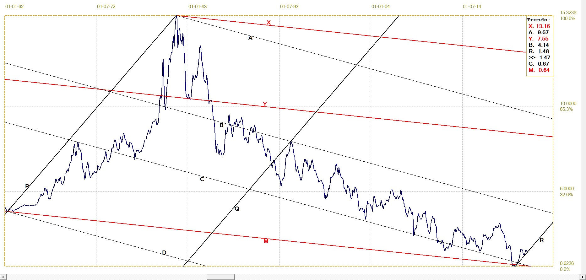
Gold price London PM fix. Monthly average (LBMA)

Gold price – Monthly average (FRED). Last = $1787
The master gradient M is the top resistance of the chart. Lines P and Q are parallel to line M and define the initial bull channel of the gold price during which the price drifted mostly sideways. After the price of gold had bottomed in 2000/01, it turned bullish and established the new bull channel, ABC, which is steeper than bull channel MPQ byt one Fibonacci transformation. The initial implicit bull channel was confirmed when the price set an earlier all time high in September 2011 to touch line M. The ratio of channel MPQ is 385:615, almost the Fibonacci ratio. The ratio of channel ABC is 500:500 and channel XYZ also has the ratio of 385:615.
The price has completed three of the usual five legs of the rising Fibonacci wedge MC. Leg 4 ran out of steam well before reaching line M, needed to complete that leg, then corrected back to line Z, which has held so far. One possible scenario, given that the suppression of the gold price, while allowing the price to break above $1800, is not yet over, is as follows: the price is to move sideways with possibly a bullish bias for some time. Either line B or the new bull channel or line P of the initial channel might have to act as support – with line B of the new channel more likely to do so.
This sideways drift will allow line M to move to higher values, so that when leg 4 resumes it will have a significantly higher target. In principle, the price should then reverse off line M into the bearish leg 5 of the rising wedge. However, 30 years ago I made strong call for a top in the price of a local corporation after it had completed leg 4 of a rising wedge. It became a major IT business and broke above the rising wedge shortly after leg 4 had been completed to become a ten bagger. Since then a break higher out of a rising wedge – or lower out of a declining wedge – has always been a possibility that I will consider.
Silver London fix Monthly average (LBMA)
The silver chart has always been one of the more difficult charts to analyse, for quite obvious reasons. The master gradient is the rising support trend line of the later part of the chart and forms the base of bull channel ABCD. The channel set has ratios: ABC 796:204 and BCD 199:801, both close to the known ratio of 200:800. Channel AD has no clear centre line, but seems to have a narrow channel down the centre.
Channel PQR with a much shallower gradient than the master line, has channel PR again enclosing the full chart. The channel ratio is 316:684. Channel XY is a current bear channel that fits quite well. The break back into this channel is a bearish signal. The break might prove to have been temporary, with recent price fixes for silver well above the value of line B ($22.75) to represent a reversal off that line. However, the value of line Y for January is $24.50, so it looks as if it could take a while for silver to break higher from the channel. A more rapid recovery to above channel XY would be a pleasant surprise.
Recently it was speculated here that the decline in the silver price as yearend approached, could be a scam to force large OTC options and contracts to expire worthless. Should the recovery in the price of silver proceed at pace after the possible reversal off line B, it would add substance to that speculation and point to a new bullish trend.

Silver monthly LBMA average (LBMA) Last = $22.468
The above charts all point to a somber picture for the US economy in the year to come and perhaps even for longer. The channel patterns in the first three charts, showing the dollar and the yield on the US 10-year Treasury note, reveal a potential bear trend for the dollar and steeply rising yields for the Treasury that could last quite a number of years, according to the time scale of the charts. This paints a gloomy picture for the economy as a whole as well as being bad news for Wall Street.
A slowing economy, with a weaker dollar, higher inflation and a bear market on Wall Street will put pressure on investors to look for a safe haven for their funds, much of which would be withdrawn from the stock and other dollar sensitive investments. The potential for bull markets in gold and silver as reflected in the charts, indicates where much of the excess funds released from other investments will find a home.
As I guess most readers would have done when reading the above paragraph, they will think of another safe haven that is becoming increasingly popular, namely the crypto market. Bitcoin is the outright leader in that market and where Bitcoin goes the majority of other cryptos follow. The daily chart of the price of Bitcoin below displays a rising wedge much like the one on the chart of the price of gold.
Much of the discussion of the gold price applies as is to the Bitcoin chart. The master lines of the two charts are similar and both display a Fibonacci derived rising wedge.
The channel set MABC has channel MC enclosing the whole chart. The channel pairs in this set have the ratios: MAB 497:503 and ABC 498:502. This means that all four channels have close to the same width.
The Bitcoin rising wedge is also still on leg 4 of the pattern, after having failed to complete leg 4 by reaching line M, ending short by quite a small margin. There is the possibility of breaking lower on leg 4 – a premature or abnormal break similar to the occasion of my bad call 30 years ago – which from this analysis would be very bearish for the crypto world. Given that Bitcoin and others would be seen as a safe haven, similar to what the role of gold was before cryptos, it seems unlikely there would be a break lower. (Unless the Fed wages all-out war on the competition for the dollar!?)

Bitcoin Daily (Nomics.com) Last = $43 082
The above raises the question to what extent Bitcoin et al will handicap the gold and silver bull markets. My guess is that both cryptos and the metals will benefit from the slow death that lies ahead for the economy when a weaker dollar and higher inflation take their toll. People under, say, 35 – and most under perhaps 30 - will go for Bitcoin and a few other more speculative cryptos. Most people over 40 will not as yet have developed full confidence in the crypto universe and can be expected to stick to gold and silver as their safe haven of choice. Both markets should attract ample funds and both ought to be bullish for the medium term, at least.
©2022 daan joubert.
*********
share
share
share
share
share