Monetary Inflation’s Impact on Markets


I’m back! I’ve been away since mid-November, having my diseased kneecap replaced with stainless steel, and that is coming along really good. The Good Lord willing, I’ll be walking miles once again by next autumn.
I was also sick during the month of January. I don’t know sick with exactly what, but I’m glad I’m over with whatever it was. As now is early February, it’s time to do some writing about the markets.
I’m going to start with the Dow Jones below, plotted in the Bear’s Eye View, or the BEV View. What is the Bear’s Eye View? The BEV View ignores prices. Instead, it compresses price data into a range of only 100 percentage points spanning from;
- 0.0%: New All-Time High,
- -100%: Total Wipeout in Valuation.
In the Bear’s Eye View, a new all-time high of less than 70 for the Dow Jones in the late 1890s, is equal to a new all-time high of over 45,000 in the 2020s; both just Big Fat Zeros as far as Mr Bear is concerned.
Plotted in the dollars the Dow Jones is published in, we’d see the Dow Jones begin its current bull market in August 1982, where for the last time in history, it had closed below 800, to over 45,000 in December 2024. Plotting the last forty-two years of the Dow Jones in dollars doesn’t make for much of a chart to study the market with, or so I think.
Looking at the Dow Jones as Mr Bear does in the BEV chart, and its frequency table below, every day it closed with a BEV value of 0.0%, it closed at a new all-time high, which happened in 878 NYSE Trading Sessions since January 1980.
Those daily closings within “scoring position” (-0.001% to -4.99%), where the Dow Jones closed for the majority of daily closings during all bull-market advances, can be seen in the -0.001% row in the frequency table below. The Dow Jones closed in scoring position for 4,660 NYSE Trading Sessions since January 1980.
To see how bullish any market advance for the Dow Jones has been, you simply add the daily closes in the Dow Jones frequency table for its 0.0% and -0.001% rows. Since August 1980, the Dow Jones has either closed at a new all-time high, or in scoring position for 5,538 of its 11,370 daily closes since August 1982, or 48.7% of the daily closings since August 1982.
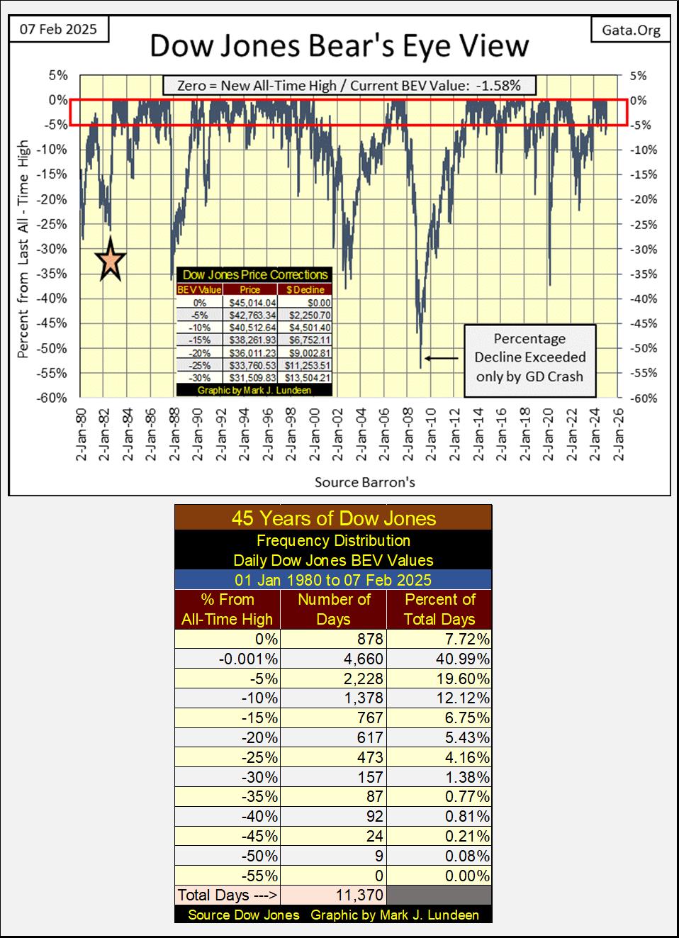
Historically speaking, since 1885 when Charles Dow began compiling the Dow Jones, this is highly irregular. This makes the past forty-three years of Dow Jones history, the most bullish half century of Dow Jones history, and a damn good reason to believe the stock market is currently in a massive bubble. Risking one’s money at the top of a massive bubble in the market is something I would not recommend to my readers.
The Bear’s Eye View of the Dow Jones in the chart above, also shows the four major market corrections seen by the Dow Jones since August 1982;
- October 1987 Flash Crash, -35% market decline,
- NASDAQ High-Tech Bear Market Decline, -38% market decline,
- March 2009 Sub-Prime Mortgage Bust, -53% market decline & second deepest Dow Jones percentage decline since February 1885,
- March 2020 Flash Crash -38% market decline.
Currently, the Dow Jones has for the most part closed in scoring position since November 2023. It’s best being bullish when any index remains in scoring position, above its BEV -5% line for a prolonged period of time. So, as long as the Dow Jones sees daily BEV values of -4.99%, or less, one should assume new all-time highs are pending. But should the Dow Jones close below its BEV -10% line above, I’d sell everything, and stay out of the market for a long time, for fear of another major market decline.
An insight into retail investors behavior I’ve gained over the years, which includes my own behavior, is they don’t know when to exit the market, and take their profits home with them. Exiting the market should the Dow Jones deflate down below its BEV -10% line isn’t calling a top in the market. Rather, it’s a rule to protect investors from losing what they’ve gained from years of exposing their money to market risks.
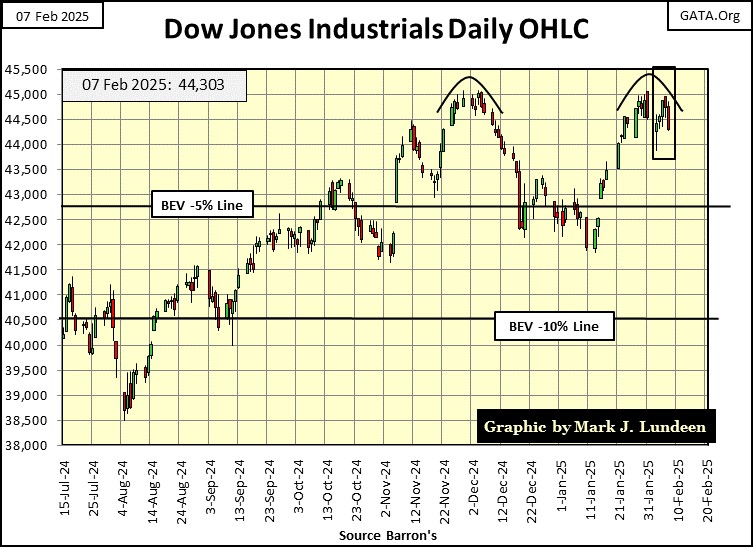
Looking at the Dow Jones in BEV terms is interesting, but I also like seeing it plotted in dollar terms, as seeing the Dow Jones below plotted in daily bars.
Looks like the Dow Jones is building a very BEARISH double top in the chart below. But as it continues closing daily above its BEV -5% line, I’m going to remain bullish, until it closes below its BEV -5% line by a good amount. Should it close below its BEV -10% line (40,500); I’d recommend anyone with market exposure exit the market completely.
I don’t see into the future; I could be wrong on this. But successful investors have rules to protect them from the unknown, and currently my rule is; should the Dow Jones close below its BEV -10% line seen below, get out and stay out. But we’re all adults here, so you do what you believe is right for you.
I follow twenty major market indexes seen below, which I use their BEV values to more easily compare their performance to each other. I really don’t care about their prices. Knowing which one is seeing a new all-time high this week, as the NYSE Financial Index did on Thursday this week (0.00%), or how far, in percentage terms, the other indexes are from their last all-time highs, seems a more valuable insight into each market index below, and the market as a whole.
These indexes closed on Friday with fourteen of them in scoring position; BEV values of less than -5.00%. That is pretty bullish. So why did only one of them make a new all-time high this week? Maybe next week we’ll see more BEV Zeros (0.00%).
I note the NASDAQ Banking Index closed the week at #20, -14.51% from its last all-time high of November 2021. It’s not good seeing banks underperform the rest of the market. But that has been the case now for now over three years, so I’m keeping my finger far from the panic button.
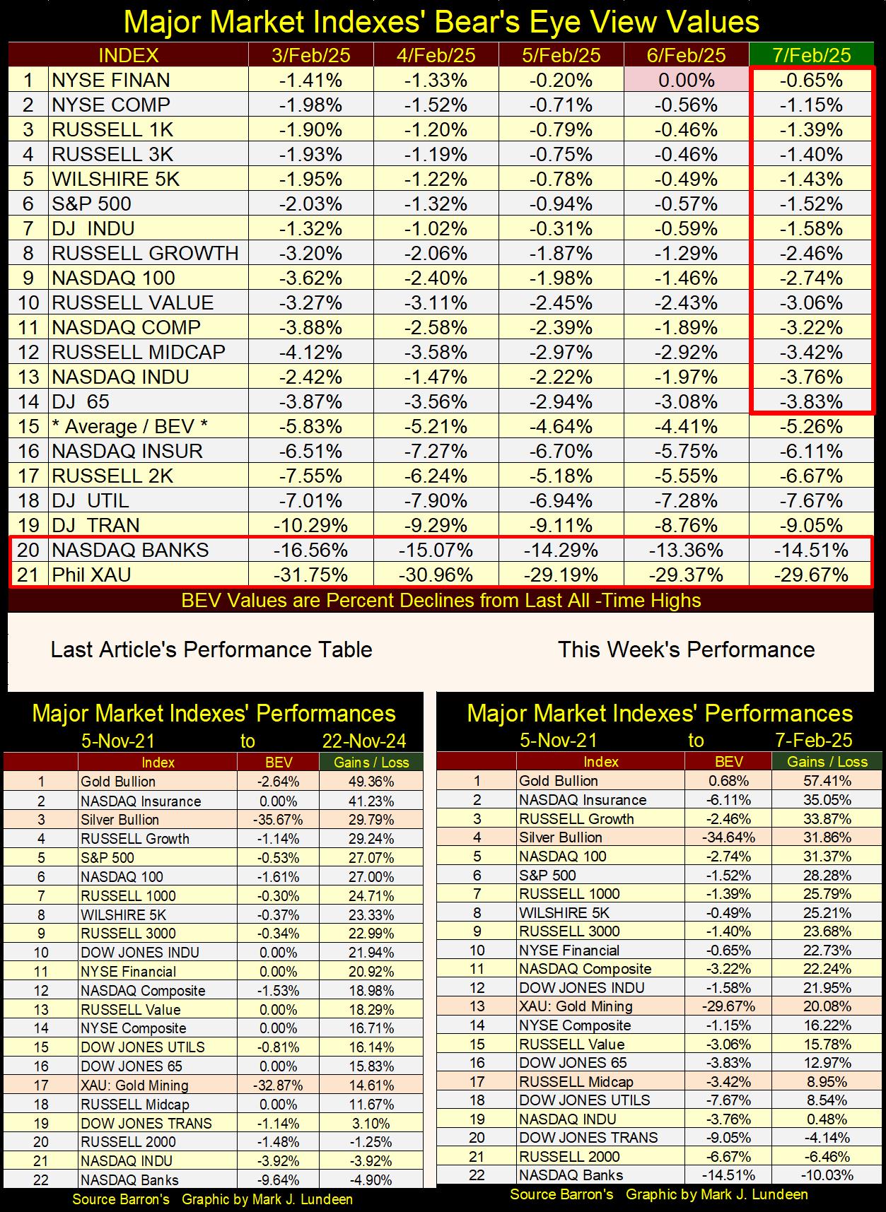
In the performance tables above, on the left we see the table for last November, as that was from my last article before my knee operation, and this week’s. Gold bullion maintained its #1 position these past three months, as it has for over a year. Silver fell from #3 to #4, but advanced in percentage terms. The XAU (gold and silver miners) is up 20.08% from November 2021, which I can’t complain about.
Monetary Inflation’s Impact on Markets
Since the US Congress legislated it into existence in December 1913, the Federal Reserve System has been the Great Engine of Inflation;
- inflating consumer prices,
- facilitating asset price booms and busts (bull and bear markets),
- an enabler of bad habits, allowing governments, corporations, and individuals to live beyond their means, with bank credit provided by America’s central bank – the Federal Reserve System itself.
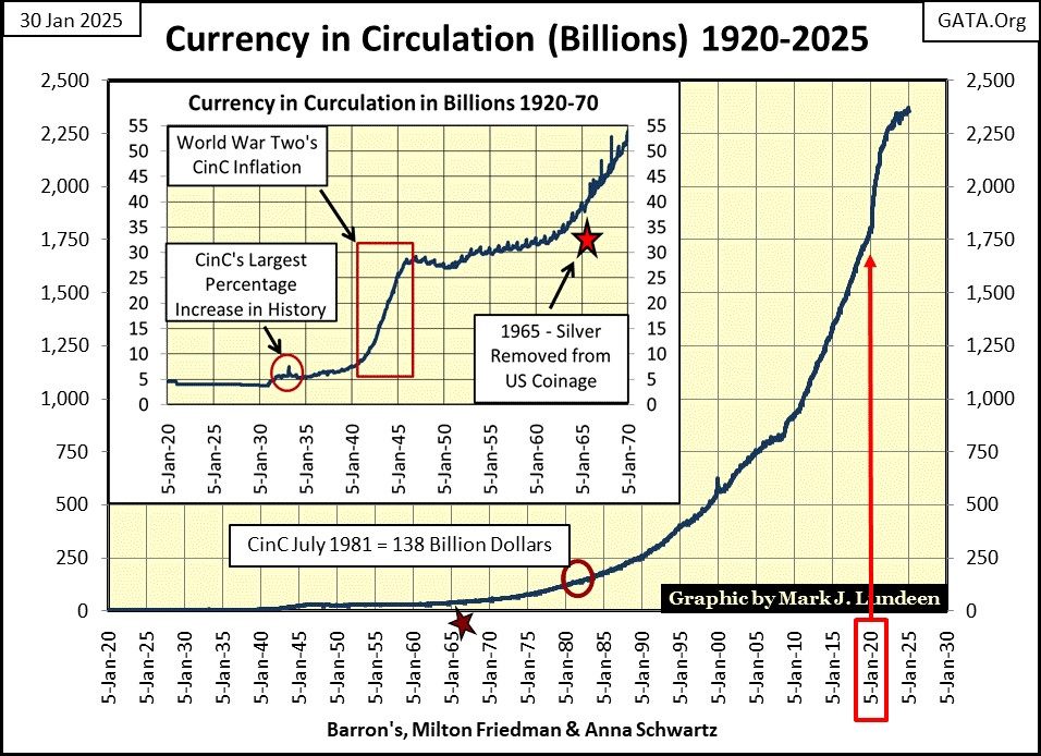
One way to understand the impact the Federal Reserve has had on the economy it has assumed control of, is to look at the ever-growing volume of paper dollars in circulation: Currency in Circulation (CinC = paper dollars in circulation) in the past century. CinC was only 4.49 BILLION dollars in 1920. This week, the Fed reported CinC was 2.35 TRILLION dollars; an increase of the volume of dollars in circulation by a factor of 532 over the past 105 years.
What is seen above is massive inflation. To believe the Federal Reserve is a “fighter of inflation” is absurd. Though contemporary “market experts” and economists frequently refer to it as such today. But believing that would be a mistake.
The Federal Reserve creates from nothing, as many dollars as it wants, whenever it wants. Looking at a chart of monthly changes in the Federal Reserve’s balance sheet below; previously to November 2007, the Fed averaged 2.98 billion dollars of monetary inflation per month since January 1997. This was sufficient monetary inflation to inflate massive bubbles in the NASDAQ High-Tech stocks (1992 to 2000), and Sub-Prime Mortgage market (2002 – 2007).
All this changed with the busting of the sub-prime mortgage boom, as is easily seen in the Federal Reserve’s monthly changes to its balance sheet below. Since October 2007, instability has become an all too frequent feature of the FOMC’s “monetary policy”, with its quantitative easings (4 QEs so far) and two quantitative tightenings QTs.
Look at the inflation “injected” into the banking system during the four QEs below, each implemented to prevent grossly inflated market prices trading on Wall Street, from collapsing into a deflationary spiral.
During the sub-prime mortgage bust (QE #1 / 2007-2009), and again during the March 2020 Flash Crash (Not QE #4), American markets were at risk at becoming no bid markets, where everyone was selling, at prices no one else, absolutely no one else was willing to pay.
The Federal Reserve’s four QEs seen below, “injected” a flood of monetary inflation into the financial system, providing it with the means to buy what no one else was willing do with their own money – buy financial assets at prices far above what a free market would have been willing to do. In effect, bear-market interruptus; placing a bottom to a bear market in progress, via massive monetary inflation, thus keeping the price structure of the financial market grossly over inflated.
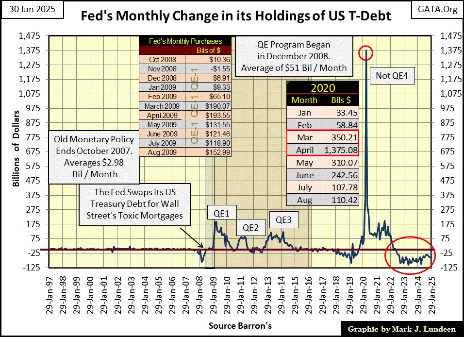
The Not QE #4 above “injected” over Two-Trillion Dollars of Monetary Inflation into the banking system from March to May 2020, a sum requited to “stabilize market valuations.” How many trillions-of-dollars of monetary inflation will it take the next time market valuations become “unstable?”
Next is a chart for the Federal Reserve’s balance sheet itself, following the QEs and QTs seen above.
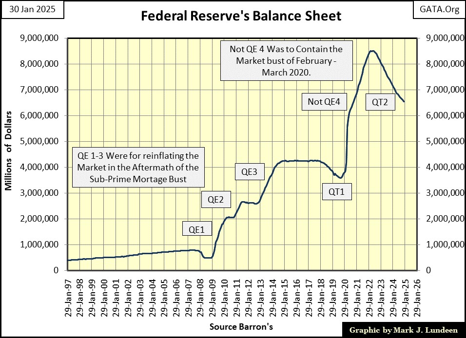
The plot above shows the assets held by the Federal Reserve as monetary reserves to back the US dollar, all purchased with dollars of monetary inflation, generated by the Federal Reserve itself.
The problem with this gross swelling of the Fed’s balance sheet is; after the QEs #1-4, should the Federal Reserve attempt to restore its balance sheet to below one trillion dollars, where it was in 2007 before the sub-prime mortgage bust, there is no market demand for what the Federal Reserve wants to sell.
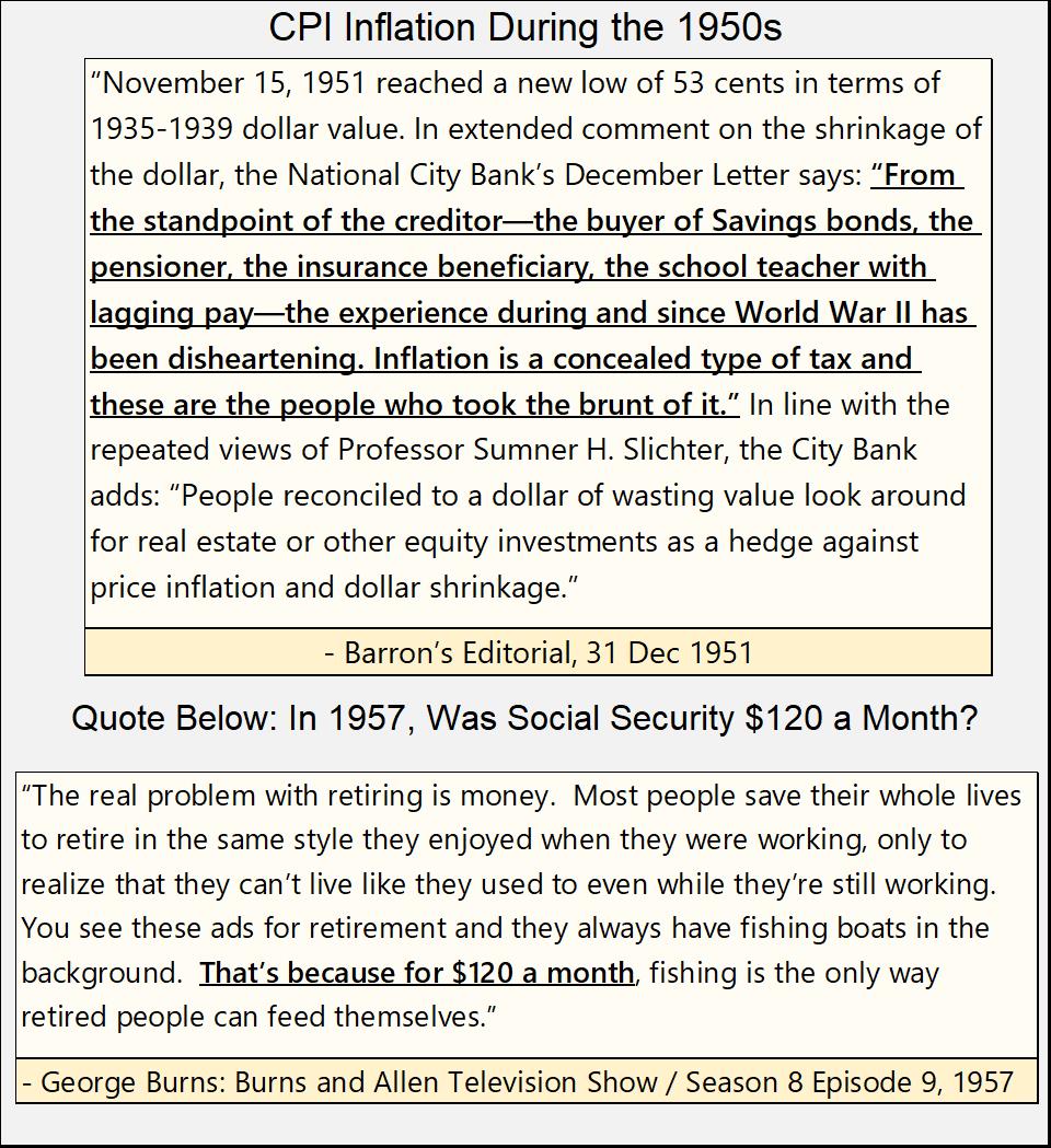
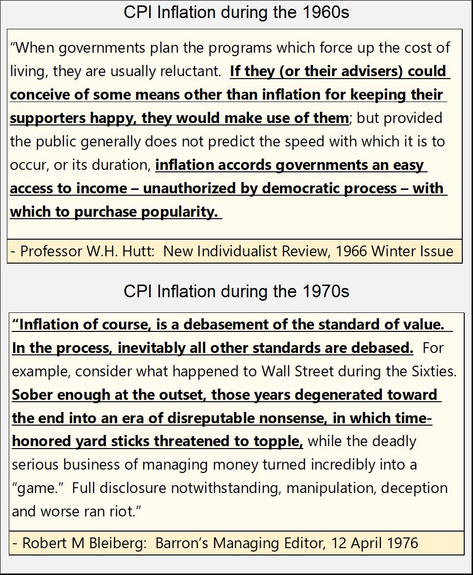
When the inflation flowing from the Federal Reserve flows into commodity prices, it’s called CPI inflation. Largely forgotten today, the 1950s, as was the 1960s, were decades of CPI inflation.
From 1958 to 1980 (22 years), monetary inflation from the Federal Reserve flowed into consumer prices. The stock and bond markets did poorly during these two decades. But gold and silver mining prospered, as seen in the chart of the Barron’s Gold Mining Index (BGMI) below.
In the chart’s insert (Red Rectangle), from 1935 to 1960, the BGMI did little for investors. Then from 1960 to 1980 (20 years), the BGMI advanced from 40 to 1285, an increase by a factor of 32.12.
Since 1980, exactly as it had from 1935 to 1960, the gold mining stocks in the BGMI did little for investors. However, a strong case for the BGMI to once again enter a period of extreme growth can be made now in 2025.
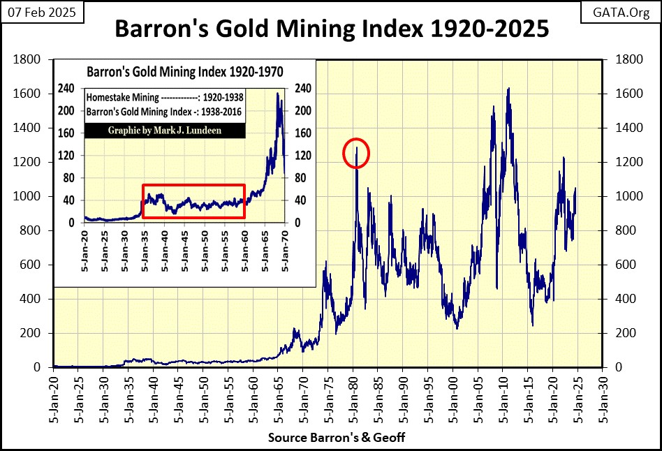
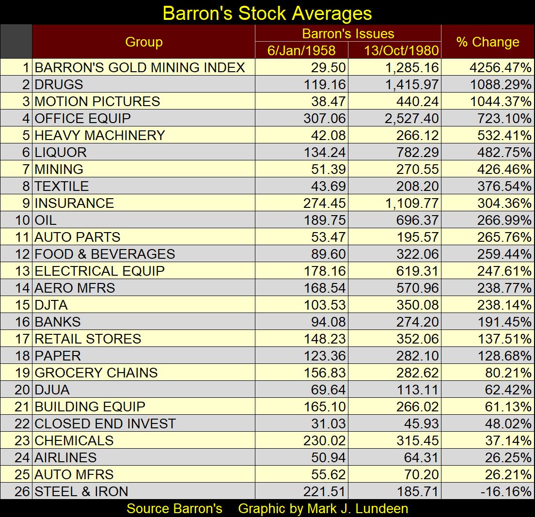
Using the now discontinued Barron’s Stock Averages (BSA: 1938 to 1988), we can compare the performance of the BGMI below with other stock averages in the BSA from 1958 to 1980, in the table below.
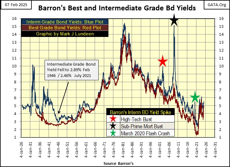
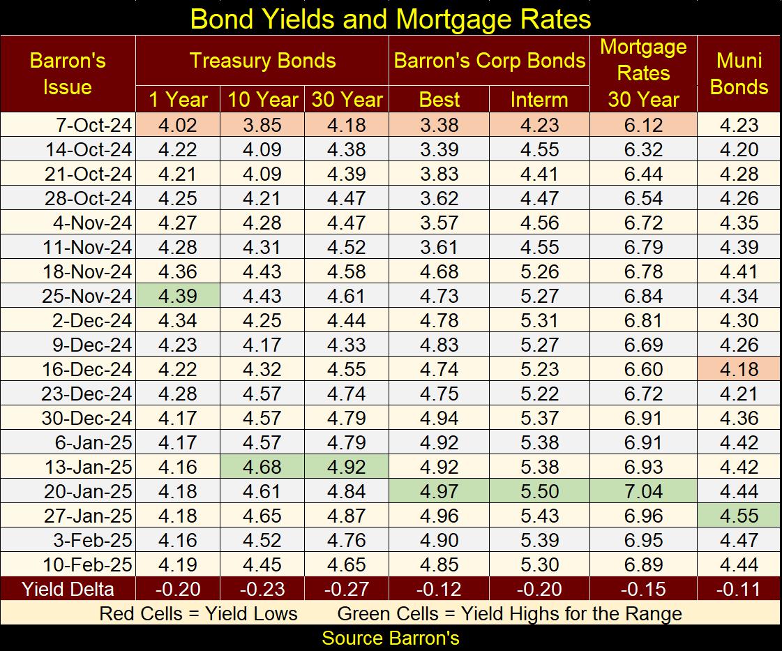
What is the key to understand when gold and silver mining stocks will under, or over perform the general market? Trends in bond yields, as seen below with Barron’s Best and Intermediate Grade Corporate Bond Yields.
When bond yields are rising, as from 1956 to 1981 below, inflation flowing from the Federal Reserve was flowing into consumer prices.
Bonds are contracts for income, aka – a fixed income investment. Buyers of bonds are very sensitive to rising CPI inflation, as rising consumer prices dilute what a bond’s future fixed income will purchase over time. That, plus deflate the value of the bonds they hold.
So, bond buyers begin demanding an inflation premium – higher yields before they are willing to purchase a bond. When the bond yields seen below increased to something above 10%, it was in response to CPI inflation increasing to similar percentages.
The BGMI’s valuation below didn’t rise just because bond yields are increasing below. But like bonds, purchasers of the gold and silver miners are sensitive to rising CPI inflation, possibly because they are former bond investors, and so are willing to pay more for these shares as CPI rises, and flight capital begins flowing toward precious metals, as a safe harbor during times of high CPI inflation.
Why would former bond holders sell their bonds, and desire precious metal miners? Look at what happened to the below 30yr T-bond since August 2020.
When issued in February 2020, this T-bond cost 100 as it yielded 2%. In August 2020, this T-bond’s yield declined to 1.19%, as its price inflated by 20%, to 120 in only six months. The next three years would not be so kind to its owner.
In October 2023, its current yield increased to 5.19%, as its market price declined to 54.15. So, seeing its yield increase from 1.19% to 5.19, only four percentage points, reduced this bond valuation by 54.9%, over half its market value from three years before.
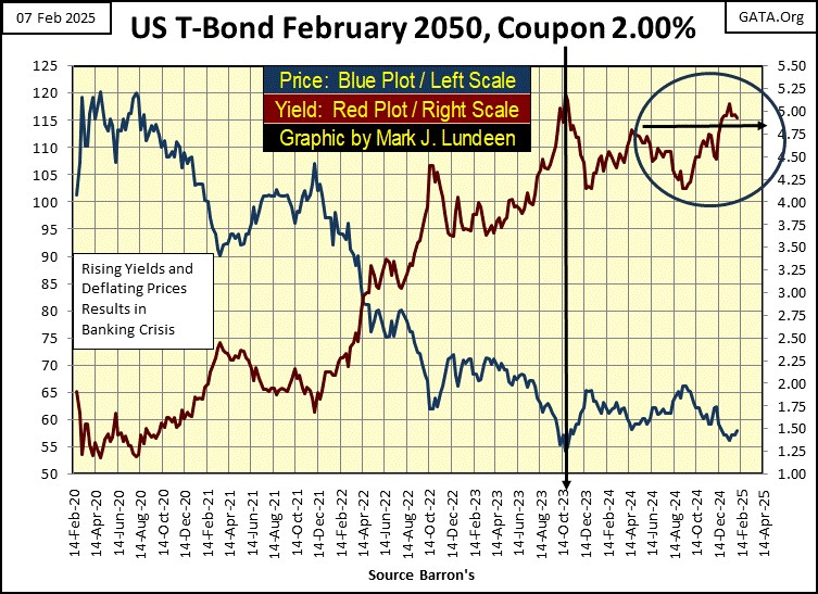
Rising bond yields will devastate the market valuations of all bonds now trading on Wall Street. Should bond yields continue rising, as they did from 1958 to 1980, there will be plenty of former bond holders who will take what is left of their former holdings in bonds, and purchase precious metals assets with them, as they did from 1958 to 1980.
Gold and silver miners do poorly when the rate of CPI inflation decreases, when the bond yields above are in decline, and bond prices rise. Falling bond yields indicates the monetary inflation flowing from the Federal Reserve is no longer flowing into consumer prices, but are now flowing into asset valuations being traded on Wall Street. As seen in the chart of the S&P 500 below.
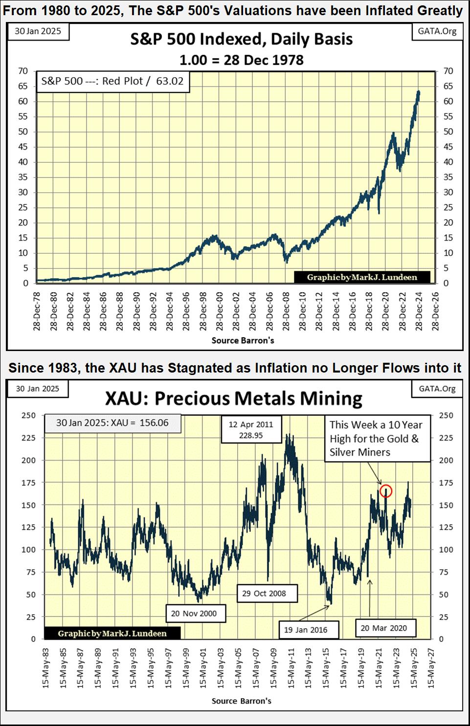
Since 1980, the gold miners have done little for investors. As seen in the XAU chart above. As of this week’s close, the XAU has advanced by only 0.46% from its first day of trading on 20 December 1983, forty-two years ago.
But since August 2020, bond yields have once again begun to rise, indicating bond buyers are once again demanding a premium before they purchase bonds, as seen for yields in the Treasury’s long bond below.
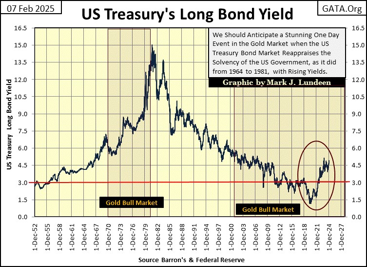
So, since 2020, the bond market has been seeing rising market risks, resulting in rising yields (circle above). So far, rising bond yields hasn’t impacted valuations for the general stock market, or valuations for the gold and silver miners.
If this trend in rising bond yields continues, at some point they will pop the valuation bubble in the stock market, and trigger a massive bull market in precious metal assets. How far could bond yields rise? I don’t know, but believe will ultimately take bond yields back up above 10%, sometime in our uncertain future.
From the 1950s to the early 1980s, rising bond yields weren’t good for stocks and bonds. But they were for gold, silver and their miners. In the years to come, possibly beginning this year, I’m expecting a repeat of the market performance seen from 1958 to 1980;
- under-performing stock market,
- a major bull market in gold, silver, and their miners.
As current market valuations now trading on Wall Street are grossly overinflated by monetary inflation flowing from the Federal Reserve, I’m anticipating a major deflation in market valuations sometime in the not-too-distant future. How deep these market declines could be is a topic I’ll cover next week, using the dividend yield for the Dow Jones.
Let’s move on to my BEV chart for gold below. Take a moment to compare gold’s BEV chart below, with the Dow Jones at the top of this article. How their BEV plots differed from 1981 to 2000, is a remarkable display of why it is said these two assets are countercyclical to each other.
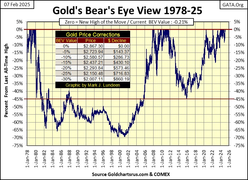
But as seen in their BEV charts below, the Dow Jones and gold are not always countercyclical to each other. In fact, since October 2022 their BEV plots have almost mirrored each other for over two years, and what is with that?
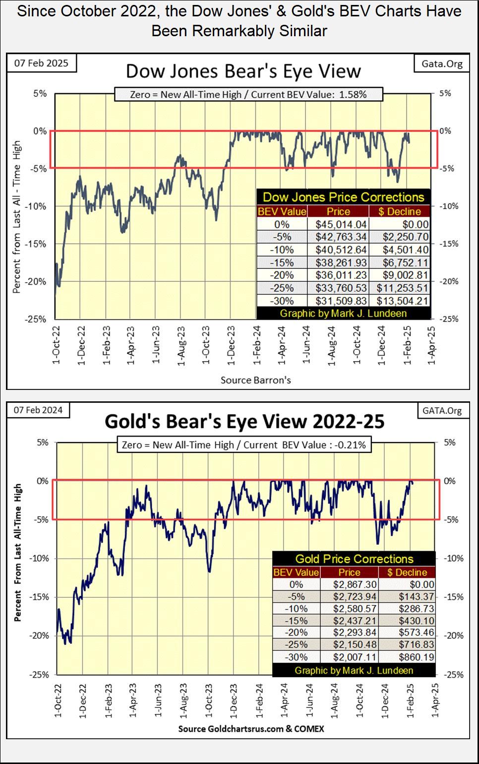
Since October 2022, the Dow Jones has seen fifty-five new all-time highs (BEV Zeros = 0.00%), while gold has seen forty-eight BEV Zeros, including five seen in the past two weeks. This multi-year, concurrent advance by the Dow Jones and gold, is just another one of those historical oddities currently seen in this market, an oddity that can’t go on forever.
What could happen to break this conjunction in the market? Reviewing their BEV charts in this article, charts going back to 1980, showing the stock market and gold are typically countercyclical to each other, I’d say one of these markets would have to see a significant market decline, as the other continued advancing to new all-time highs for years to come.
And what could trigger this break? Well, I’m not a “market expert.” I’m only a market enthusiast who has followed the financial markets for decades. Which is long enough to study the effects of increases and decreases in bond yields, on the stock market and precious metal assets.
Looking at the bond yields and mortgage rates in the table below, it seems to me, that yields continue trending upwards, with no indication their rise has found a top. Should this trend in rising yields continue, it will result in a big-bear market in the stock market, as precious metal assets continue rising to prices not known today.
Moving on to my step sum tables for gold and the Dow Jones, gold has been overbought since January 10th, when its 15-count increased to a +7. It’s 15-count increased to a +9 on January 22nd, making gold a very overbought market.
But no one seemed to care, including me, that gold was overbought, as gold closed at new all-time highs, five times in the past two weeks. Look at all those pretty blue BEV Zeros below for gold.
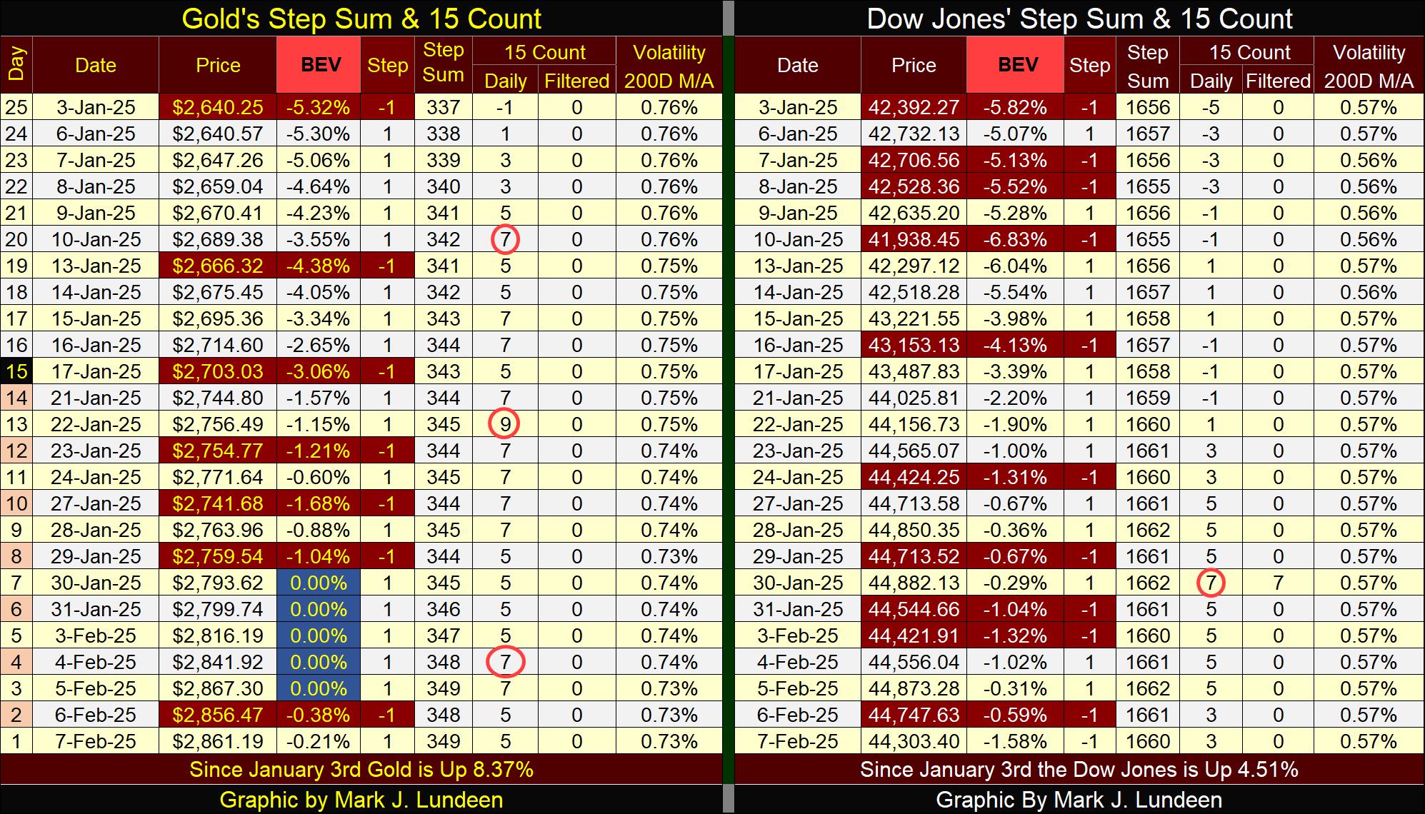
The Dow Jones hasn’t seen a BEV Zero since December 4th, which happened to be the same day I got my kneecap replaced.
So, is a pause of two months in generating new all-time highs bad? Let’s look at gold. Before January 30th, when it made its first BEV Zero above, its last new all-time high was on October 30th; a pause of three months between BEV Zeros, then five of them just pop up beginning last week.
Keep in mind, when looking at a BEV chart, its normal seeing daily closes in scoring position (-0.01% to -4.99%) overwhelm new all-time highs (BEV Zeros 0.00%). So, for the Dow Jones, as long as its daily closes remain in scoring position, I’m going to assume future new all-time highs are pending.
But then, should the Dow Jones begin to see daily closings with BEV values below -5.0%, say like BEVs of -7.0% or deeper, that could be trouble. And for a close with the Dow Jones below a BEV of -10%, I recommend exiting the market, and going into cash. Or better yet, placing a good portion of your holdings in precious metal assets.
Mark J. Lundeen
********