Precious Metals Sector Update - Big Golds Major Breakout...


The main purpose of this update is to make the point that for the first time since this major bull market phase began early last year, investors are starting to take a serious interest in Precious Metals’ stocks with major breakouts in a range of large and mid-cap gold stocks last week. This means that the sector advance has much further to go, a point that is rammed home by the almost tragic reading of the silver / gold ratio which we will have a look at in this update. We’ll start by swiftly reviewing the latest gold charts, then silver, then the revealing ratio charts, then Precious Metals’ charts (GDX) and lastly take a quick look at the dollar index.
We will begin with a 2-year chart for SPDR Gold Shares which is a reliable proxy for gold and the reason for using this chart instead of the gold chart is that it shows volume, which is important at this juncture. We are looking at a 2-year chart because it shows all of the bull market from when it broke out of its giant Cup & Handle consolidation pattern to begin this major bull market phase. On this chart we can that it has arrived at the upper rails of two channels in an overbought state, and with volume having become heavy, it looks like it is in need of a rest. However, it may not get much of one given the likelihood of an attack on Iran in coming weeks. At the time of writing on Monday morning it is reacting back and it is entitled to, and dips may be bought. Note that the uptrend may be becoming steeper, hence the steeper channel drawn on the chart.
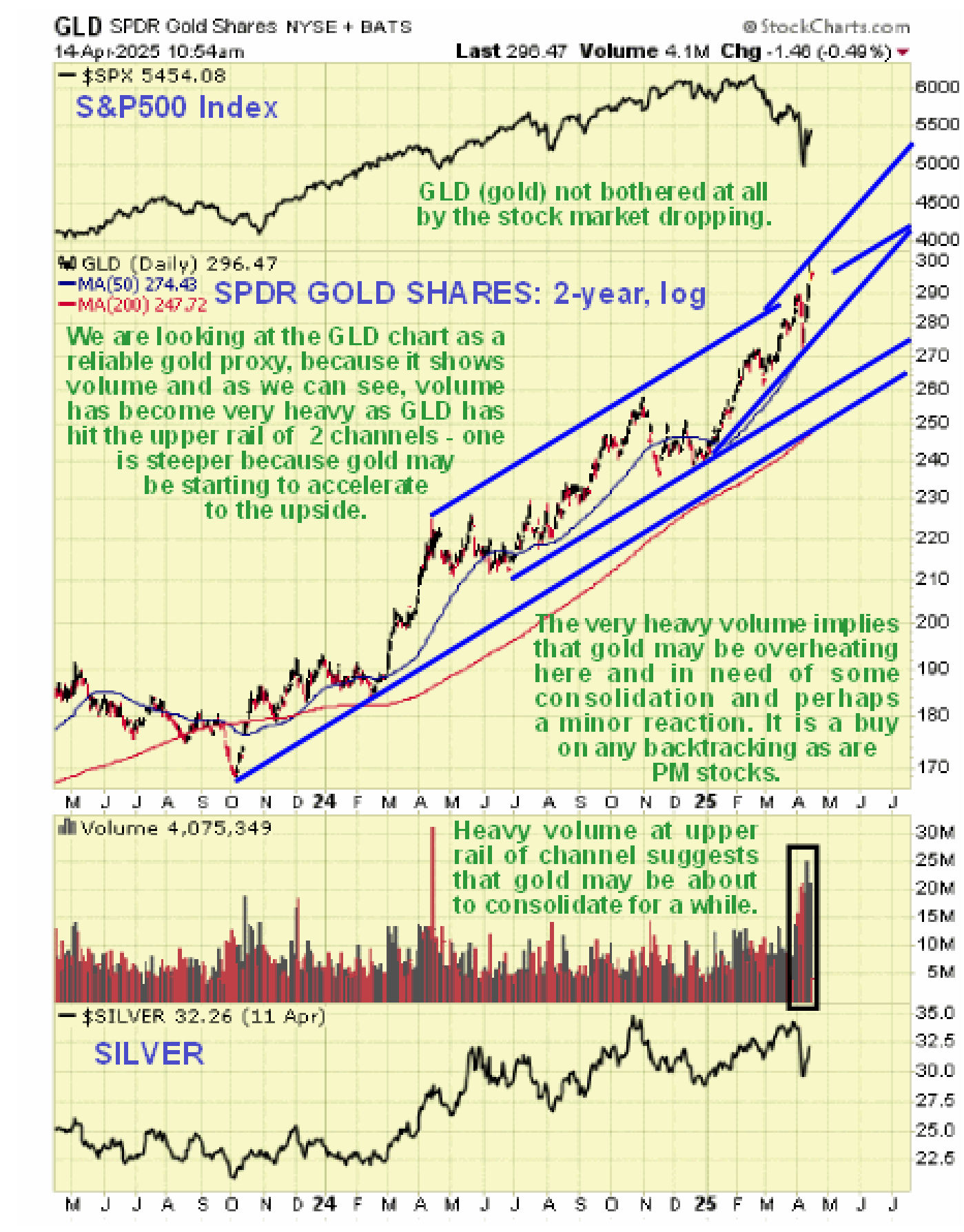
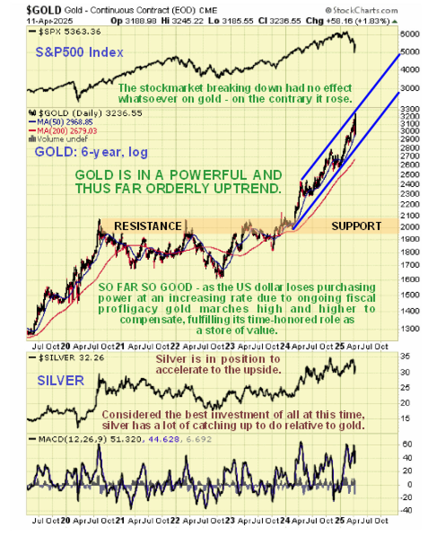
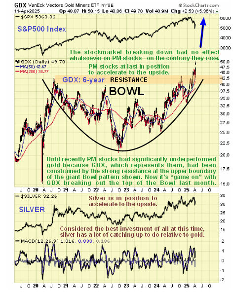
On gold’s 6-year log chart we see that it has risen to the upper rail of its orderly strong uptrend, hence this morning’s creation. So it could use a rest here, although as mentioned above, given what’s going on in the world it may get much of one and before long this uptrend could accelerate and get even steeper. It’s worth observing on this chart that gold was not bothered at all by the recent selloff in the stock market (S&P500 index is shown at the top) – on the contrary, it rose.
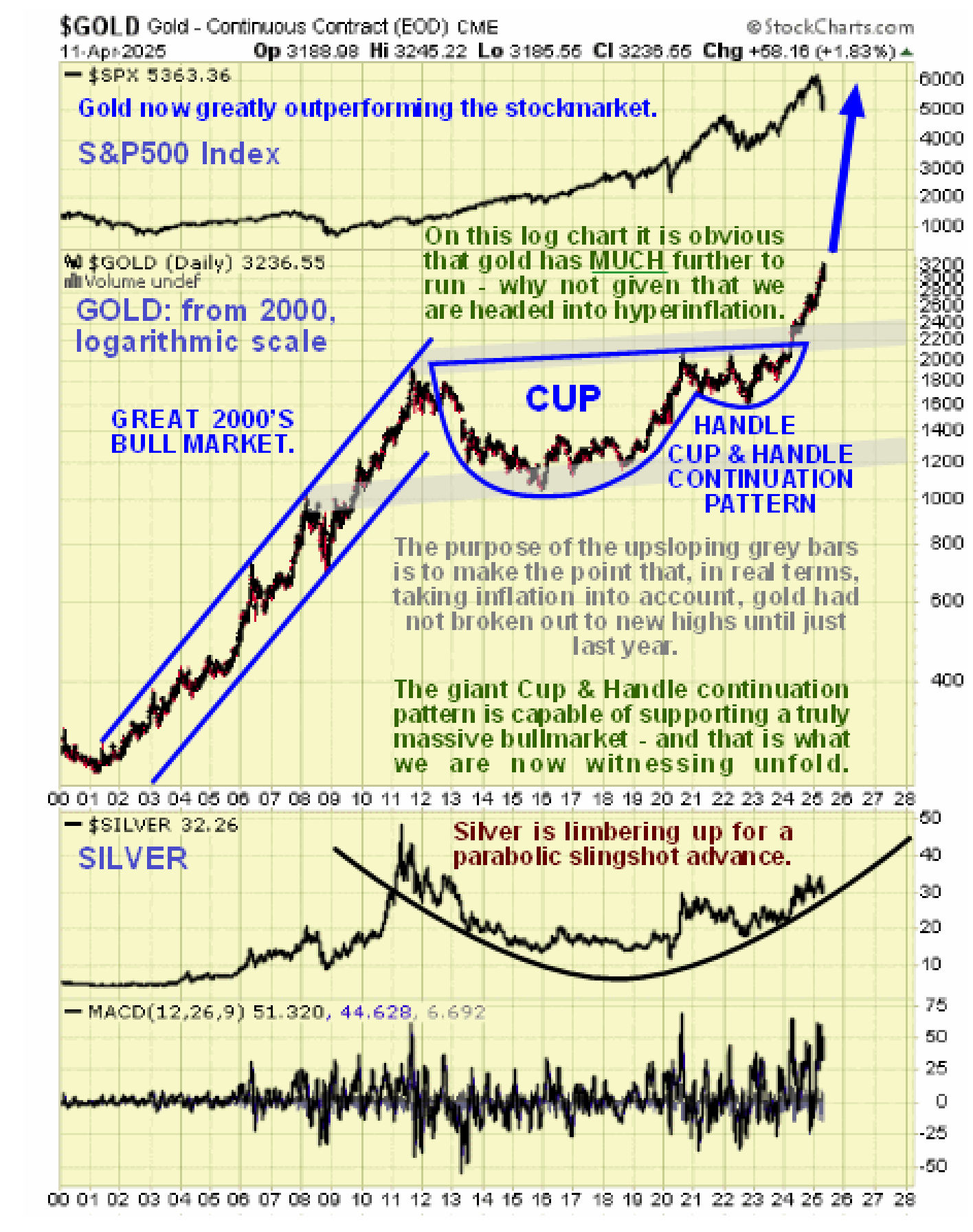
The long-term log chart going back to the start of the millenium, i.e. to the start of 2000, gives broader perspective and enables us to see that gold is advancing away in an orderly uptrend from a Cup & Handle continuation pattern that is so gigantic it can clearly support a bull market that will take it much higher than the current price.
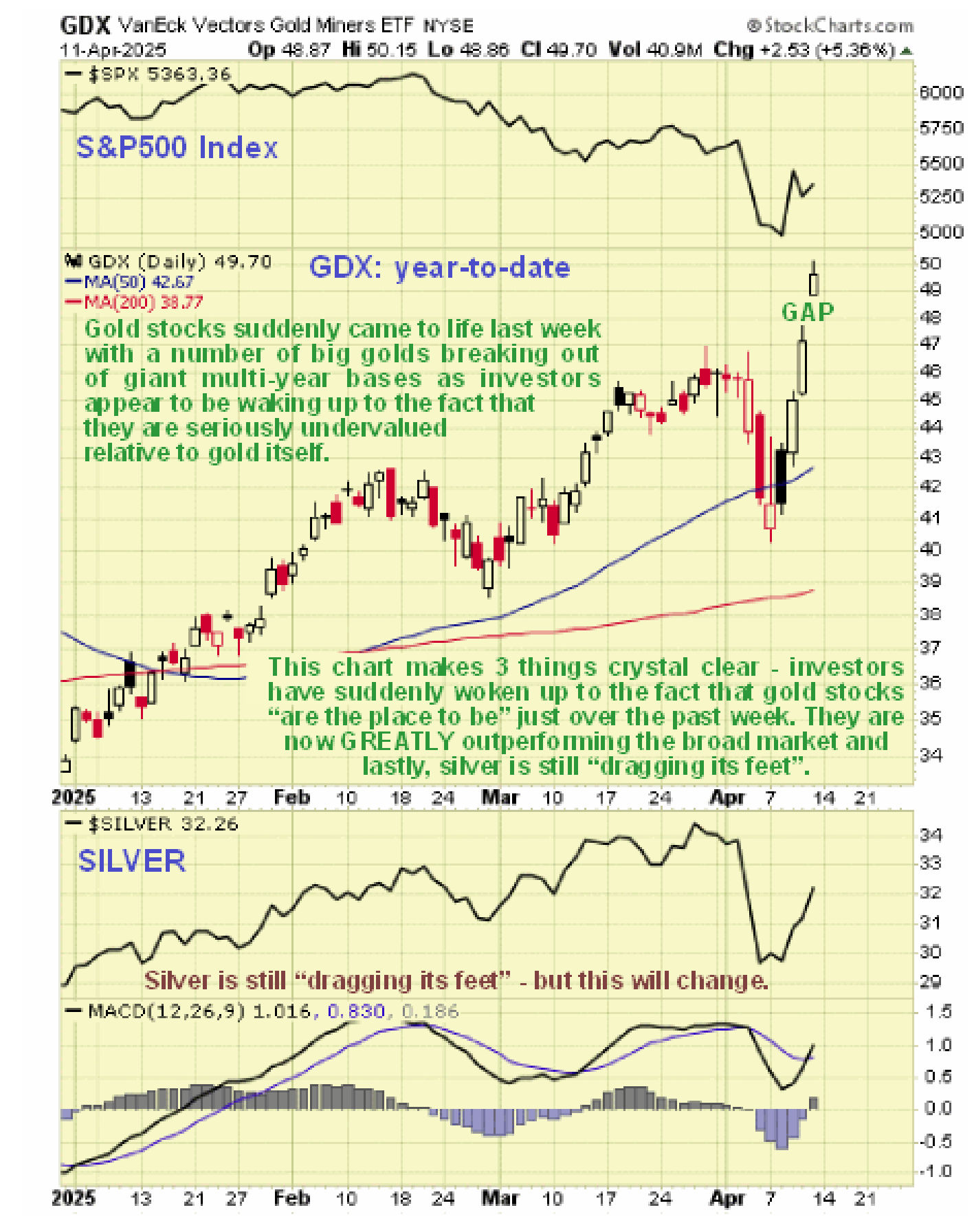
Silver meanwhile continues to “drag its feet” like an unwilling child being taken for a walk by gold and it’s remarkable to see on its 2-year chart that it is no higher than it was 11-months ago. This is actually normal early on in a growth phase for the sector and it’s what you want to see, for its a reliable sign that the sector is going much higher.
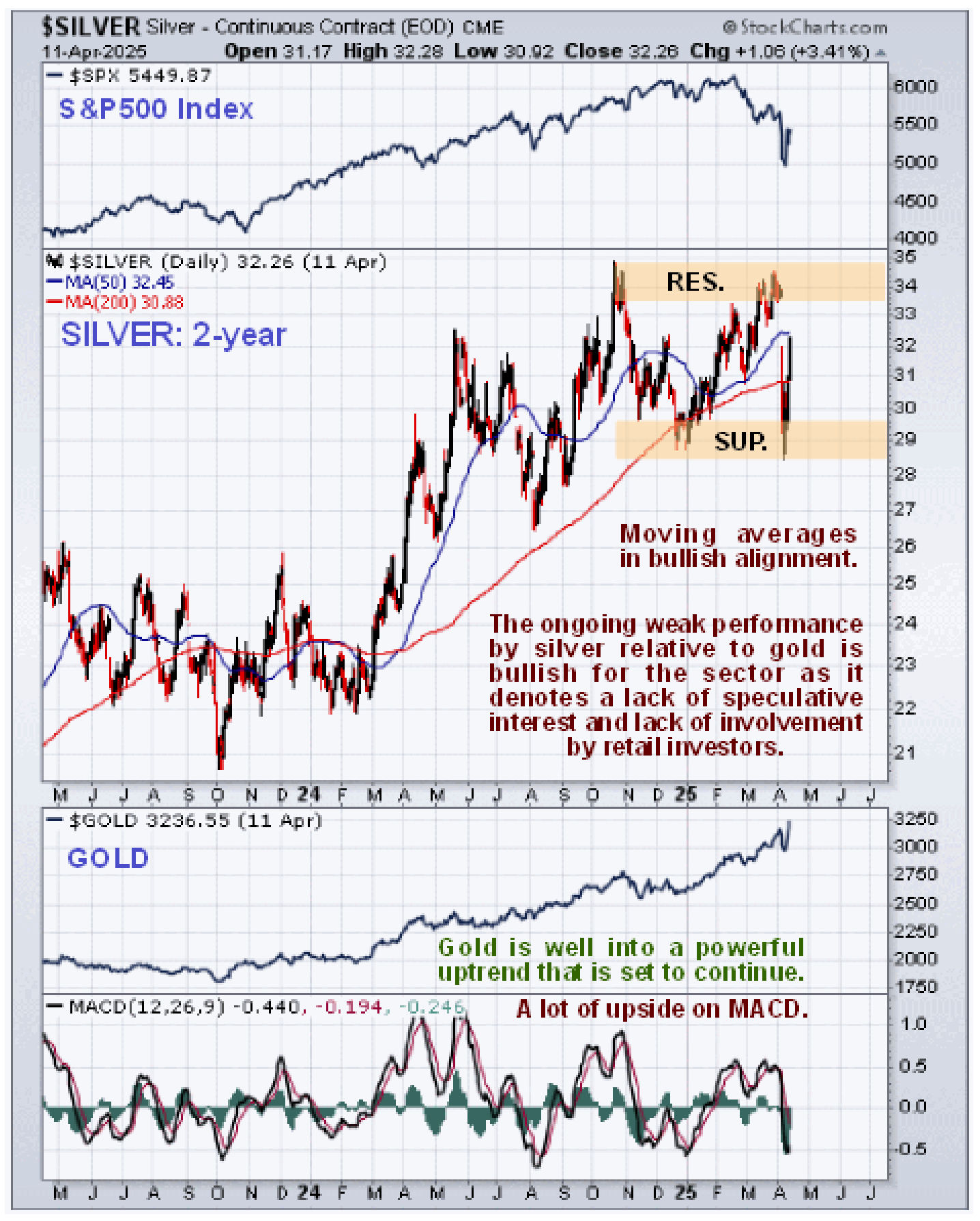
On its 7-year log chart it is again remarkable to see that silver is still only a shade higher than its mid-2020 and early 2021 highs. However it is “slowly getting with the plot” and is actually in position to slingshot higher which would certainly catch a lot of people by surprise.
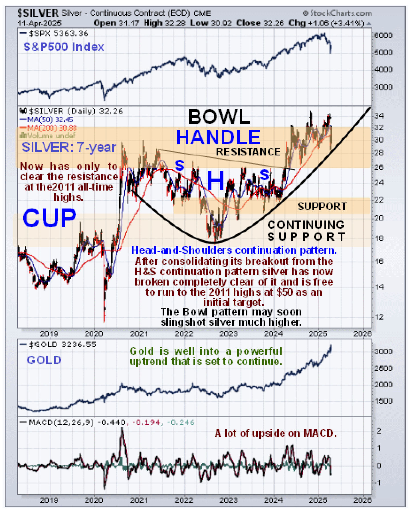
The long-term log chart going back to the start of the millenium, i.e. to the start of 2000, gives broader perspective and enables us to see that silver is just starting to advance out of a gigantic Cup & Handle base that is similar to the gigantic Cup & Handle continuation pattern that launched gold higher and a base of this magnitude can clearly support a massive bull market. So there is everything to go for with silver which is viewed as the best investment of all at this time, although gold is where the action is right now.

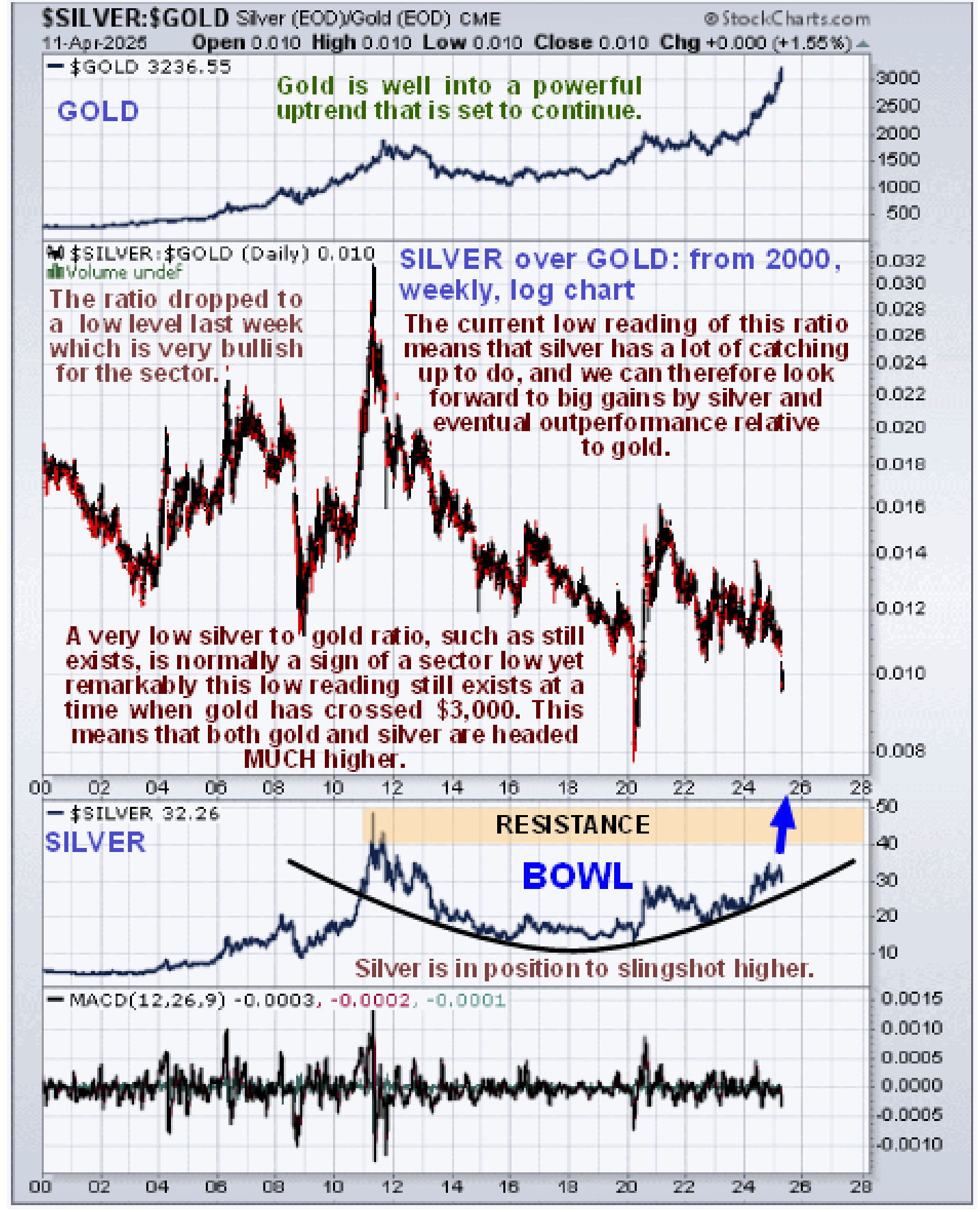
Now we will look at a couple of ratio charts and start by looking at what is probably the most important chart in this update, which is the long-term chart showing the silver to gold ratio. The rationale behind interpreting this chart is this; when there is a lot of speculative interest in the PM sector, investors favor silver over gold, because it has the capacity to make bigger percentage gains faster – this is what we saw when the sector peaked in 2011 with silver hitting $50 in the late Spring of that year and gold topping out later in the year in September which is why the silver over gold ratio hit a peak. When, on the other hand, the silver over gold ratio is at a low level it means that speculative interest in the sector is at a low ebb, investors have no interest in it, which is very bullish as it means that there is the potential for it to go much higher. This is what we saw at the ratio lows in 2003 before the sector headed much higher, at the lows of the 2008 broad market crash which dragged the PMs down with it (that won’t happen this time as we have seen in recent weeks) and at the time of the Covid Crash in the Spring of 2020 when we saw a freak low as the Goyim thought that the world was coming to an end. As we can see on this chart the ratio dropped to a very very low level just last week as gold soared and silver didn’t do much, not so far from the Covid Crash freak lows. This sort of low reading means that there remains very little retail interest in the sector – this is very bullish for the sector and for silver in particular which is regarded as a “steal” at these prices. As Mike Maloney pointed out in a recent video “I’m Saddened…Whales Are Scooping Up Gold and Silver Not the Middle Class “ Big Money is mopping up gold and silver as fast as it can while the middle class are for the most part just standing around gaping like frightened rabbits.
Now to our other ratio chart that we have been tracking for a while the ratio of gold to the S&P500 index which shows that gold’s big rise over the past year has “barely moved the needle” on the long-term chart compared to the broad US stock market against which it is still at a low historic valuation. This started to change just this year…
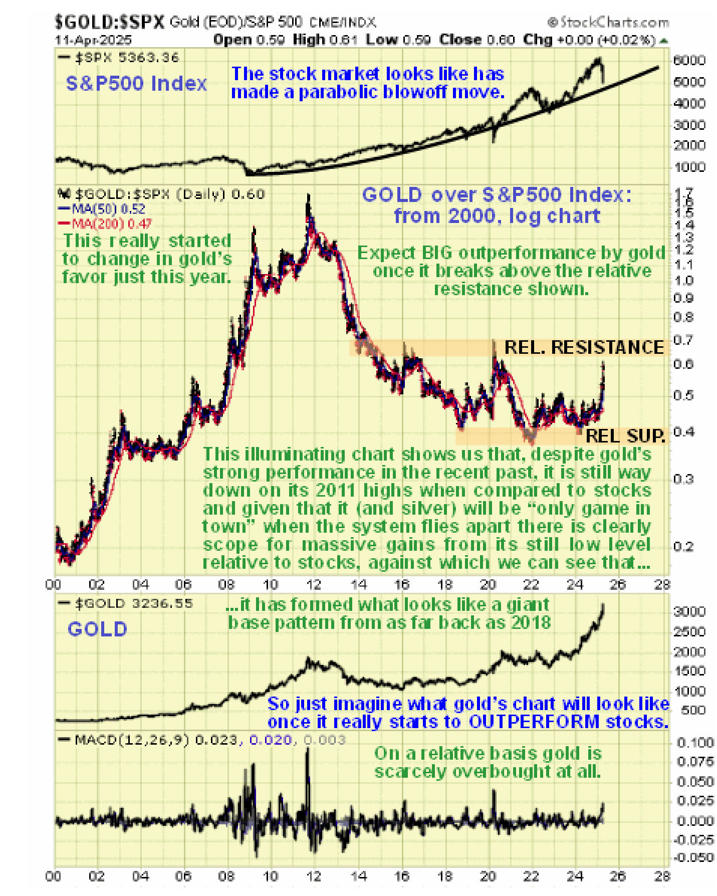
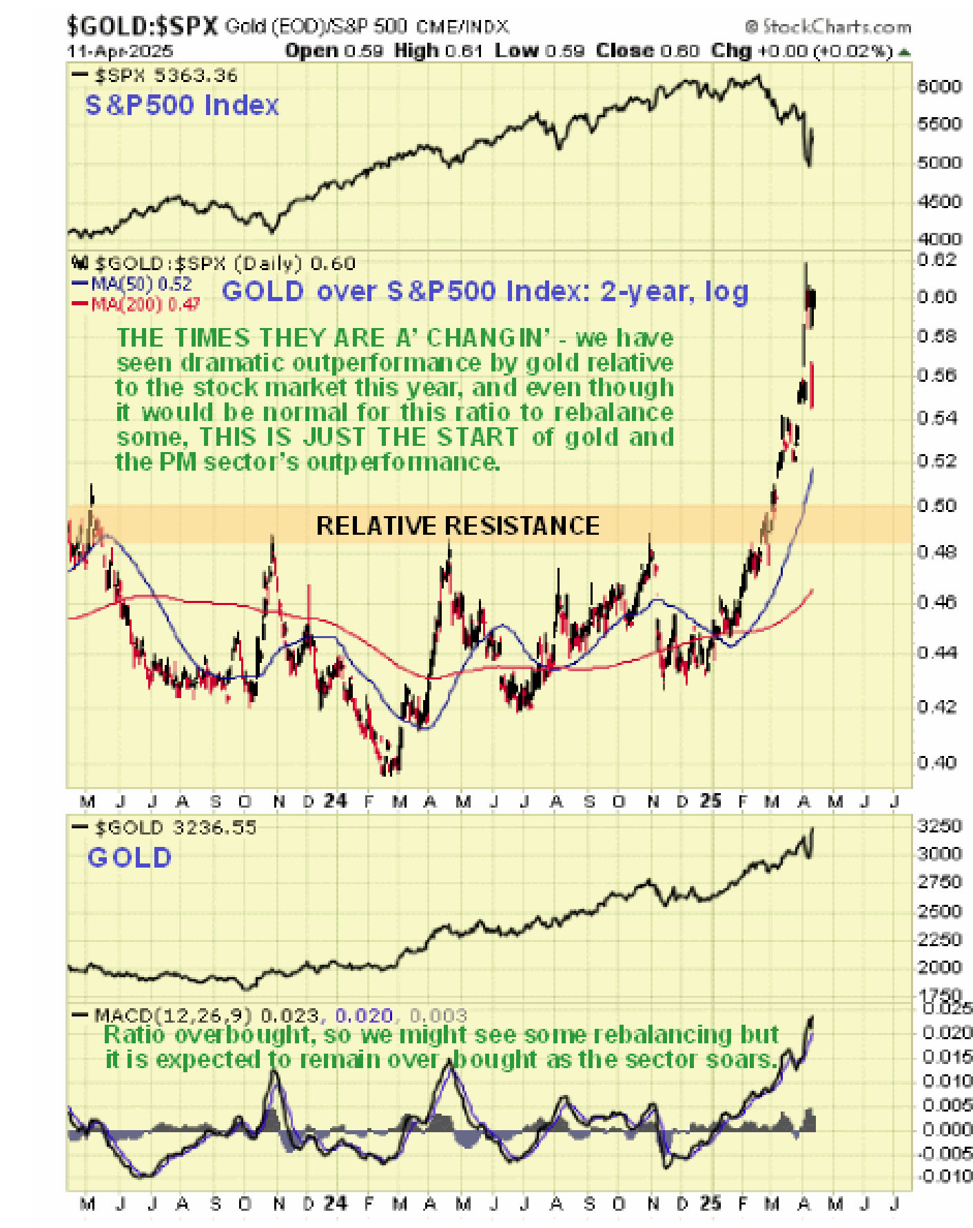
On the shorter-term 2-year chart for the ratio of gold to the S&P500 index however we can see that there has been a dramatic shift just this year in favour of gold and while there may be some rebalancing of this ratio as it is so overbought short-term, it is expected to continue to much higher levels as implied by the long-term chart above.
Now we come to the main subject of this article which is the sudden increase in interest in the Precious Metals sector, and it’s about time, considering how much gold has risen.
We can see this sudden increase in interest on the year-to-date chart for GDX on which we can observe that, after trending steadily higher from the start of this year, it suddenly zoomed higher last week in a straight up move, which was the result of a number of major breakouts by large and mid-cap gold stocks. Whilst it is clearly overbought here with the gap up on Friday suggesting temporary exhaustion and a possible reaction, the move itself has strongly bullish implications.
The 6-year chart for GDX is most illuminating as it reveals that the PM sector has only just started to advance in a serious manner following its recent breakout from a giant Bowl pattern that has been forming from mid-2020 and is only just completing now. A Bowl of this magnitude can support a major bull market and it is clear, looking at this chart, that a major bull market has only just begun and also that there is plenty of scope for the sector to accelerate away to the upside from here…
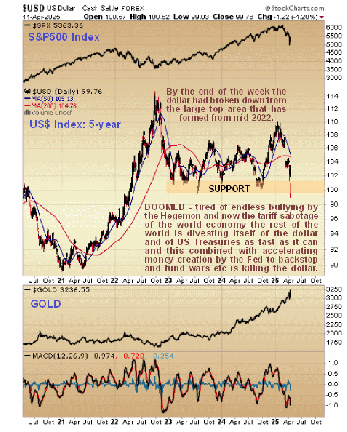
Lastly, the 5-year chart for the US dollar index shows us a big reason why the Precious Metals are likely to accelerate away to the upside. Last week the dollar broke down from a large top area and having done so is vulnerable to a severe decline. This is hardly surprising given that the rest of the world is looking to ditch the dollar after Trump’s tariff rampage of the past several weeks and bearing in mind that trillions more dollars are set to be spirited into existence to effect a massive bailout of failing hedge funds.
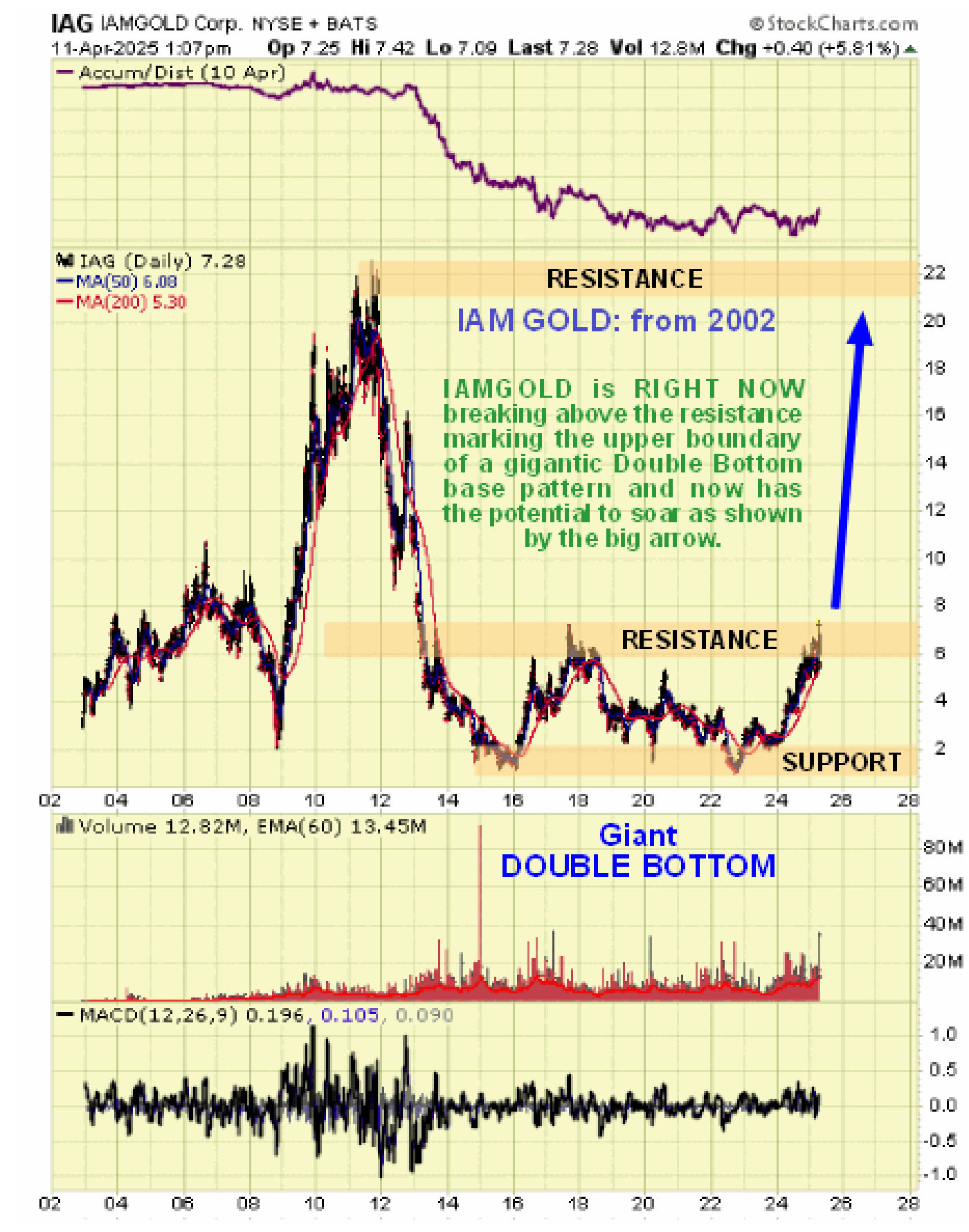
As mentioned above, one of the reasons for the strong performance by GDX last week was that several gold stocks are breaking out of giant base patterns. An example is IAMGOLD which was recommended for purchase on the site in February at $6.24. Here is the chart for IAMGOLD posted on the site last Friday showing how it is on the point of breaking out of the top of a giant Double Bottom base pattern and once it succeeds in breaking clear out of it, it should rise very rapidly as indicated and of course many large golds will probably do likewise. If we do see it slip back into pattern on a minor sector reaction it will provide an excuse to buy more.
So, in conclusion, it looks like we are still in the early stages of what should prove to be an epochal bull market for the Precious Metals sector, that could dwarf all previous ones.
---
Clive Maund is an English technical analyst, holding a diploma from the Society of Technical Analysts, Cambridge and lives in The Lake District, Chile.
Visit his subscription website at clivemaund.com .[You can subscribe here].
Clivemaund.com is dedicated to serious investors and traders in the precious metals and energy sectors. I offer my no nonsense, premium analysis to subscribers. Our project is 100% subscriber supported. We take no advertising or incentives from the companies we cover. If you are serious about making some real profits, this site is for you! Happy trading.
********

Clive P. Maund’s interest in markets started when, as an aimless youth searching for direction in his mid-20’s, he inherited some money. Unfortunately it was not enough to live a utopian lifestyle as a playboy or retire very young. Therefore on the advice of his brother, he bought a load of British Petroleum stock, which promptly went up 20% in the space of a few weeks. Clive sold them at the top…which really fired his imagination. The prospect of being able to buy securities and sell them later at a higher price, and make money for doing little or no work was most attractive – and so the quest began, especially as he had been further stoked up by watching from the sidelines with a mixture of fascination and envy as fortunes were made in the roaring gold and silver bull market of the late 70’s.
Clive furthered his education in Technical Analysis or charting by ordering various good books from the US and by applying what he learned at work on an everyday basis. He also obtained the UK Society of Technical Analysts’ Diploma.
The years following 2005 saw the boom phase of the Gold and Silver bull market, until they peaked in late 2011. While there is ongoing debate about whether that was the final high, it is not believed to be because of the continuing global debasement of fiat currency. The bear market since 2011 is viewed as being very similar to the 2-year reaction in the mid-70’s, which was preceded by a powerful advance and was followed by a gigantic parabolic price ramp. Moreover, Precious Metals should come back into their own when the various asset bubbles elsewhere burst, which looks set to happen anytime soon.
Visit Clive at his website: CliveMaund.com


