Step Sum Review And Market Update
This past week was unusual as the stock market was under pressure, especially the bank stocks, while the price of gold and silver reversed their declines late in the week! More comments on this in my market update section below.
Since my article of 26 March 2012, I've frequently published a chart for the price of gold with its step sum. From this chart I predicted two months ago our current collapse in the price of gold and silver. This is a very important chart for us to follow, as we can expect this chart to provide a strong and unambiguous all-clear signal for entry back into the gold and silver markets. I don't want to lose any of my readers in the weeks and months to come, so I'm doing one of my occasional refreshers on one of my unique technical indicators: the step sum. You won't see step-sum analysis anywhere else but here, so I need to do this every now and then.
What is a step sum? It's a * MARKET SENTIMENT * indicator that's easy to construct and follow, as it's a simple single item Advance - Decline line, derived from the daily price changes in a market series, such as the price of a commodity or market index. I've only used daily data for my step sum studies, but I see no reason why it wouldn't work using hourly or weekly data. The step sum provides an insight into the emotional state of the only people who actually matter in the markets, those who actively buy and sell on a daily basis. If you're not a frequent daily trader or institutional money manager, the step sum doesn't know you exist, or cares what you think.
Each day, the price of an investment can do one of three things:
- Go up
- Go down
- Go unchanged (rarely)
I convert every up day to a +1, down days become a -1. I then total all the up and down days to construct my step sum. So, when a step sum is rising, it tells us that the price series is seeing more up days than down and that the market's sentiment is bullish, and vice versa for a declining step sum. The actual value of the step sum is meaningless. In the table below, from 01 Feb to 17 May 2012, the step sum moved from +1 to -5. But a move in a step sum from 1001 to 995, during the same time period, would contain the identical information; a net decline of 6 trading days. Here is a table illustrating how a step sum is constructed.
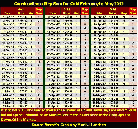
Note in the table above, that as the price of gold oscillated from $1784 (Feb 23) to $1634 (May 03) as the step sum itself changed very little. It wasn't until May 07 (as I see it) that the step sum broke out of its three month range, when the gold bulls finally accepted that the next major trend in the price of gold would be down.
So how does this look in a chart? Well, like the step sum (Red Plot) in the bear box below on the far right. In some of the charts to follow in this article, it's obvious that trends in a price series and its step sum usually trend together for years at a time. During the 1950s & 60s one finds few step sum boxes in the Dow Jones, as markets decades ago were essentially very boring compared to the emotional rollercoasters we now consider normal market action today; for instance, the gold market since August 2011. The step sum boxes below indicate that the gold market for the last year, if we include the failed bear box, has been an emotional market. The gold bulls (for good reasons) are having a hard-time accepting the post August bearish trend for the price of gold.
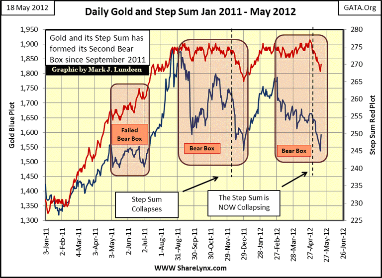
Friday 18 May Comment: Gold and its step sum had two good days, but two days do not make a reversal in a trend. I mentioned that the step sum will provide us with a clear and unambiguous entry signal; look at these two bear boxes; see the sharp upturn in both the trends in gold's price and its step sum? That is the signal, but a +2 increase in the step sum is too little information for me to call the turn, and then like all technical indicators, the step sum reversal indicators sometimes fail us, but they are usually very dependable. Just understand that we are only reading the market's tea leaves, not the script for future trends. But If gold (and its step sum) continue rising next week, we * may * have seen the lows of the move. But in any case, if you are going to buy metal, I think these prices are attractive, even if a month from now gold is lower.
Due to Europe's and American banking problems, and the inevitable inflationary response (QE to Infinity) by the West's central bankers to protect their financial systems, the potential gains for gold and silver are huge for the next year. Personally, I suspect we will still see lower prices before this current downturn is complete. Heck, we haven't even seen the COMEX raise margin requirements for the precious metals spec longs yet! If gold and silver continue to rise, you can count on that happening one more time! And for that reason, and others, I'm not turning into a roaring gold and silver bull just yet.
For most markets there are those unusual periods when the step sum's trend (market sentiment) diverges from its price, which forms a box in step-sum analysis. Boxes begin as the price and step sum trends diverge, and terminate when the step sum's trend reverses to once again follow the price trend: never the other way around! Whether a box is bull or bear is determined by the price trend. For example, the boxes above are bear boxes, because the price of gold began trending down, as their step sums (market sentiment) refused to accept the fact that the price of gold was trending downward.
I'm not quick in calling for a box in a market I'm following. But I monitor divergences in trends closely. Divergences of only a few weeks are suspect. But if a two week divergence develops into divergence of two months or more, a box is formed. Importantly, the longer a box continues, the more likely it will break as expected with an unmistakable reversal in the step sum's trend toward the price trend. Typically, when a box terminates with the reversal of its step sum, the price trend experiences a buying or selling climax that can last weeks or maybe months.
Occasionally, boxes fail, as we see in the chart above in my failed-bear box, where the step sum (bullish market sentiment) proved correct, forcing the bearish price trend to break bullishly upwards toward its step sum. It happens. To keep my charts clean of clutter, I usually don't highlight failed boxes. For example, the failed bear box in my next chart between the two purple markers that I left unmarked.
Let's look at another emotionally charged market: financial companies as measured by the NYSE Financial Index from the credit crisis lows to this week. Starting from the left of the chart I highlighted two interesting features. By the credit crisis low of 09 March 2009, the NYSE Financial index had declined 79% from its housing bubble top. Nothing like this has been seen in such a major market sector since the Great Depression! After a decline like that, bank-stock investors had battered-bull syndrome. But now look at my first purple highlighted box. From the ashes of this ruin, one of the most remarkable recoveries in the history of the stock market occurred as market sentiment (as measured by the step sum) "bearly" moved.
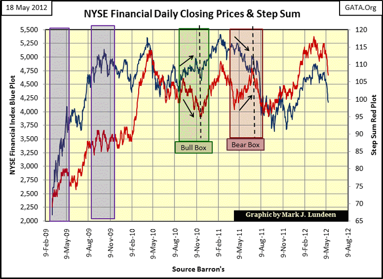
Friday 18 May Comment: The NYSE Financial Index is in deep trouble, and the step sum is telling us that the market knows it. We may see panic selling of the financial shares in the weeks to come. No guarantees as I can't see into the future. I'm just looking at the chart and keeping current on what is happening in the European financial system. And contrary to popular belief, fostered by CNBC, Europe's banks * ARE * joined at the hip to the US Banking system. If not, why were major European banks on the Federal Reserve's list for the secret $16 trillion "liquidity Injection" during the credit crisis? Or the more recent large dollar swap deal between the ECB and the Fed?
Let's look at the specifics in the table below. Amazingly, during a period of only forty-four trading days, the NYSE Financial Index gained almost two thousand points, or 94% on only * TEN NET UP-DAYS * from March 09 to May 08, 2009! I suspect nothing similar has happened in the history of the American stock market. But we should keep in mind that the US Treasury and Federal Reserve were dumping tens of trillions of dollars into their favorite stock sectors during this time. If they hadn't many of these stocks would've had their Lehman's moments, and continued going down toward zero by May 2009.

Be-that-as-it-may, you can be sure only a handful of intrepid traders benefitted from this historic market event, most likely traders employed by these same financial companies; financial companies who were fully aware of the government's massive efforts to save their to-big-to-fail banks. Me, I didn't turn bullish again until a few weeks after May 8th, and I wasn't looking at financial companies. Three years ago, I just couldn't fathom these radioactive stocks gaining 94% in just two months. Now as then, there is no good reason to invest money in financial companies other than the US Government's obvious commitment to prop up these failed institutions up using your tax dollars.
Let's now examine what happened after my second purple highlight box. The step sum (market sentiment) was extremely bullish in early 2010, as is typically the case near a market top. But the bullish expectations of the market were not rewarded with significant gains in the NYSE Financial index.

The point of these examples is that the price trend is * ALWAYS * more important than market sentiment (as measured by the step sum). So why bother with a price series step sum? Well, during those times when the price and step sum trends are tracking together, it most likely isn't critical; though it's always nice having an independent method to confirm a price trend. But in an emotionally charged market, where traders' hopes and fears can overwhelm the reality of what the market's price is actually doing, keeping a step-sum plot can occasionally provide a market insight that is unique, as we see in the NYSE's bull and bear boxes above.
I think it's notable that the actual February 2011 top in the NYSE Financial index was propelled upwards by the termination of a step-sum bull box. And what a picture perfect bull box it was too! Take a moment and study the green bull box in the chart above. For over three months, the price trend of the NYSE Financial index climbed upwards, as market sentiment (the step sum) RAN the other way. By early November 2010, the step sum's trend turned around sharply, telling us that after a full three months of losing money, short-side speculators finally got the message that the NYSE Financial index was going to a new post credit crisis high. The bears then dumped their shorts, and going long, gave the NYSE Financial index a nice boost up to its ultimate post credit-crisis high.
When they form, step-sum boxes are a wonderful technical tool that uses the investments' own daily closing prices. In the bull box above, seeing market sentiment decline as the valuation of the NYSE Financial index strongly increased for a few months, was a gift to the bulls from the Grand Wazoo of the market.
The NYSE Financials' step sum bear box that followed was beautiful, too! The step sum steadily increased for two months (more up days than down) as the valuation of the NYSE Financial index fell in a serious decline. Again, market sentiment was wrong, as it usually is in a step-sum box. In July, the step sum collapsed, falling in-line with the price trend. Note that just days after the step sum collapsed, the NYSE Financial index saw a significant decline as the stubborn bulls became remorseful bears, shifting the focus of their portfolios from bullish to bearish.
Since August of 2011, the NYSE Financial index's step sum has fallen in line with its price trend, indicating that market sentiment hasn't strayed far from the changing price trends. So, we now go on to my next few charts, with significantly less text from me to describe the market action.
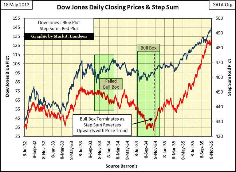
Shortly after the Dow Jones traumatic 89% decline (September 1929 - July 1932), surviving traders were in a state of shock, so it's expected to see a step sum box form somewhere in the early 1930s. From July 1932 to 1933, almost exactly a year, the Dow Jones saw its best one year gain in history: 163%! After the traumatic 1929-32 crash, the impulse to take the money and run must have been tremendous, and the desire to do so is easily seen in the step sum from July 1933 to November 1934.
We see a failed bull box forming, which failed after the Dow Jones exceeded the highs of July 1933. Post Great-Depression Crash sentiment proved to be correct, that such a happy event couldn't last, at least not yet. Then in July 1934, the price of the Dow Jones stopped going down, and began trending sideways as its step sum continued collapsing to its lows of July 1932; a bull box formed, and this one didn't fail. True, when the bull box terminated, the Dow's valuation didn't receive its expected boost as market bears reversed their positions from short to long. But the step sum tells an interesting story; after the bull box terminated, stock traders could finally put the trauma of the Great Depression behind them, and once again believe that stocks could go higher without the fear of the Earth opening up beneath the floor of the NYSE. In the bull box below, note the strong and unambiguous buy signal, when the Dow's Step Sum trend reversed to fall in-line with the Dow's rising-price trend.
Next is a Bear's Eye View chart for gold and its step sum from 1969-2012. It has a humongous six-year long bear box from 1989-95, proving that gold bugs are stubborn if nothing else! From 1980 to 1995, market sentiment in the gold market remained basically unchanged no matter what happened to the price of gold. But by mid-1995, there was just too much money to be made in the high-tech shares for even gold bugs to ignore. Gold's step sum collapsed, taking the price of gold down with it for an incredible six years!
After this twelve year performance by gold and its step sum, a performance I have never seen in any other market, I have to say that the May 2001 bottom in the gold market has to be one of the hardest, most over-sold bottoms ever seen in any market. Look at gold's step sum, since its 2001 bottom; gold bulls have believed they are ten-foot tall and bullet proof. And for the past decade they have been! Since 2001, each year-end price for gold has ended higher than its previous year's year-end price, and I expect this will be true for 2012, and 2013 too.
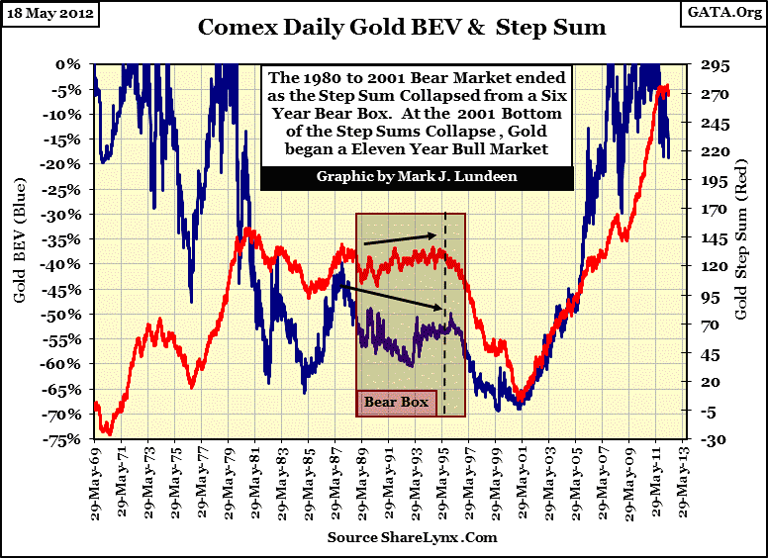
Concluding this update; remember the step sum is a sentiment indicator of the only people who matter in a market; the people who actually buy and sell on a daily basis. Gold's step sum cares nothing about the opinions of billionaire buffoons, such as Charlie Munger, who believes "only jerks" or 1930's era holocaust victims buy gold. Gold's step sum also ignores stunningly beautiful financial reporters who never get around to asking someone like Jamie Dimon of JP Morgan a proper question concerning their 70 trillion dollar OTC derivative exposure, or their activities in the paper silver markets.
I can feel the liquidity draining from the stock market. What does that mean? Simple; investors who hold overnight positions in the stock market may believe they are keeping their "money" in the stock market overnight, but the NYSE is not a bank that holds money for clients. The NYSE and NASDAQ are only exchanges where buyers and sellers buy and sell stocks during trading hours. Okay, so where is all the money kept after hours? It's in the cash accounts of institutional money managers, hedge funds, and day traders, who may, or may not show up when trading begins again on the next day. When "liquidity" begins draining from the market, it means that these people go on a buyers strike. Sometimes the Federal Reserve, and their cronies come into the market to support "market stability" with inflationary financing from Doctor Bernanke. But in times of market distress, even they step back and wait for the market to become oversold before they begin their inflationary support of market valuations. And since the market top of 2000 (twelve years) they have continually "supported market valuations."
We can see the truth in this in the trading volume for the Dow Jones Total Market Groups (DJTMG) below. Over a century ago, Charles Dow noted that bull markets see an expansion of trading volume as more people enter the markets to trade, bear markets see a decline of trading volume as people close what is left of their cash accounts, and swear off trading stocks. For one hundred years we could observe this correlation in volume and price trends until 2000, when this century long pattern was turned on its head because "policy makers" began "stabilizing valuations" in the stock market.
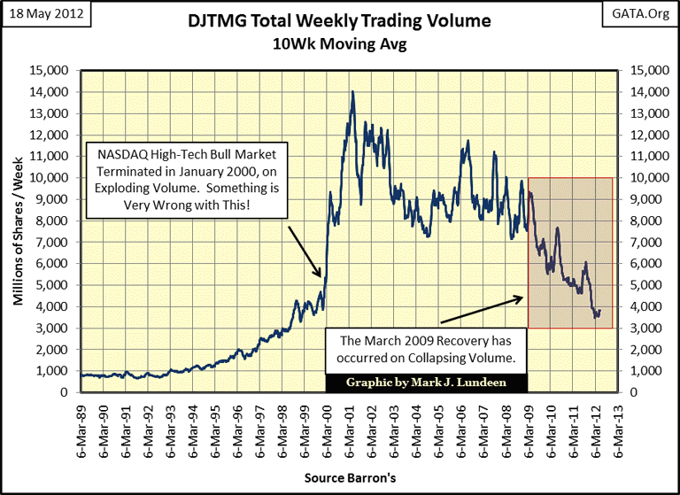
If Charles Dow looked at this chart, he would have guessed that the high-tech market top occurred sometime in 2001-02, and he would have been wrong. In fact, from its 2000 top to its 2002 bottom, the NASDAQ Composite index crashed 87.5% as trading volume exploded above, and the Dow Jones declined by 38%, which is huge by historical standards. Since 1885, the Dow Jones has only declined by 40%, (or more) nine times. The Dow's 2002 bottom just missed increasing this list to ten. And look at trading volume for the post credit crisis recovery; it has declined by almost 60%! I want nothing to do with this contrived mess, and I suspect it won't be long before many institutional money managers and hedge funds agree with me, taking stock investors and day traders' "money" with them.
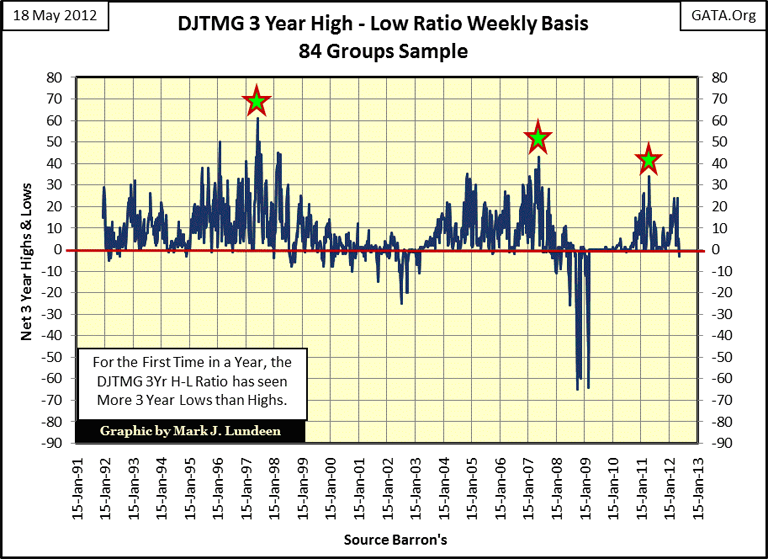
I follow the NYSE's 52Wk H-L ratio daily, but I also compute a 3Yr H-L Ratio for the Dow Jones Total Market Group (DJTMG). Since 1992, we've seen three positive waves, with each succeeding wave weaker than the last. In my opinion, this is not a good sign for stock investors in May 2012. Also this week, we saw a -3 in the ratio. This is the first negative reading we've seen in the past year. And to tell you the truth, it's strange seeing a * 3 Year Low * for any major stock market index, IN A BULL MARKET that is. If the stock market is entering a period of distress, and I believe it is, we'll see an expansion of major indexes declining to new 3 Yr. Lows.
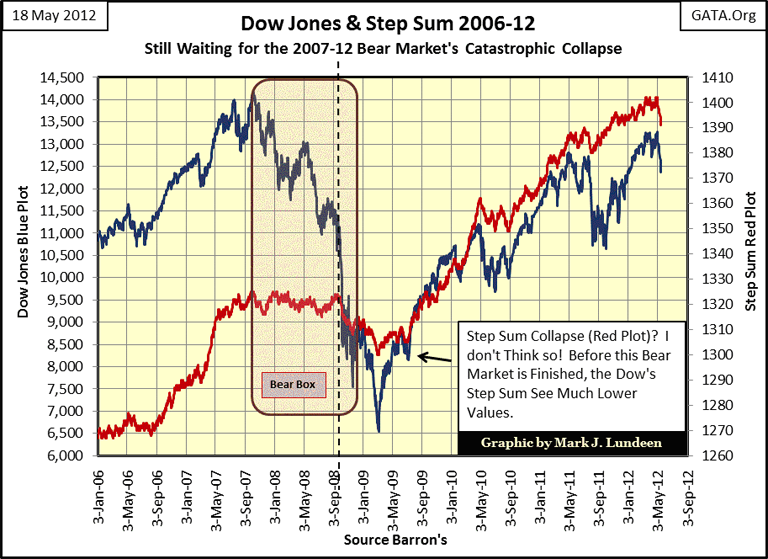
This chart of the Dow with its step sum doesn't look good either. I'm still waiting for the 2007-20?? Bear Market catastrophic collapse in the Dow's step sum. Is this the beginnings of it?
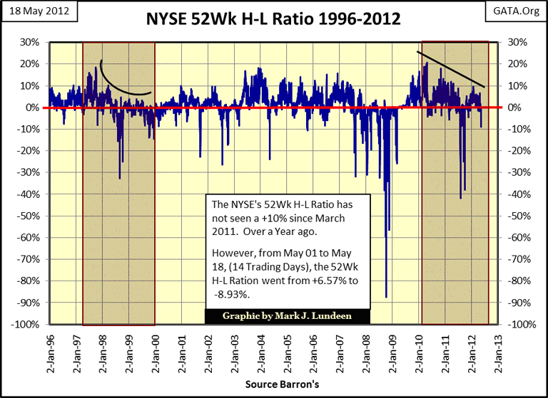
The NYSE 52Wk H-L Ratio broke down this week. It hasn't seen a +10% for over a year, but saw a -8.93 today (Friday). The thing to note about the chart below is how the NYSE 52Wk H-L Ratio collapsed from 1997-2000, as the Dow Jones and NASDAQ went on to new all-time highs. On the day the Dow Jones saw its ultimate high the 1982-2000 bull market (14 January 2000), of the 3517 NYSE listings trading that day, only 121 made new 52Wk Highs, while 58 made new 52 Wk Lows. The Dow Jones can get really lonely at the top of a bull market. The same can be true at the top of a major dead-cat bounce, such as we've seen in the Dow Jones since March 2009. Remember, the Dow's highs of October 2007 still stand.
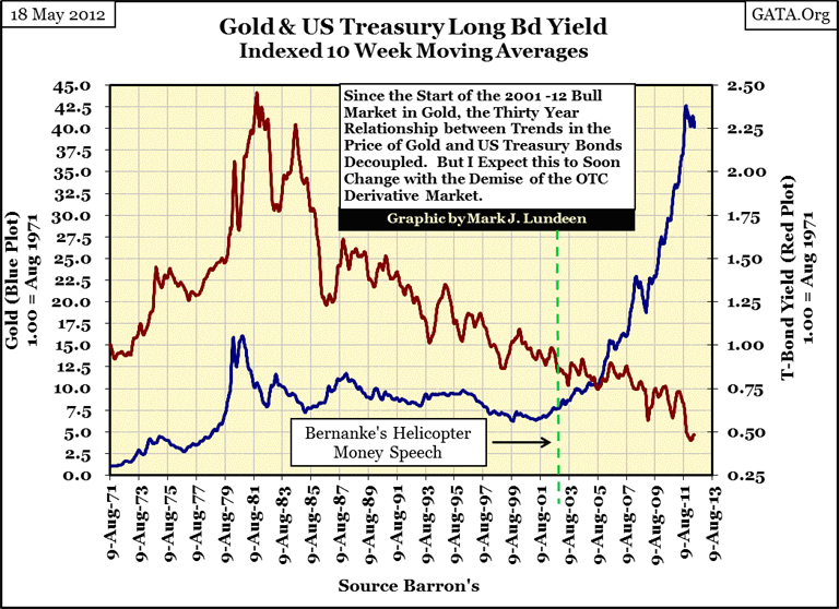
My last chart plots the indexed ten week moving average for the yield of the US long bond and the price of gold. Up to about the occasion of Doctor Bernanke's Helicopter Money speech, there was a relationship between the trends of gold and long-term bond yields. Afterwards, the price of gold accelerated upwards as bond yields collapsed. Someone is wrong here, and I don't think it's the people investing in gold and silver.
As gold has gone far above its highs of the early 1980s, I expect that ultimately so will yields on the US Long Bond. There is nothing that can stop this from happening. Since November 2008, Washington has had annual trillion dollar PLUS budget deficits, flooding the bond market with more bonds than anyone actually cares to purchase. The Federal Reserve is now the largest purchaser at Treasury bond auctions, or so we are told. When I actually look at the published data by the Fed for their US Treasury purchases, and the increases in the national debt, this doesn't seem to be exactly correct. But I keep in mind that the neither the Fed or the US Government books are open to an actual audit, so I'm inclined to believe the worst when I read about anything financial concerning the Federal Reserve or Washington. Heck, the Congress hasn't passed a budget for the president to sign for the past three years. Only a foolwould lend money to people like this, or believe that gold and silver are going up for no good reason.
In conclusion, this week seems to be a tipping point in the markets. Maybe the financial markets will begin a prolonged, and much deserved decline, and then maybe not. This is an election year. So, one thing we do know for sure; should the markets begin to plunge, telephones all over Washington and New York will start ringing, with angry voices on the other end demanding to know what in the hell is being done about it. Yep, the future prices for the old monetary metals have only one way to go, and that is up.
[email protected]


