Timing the Market with NYSE 52Wk Highs and Lows


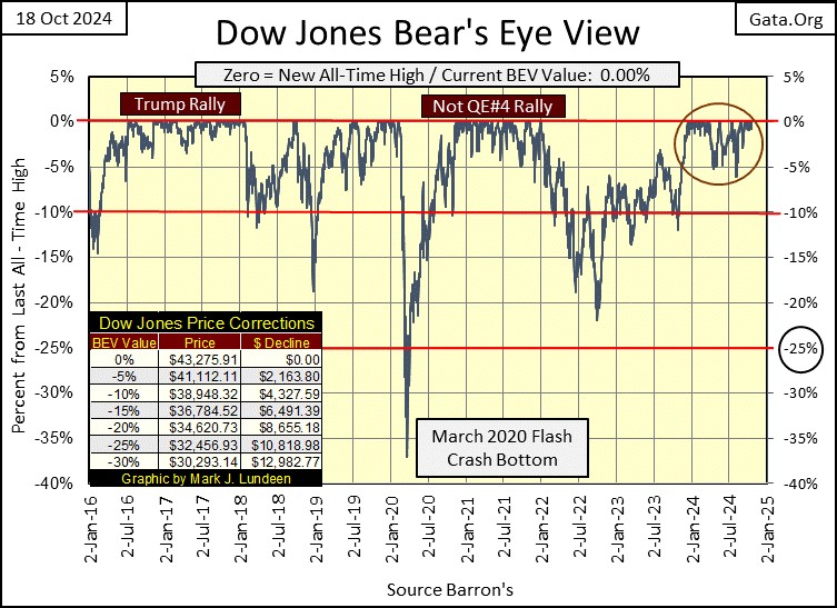
In its Bear’s Eye View (BEV) chart below, the Dow Jones is looking darn exciting, or as exciting as a BEV chart can display a mighty-market advance. This chart is a record of the Dow Jones from January 2016 to this week’s close; from 15,766 to 43,275, an advance of 174% for the Dow Jones, not that it looks anything like that in the BEV chart below.
But the Bear’s Eye View displays the market as Mr Bear sees it; in terms of new all-time highs (0.0% = BEV Zeros), and percentage claw-backs from those new all-time highs. Each new all-time high since January 2016, seen below, were clipped at 0.0%, and never more.
The excitement comes from seeing these BEV Zeros forming a cluster on the Red 0.0% line. Since last November when the Dow Jones entered “scoring position” on November 20th (daily closings between the -5% and 0.0% lines) the Dow Jones has compiled forty-seven new all-time highs, advancing the Dow Jones by 23.11% in the past eleven months. A damn fine market advance for thirty old fuddy duddy, dividend yielding blue-chip stocks.
Below is a look at the Dow Jones in dollars (Black Plot), with its 52Wk High and Low lines (Blue & Red Plots), providing a more traditional view of the Dow Jones since 2016. Since 2016, the Dow Jones has pushed down its 52Wk Low line only three times in the past eight years. But note, since the Dow Jones entered scoring position last November, pushing up on its 52Wk High line has become a matter of habit for the Dow Jones, for each of its forty-seven new all-time highs.
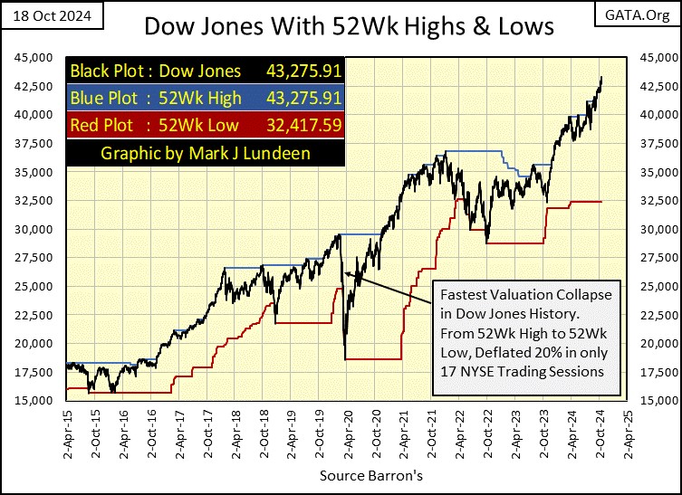
Looking at the values for the 52Wk High and Low lines at the close of this week, there is a gap of 10,858 dollars between them. That seems like a lot. As this advance matures, how much larger will this gap grow?
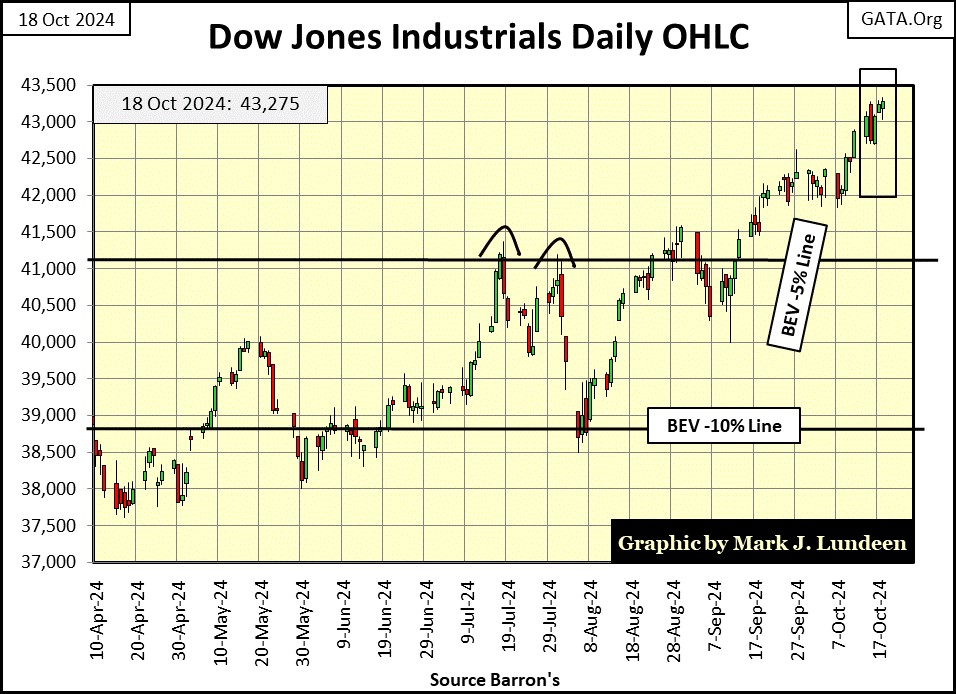
Lastly, there is my chart for the Dow Jones in daily bars below. The BEV -5% line (41,112) is based upon the Dow Jones’ last all-time high, which this week was Friday’s close of 43,275. So, why did I extend this line across the chart, back to last April, when the BEV -5% line was only 37,817? Okay, I’ll tell you; I don’t need to, but this line visually looks good spanning across the chart below, so there it is. Same goes for the BEV -10% line.
The thing to understand about my placing the Dow Jones’ BEV -5% and -10% lines on the daily bar chart below, is these lines provide guidelines of what to do as this advance matures. As long as the Dow Jones is daily closing above its BEV -5% line, the Dow Jones remains in scoring position, so we should assume additional new all-time highs are pending. When the Dow Jones breaks below its BEV -10% line below, it’s time to exit this market by locking in some profits made during this advance by selling, and not be in a big hurry to return.
Get real here! Every time an investor buys something, they are fated to sell what they bought sometime in the future. But when should an investor sell;
- during a market advance, when selling produces profits?
- or during a market decline, when selling results in losses on invested funds?
I’m not your boss, the choice is yours. I have to say, I personally favor selling during a market advance. Though being honest with you, there were times, more times than I am willing to admit, I did sell during a market decline, and I did not enjoy the experience one bit. But that’s just me.
Okay, sell during a market advance is best – got it. But how much further can this market advance? I haven’t a clue, because what is driving this market ever higher is the “liquidity” being “injected” into it by a bunch of idiots dictating “monetary policy” at the FOMC, as seen in my chart of CinC below.
CinC is the volume of paper dollars in circulation, and back in 1920, the volume of paper money was about the same as the gold coins in circulation. That is because in 1920, anyone with a paper $20 bill could go to a bank, and demand it be exchanged with a $20 double eagle, gold coin. This was called convertibility. This ability for dollar holders to convert their paper dollars, into gold dollars, prevented the US Government from over issuing paper money, aka monetary inflation.
In 1920, the law said the $20 was the gold coin. The paper-money bill was a $20 bill (a debt) on the US Treasury, payable with a $20 gold coin. This was true for all paper money dominations. Horror of horrors, the failure for the Federal Government to be able to redeem its bills (paper-money bills) in gold, resulted in the bankruptcy of the US Treasury – ouch! As you might imagine, politicians and bankers have always hated gold as money, as it kept them honest.
As seen below, after 1934 when President Roosevelt eliminated the convertibility of paper money into gold for American citizens, soon thereafter the flood of paper money seen below, began. Since the Chinese first invented paper money in the 10th century, the American post Great Depression experience with paper money hasn’t been unique.
Taking the dollar digital via a crypto-currency scheme, won’t make a difference, as what central banks like the Federal Reserve do, is inflate the money supply to keep their masters happy, and to hell with everyone else.
In 1920, CinC was only 5 billion dollars. Oprah owns more dollars than that today, because CinC is currently at 2,358 billion dollars. In the chart below, you’re looking at the monetary inflation “injected” into the economy for the past 104 years, by the Federal Reserve System.
This is a chart you’ll never see in a college text book on economics, or on CNBC, as it is hard making the case for the Federal Reserve System being an “inflation fighter,” after seeing the inflation it has generated for over 100 years, posted below.
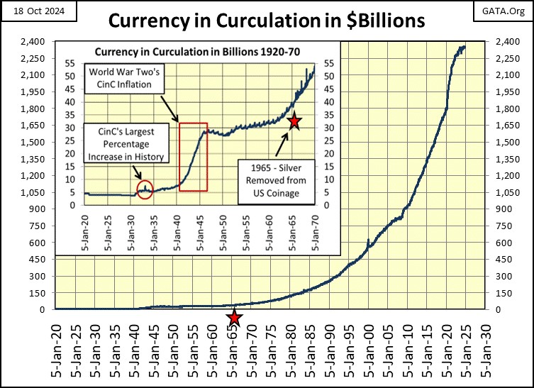
Monetary inflation flows throughout the economy, from Oprah’s net-worth, the market value for housing and other costs of living items, and valuations trading in the stock market. Maybe the current “monetary policy” being dictated by the idiots at the FOMC, is they are going to prevent any big market decline in the future.
They could do this, but at the expense of the dollar, which ultimately would become worthless, if such a policy is implemented. That is why I call these guys and gals at the FOMC a bunch of idiots, because whatever they do to the dollar, will also come back at them, their friends, and families too. Apparently, that thought never comes to the minds of the psychopaths currently in control of the FOMC.
Well, thanks to what we see above, the major market indexes seen below are all advancing towards new all-time highs. Look at all those BEV Zeros in the table below. The week closed with nine of them at new all-time highs, and seven of them in scoring position. Scoring position, so I’m expecting more of these indexes will be making new all-time highs before this advance is over.
The NASDAQ Banking Index and the XAU (#20 & 21), are moving up too.
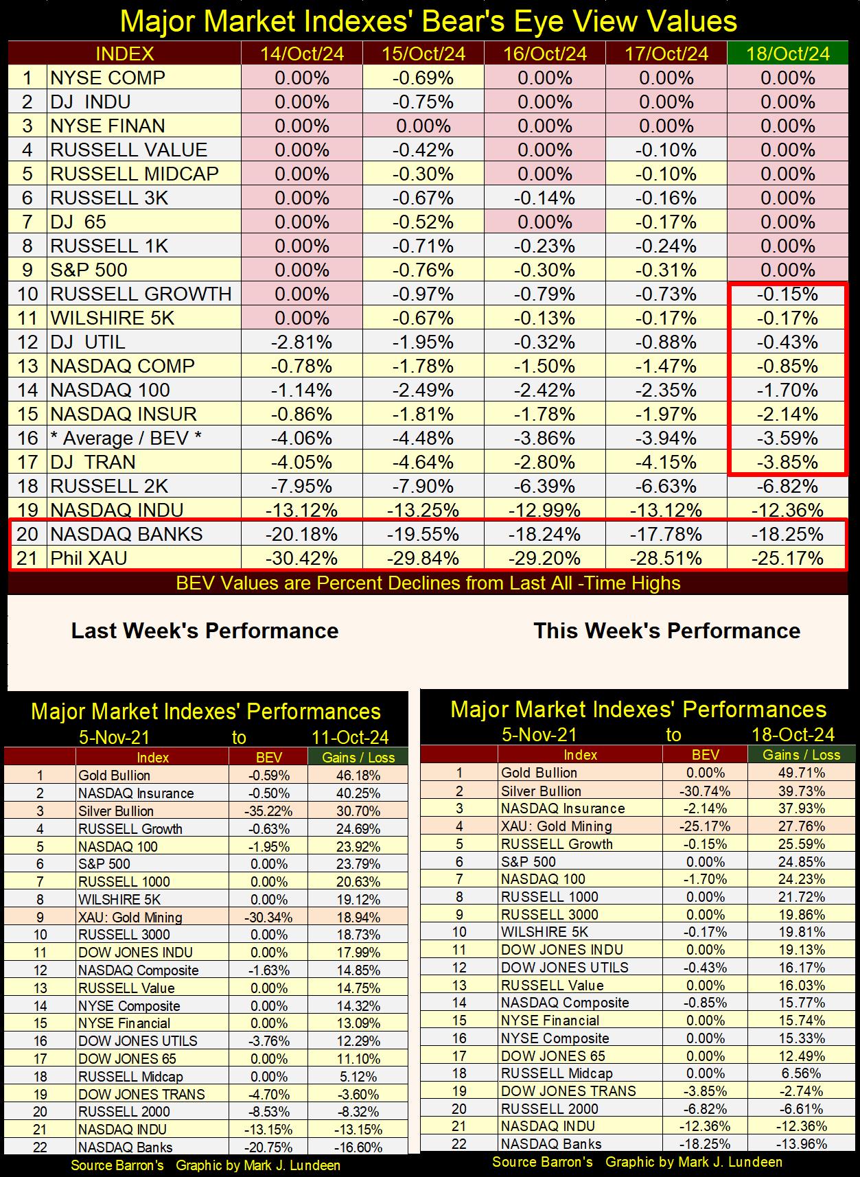
In the performance tables above, gold, silver and the XAU had a great week. The gold and silver miners in the XAU are finally getting some attention in the market, for the simple reason that gold and silver are doing really good. Don’t be surprised should the XAU become the #1 in the table above, as the miners are a leveraged play on the price of gold and silver.
People use stock indexes as their yardsticks for the stock market. I know I do with the Dow Jones Industrial Average. But the stock market has many other metrics useful in taking a measurement of market performance that sadly, most people fail to track.
One of these is keeping track of the NYSE 52Week Highs and Lows. 52Wk Highs and Lows are easily understood. If the share price of a listing on the NYSE closes at its highest value in the past 52Wks, it’s a 52Wk high, if it closes at its lowest value in the past 52Wks, it’s a 52Wk low. The NYSE, and Wall Street Journal publishes this data daily.
The Wall Street Journal, and Barron’s have provided a huge public service for all the market data they have published for over one hundred years. Do you like my long-term charts? I got the data from old issues of Barron’s. It’s a shame more investors don’t take advantage of this data. But doing so takes effort, to be willing to spend an hour, or so a day, keeping the data current.
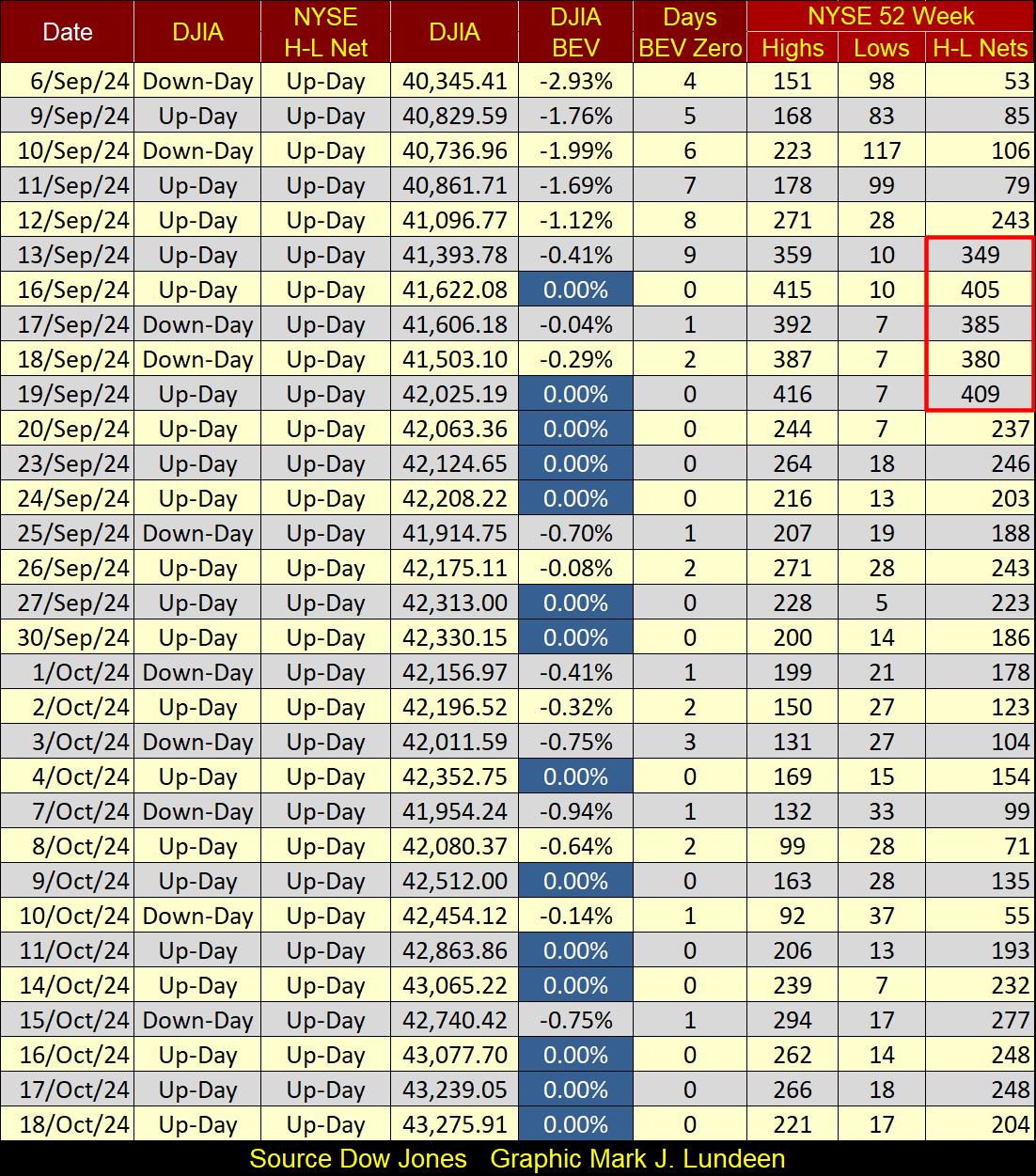
For you bulls on the stock market, there is good stuff happening with the NYSE 52Wk High – 52Wk Low Nets (H-L Nets) in the table below; 52Wk highs are overwhelming 52Wk lows, and have been since last summer.
I like to note those days the H-L Nets exceed +/- 299; let’s call them 300 H-L Nets, as a H-L Net of +300 is a superior day at the NYSE, as is a H-L Net of -300 is a bad day at the NYSE. In mid-September, while I was recovering from my surgery, I see the NYSE saw a couple of +400 days for H-L Nets in the table below.
Since then, the 52Wk Highs at the NYSE have calmed down a bit, which is good as this is an indication the market isn’t getting overexcited. But look at all those blue BEV Zeros for the Dow Jones below. You bears beware; this is a market that wants to go up.
Using the NYSE 52Wk high and low data seen above, I created the chart below plotting the NYSE Net H-L Ratio. I filtered out any daily ratio that was less than +/-10%, to eliminate the noise plotting every daily ratio going back to 1980 would present in the chart.
Why +/- 10%, and not the +/-300 used in the table above? Over time, the number of issues (companies) trading daily at the NYSE have changed greatly;
- In 1926, about 500 issues traded daily,
- In 1980, about 1900 issues traded daily,
- In 2000, about 3400 issues traded daily,
- Today, about 2800 issues trade daily.
Using a set sum, like my current +/-300 during the past forty-four years seen below, would become inconsistent over time. However, using a ratio, with a threshold of +/-10%, gives each day over the past forty-four years, equal weight in the chart below.
The strongest H-L ratio was on 11 October 1982 (Red Triangle below), where this ratio reached a +32%. But this was just months into the bull market that continues to this day. It is early in a bull market at the NYSE, that most issues trading enjoy great gains. As any advance matures over time, the market advance becomes more selective, as the major market indexes approach their last all-time highs.
Note how on the negative days, this ratio declines into percentages not seen on positive days; proof that fear is a stronger motivator than is greed in the market. Typically, a negative 30% H-L ratio identifies a bottom in a market correction; a good time to buy.
But before you can buy, one has to first sell to raise some cash. The time to do that, according to the chart below, is when the NYSE 52Wk H-L Ratio is generating a cluster of +10% ratios over a period of a year or more. An investor may want to liquidate 30% to 70%, possibility more of their bull market position, at a nice profit, and stay out of the market until this ratio once again breaks below -30%.
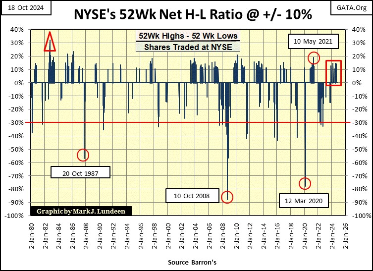
Since 1980, the NYSE has seen three outstanding buy signals (Red Circles), using its H-L Ratio seen above;
- October 1987 / 1987 Flash Crash,
- October 2008 / Sub-Prime Mortgage Crisis,
- March 2020 / 2020 Flash Crash.
When the NYSE 52Wk H-L Ratio reached the negative extremes seen above, the stock market was in a state of shock, with few, if any bulls to be seen anywhere in the financial media.
Note, each red circle proved to be a fantastic buying opportunity for those who understood the best time to buy, was when everyone else was selling in a panic, for pennies on the dollar. What does a selling panic look like in the stock market? The chart above identifies three of them.
A big problem with all market bottoms is; only a few people have any money to buy. That is why it’s a good policy to be willing to sell some shares in a market advance, to raise cash for buying bargain at a market bottom, that one day will be sure to come.
It takes patience and discipline to do this successfully, and to have the courage to buy at a bottom, which due to human psychology, is something easier said than done.
So, what is the NYSE 52Wk Ratio telling us about the market today (Red Square)? Well, take a moment to look at it, and compare today’s situation, with what has happened since 1980.
As I understand this data, the stock market is currently topping, making this an excellent time to raise some cash by locking in some profits from the past year. Though you may want to wait until the Dow Jones breaks below its BEV -5% line, a BEV of -7% or -8% are good trigger points, before you start selling.
The objective of this selling is to raise cash, money to be used for buying when the NYSE 52Wk H-L Ratio once again breaks below -30%, which one day it most certainly will, though I can’t say when.
Also, taking profits from the market is an achievement many people fail to realize, one that you should reward yourself for. Should you sell some of your position at a profit, and then most importantly; deposit the proceeds into your checking account, feel free to sniff a few roses, and buy something nice for yourself or loved ones.
Don’t forget to send to Uncle Sam his share of your profits!
Let’s look at gold’s BEV chart below. Look at gold’s growing cluster of BEV Zeros that began last November (Red Oval). Gold hasn’t seen anything like that since 2011. This should tell you something; something has changed in the gold market. After over a decade, something bullish is finally happening in the gold market, something that hasn’t been seen since 2011.
This week gold closed at $2,721.28. When it entered scoring position last November, it did so at $1,962.11, an eleven month gain of 38.69%. Much better than the Dow Jones’ gain of 23.11% since last November, though one could not see that when comparing the BEV charts for the Dow Jones and gold.
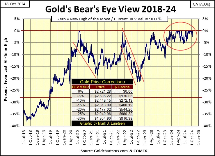
How much higher can gold go from here? I don’t know, but taking a quick look at my chart of CinC above, a whole lot more in the years to come. The monetary inflation from the past 100 years, has yet been fully expressed in the price of gold at this week’s close, but eventually it will. Gold trading for well over $30,000, and silver trading over $3,000 on ounce, and much more is very possible in the years to come.
That is just my opinion, but it’s not so much that gold and silver are going up in price, but the purchasing power of the dollars used to purchase them are going down, to the point it will take 30,000 dollars to buy an ounce of gold, and 3,000 dollars for an ounce of silver.
Buying gold and silver bullion today is much more than just an investment, it’s an insurance policy protecting your purchasing power from the pending destruction of the American dollar. As I see it, rising precious metal prices is a consequence of having idiots dictate “monetary policy” at the FOMC.
As of this weekend, I saw tubes of 20 silver eagles selling for $759.40, and monster boxes of 500 silver eagles selling for just under $20,000 on the internet. I think 1oz silver eagle coins from the US Mint, are an excellent investment at these prices.
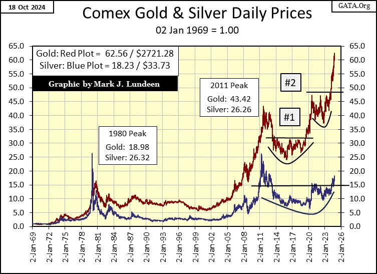
One thing I like about silver, is it has a lot of makeup to once again mirror the gains gold has seen since 2002, see chart below. Slowly, but surely, silver is approaching its 20-index line. Once that level is cleared, we just might see some excitement in the silver market. It’s about time.
Gold in the chart below is making a solid headway towards much higher prices. Every month, or so, I have to increase the indexes up by 5, and I’m happy to do so.
Next, we look at gold’s step sum table below. Gold became overbought in late September, with a 15-count of +7, then sold off from those levels. Not by much; only a BEV of -2.44% on October 9th, as its 15-count declined to a -1. Since then, once again daily advances began overwhelming daily declines, and this week gold saw three new all-time highs.
Gold’s step sum chart at the close of this week looks very constructive, meaning I’m expecting to see more new all-time highs for gold in the weeks and months to come.
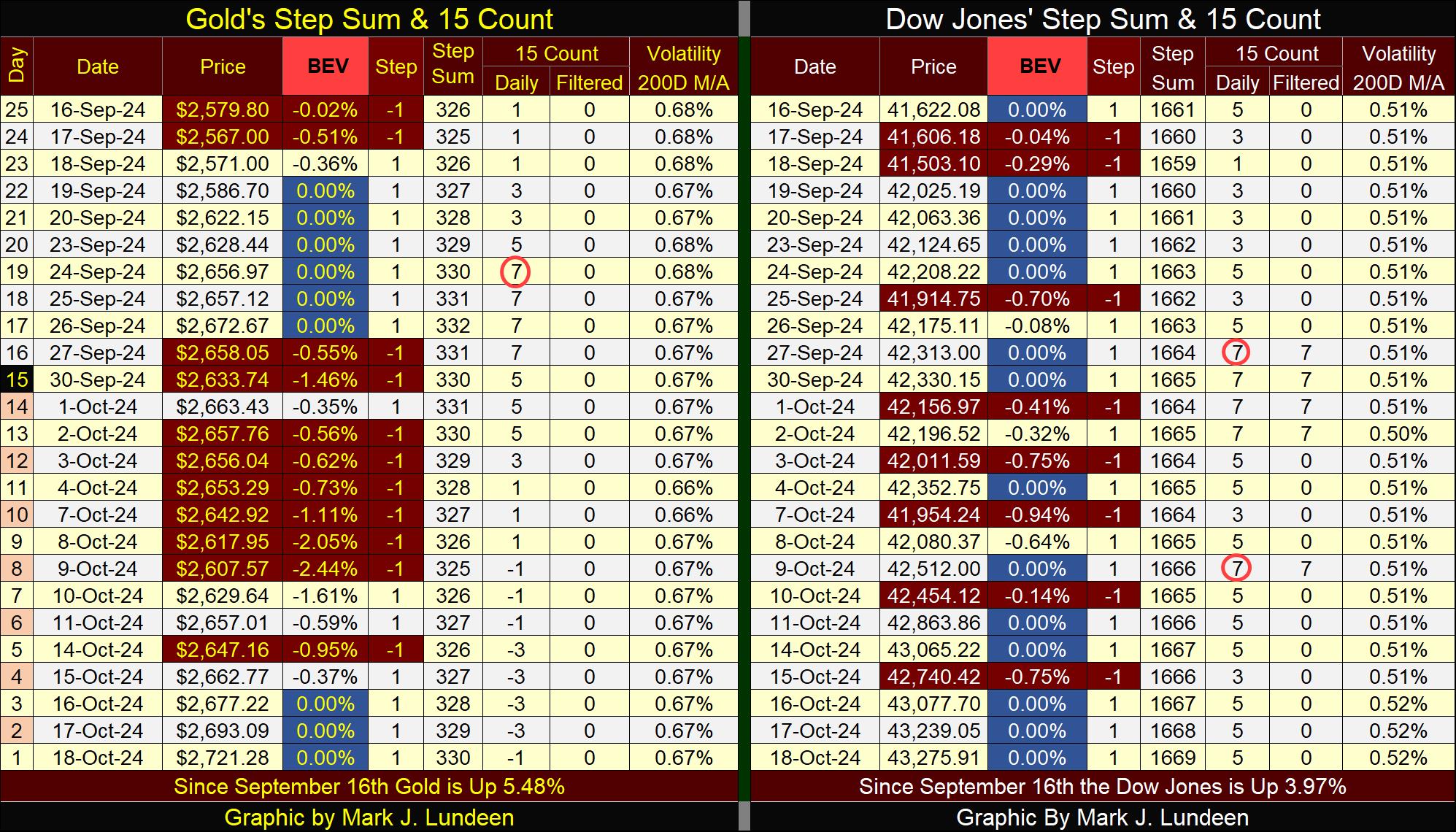
The Dow Jones’ step sum table above is crazy. In the past twenty-five NYSE trading sessions, the Dow Jones has made fourteen new all-time highs, look at all those blue BEV Zeros above.
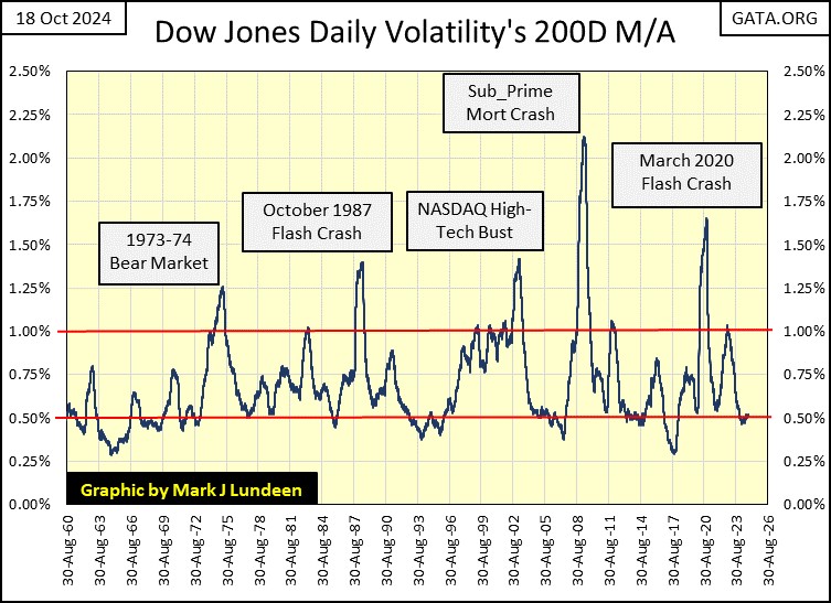
This could go on for a while. One factor encouraging a continuing market advance for the Dow Jones, is seen in its Daily Volatility’s 200D M/A, it closed the week at 0.52% as seen in the chart below.
In the chart below, we see bear markets bottom with big daily volatility, well over the 1.00% line in the chart. Bull market top with small daily volatility, at or below the 0.50% line.
So, seeing the Dow Jones daily volatility’s 200D M/A for months now, close daily slightly above its 0.50% is very much indictive of a market top. BUT; until this metric of daily volatility for the Dow Jones once again advances up towards its 1.00% line, which is something it so far has refused to do, I’m going to remain bullish on the Dow Jones, and the stock market.
The Japanese government has apologized to it citizens for forcing them to become vaccinated for the Covid-19 virus. Now its Australia coming to terms for its complying with Bill Gates, and his World Health Organization (WHO) demands for using untested mRNA vaccines on its citizens.
When will the US Federal Government do its duty towards its citizens, and have the Justice Department prosecute to the fullest extent of the law, those who have done this to us?
Mark J. Lundeen
********