Why Juniors?, Why Now? Analysis of The Canadian Cdnx Index...


For over 18 months most junior mining stocks have put in an absolutely terrible performance. The chart for the CDNX index, which best represents junior gold miners as it is made of about 500 stocks most of which are mining stocks, makes this abundantly clear - and many investors in the sector will not of course need reminding of this.
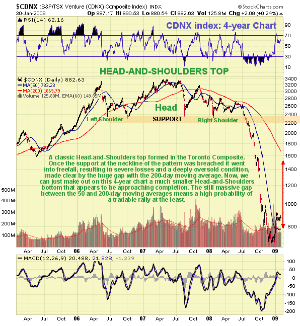
On the 4-year chart for the CDNX index we can see that after it broke down from a classic Head-and-Shoulders top it crashed, with the decline being exacerbated by the tidal wave of selling that overwhelmed commodities and stockmarkets generally. The severe decline continued until as recently as late November, before the index finally steadied, having dropped by an amazing 80% or so from its highs. The question now is whether that's it - whether the brutal bearmarket in juniors is over. The sheer scale of the decline, which is out of all proportion to the drop in the gold price certainly suggests that the selling has been grossly overdone, and in fact the current absurdly low valuations of the better junior gold and silver stocks would reasonably lead one to surmise that investors have decided that there won't be any need for exploration and development in the future, and that, therefore, existing mines will soldier on forever. The notion is ridiculous and is an indication of the walnut-brained manic-depressive idiocy of most investors. We can therefore conclude that the chances are high that the December low was the bottom. Additional technical factors suggesting that the index has bottomed are the huge gap between the 50 and 200-day moving averages, which shows that the index remains extremely oversold, despite the normalisation of many short-term oscillators, and the rising trend of the MACD indicator shows the recovery in sentiment that is a necessary prerequisite for a major uptrend.
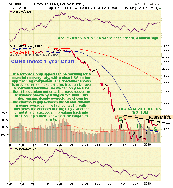
The 1-year chart for the CDNX index is most revealing for on this chart we can see that following the severe decline during the second half of last year, a clear Head-and-Shoulders bottom appears to have developed with the index suspected to be completing a shallow Right Shoulder, although there remains some chance that it will drop back further in the short-term to mark out a deeper Right Shoulder. This H&S bottom pattern thus far has a downsloping neckline and we will only be able to be sure that it has broken out upside from it once the index gets above the resistance that is above the neckline and approaching and at the 1000 level. Observe how this potential base pattern has allowed time for the 50-day moving average to flatten out and turn up. Volume indicators are now bullish, particularly the Accum-Distrib line which has risen robustly over the past 5 weeks, suggesting that an upside breakout is pending.
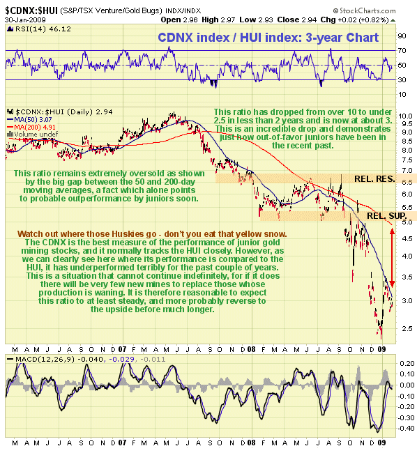
While 2008 was a bad year for gold stocks, as shown by the HUI index dropping from its March peak over 500 to hit a low at 150 in October, before closing the year at about 245, it was even worse for the juniors. This is made graphically clear by the chart created by dividing the CDNX index by the HUI, to reveal the former's performance relative to the latter. Our 3-year chart for this ratio is truly shocking as it reveals that the juniors lost more than half their value in 2008 relative to the 15 large gold stocks that comprise the HUI index, which themselves suffered heavy losses, and this came on top of similar very heavy losses relative to the HUI constituents in the latter half of 2007, so that the ratio of the CDNX relative to the HUI now stands at about 3, compared to a peak at over 10 in mid-2007. This fact alone strongly suggests a relative recovery in the beaten down juniors.
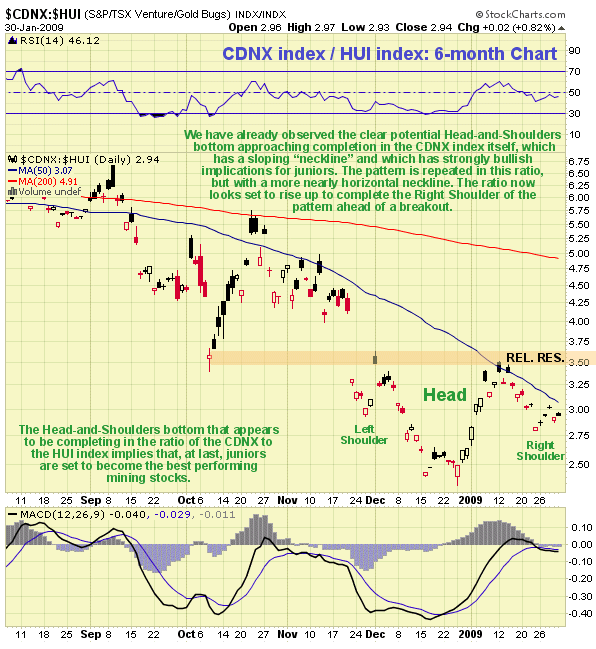
On the 6-month chart for the CDNX index relative to the HUI index, we again see evidence of a reversal in the juniors, although this time of course it is a relative reversal. The same Head-and-Shoulders bottom that we saw in the 1-year CDNX chart shows up again in this ratio chart, although here it is more symmetrical with an almost horizontal neckline. This reversal pattern in the ratio strongly suggests that juniors are about to outperform. The ratio is close to the trough of the suspected Right Shoulder of the pattern, implying that the juniors should soon start to outperform noticably. The quality junior silver stocks are shaping up to be star performers. We have been accumulating these since November and some of them have already made very substantial percentage gains.
Clive Maund, Diploma Technical Analysis
[email protected]
www.clivemaund.com
Copiapo, Chile, 5 February 2009

Clive P. Maund’s interest in markets started when, as an aimless youth searching for direction in his mid-20’s, he inherited some money. Unfortunately it was not enough to live a utopian lifestyle as a playboy or retire very young. Therefore on the advice of his brother, he bought a load of British Petroleum stock, which promptly went up 20% in the space of a few weeks. Clive sold them at the top…which really fired his imagination. The prospect of being able to buy securities and sell them later at a higher price, and make money for doing little or no work was most attractive – and so the quest began, especially as he had been further stoked up by watching from the sidelines with a mixture of fascination and envy as fortunes were made in the roaring gold and silver bull market of the late 70’s.
Clive furthered his education in Technical Analysis or charting by ordering various good books from the US and by applying what he learned at work on an everyday basis. He also obtained the UK Society of Technical Analysts’ Diploma.
The years following 2005 saw the boom phase of the Gold and Silver bull market, until they peaked in late 2011. While there is ongoing debate about whether that was the final high, it is not believed to be because of the continuing global debasement of fiat currency. The bear market since 2011 is viewed as being very similar to the 2-year reaction in the mid-70’s, which was preceded by a powerful advance and was followed by a gigantic parabolic price ramp. Moreover, Precious Metals should come back into their own when the various asset bubbles elsewhere burst, which looks set to happen anytime soon.
Visit Clive at his website: CliveMaund.com


