Gold Market Update
If we lived in a normal word of fiscal propriety, the falling oil price would be viewed as something to celebrate, as it reduces costs across the board, and should theoretically boost the economy, but we live in an abnormal debt-wracked world where instead fears are surfacing that the plunging oil price will trigger a series of cascading loan defaults that have the potential to collapse the system – already world stockmarkets are buckling. If things really start to unravel it should provide the perfect excuse to bring in global coordinated QE, which we have been moving towards over the past few years, albeit on an ad hoc basis, whose underlying purpose will be to maintain interest rates at zero to stop the system collapsing, and to push the bill for the mess onto the little guy, whose standard of living will be progressively eroded by QE engendered inflation. At what point will they ride to the rescue with their global QE program? – that is a matter of conjecture, but we can presume that they will wait until things get sufficiently bad that people are starting to clamor for it so that it becomes politically acceptable and they can get away with it.
Coordinated global QE should be good for the gold price in all major currencies, for the simple reason that money will be losing value steadily so that gold, which is real money, must advance to compensate for this. Looked at from this point of view it is remarkable that gold has corrected as far as it has over the past several years.
Right now gold appears to be in a base building process as its rate of decline has slowed as we arrive at what is believed to be the end of its long corrective phase from its 2011 peak. On its 15-year chart we can see that there was very little follow through after it broke down from its long-term uptrend and beneath the support at last year’s lows – one would have expected it to drop quite quickly back to the next important support level in the $100 area – instead it hopped back above the failed support. This lack of follow through is regarded as a positive sign, especially as the dollar has remained resilient in the recent past.
On its 18-month chart we can see how gold broke down beneath the support at last year’s lows, but then reclaimed the lost ground by jumping back above the support, which was a positive and to many a surprising development. Last week it even managed to break above the downtrend line in force from August, but this move was not confirmed by stocks, which remained weak, and the COT picture deteriorated last week also, putting us on notice to expect a reaction back imminently.
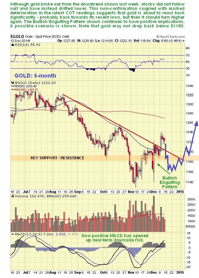
On its 6-month chart we can see recent action in more detail, and how gold broke out clear above its downtrend in force from August last week. However, the move was not confirmed by stocks which remain within a downtrend channel, and the latest COTs are urging caution after another sizeable increase in Commercial short and Large Spec long positions. This suggests an imminent reaction, with a potential scenario shown on the chart, which should not be taken too literally. While it seems likely that gold will react back to the vicinity of the intraday low of the recent Bullish Engulfing Pattern, the reaction may stop at or a little above the support in the $1180 area. That high volume Bullish Engulfing Pattern continues to have positive implications, and it should arrest any reaction from here.
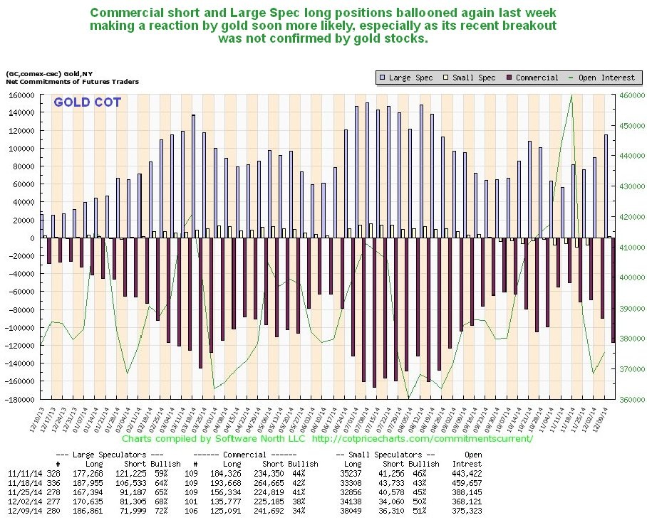
The latest gold COT chart shows another sizeable ramp in Commercial short and Large Spec long positions, after a significant increase last week. This increases the probability of a reaction here, and there is certainly room for one given that gold is now a little overbought as shown by the MACD on its 6-month chart. While it is normal for Commercial short and Large Spec long positions to increase on a rally, the problem here is that they are rising too far too fast, and a similar problem exists with silver.
The Gold Hedgers chart, which was bullish, has eased back towards more neutral territory, making a reaction more likely.
Chart courtesy of www.sentimentrader.com
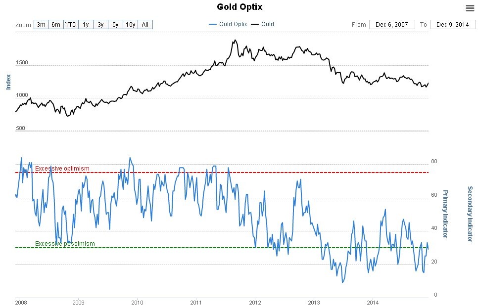
The latest Gold Optix (Optimism Index) chart, has also eased back, but it still quite strongly bullish. This implies that if we do see a reaction it shouldn’t carry very far.
Chart courtesy of www.sentimentrader.com
Rydex Traders have no interest in gold, which is strongly bullish, especially over the longer-term, as they are a reliable contrary indicator.
While the 5-year chart for the HUI Goldbugs Index chart doesn’t exactly look great, with a downtrend still in force, this downtrend shows marked convergence, so it could be a bullish Falling Wedge. It will be a positive development if this index can break back above the nearby failed support and out of the downtrend channel.
Meanwhile, the 5-year arithmetic chart for the Market Vectors Juniors Gold Miners ETF, GDXJ, actually looks very encouraging. On this arithmetic chart we can define an orderly downtrend all the way down from the highs in 2011 to the present, and further see that it broke out of this downtrend way back in July on a marked pickup in volume, which has been expanding all year. Ordinarily that would have been it, with a Head-and-Shoulders bottom having completed with an appropriate volume pattern, GDXJ should have advanced, but along came the Bank of Japan with a curveball massive QE in October, which caused the pattern to abort. However, the bullish implications of this pattern remain in force, despite its having failed, which should be clear from the continuing enormous exponential ramp in volume. Since only a fool would sell at such low prices (or a distressed seller) it is reasonable to assume that what we are witnessing is a torrid rotation of stock from weak to strong hands, of the sort that we associate with an important bottom reversal. Before leaving this chart, note that despite its having dropped to new lows in the recent past it HAS NOT dropped back into the downtrend channel, but is finding support near to its upper boundary. Note also that that it has room to make fresh new lows by dropping over the short-term that still won’t result in it re-entering the channel. Any such new lows should be seized upon as a buying opportunity.
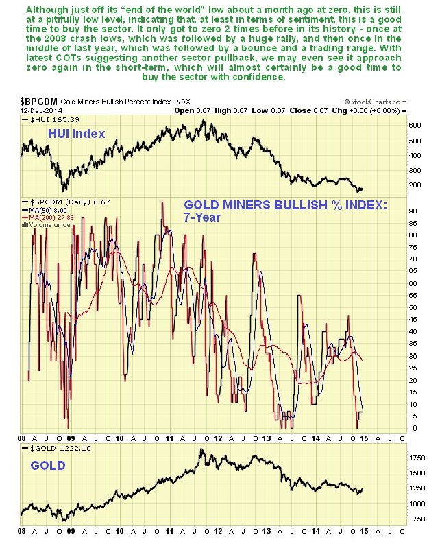
Next we review the latest 7-year chart for the Gold Miners Bullish Percent index, which shows that, despite an uptick from 0 in recent weeks, gold stocks remain about as popular as snow in July (except in a New South Wales ski resort). Such readings indicate that we are close to a major bottom here – if the sector drops back more within the next few weeks and even makes new lows, this indicator could drop to zero, which would provide a rare opportunity to build positions at very low prices while the sheep are all up at the other end of the field.
The 20-year chart for the XAU large gold and silver stock index divided by the price of gold shows extreme fear with respect to the sector which indicates that we are close to a major bottom. This is because when investors are fearful towards the sector, they favor gold bullion over gold stocks, because they are scared that gold stocks will approach 0, but reason (correctly) that this will never happen to gold itself. So the lower this ratio is, the more positive it is for the sector, since the majority are always wrong.
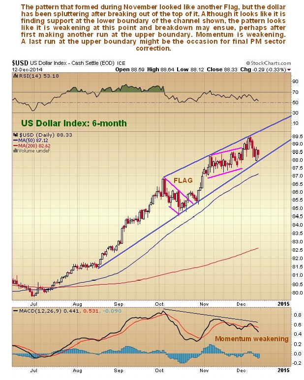
The dollar meanwhile looks like it may be spluttering. On the 6-month chart for the dollar index we had identified a second bullish Flag within its uptrend, and initially expected this to lead to another sharp rally, but when the Flag got drawn out we got suspicious of it, and sure enough it broke out upside, but has since failed to make any significant progress, so that a bearish Rising Wedge may be completing. On Thursday it successfully held and bounced off the lower channel boundary. One possibility here, which fits with our cautious short-term view regarding the PM sector, is that it makes a run at the upper channel boundary near-term but doesn’t get above it, and then turns tails and breaks down from the uptrend. It is noteworthy that this uptrend in the dollar is losing steam, as suggested by the series of lower peaks in the MACD indicators shown at the bottom of the chart.
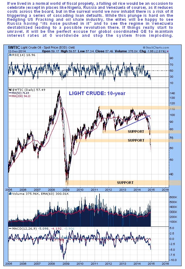
Finally, we will take a quick look at the oil chart, as it is currently such a hot topic, and is having major collateral impact across markets. It has collapsed as predicted in the last Oil Market update. On the 10-year chart for Light Crude we can see that, with last ditch support having failed, oil is in freefall. It is already massively oversold which is why we unloaded our bear ETFs in it last week, and the decline could halt anywhere, particularly if there is some kind of intervention or convincing jawboning by OPEC to prop it up, but equally it could continue to drop vertically into the $40’s or even lower. You would think that markets would be “over the moon” about this, as falling oil reduces costs across the board and should thus increase consumer demand in most nations, but not in the crazy mixed up world we live in, perhaps because this oil plunge threatens to precipitate a series of loan defaults that could have serious knock-on effects for many institutions. The US elites are happy to see the oil price collapse in some respects however, in order to grind Russia into the dust and destabilize and topple the regime in Venezuela.
The flip side is that this is not exactly helpful to the high cost US oil industry, where fracking and oil shale operations may be rendered uneconomic almost overnight. If this oil price collapse triggers a global stockmarket crash, it will provide the perfect excuse for World Central Banks to wheel out their Global Coordinated QE program to keep interest rates at 0 in perpetuity and rescue the World Economy, which they have clearly been working towards for several years, and which might require the inauguration of the World’s first Global Central Bank. With his now vast experience in this field and impeccable resume, Abe of Japan would clearly be the top contender for the Presidency of this august body by a country mile.


