Precious Metals Stocks: Are We There Yet?
The Psychology of a Triangle
One can only draw so many lines on a chart before they become completely confused on what trendline is actually important. Many will just start connecting two top points and two bottom points and calling it a pattern. That’s not how you find a chart pattern. A chart pattern shows the fight between the bulls and the bears. Let's use a triangle as an example of the fight between the bulls and the bear in an uptrend.
If the stock is in an uptrend the first reversal point will be when the initial top takes place. This can be on any time frame. Next you need to see the bears take control and drive prices lower creating the first reversal point starting at the top. At some point the bears will run out of gas and the bulls come charging back rallying the price backup to another high that is slightly lower than the first reversal point number one high, before they run out of strength to move the stock higher. Once the lower high is in place you can put a number 2 under the first low inside the triangle.
I always put a 3? with a question mark, at the second high within the triangle, until I can see the bears taking back control and start moving the price lower again. This time the bears couldn’t drive the price below the previous low, at reversal point number two, before the bulls took control again. Once the bull took control I can then take the question mark off of the third reversal point, second high within the triangle. So at this point we have the first reversal point at the first top, the second reversal point at the first bottom, the third reversal point at the second lower high and now we wait for the fourth reversal point to reach the trendline that connects the first and third reversal points. Once that trenline is reached we can now label the fourth reversal point as the second higher low. A breakout of the top rail will then signal the bulls are back in charge in the dominant trend once again. Three things I like to look for on a breakout are in increase in volume, a possible gap or a nice long bar that is bigger than anything around it.
What I described above shows you the fight between the bulls and the bears that was a give and take event. A proper chart pattern needs to show these individual battles moving between the top and bottom rails of whatever pattern is setting up. Many inexperienced chartists will just start connecting tops and bottoms on a chart with no idea of the psychology that is needed to identify a true pattern. It’s the individual swings between the top and bottom trendlines that you need to identity in order to have a true chart pattern. Again just connection two high points and two low points, at random, shows you nothing of importance.
The reason I took this time to explain to you on how to identity the psychological makeup of a chart pattern, is because you’re going to see a ton of them on the precious metals stocks to follow. Chartology is the study of charts and the psychology behind the charts.
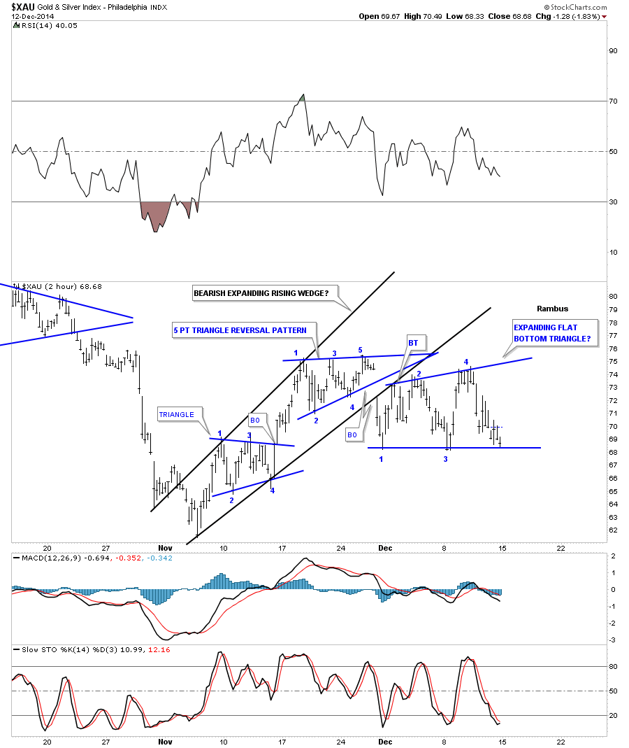
Before we look at the individual precious metals stocks I would like to start out by look at the XAU as a proxy for the rest of the PM stock indexes. This first chart is a 2 hour line chart that shows the correction that has been in place since the PM stocks bottom in early November. Keeping in mind what we discussed above, the first chart pattern shows a blue four point triangle consolidation pattern. Note how the price action transverses between the top and bottom trendlines. That shows how the bulls and the bears each took a shot to dominate this short term trend. As you can see the bulls won the fight when they were able to break above the top rail of the triangle. As the triangle formed in the uptrend the first reversal point had to start at the first high just as I described on the tutorial above. Note the near vertical move off of the fourth reversal point in the blue triangle that accompanied the breakout of the top rail. The bulls were clearly in charge as they were able to rally the XAU all the way up to the first reversal point in the top blue triangle before they ran out of gas. Reversal point number one is where the bulls ran out of gas and the bears took over for awhile. As you can see the triangle, at the top of the chart, shows the battle that ensued between the bulls and the bears with each side winning and loosing ground. The main thing to understand is the individual reversal points within the triangle, from top to bottom and then bottom to top.
Here’s where it gets interesting. During a consolidation pattern you need to see an even number of reversal points, 4, 6, 8 and so on. A reversal pattern will have an odd number of reversal points such as 3, 5, 7 or more. As you can see the triangle at the top of the chart has 5 reversal points which makes it a reversal pattern that told us the bears were back in charge as the bulls were unable to take out the top rail. Note that the 3rd reversal point doesn’t show the price action reaching the top rail. That’s because this is a line chart which just shows the closing price for this 2 hour time frame. I will post this exact same chart showing a bar chart that does show reversal point number 3 was indeed touched.
So now we have the five point triangle reversal pattern in place, at the top of the chart, which is reversing this small counter trend rally off of the November low. The third chart pattern on this chart is still building out which is taking on the shape of a flat bottom triangle. As you can see it has formed below the blue 5 point triangle reversal pattern and is testing the bottom rail which will complete the 4th reversal point when or if it’s touched. Note in the downtrend, the first reversal point started at the first low. So on the very short term time frame the XAU is in a confirmed downtrend. A break of the bottom rail will set in motion the next move lower to the November low. This next chart is a bar chart which is the exact same chart as the line chart above. I’ve left the trendlines in place, which I showed you on the line chart, so you can see the subtle difference between the two.
This next chart is a daily line chart that shows the counter trend rally off of the November low. You can see how important that dashed mid line is as it reversed its role, to what had been resistance on the way up, to now holding support on the way down. There is not much support on this chart if the mid dashed line breaks to the downside until the November low is reached. Note the 50 dma has been holding resistance so far.
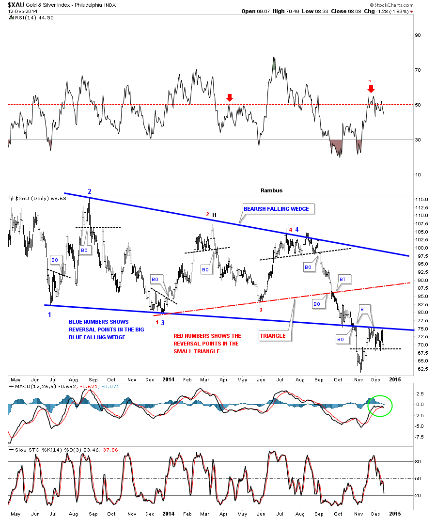
This next long term daily chart for the XAU puts everything in perspective. First notice the big four point blue falling wedge which is labeled with blue numbers and the smaller red triangle labeled with red numbers. The main thing to grasp here is the big patterns are still in play regardless of all the reasons this counter trend rally is the beginning of a new bull market. Note the price action down at the bottom of the blue falling wedge at the breakout point. As you can see the XAU got an initial pop when it hit the bottom blue rail that lasted several weeks. Next came the breakout and our counter trend rally off of the November low which is backtesting the bottom rail of the falling wedge from below. You can see how critically important this backtest is. Note the RSI at the top of the chart which is just above 50 or so that often times signals a top within a downtrend. Also the MACD and histgram are now negative at the bottom of the chart. So if there was ever a place to start the next impulse move down this is as good as any. One last note on this chart below. If you look at the fourth reversal point on the blue falling wedge you can see a small top that formed. When the price Acton broke below that black dashed trendline we were fully invested in the Kamikaze Stocks. That portfolio more than doubled when the November low was hit. However, just this small counter trend rally took away about 90% of those gains in a week or two. I’m just bringing this to your attention so you know how volatile these Kamikaze stocks, such as JDST and DUST are.
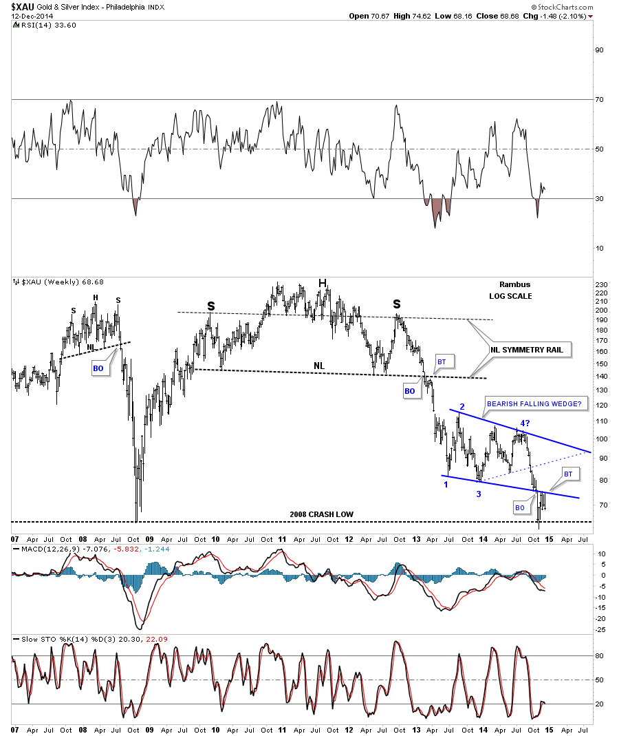
Now let's put the blue falling wedge in perspective by looking at the weekly chart. First notice the beautiful massive H&S top that reversed the bull market. The neckline symmetry rail showed the high for the right shoulder. When the XAU broke below the big neckline you can see it had a quick backtest that told us the neckline was hot and the next impulse move down was gaining strength. We rode most of that big impulse move down when we went short in the first week of December of 2012. On this chart you can also see the smaller H&S top that formed just before the 2008 crash that virtually nobody else seen at the time for which I took a lot of flack from the gold bugs. They wanted my head for blasphemy. The bottom line is, I look at the blue bearish falling wedge and see the breakout and now the backtest which looks like it’s completing. We won’t know until we can look back in hindsight, however it sure looks like this chart is getting ready for the next impulse move down.
The monthly line chart tells a story of its own. On a monthly closing basis it shows the XAU already breaking out of an expanding triangle and on its way lower. When using a line chart note how clearly the inverse H&S bottom that launched the bull market, the 2008 H&S top and the massive multi year H&S top look. They stand out like sore thumbs.
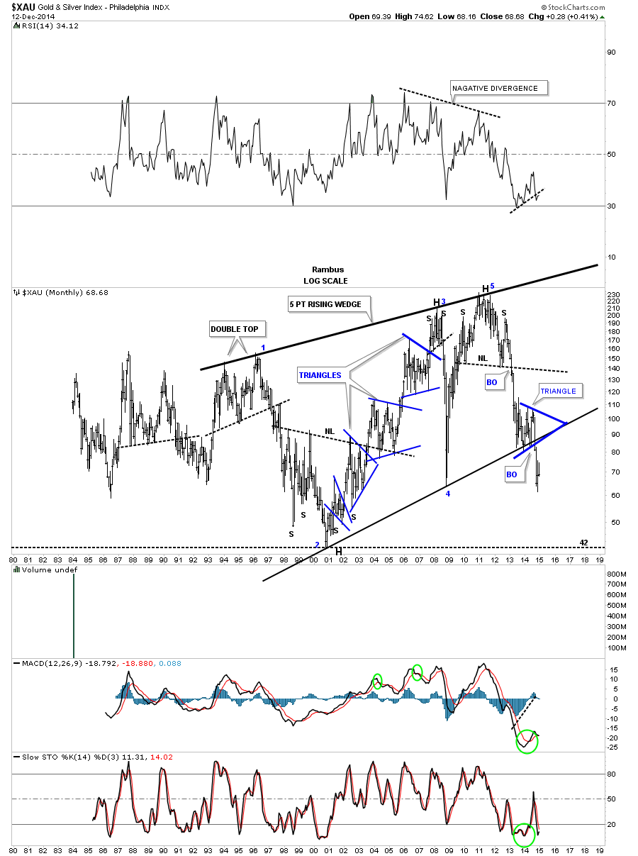
The monthly bar chart for the XAU shows a bearish picture but from a different perspective. This monthly bar chart shows the XAU formed a blue triangle right on the bottom rail of the 5 point bearish rising wedge and then broke out. Note the three blue consolidation patterns that formed during the bull market years. That’s what a bull market looks like. Now compare the price action to the right side of the chart. That’s what a bear market looks like. This chart shows you a good example of how hard it’s to short a bull market and how hard it’s to buy in a bear market. You have to nail the tops and bottoms perfectly in order to capture a profit. I’m not saying it can be done but it’s by a magnitude, much harder going against the main trend. How many have made any real money shorting the stock markets or buying the PM stocks, over the last three years or so, and not giving it all back on the next impulse move.
As investors we always want to see things make sense to us when we invest in the markets. For instance when the US dollar is falling gold and commodities should be rising which is the case most of the time but not always. Recently a lot things we thought should be happening are out of sync with conventional wisdom so when we look at the following precious metals stocks, that make up the PM stock indexes, let's just focus on the chart patterns and what they’re telling us right now, today. We can complicate things to any extreme we desire by looking at so many things that one becomes so confused they don’t know down from up anymore. Keeping it simple and understanding what the charts are saying takes away a lot of unnecessary noise from making a rational decision. Believe me I know how hard it can be at times. As I’ve said many times in the past, we’re playing the toughest game on the planet to win and be successful. We’re playing against the brightest minds and computers in this arena and they want to take every dime you have and don’t care one bit if you go broke. It’s eat or be eaten.
When looking at some of the longer term charts notice the many massive H&S tops and how a lot of PM stocks are testing or have already broken below their 2008 low. There are also some PM stocks that are backtesting below previous support which is turning into resistance now. BO means breakout and BT means backtest.
Let's start with one of the big cap PM stocks ABX. This weekly chart shows ABX backtesting the summer low and is beginning to sell off.
This long term monthly chart shows the neckline extension rail where I’ve extended the neckline from the bear market low in 2000. As you can see it’s still hot right up to last month where it backtested the neckline extension rail from the underside, blue arrows. Note how it’s reversed its role from support to resistance. ABX is also trading way below its 2008 crash low and is testing its all time low. Repeat: All Time Low!
As ABX is one of the giants in the industry let's look at one more monthly chart that shows the blue triangle that I’m viewing as a, HP, halfway pattern to the downside. When this one broke down from the massive H&S top I told members to look for reverse symmetry to the downside as the 2008 rally was so strong it didn’t leave behind much in the way of any consolidation patterns to help stop this bear market decline once it got started.
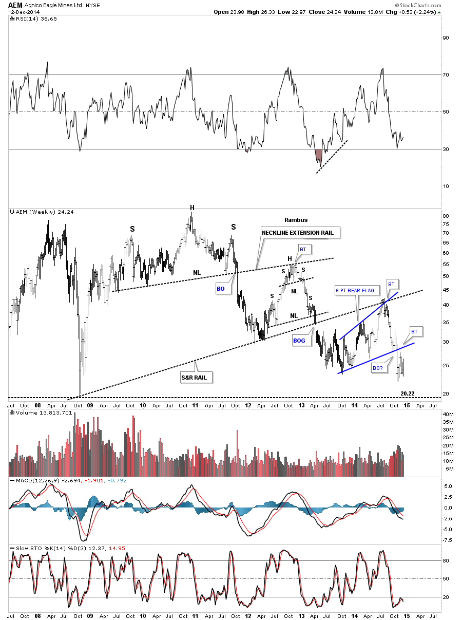
The weekly chart for AEM shows it recently broke out of the 6 point blue bearish rising flag and has attempted a backtest to the bottom rail. A break below the most recent low would suggest that the backtest is compete and the new impulse down is underway.
This long term monthly chart for AEM shows its entire history with our current red bear flag just hanging below the black dashed support and resistance line as the backtest. Note how similar the price action is to when AEM backtested the neckline of its H&S top.
The weekly chart for ANV shows the massive H&S top that has led to the most recent low. If one was aware of that big H&S top they would have saved themselves a lot of pain in this popular PM stock. Note the most recent blue expanding triangle consolidation pattern that has formed at the 2008 crash low. It completed a breakout and backtest before the bottom fell out. Try to be unemotional about this if you recently bought this stock thinking it could not possibly go any lower . Well It did and you can’t .
The monthly chart for ANV shows you one of those bearish falling wedges that tend to show up in strong impulse moves on any time frame. It showed some very nice reverse symmetry to how it went up and how it came back down.
One thing I like about trading the PM stocks is that it’s a small enough universe in which you get to know all the stocks almost on a personal level. I like to watch the ones that have a nice clean chart pattern, that has developed, which helps in understanding how the PM stocks on a whole may move. This daily chart for ASA shows it has been building out a beautiful rectangle consolidation for over a year and a half. I have shown this chart many times before the break in late October. The backtest to the bottom rail looks like a H&S consolidation pattern pointing to new lows if the little neckline gives way.
I’ve extended the left side of the chart out in time so you could see what a real impulse move down looks like. After putting in a triple H&S top you can see a series of smaller red consolidation patterns that formed during the big impulse move down in 2013. Think of the big blue rectangle as a halfway pattern between the triple H&S top to the next major low. If the backtest is finished then ASA is close to duplicating the last impulse move down as shown on the chart below.
This weekly chart for ASA is interesting because it shows the multi year expanding downtrend channel that broke below the bottom rail. The backtest is what set into motion the second reversal point in the blue rectangle. Note how the bottom black rail, of the expanding downtrend channel, reversed its role several times from support to resistance and most recently back to resistance where the bottom of the blue rectangle intersect as the backtest for both important trendlines. If ASA can trade above those two intersecting trendlines then the bulls will be back in charge. Until that happens the trend is down. That area shows a nice clean line in the sand.
As always the monthly chart puts everything into perspective. As you can see ASA’s bull market top ended with a double H&S top reversal pattern with the blue rectangle, which I’m viewing as a halfway pattern, from the breakout of the H&S top.
I’m going skip on down and show you one last stock that I know a lot of folks are interested in. Below is a weekly chart for SLW that shows it just breaking out of a blue triangle consolidation pattern and is backtest mode. This blue triangle sits inside a much bigger pattern an expanding falling wedge.
This monthly chart for SLW shows its entire history. I’ll let you decide if this looks like a place to backup the truck or get on the train before it leaves the station. I hope these charts make it abundantly clear to you that the bear market is still in full force and buying the dips may still be hazardous to your health which many a gold bug will shortly find out. There are still a few big caps I haven shown you in this report but these are the bulk of big cap stocks that make up the PM stock indexes. This is where the truth lies IMHO. It’s not in the price of gold or the US dollar or any other fundamentals you want to throw at the gold stocks. Whatever the real reason is it’s showing up in the price action of all these charts. The time is coming, but the answer to the question “Are we there yet? ” is still No.
All the best…Rambus


