Breaking The $35 Gold Price Peg…The Truth And Consequences Of It
Since July 8th the Dow Jones has seen only one day where it closed more than 1.50% from its last all-time high (Aug 2nd: -1.51%). Since then the Dow Jones has also seen nine new all-time highs, seven of them occurred in a string of days spanning from July 12th to 20th. Except for the lack of trading volume, the market has seen since the lows of last February, 2016 hasn’t given the bulls anything to complain about.
Still, I have to note that after advancing for the past seven years from the bottom of the credit crisis bear market (March 2009), this is an aging bull market. We are at that point in time where in every bull market, it makes more sense to be looking for reasons to sell than to buy. But until the Dow Jones breaks below its -6.40% level seen on June 24th (17,442), it’s safe assuming this market is a hold, or may yet see some new all-time highs.
The next chart plots the Dow Jones with its step sum. Look at how the Dow Jones advanced from March 2009 to May 2015. There were pauses in the advance, most notably between July 2011 to January 2013 where it had difficulty breaking above, and staying above 13,000. However, for most of those six years (2009-15) the Dow Jones regularly broke above its millennial lines with ease. But since January 2015, over a year and a half ago, the Dow Jones has been struggling with 18,000.
Will we see the Dow Jones at 19,000 sometime in the near future? I doubt it if the FOMC increases interest rates in the next few months. But they’ve been promising to “normalize” short-term interest rates for years now, since Doctor Bernanke was chairman at the Fed. They’ll “normalize” their Fed Funds rates someday, but my guess is that it will only be after Mr Bear begins to deflate the bond market, forcing the FOMC to raise their Fed Funds rate with rising bond yields.
As a bear in the stock market, I really don’t care one way or the other if the Dow Jones sees 19,000 or even 20,000, because whatever capital gains the post credit crisis bull market had to offer investors, the best part of those gains are now best viewed by investors in their rear view mirrors.
Look at the little note at the bottom of the chart; since March 2009 the Dow Jones has gained 12,089 points for a 185% gain. It’s totally unrealistic believing the market’s next seven years will be a repeat of its last.
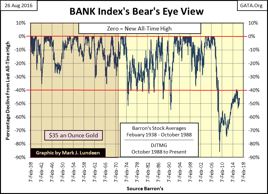
One excellent reason to be bearish on the stock market is the banking system. During the 2007-09 credit crisis, the banking stocks in the BEV chart below crashed 85%, taking everything else down with them. And since their recovery high of July 2015, they appear to be rolling over again.
Considering the tens of trillions of dollars in assistance the banks have received from the Federal Reserve, the changes in accounting rules for their reserves, and who knows what else to keep them in operation, one should expect more from them. But there they are. In the BEV chart below, they’re in the worst shape they’ve been in since 1938.
From 1938 to when Washington broke the Bretton Wood’s $35 gold peg in August 1971, the banking shares never saw a decline of over 40%. Since the bottom of the credit crisis, the banks can’t seem to get above their BEV -40% line. That has to mean something.
These banks are the center of the global payment system. If they can’t operate, global trade stops as consumers can’t make payment for goods or services received, and business can’t get paid for providing them. Because Washington’s political class allowed their banking system to play in the corrupt sub-prime mortgage market, the American and global payment system for commerce almost ceased their operations; that was the real crisis in 2008-09.
From the appearance of the BEV chart above, and from what market commentators are saying about solvency of various key European banks, it seems the market is anticipating the American banking system may take yet another run into Mr Bear’s meat grinder sometime in our very uncertain future. But then I could be wrong, and we’ll see the banks in the BEV chart above breaking above their BEV -30% line sometime in the next twelve to eighteen months. Personally, I’m betting on Mr Bear.
Gold (Blue Plot below) still looks good. True, since early July it hasn’t gone on to a new high for the move, but it’s not breaking down either. Market sentiment, the step sum (Red Plot) is breaking down. But as long as the price of gold holds above $1300, seeing gold’s step sum declining is actually a sign of encouragement for the bulls.
What I’m waiting for is for both the price of gold, and its step sum to reverse vigorously upwards, which will signal the beginning of the next phase in the bull market. Hopefully we’ll see this happen sometime in the next month or two.
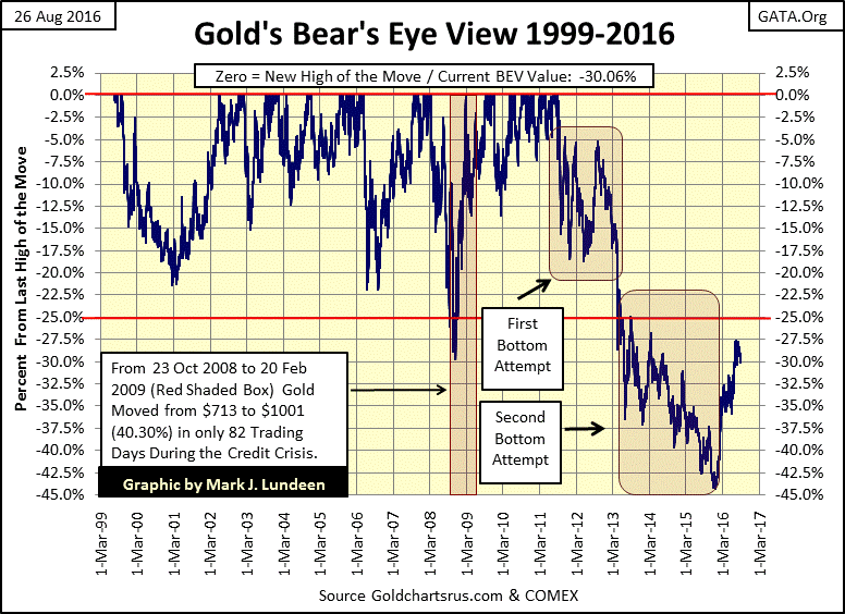
Next is gold’s BEV chart. I started the BEV series from the absolute bottom of gold’s 1980 to 2001 bear market, which occurred on 19 July 1999 with gold closing at $253.70. If you study gold’s corrections since 1999, it’s apparent that the correction that began in August 2011 was particularly brutal, and for that reason I expect the lows of last December will hold.
Gold’s advance since its lows of last December has been excellent. Seeing anything in a BEV chart advance from its -45% up to its -27% level in less than six months is an accomplishment! So as I see it, gold is currently taking a rest before it resumes its advances upward towards its red BEV Zero line.
Here’s silver’s BEV chart. Silver’s E correction was a brutal 72% decline from its highs of April 2011. Like gold, its advance from the lows of last winter has been excellent, so I’m not alarmed that at present it’s taking a rest.
Silver has seen some really curious market moves since 2001. I placed an X on silver’s market declines of more than 20%, huge declines that occurred in just a few trading days. As seen in the chart below, since 2001 there have been all too many sharp sell offs; with three of them happening during the 2011-2015 correction.
Every one of those Xs is a fingerprint of the big banks whacking the price of silver by flooding the COMEX futures market with promises to deliver silver the banks didn’t have or couldn’t deliver even if their CEO’s lives depended on it.
The last time the big banks gave the price of silver a proper whacking was in the spring of 2013. Will they dare to do so again as the bull market once again takes the price of silver upwards toward a new BEV Zero? That’s something the bears didn’t attempt during the recoveries of corrections A-D. It will be interesting to see if they attempt to whack the price of silver again as the market recovers from the bottom of correction E.
At week’s end, both gold and silver’s 15 counts in the table below found themselves at -3. Though not unusual, it takes a lot of down days; a lot of selling to get a 15 count at -3. Considering everything on display below, the price of gold and silver are holding up pretty well as down days predominate over advancing days in the past fifteen trading days.
Sometime in the next few months, the cycle will reverse and we’ll see gold and silver’s 15 counts increase to a +3, or even a higher value as advancing days once again predominate over declining days. If gold and silver are in a bull market, which I believe they are, seeing their 15 counts once again solidly positive will be an excellent opportunity for the old monetary metals to break above $1400 for gold and $21 for silver. Hopefully, this is something we’ll see in the next two months.
Note on the table above: I changed the BEV column to a 2Mth BEV column. The BEV column used in past tables gave the percentage decline of the daily close from the last all-time high, which for silver went back to January 1980. The 2Mth BEV column gives the percentage decline of the daily closing from the high of the past two months.
Looking at silver’s 2Mth BEV, we see a BEV Zero on 02 Aug 2016, which informs us that silver’s high of the past two months was $20.60.
In 1999, with the world waiting for the introduction of the euro into the global monetary system, much was made of the “fact” that the euro would be partially backed by gold. Fifteen percent is the figure I recall. At the time, the ECB believed partially backing their euro with gold would provide its currency with a stability everyone knew the dollar lacked, making its currency a serious alternative to the dollar for global commerce and finance.
Today, speculation is that China has accumulated an unspecified, but huge gold reserve for the purpose of backing its yuan with gold sometime in the future. This theory holds that China is doing this in anticipation of the coming failure of the dollar in the global currency markets. I don’t doubt how at the highest levels of Chinese “policy making” this is a plan they are seriously considering. I just believe the gold backed yuan, if attempted, will ultimately fail for the same reasons the ECB no longer points out the euro has a 15% gold backing (which in 2016 it certainly does not), or why the US dollar is no longer convertible into gold at $35 an ounce.
For gold to function as money, the government submitting to a gold standard must first respect the property and civil rights of it citizens – something governments hate to do. Apparently, the self-restraint requirement of a government bureaucracy to maintain a gold standard becomes impossible when government officials, and individuals of influence, begin seeing their fellow citizens as nothing more than a human resource to be exploited. And that exploitation takes the form of monetary inflation, which as we see in the blue plot of the chart below, the dollar has seen plenty since the end of the 1920s.
The chart also illustrates why the Federal Government stopped minting $20 gold coins in the early 1930s, and why pocket change from before 1933 can today now trade in the open market for several thousand dollars.
“Bankers know that history is inflationary and that paper money is the last thing a wise man will hoard. “ - Will Durant
Mr. Durant got that right. Knowing this now, whether the price of gold is up or down this week or month, can any of my readers doubt much higher gold prices must, by necessity, be coming our way in the years to come?
Look at the chart again if you have to, but politicians, academics and bankers, cheered on by the mainstream financial media, will continue inflating CinC until the dollar becomes just another chapter in the sorry history of paper money that failed. You’ll be glad you purchased some gold and silver at today’s prices when that happens.
Every now and then I see another article on the failure of the gold standard. Here’s one by Market Watch.
These articles all have two things in common; they always post a photo of gold bars in them, and never publish the chart above. There is no excuse for this as US gold reserves and CinC data has been published weekly in Barron’s since the 1920s; that’s where I got it!
There’s actually a third item too. All these articles on the failure of the Bretton Woods gold standard always mention that it was President Nixon, who in August 1971, for reasons good or bad (to the author usually good), who killed it. But as recorded in the dusty old pages of Barron’s, we see that in August 1971, the Bretton Wood’s $35 gold peg failed because the US Treasury had issued $198.82 paper dollars for each ounce in its gold reserves.
In fact the Bretton Woods’ $35 gold peg was a recognized fiction long before “Nixon closed the gold window.” In 1966, with the US Treasury having issued more than one hundred paper dollars for each ounce of gold in its reserves, Professor Hutt said the following below.
“How can businessmen coordinate the private sector of the economy effectively when the most important measuring-rod of all; the monetary unit has been left with no reliable defined value? Units of length, volume, and weight have been universally defined with meticulous care; but dollars, lire, francs and pounds have been allowed to change in every significant attribute over time.”
- Professor W.H. Hutt: New Individualist Review, 1966 Winter Issue
A point of interest to us now living in 2016; note who Professor Hutt said in 1966 “coordinated the private sector of the economy” – businessmen. After fifty years of government legislation and regulations, you can be sure the correct answer to that today is lawyers, and government bureaucrats.
Before my mother passed away, she’d remark how from year to year people don’t note they’re getting older. But from decade to decade, whether going from ten to twenty years old, or from sixty to seventy, people see the physical process of aging. Money functioning in an inflationary regime is much the same. There are good years and decades as well as bad. The bull markets of the Roaring 1920s and the 1990s would have been impossible had it not been for monetary inflation flowing from the Federal Reserve. The depressing 1930s and the recent bust in the global real estate markets were unavoidable because of inflation.
Below we see the weekly data as published in Barron’s for its now discontinued Dow Jones 10-Utility Bond Average from 1938 to 2002. The bonds used in the average in 1938 were certainly not the same bonds used in 2002, or even in 1958. As bonds approach maturity, they are replaced with newer bonds of different coupon yields.
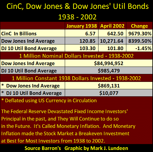
But as highlighted in the table below, the difference nominal bond prices and coupons was negligible after seven decades of monetary inflation. In the top portion of the table I placed the as published values for Currency in Circulation (paper dollars in circulation), the Dow Jones Average and the DJ 10-Util Bd Average. From its first published value in 1938 to its last in 2002, the DJ 10-Util Bd Average lost $1.50 in nominal dollars. While both CinC and the Dow Jones increased by a two orders of magnitude, with CinC (monetary inflation) increasing more than the Dow Jones. Bonds, with their fixed income, were a disaster for investors from 1938 to 2002, as seen in the green plot above.
The table’s second section records the gains / losses of a million dollars invested during the course of seven decades. In 1938, the income from a million dollars invested in either dividend yielding blue-chip stocks or high quality bonds allowed someone to live like a millionaire. A nice apartment in a fashionable part of Manhattan, with the means to enjoy the best of what life had to offer.
For the 1938 millionaire who invested in blue-chip stocks (the Dow Jones), sixty-four years later their now $84.994 million dollar investment in the stock market allowed them to continue to live in wealth and luxury. This was not so for the 1938 millionaire who invested in bonds. In 2002, no one with $958,479 in fixed income yielding only 7% was living the good life in Manhattan.

The table’s last section shows why. A million dollars invested in blue chip stocks in 1938 was still worth $869,131 in 1938 terms by 2002. As dividend income is not fixed, as are bond coupon’s payments, dividend payouts for the Dow Jones also increased from $8.17 in January 1938 to $183.11 in April 2002. With inflation from the Federal Reserve flowing everywhere but into the bond market during those seven decades, its only expected that in constant 1938 dollars terms, a million dollars in utility bonds would collapsed to only $10,077 in 2002.
What happened? The elected officials of the Federal Government, along with the promoters of BIG GOVERNMENT in banking and academia, decided they would not submit to a gold standard, and investors in bonds paid the price.
“In the absence of the gold standard, there is no way to protect savings from confiscation through inflation. There is no safe store of value. If there were, the government would have to make its holding illegal, as was done in the case of gold.”
- Alan Greenspan; Gold and Economic Freedom / 1966
Here is a link to Greenspan’s article.
http://archive.lewrockwell.com/north/north204.html
Money today has become what these selfish people would have it be; a liability to everyone else but to themselves, not the stable measure of wealth that gold once provided to private citizens and honest commerce. For this reason, there has never been a better time to take some profits, or cut one’s loses in the stock market, and to purchase some gold and silver bullion, and maybe take a look at the precious metal miners too.


