The Sham U.S. Bullmarket...
When the S&P500 index broke to new highs at the end of May and again in recent weeks there was a great media fanfare. In this brief article, which is actually directed at that select band of readers who are more interested in reality than illusion, we are going to examine this “remarkable accomplishment” to see just how remarkable it really was.

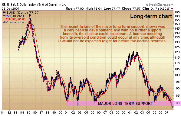
First we will look at the straight long-term chart for the S&P500 index. On this chart we can see that despite the break to new highs the index is more or less at about the same level as it was in 2000. Now, some readers, especially outside of the US, will be aware that the dollar has fallen against most other major world currencies in the years since 2000, and against a lot of lesser currencies. The principal reason for this is that there are a lot more dollars around now than there were in 2000, which means that it takes more dollars to buy the same amount of these foreign currencies - i.e. the dollar is worth less. So if you sell your US stocks now for the same prices that they stood at in 2000, and convert the proceeds into other currencies you will get a lot less of these other currencies than you would have in 2000. The way to make this obvious is to chart the S&P500 index in other currencies, which we will now do.

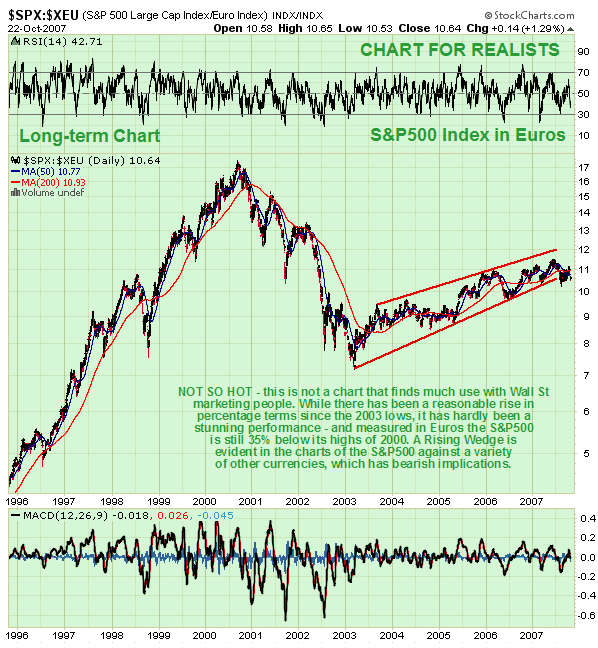
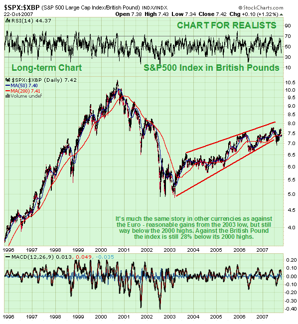
We will start by looking at the S&P500 index charted in the currency of the European Union trading bloc, the Euro. On this chart the bullmarket in US stocks from early 2003 looks a lot less impressive, in fact all it looks like is a rally within an ongoing bearmarket - while it has certainly risen significantly, it is still an insipid performance given the time involved, and it is still way below its highs. Well below its highs? - comparing the recent high on this chart at approx. 11.3 with the top value in 2000 and making a simple calculation, it turns out that measured in Euros, US stocks are down a whopping 35%. It’s a similar picture against most other currencies, with US stocks down 28% measured in British Pounds, as made clear by the chart for the S&P500 in British Pounds shown below. Incidentally, both these charts show bearish looking Rising Wedge patterns, which implies that the performance of US stocks could soon deteriorate dramatically measured against British Pounds and Euros.

This article is not primarily predictive in nature - its purpose is to point out the reality of the situation to date. Actually, although the charts for the S&P500 against many other currencies look bearish, with a Rising Wedge apparent on various charts, the latest S&P500 COT chart looks bullish and suggests continued advance, although as we have seen, if the dollar continues to drop as it has been doing in recent years, the gains in real terms are likely to be limited or even non-existent. Should inflation worsen significantly and possibly develop into hyperinflation, which is not impossible given the cavalier attitude of the present administration towards money creation, we could witness a situation where stock indices are rising strongly on a nominal basis but are nevertheless falling heavily in real terms at the same time.

Mr Bush appeared on television in recent days, holding out the hat for more money for Iraq. There was also some commentary about what the money could accomplish if used instead at home for education or health etc, but what was more interesting was that some guy then popped up to say that the government would have no trouble paying for everything. Sure it won’t - it will just get the Fed to print more dollars, as many as it wants, and if foreign mugs won‘t buy Treasuries any more because they have finally put 2 and 2 together, no problem, just monetize the debt domestically. So now you know what you can look forward to - more inflation and a lower dollar - much more inflation and a much lower dollar.
Clive Maund, Diploma Technical Analysis
Copiapo, Chile, 21 October 2007


