Corporate Bond Yields: 1925 to 1924
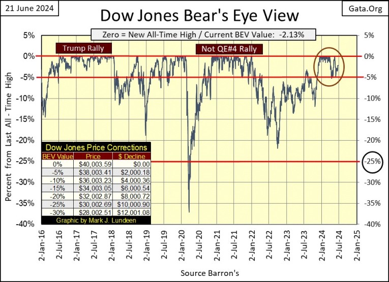
The Dow Jones’ last all-time high (BEV Zero) in this BEV chart was on May 17th, over a month ago. That seems like a long time, maybe the advance that began last November is over. Well, if someone wanted to next week begin selling all their positions, exit the market, taking all their profits with them, I wouldn’t talk them out of it. In fact, I’d encourage them to do so.
But when I’m speaking of the Dow Jones making additional BEV Zeros from this point on, I’m not thinking rationally, something one must be when money is involved, but theoretically, a luxury I can afford as I have no exposure to this market. Keep in mind, that for every market advance, comes a last all-time high, or Terminal Zero (TZ = Last BEV Zero in a bull market). But, as long as the Dow Jones closes daily in scoring position (BEV values of -0.01% to -4.99%), the Dow Jones is in position to score – is able to make new all-time highs.
Once the Dow Jones declines below its BEV -10% line, it good assuming its ability to generate new all-time highs is increasingly less likely. But since January 2016, look at all the times the Dow Jones closed below its BEV -10% line in the chart below, only to rise and score additional BEV Zeros.
This was especially so for the March 2020 Flash Crash seen above. In a mere twenty-eight NYSE Trading Sessions, the Dow Jones collapsed over 35% from an all-time high. Something since 1885, had never happened before at the NYSE. During the initial 1929 market crash, it took forty-seven NYSE trading sessions for the Dow Jones to decline 35% from its September 3rd TZ.
Also in March 2020, the corporate bond market was melting down, as bond yields spiked upward. This had the makings of a bear market in financial assets (stocks and bonds) to match the losses seen during the Depressing 1930s.
That is only my opinion, which I admit matters little in the grand scheme of things on Wall Street. But whose opinions matter a whole lot more than mine, are the idiots at the FOMC. In response to the meltdown seen in the Dow Jones above, and in the corporate bond market in early 2020, the idiots “injected” a couple of trillions of dollars of “liquidity” into the market, in just a couple of weeks.
This was the FOMC’s 4th, and largest QE since January 2009, but we’re not supposed to think of this massive infusion of “liquidity” as such; as a QE. In fact, now in 2024, we’re not supposed to even recall the near market meltdown in March 2020, or the idiots’ desperate “policy actions,” that “stabilized” this now forgotten, little footnote in market history.
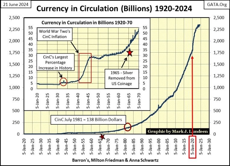
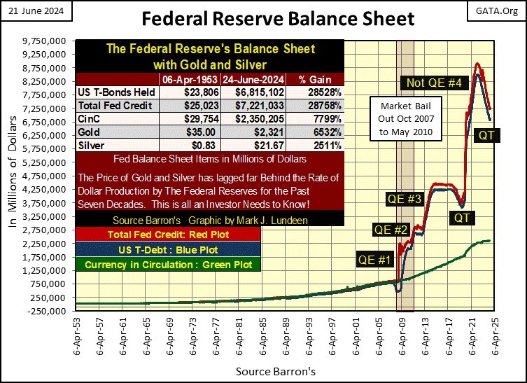
But like all crime scenes, finger prints are always left behind, such as the surge in CinC seen below in early 2020. “Market experts” and economists espousing their opinions on our current rise in CPI inflation, always limiting their comments on what the idiots at the FOMC will do in manipulating interest rates, to get CPI inflation back below 2%.
You will never, ever see a “market expert” in the financial media post this chart on CinC, and explain to the public the reason why the stock market is in a historic bubble, and why consumer prices are rising; is because what the Federal Reserve has done to the supply of dollars, as seen in the chart below.
Why did they do that, this unacknowledged QE in early 2020? Again, this is just my opinion, and my opinion doesn’t matter much on Wall Street. But I believe in March 2020, the idiots agreed with me that valuations in the stock and bond markets were at risk of falling off a cliff. As 2020, like 2024 was an election year, that was something not allowed.
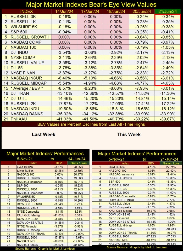
Okay, so the Dow Jones hasn’t seen a new all-time high since May 17th. But the Dow Jones is only 30 large, dividend paying blue-chip stocks. At the NYSE, every day there are about 2,800 issues trading, the NASDAQ has about 4,300 issues trading daily.
So, it’s good looking at market indexes other than just the Dow Jones. In the table below, listing the BEV values for the major-market indexes I follow, this week there were market indexes making new all-time highs. And at week’s end, fourteen of them closed in scoring position.
We can argue all day long why the market is going up. That the idiots did this, or the idiots did that. Yeah, I’m up for a little verbal-combat with a gaggle of idiots at the FOMC, about the dirty tricks they are using to keep the market going up. But it doesn’t matter, as the market is currently advancing. So being a big bear by buying puts or going short in this advancing market, is an expense I can’t afford right now. Forget that, I’m just enjoying the show of the bulls running amuck on Wall Street.
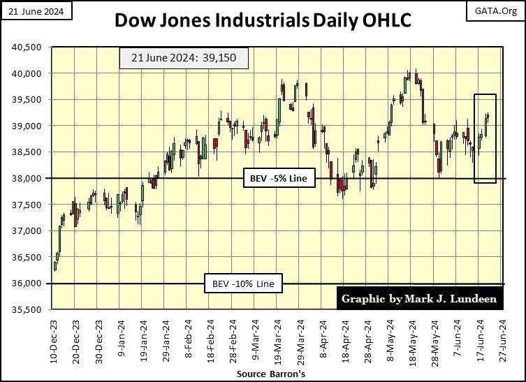
Not much has changed in the performance tables above. So, we now go to the Dow Jones in daily bars below, to see what the Dow Jones is doing in dollar terms.
Last week I was concerned the Dow Jones would deflate below 38,000 (or BEV -5% line in a BEV Chart). As you can see below, that didn’t happen. Instead, the Dow Jones closed above 39,000, well on its way to close above its current all-time high of 40,003.
Many things can happen to the stock market before that happens. But we are in a market advance, so I’m going to assume that the Dow Jones will rise to new all-time highs before Mr Bear returns, and present his bill for the liquor and broken furniture to the bulls, for the rowdy party now going on Wall Street.
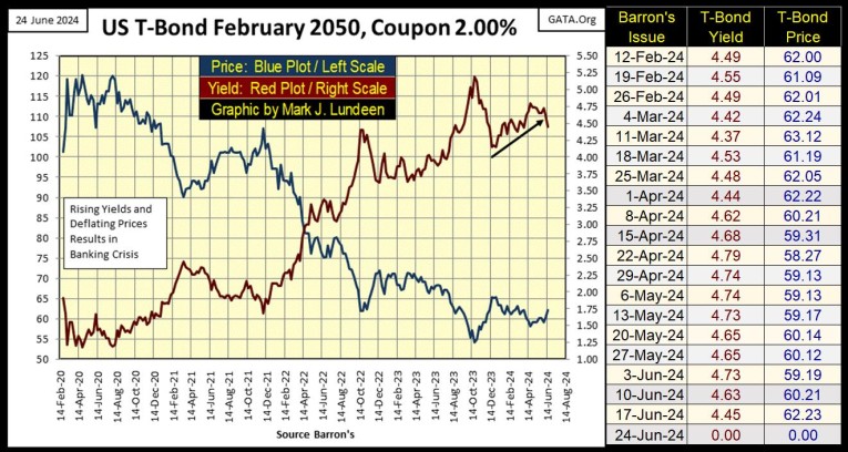
Here’s a chart for a 30Yr T-bond issued in February 2020. From August 2020 to October 2023, this bond lost 55% of its market valuation (Blue Plot), as its current yield (Red Plot) increased from 1.19%, to 5.12%. The bond’s valuation has bounced a bit from its lows of last October, but the bear market in Treasury Debt has a lot more to go before it’s over.
The idiots are trashing the dollar, as Washington demands more and more of them, by the trillions to finance foreign wars, market bailouts, and who knows what else? Go back and look at the chart of CinC above. This inflation in the US dollar isn’t going to stop until the dollar, and this T-bond below becomes totally worthless. No one important wants to talk about that, but that is the truth.
It’s criminal inflating a currency until it becomes worthless. It’s an act of theft, no less than a bank robbery. That prestigious university professors-of-economics are managing this collapse of the dollar doesn’t make it right. But no one cares – not yet anyway. Well, that isn’t true; the Persian Gulf oil Emirates and Saudia Arabia are now working their way out of the petrol-dollar standard, while the getting is still good. I can’t say I blame them.
During bull market advances, and bear market declines, investors typically become complacent, believing that things as they are now in the market, have become fixtures in the economy; that what has been rising will continue to rise, and what has been declining will continue to go down. However, that is wrong, as investors must keep in mind that over time – things change; that there are times to buy, to hold, and to sell any investment.
Here is an important point to keep in mind too; Wall Street is always eager to tell investors what, and when to buy. Unfortunately, Wall Street never rings a bell when the time comes to sell what they’ve sold to you. They never have, and never will – you have been warned.
To illustrate my point that things change over time, let’s look at the Barron’s Best and Intermediate Grade Bond Yields going back almost 100 years in the chart below. Keep in mind, bond yields and bond valuations are inversely related;
- rising bond yields = lower bond prices (Bond Bear Markets),
- falling bond yields = higher bond prices (Bond Bull Markets).
Both Barron’s Best and Intermediate Grade Bonds are investment grade, corporate bonds. But Best Grade Bonds are issued by long established companies with strong balance sheets, companies the bond market believes could survive something like the Great Depression, able to service their debts as they did.
Intermediate Grade Bonds are issued by solid companies, but companies that carry more debt than a company the bond market sees as best grade. During good economic times, these companies have no problems servicing their debts, so their bonds’ yields come very close to the yields on best grade bonds. But during economic hard times, the bond market sharply discounts the prospects for these companies to service their debts, which results in these bonds’ valuations declining, as their yields spike upwards, while the best grade bond’s valuation and yields remain about the same.
Note: during the 1920s and 1930s, Barron’s Intermediate Grade Bond Yields were actually the yield for the now long discontinued, Dow Jones 40-Bond Average, a statistic Barron’s began publishing in 1925, before the 1929 crash. In the chart below, it’s easy seeing the 1929 to 1932 stock market crash, as yields for the DJ 40-BD Average spiked up from 5% in September 1929, to over 10% by May 1932.
The market (the people who buy and sell in the market) is perverse. What people were willing to buy in 1929 for a $1.00, yielding only 5%, they avoided when it could be purchased for $0.50 in 1932, and yielding over 10%. Too bad, as in the next few years, these intermediate grade bonds were yielding 4%, more than doubling these bonds’ valuations for those who purchased them in 1932. This meant huge capital gains when these bonds matured years later, as they locked in a 10% annual income during the Great Depression!
I used to be an instructor at the Navy’s Electrical School at NTC/SSC Great Lakes, Illinois. I wrote questions for some of the school’s tests. That was a rewarding tour of duty while I was in the Navy; being a teacher.
To relive my glory days when I taught the 1,3 & 5 MC system (the shipboard announcing system on an air craft carrier), or on an SSTG’s voltage regulation, for this course’s final exam, I’ll be asking the following multiple-choice question. Everyone who answers this question * incorrectly *, will be shipped back to the fleet as a deck ape, or a skivvy waver. So shipmates, don’t ***k it up! Here it goes;
Intermediate Grade Bond Yields spiked for a second time in the Depressing 1930s, from April 1937 to April 1938 because?
- Why should I tell a fresh-air snipe like you? (I added a little Navy jargon for color),
- Science in 1937 discovered rising CO2 levels would terminate all life on Earth by 1950,
- For the second time in the Depressing 1930s, the economy and stock market crashed,
- Because DEI policies had yet to “stabilize the economy.”
Of course, college graduates today would instantly tell you; B is the correct answer, though answer D looks good to them too. Answer A is what I used to call my idiot test, because if you picked A; U. R. A. idiot, someone who should be kept ten feet from anything electrical.
As for answer C; wait a second, my phone just rang and its Bill and Hiliary on the other end, I simply must take it. I’m back. I have a headache after listening to Hillary go on, and on, about the 2016 election. I’ve heard all of this so many times before! So, I changed the subject and asked both Bill and Hillary the above question.
Hillary liked answer A. But Bill, as a lover of life on planet earth, and constant seeker of social justice, chose both B and D. Can he choose multiple answers? It’s important for you to know, that you can’t! Why do these people keep calling me? Probably because they know I’ll pick the phone up.
Back to the chart below, from 1926 to the mid-1940s, what is observed was how lesser grade bonds’ yields would spike up during times of economic uncertainty, something that happened twice during the depressing 1930s.
Let’s now look at something new in the bond market, where from 1946 to 1981, both best and intermediate grade bonds’ yields increased from low single digit, to well into their teens. Though from 1946 to 1957, these bond yields didn’t increase that much, until after 1957. What happened in 1957 that would spike both bond yields?
- Elvis Presley hit the music scene,
- Aluminum replaced wood for constructing speed boats for water skiing.
- The US Government was issuing paper dollars, well in excess of the Bretton Woods $35 paper dollars / one ounce of US gold peg. In 1957, a run on the US gold reserves began, and the dollar began losing purchasing power.
- Beat Generation Poet / Allen Ginsberg read his poem “Howl” while standing naked in a San Francisco coffee house.
Okay, I can see from everyone’s expression this is a tough question, all the answers seem so plausible. So, I’ll cut you guys some slack; as with my first question, the correct answer is C. But if you actually listened to Ginsberg read his poem in the link, one could make a case for D as the correct answer, but for now we’ll ignore that.
As the US Government began issuing more paper dollars than the $35 gold peg would allow, the dollar began losing purchasing power. The bond market responded by demanding an inflation premium in yield, to compensate bond buyers for rising CPI inflation, which resulted in a bear market in bond prices for a quarter century.
But note, it wasn’t just the Intermediate Grade Bond Yields spiking above Best Grade, as happened during the economic crisis of the 1930s, but both intermediate * AND * best grade bond yields continued rising for a quarter of a century. Because monetary inflation flowing from the Federal Reserve System, was devaluing the entire fixed-income market.
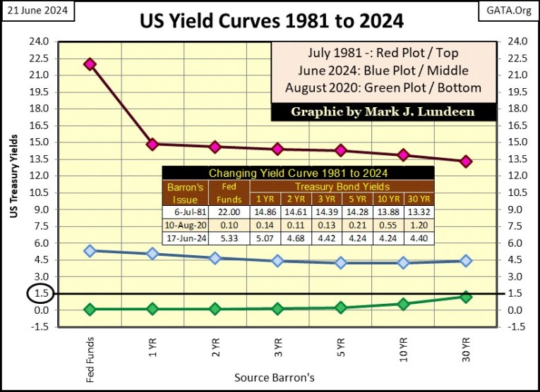
Beginning in the late 1970s, then Fed Chairman, Paul Volcker raised his Fed Funds Rate above the then double-digit T-Bond yields. In July 1981, the Fed Funds Rate was increased to a whopping 22%, 6% higher than any T-bond yield in the curve (Red Plot, chart below)
That did it. And exactly what is “it?” Well, the problem was monetary inflation flowing from the Federal Reserve, was flowing into consumer prices, which is something everybody hates. FOMC Primate Idiot Volcker was successful in diverting his monetary inflation from flowing into consumer prices, to now flow into financial asset valuations, such as stocks, bonds and real estate. So, monetary inflation was no longer a source of “consumer price inflation,” but became a source of “economic growth,” bull markets on Wall Street for the next four decades.
We know with 100% certainty that monetary inflation was flowing into the bond market from 1981 to 2020, as bond yields, Treasury and corporate began going down, which can only happen when bond prices are going up.
But all things must come to an end. The bull market in T-debt came to an end in August 2020, when no Treasury note, bill or bond yielded over 1.50% (Green Plot above). They have risen since (Blue Plot above), and will continue rising until they are far above where they were in 1981.
This may take many years, or only a few days should a selling panic / buyers’ strike comes to the Treasury-debt market. This exact thing happened in the multi-trillion-dollar, secondary mortgage market during the sub-prime mortgage debacle. A day came when there were only sellers in the mortgage market, no buyers.
Looking at the chart of Barron’s bond yields (above), they too have been rising (bond prices falling) since January 2021. Considering all the monetary inflation the FOMC is flooding the economy with, its best considering the corporate bond market too, is in the early stages of a massive bear market. As they were in 1981; bonds will once again become another dirty four-letter word in the markets.
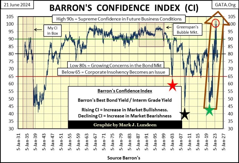
Here is another view of Barron’s Best and Intermediate Grade Bonds, what Barron’s calls its Confidence Index (CI). The CI is a ratio of its best grade / to its intermediate grade bond yields. Long ago, before many of my readers were even a twinkle in their mother’s eyes, the CI was a popular statistic for investors. But sometimes I feel as if Barron’s CI is now only followed by me, and a few other grizzled old-timers.
Barron’s states a falling CI is a precursor to a decline in the stock market. That was certainly true for the late 1930s, as it was for the NASDAQ High-Tech bear market (Red Star), the sub-prime mortgage debacle (Black Star), and again for the March 2020 flash crash (Green Star).
Barron’s also states a rising CI is a precursor to an advance in the stock market. For the examples just given; the late 1930s and the three stars seen below, that was also true.
But what I find fascinating about the chart of ninety years of CI below, is how from 1934 into the 21st century, this ratio of bond yields had never increased to 100, where Best Grade and Intermediate Grade Bond Yields were equal to each other. From the late 1950s to 1999, this ratio (the CI) came close to increasing to 100, but that never happened.
That was until July/August 2023, where for four weeks, the CI closed over 100; where Intermediate Grade Bonds yields were actually lower than Best Grad Bond yields, highlighted by the Red Circle and Brown Arrow above.
This is an amazing event in the history of this metric, published by Barron’s for decades. Take a moment, and have a good hard look at it. In only three years, the CI spiked from 47.30 in July 2020, to 102.00 in August 2023. What happened in the corporate bond market that caused this to happen?
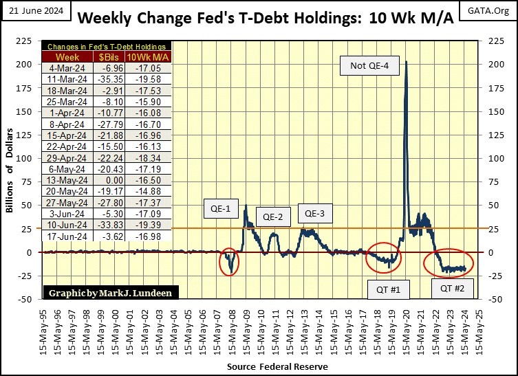
I’m not a “market expert,” just a market enthusiast. So, I shouldn’t speak in terms of absolute certainty of what is, or what is not in the financial markets. But I find it curious how FOMC Primate Idiot Powell’s massive Not QE#4, plotted in the chart below, occurred precisely when the spike in CI seen above happened.
Is it possible that there is a correlation between the Not QE#4 seen below, and the three-year spike in the CI, from 47.30, to 102.00 above?
Also, how is it possible for the Dow Jones to have seen twenty-six new all-time highs since last November, two years into QT #2, seen above, and below? Since May of 2022, the idiots have reduced the Federal Reserve’s balance sheet (chart below) by 20%. The United States, and much of the world should now be in a deep recession, for what is seen above and below. But it’s not, how is that possible?
I was standing alone in a dark room, lights out with my nose pressing against a wall to better ponder the deep-mysteries of the market, when a revelation came to me as if by a bolt of lightening; that at market tops, most, if not all “market experts” and economists appearing on the MSM, are either clueless about the markets and economy they talk about, or are sociopathic liars. But I’m only a market enthusiast, someone standing alone in a dark room, a humble seeker of truth about the markets, so what do I know?
One thing I do know with certainty, is the gold market isn’t overbought. Overbought? What does that mean? That people own a house (a mortgage), have money in a mutual, or union pension fund, or own stocks outright. People have lots of debt, with school loans, credit cards, car loans, or are paying off the new washing machine over time, with credit from their bank. They may have as much as a $1,000 in savings in their bank, but most likely have much less than that.
One thing most people don’t have, is even one silver dollar, or pre-1964 junk grade silver half-dollar. Gold? With gold today selling for over $2300 an ounce, most people certainly don’t own any gold bullion as an investment. Hundreds-of-thousands of dollars owed to a bank many people have. An ounce of gold for $2,300 they have not.
You don’t have to have your nose pressed against the wall in a dark room, to see the potential for gold and silver in the not to distance future is huge. So, don’t get angry and upset that the price of gold and silver isn’t now soaring up to the moon. It’s because the government is keeping the price of gold and silver at as low as it can.
So, if you are a buyer, the Federal Government and the big Wall Street banks are your best friends. I don’t think there is anything wrong for someone buying silver at today’s rock bottom prices, sending a very nice letter to JP Morgan’s Jamie Dimon, thanking him for making this possible. I’m serious! What a guy!!
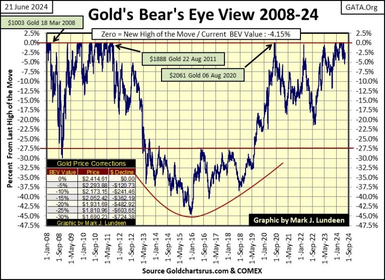
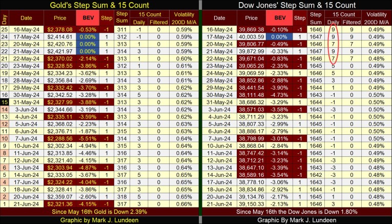
It's getting late, and this week’s article is getting much too long, so I’m going to end it here before I go over gold’s BEV chart and my step sum tables. But I’ll include them for those who are interested in them, and God willing, I’ll be back next week.
Mark J. Lundeen


