Let the Good Times Roll
 share
share
 share
share
 share
share
 share
share
 share
share
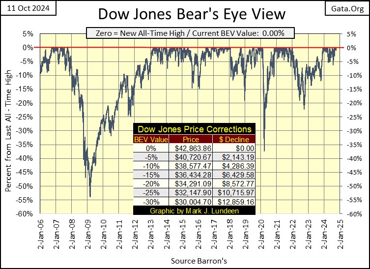
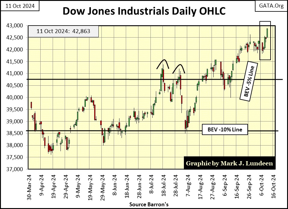
The Dow Jones closed this week at a new all-time high, a BEV 0.00% in its BEV chart below. This is the forty-third new all-time high since it entered scoring position last November. How long can this advance continue? We should check to see how long past advances have continued in the Dow Jones’ BEV chart below. This chart goes back to January 2006. Since then, the Dow Jones has seen quite a few advances into market history, clusters of BEV Zeros (0.00% = new all-time highs) forming on its Red 0% line.
Not always, but these clusters are typically range bound between the BEV 0%, and -5% lines, aka in “scoring position,” and the Dow Jones during these clusters of BEV Zeros, is advancing into market history, and can continue to do so for a couple of years. Take a moment to study the Dow Jones BEV chart below, and you’ll soon know as much as I do, of what we can expect from the Dow Jones in the weeks and months to come.
So, until the Dow Jones once again closes below its BEV -5% line, and stays there as it begins to decline towards, and ultimately below its BEV -10% line, I’m going to remain bullish on the stock market. How long before that happens, I haven’t a clue.
So Mark, are you beginning to like the stock market as a place to risk some of your investment capital on?
NO, I DO NOT!
It’s a risk to reward ratio thing. After any prolonged advance, the chances to realize any capital gains from investing in a market, doesn’t favor a bull. So, the higher the Dow Jones goes, the less I like it, for the simple fact that the closer any market gets to its ultimate high of any advance, market risks to invested funds only grow larger, as the potential for financial gains in that market approach zero.
Dow Jones 50,000 sounds attractive, but from this week’s close, 50K on the Dow Jones is only an advance of 16.65%. And what is the down side from here? I fear the potential for massive losses are huge.
Yesterday, over at Bill Murphy’s Le Metropole Café, Trader Roger had a very interesting comment I think all my readers should be aware of;
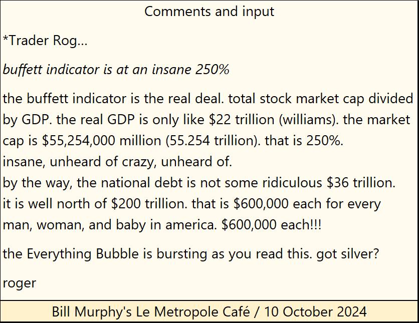
The market cap for the stock market is 250% greater than the United States’ GDP? Good Grief! As far as the national debt being much more than the official figure of $36 trillion, that is very true. The US government doesn’t have to, so it doesn’t follow accepted accounting standards, it mandates for everyone else. Its “unfunded liabilities” is a vast pool of off the book, unpayable IOU nothings, such as the reserves for social security, and all the other promises our elected officials have made to get elected, and stay elected over the decades.
In Barron’s 21 September 1936 issue, Barron’s called Social Security’s accounting a fraud. Nothing has changed in the past eight-eight years, except social security, and other Federal Government social programs, have only gotten more bloated, wasteful, and unaccountable. It’s a scandal how the mainstream financial media for decades, has never held the Federal Government to account, for its lack of accounting with its income and spending, that would be criminal for anyone else.
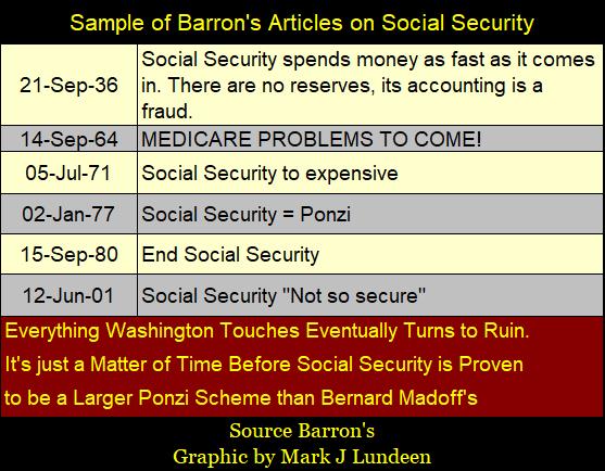
What does social security have to do with the Dow Jones and the stock market? Unfortunately, more than it should, as both the stock market and social security are Ponzi schemes managed by Washington, and both will end as all Ponzi schemes do – in ruin.
What did Trader Rog have to say; got silver?? That sounds like good advice from Roger.
Oh Mark, now you gave me a headache. Show me something pleasant to look at. Okay, here is the daily bar chart for the Dow Jones, in a bull market that only knows how to go up. Look at the Dow Jones current BEV -5% line; it’s about to rise above the Dow Jones’ all-time highs of last summer.
Well, historic bubble or not, as long as the Dow Jones continues closing above its BEV -5% line seen below, one has to believe this market is going higher. But then, as soon as it closes below its BEV -10% line, it’s best to be 100% out of this market. Or so, this is how best to be safe in this moral hazard, known as the stock market.
Below, in my table for the BEV values for major market indexes I follow, at Friday’s close, ten of them closed at a new all-time high, and the next six market indexes closed in scoring position. Not much else to say about it.
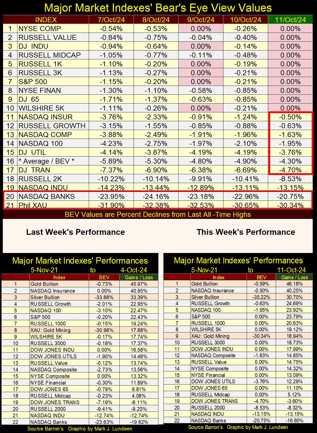
In the market performance tables above, gold was up for the week, as silver was down. The XAU was up for the week, but was kicked off its #8 spot by the Wilshire 5K.
I note the NASDAQ Banking index (#22) at week’s close is 16.6% below where it was in early November 2021. That is a red flag waving over the financial markets.
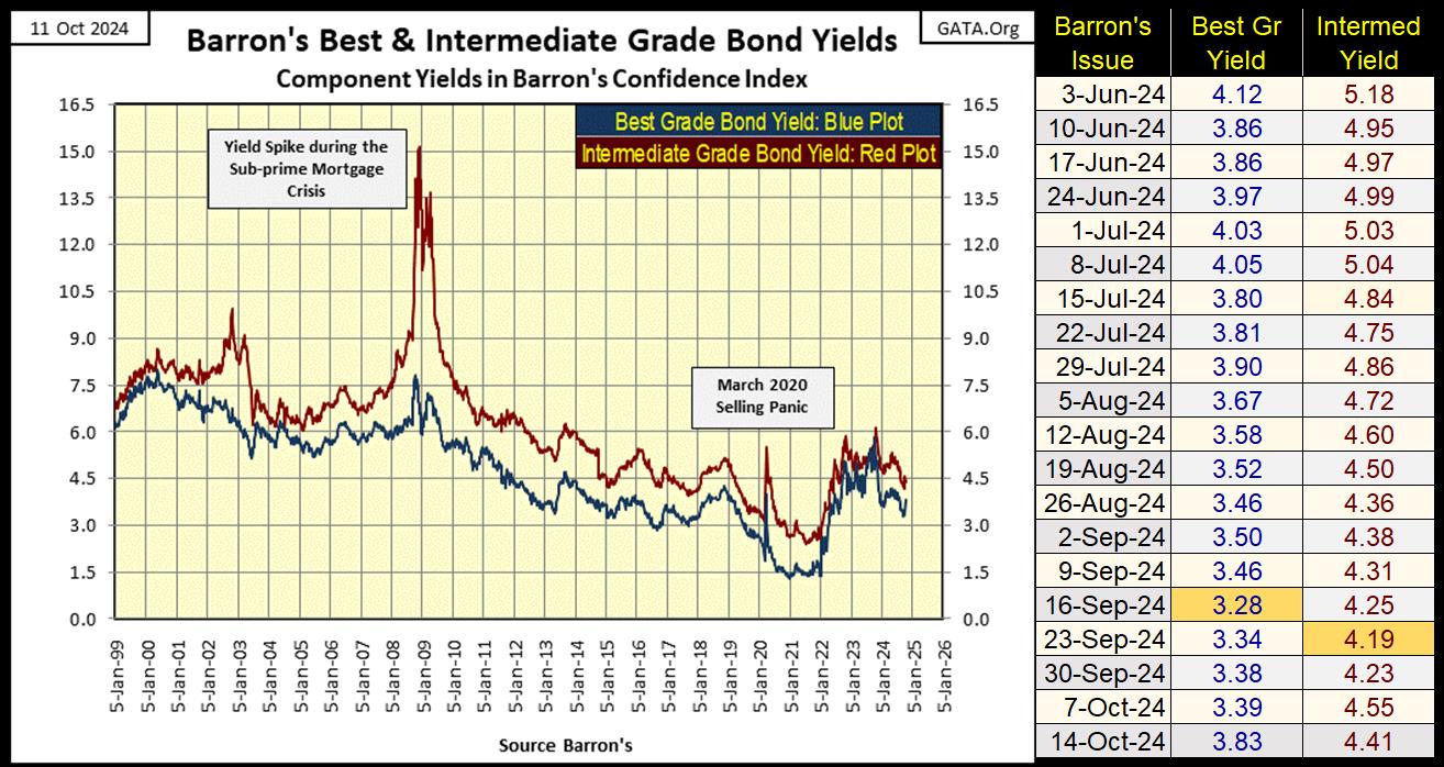
Below are the yields for Barron’s Best (Blue Plot), and Intermediate Grade Bonds (Red Plot). Both series are considered investment grade bonds. But as seen below, during times of crisis in the financial markets, intermediate grade bonds see their yields spike (prices decline).
These bonds were in a bull market that began in 1981, a bond bull-market that peaked in January 2022. Since January 2022, yields for both bond series have increased (prices have declined). In time, I believe we’ll see a massive bear market in corporate bonds that began in January 2022, that will most likely take bond yields back up to double-digit yields, where they were in 1981, and possibly higher.
Rising bond yields have never been a good omen for the stock market. So why did ten of the major market indexes I follow in the table above, close this week at new all-time highs? Yes, that is a good question, one I don’t have a good answer to, except its an election year, and the idiots at the FOMC are making this happen.
Looking at the 30Yr T-bond below, issued in February 2020, the T-bond market apparently has also entered into a bear market – rising yields, and deflating prices, since August 2020.
I placed a big arrow over April 2023. This was when a couple of banks in Silicon Valley had to close their doors, because they could not return the deposits their depositors had in them.
What was their problem? You can see it below; their reserves of Treasury bonds’ valuation (Blue Plot below) lost considerable market valuation, due to rising bond yields (Red Plot), from August 2020 to April 2023. What they purchased in the Treasury Market for a $1.00 in 2020, they could recover only $0.60 in April 2023.
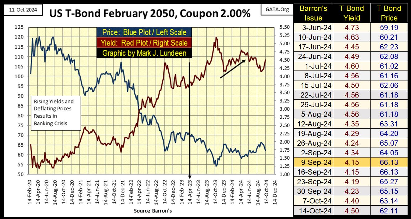
Things in the Treasury market have calmed down since 2023, but I believe the debt markets have all entered massive bear markets, that may take decades to fully express themselves. And as these bear markets play themselves out, we should expect additional problems in the banking sector, insurance companies and pension funds. Looking at the substandard performance in the NASDAQ Banking index above, I believe the stock market is looking at the banks that way too.
Let’s look at commodities, something we’ve not done since July. From 1966 to 1982, the stock market did little for investors. During this time of rising annual CPI inflation, increasing from low single digits, to over 15%, it was in commodities that money was made in the markets.
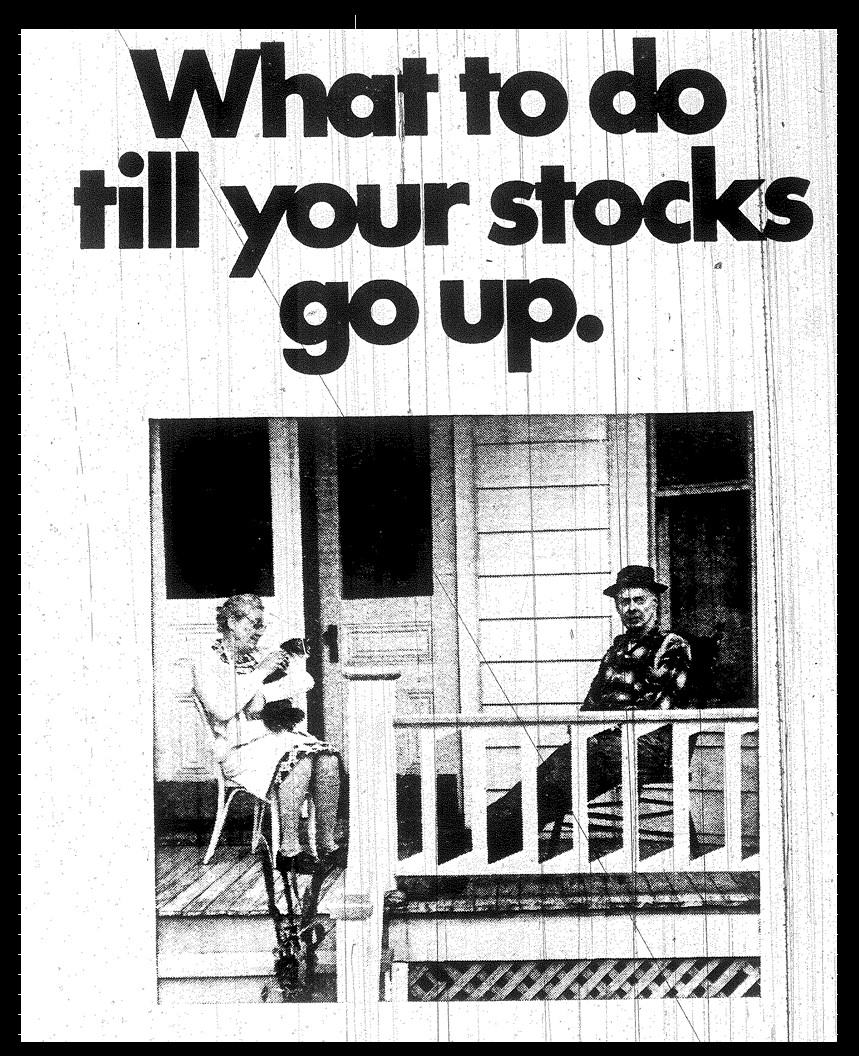
Below is an advertisement from an old issue of Barron’s from the 1970s, by one of America’s commodity exchanges. Fifty years ago, what to do until your stocks go up? Grow old, was the answer to that question, and from 1966 to 1982, that was how it felt too. How times have changed.
Well, things are changing all the time, though most people are slow in realizing the change. In the past ten years, one of the biggest things I’ve noticed change, is consumer price inflation (CPI) is once again raising its ugly head, and for the same reason it did from the 1950s to 1982; the Federal Reserve System was / is now over issuing dollars and creating credit at reckless rates.
I know my daily and weekly expenses have increased a lot in the past few years. Much more than the low inflation rates Federal Government would have us believe.
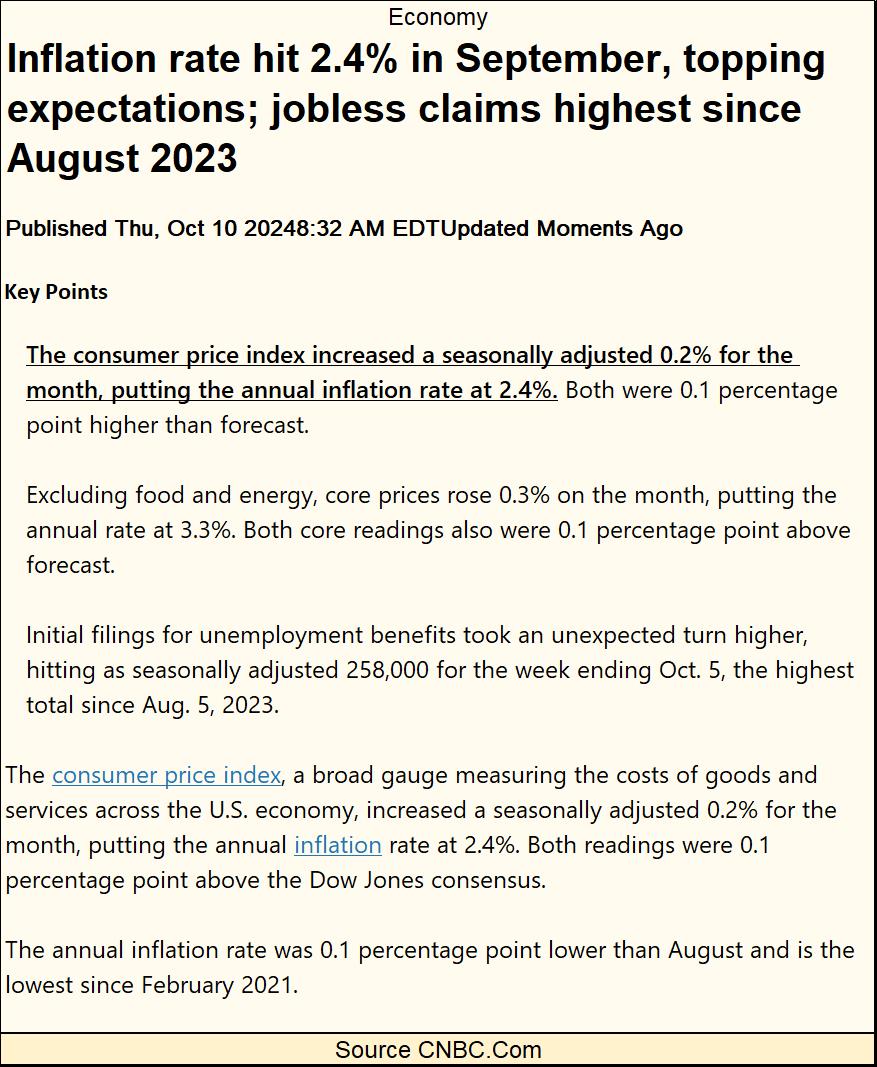
https://www.cnbc.com/2024/10/10/cpi-inflation-september-2024.html
My monthly Navy pension and Social Security income doesn’t go as far as they once did. I read where the Federal Government is going to increase Social Security payments for next year by 2.5%, and I’m assuming my Navy pension will go up by about the same. What a joke.
So, how has this big pickup in CPI impacted commodity prices? Surprisingly, not by much, if you believe the BEV values seen in the table below. Gold made a few new all-time highs in September, and I believe copper also has seen some new all-time highs in the past few years. But look at how far these commodities are from their last all-time highs in the table below. Crude Oil (#12), is down by 47.90% from its last all-time high, seen in 2008 during the sub-prime mortgage crisis.
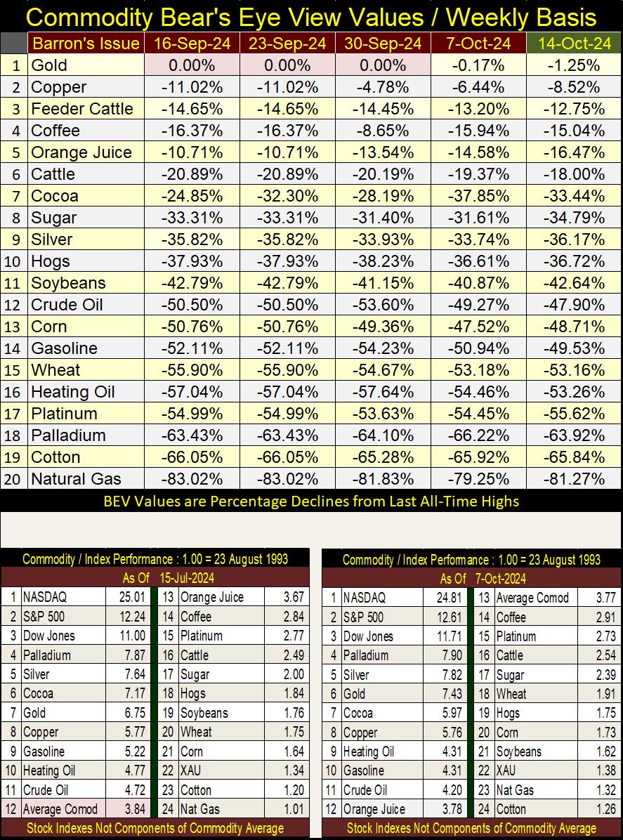
In the performance tables above, we’re looking at the same commodities, but by factor increases from a base date of 23 August 1993 = 1.00. So, when one of the above items has increased to 2.00, it had increased by 100%, a doubling in price.
- The top three items are stock indexes, and since August 1993, a dollar in the NASDAQ Composite index, is now worth $25.01, with the other indexes up by double-digit factors. This is because, since 1993, inflation flowing out of the Federal Reserve System has been flowing into financial-asset valuations, not commodity prices.
- The next in the group are the metals (#4-8), along with cocoa. They are up by a factor of 5 or more.
- Energy comes next (#9-11), seeing factor increases since 1993 between 4 to 5.5. Natural Gas, #23, up by a factor of 1.32.
- Finally, agricultural items (food) are seen, with most seeing an advance for these past thirty years of less than a factor of 4.
Looking at the table above; are rising commodity prices the driving force behind today’s rising CPI inflation? Maybe, but I don’t see it. So, why has CPI inflation increased so much in the past few years? It’s a bit of a mystery to me, but I suspect rising prices are due to chronic mismanagement at the highest levels of government and finance. Don’t expect to ever see CNBC.Com consider that as a possibility.
Here is a chart for crude oil, the upper chart plotting crude oil in dollars. The lower chart plots crude oil in the Bear’s Eye View, where new all-time highs register as 0.00%, and all data points not a new all-time high, register as a percentage claw-back from its last all-time high.
Crude oil’s last all-time high, is from the 2007-09 sub-prime mortgage crisis. Oil prices spiked as wealth fled from the collapsing mortgage market, flooding into crude oil, seeking a haven from deflation in the financial markets.
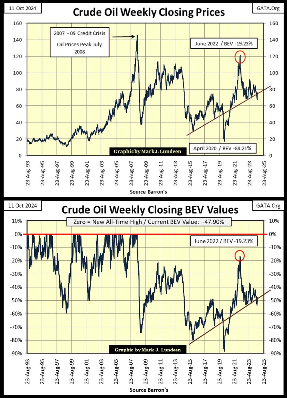
In crude oil’s BEV chart above, its scoring position doesn’t seem to lie between -0.01% and -4.99%, that the Dow Jones does. First, the data plotted above is weekly data, not daily data as I use for the Dow Jones. Also, they are different markets, so why would they behave identically to each other?
Fortunately for us, gold’s BEV chart below, plotted with daily data, does have its scoring position very similar to the Dow Jones. That keeps things simple.
Gold in its BEV chart below tells an amazing story. From 2001 to 2011, gold made big gains into record highs, lots of BEV Zeros in its BEV chart. Then from 2011, to 2020, for nine years gold endured a massive correction, a 45% price decline by December 2015. That was one hard bottom, that convinced many former bulls in the gold market, they wanted nothing to do with gold. Hard bottoms such as this, are the best buying opportunities for informed investors.
But buying at any market’s hard bottom, when everyone, including the financial media is bearish to an extreme, is psychologically difficult for most investors. However, at these hard-market bottoms, when no one wants to buy, investors will find market risks at a minimum, while the potential for market gains at their maximum. The exact opposite to the risk-reward situation currently to be found in the stock market; following a prolonged advance, when everyone, including the financial media is bullish.
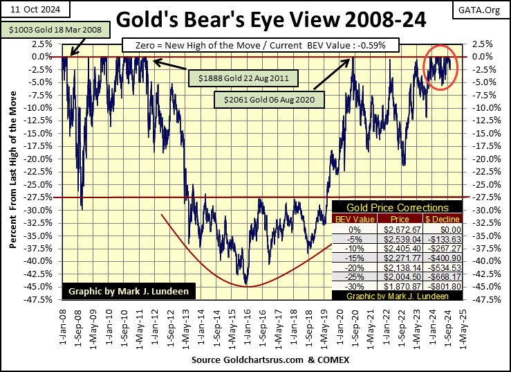
Look at that nice cluster of BEV Zeros gold has been forming since last November in its BEV chart above (Red Circle). So far, gold has seen thirty-seven new all-time highs in this cluster, and I’m expecting more to come.
Below, I’ve included a BEV chart for gold and the Dow Jones from October 2022 to today’s close, in a single graphic. Seeing both gold and the Dow Jones entering scoring position last November, and staying there for the past eleven months is very unusual, but there it is.
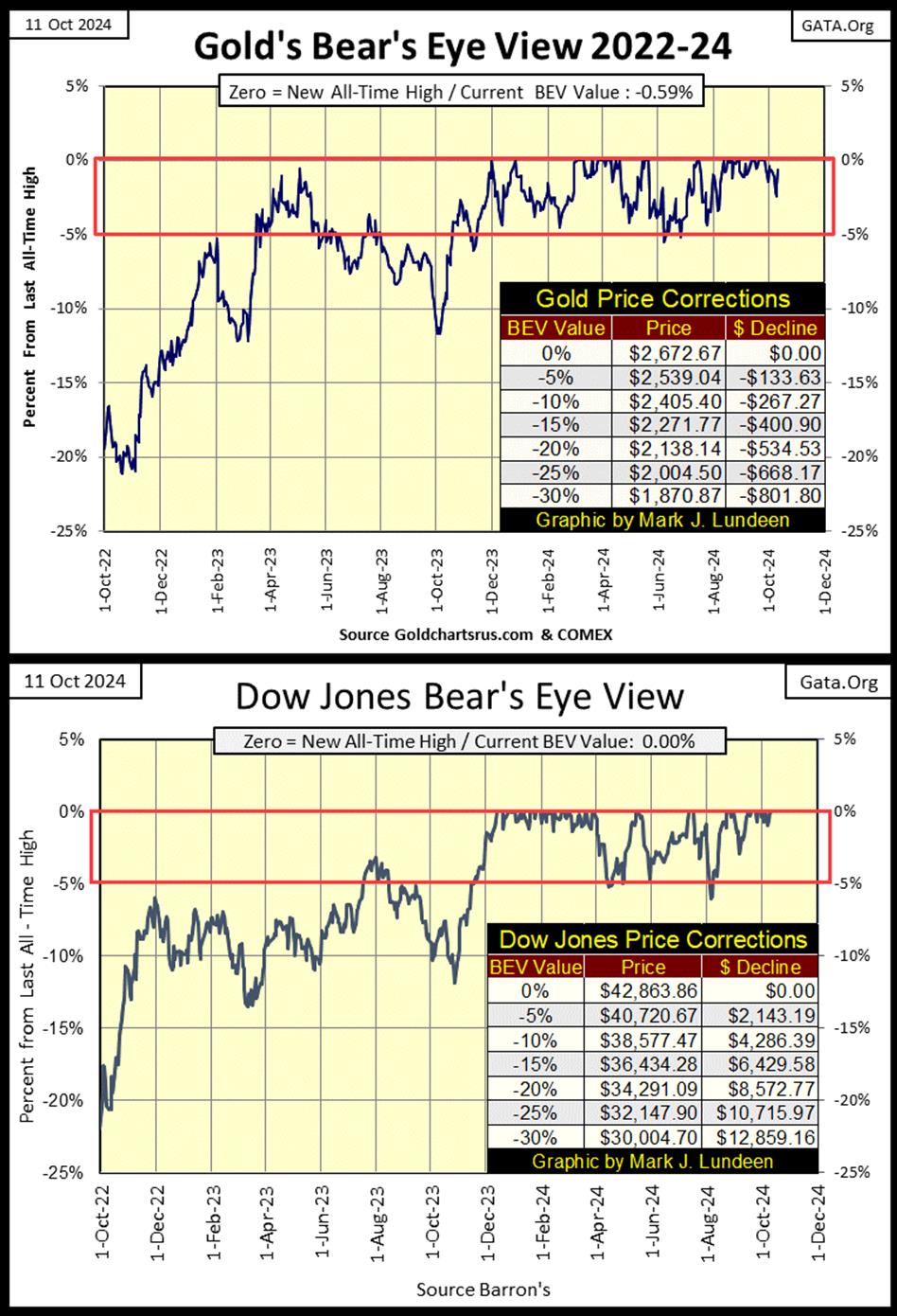
Which of these markets will first deflate below their BEV -10% line? I’m thinking the Dow Jones, but I’ve been wrong before. No matter, it’s a point of historical interest, seeing these two very different markets, with their BEV charts being so similar, for almost a year.
Gold in its step sum table below is looking interesting. Lots of blue BEV Zeros in September, taking gold’s 15-count to an overbought +7 on September 24th. Markets don’t like being overbought, so seeing gold selling off in October was to be expected. But after all those red down days seen below, the most the bears could take gold down was to a BEV -2.44% on October 9th, as its 15-count declined to a neutral -1.
As things are at the close of this week; next week, or the week after, gold should once again enter a period were advancing days out number declining days. When it does, I’m anticipating additional new all-time highs for gold.
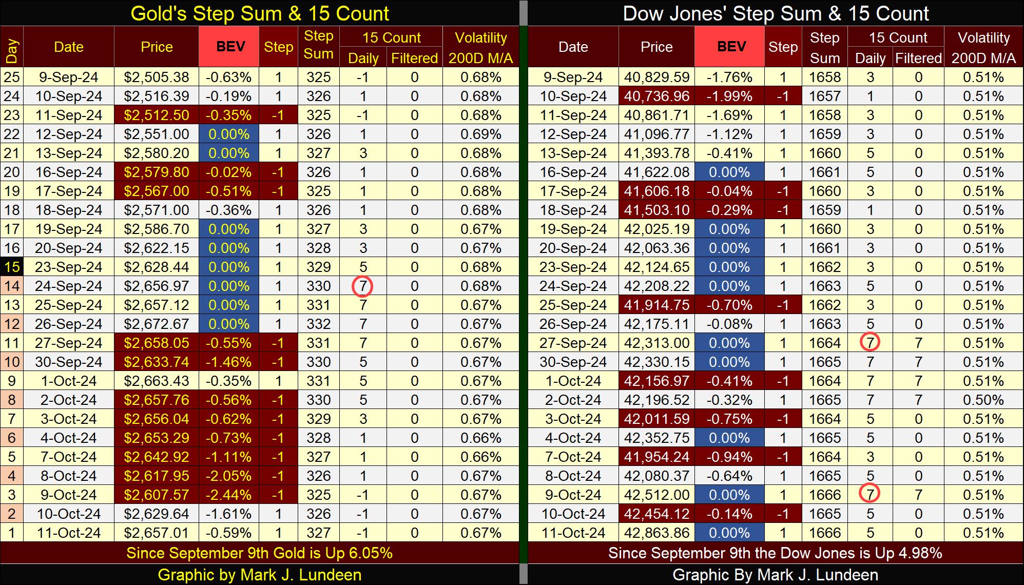
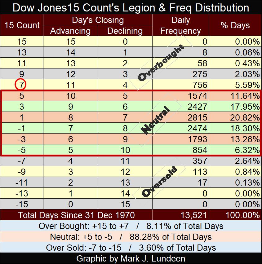
Looking at the Dow Jones’ step sum table, twice since September 9th, the Dow Jones has seen its 15-count a +7, an overbought market. Now we know markets don’t like being overbought, but since August 26th, the Dow Jones has closed with a 15-count of +7 for twelve of these thirty-three trading days. That is a lot of +7 in such a short time, but obviously the bulls don’t care, so why should we?
My thinking about the Dow Jones being chronically overbought, with no one caring about it, is this could go on for a while. But when once again, declining days overwhelm advancing days, as one day it must, as you can see happening over on gold’s side of the step sum table, things could get dicey for the bulls in the stock market. What exactly does dicey mean? Possibly that the Dow Jones sees its BEV value approaching, or breaking below its BEV -10% line.
Mind you, I’m not predicting anything here. It’s just very unusual seeing a market so overbought, for so many days, and not selling off to lower its 15-count back to a much lower neutral value.
I have an update for Eskay Mining’s summer of 2024 exploration program. No core samples were pulled out this year, but the company’s geologists did travel across Eskay’s massive property to gather grab samples and to chip at interesting rock formations. The assays for these samples are now in, and published in Eskay’s website, and look very promising.
I’m not a geologist, or a market analyst for the gold mining sector, so take my opinion on Eskay Mining for what they’re worth, but I continue to be very optimistic about Eskay Mining’s potential for making a huge impact on its shareholders net worth. Why would that be?
All around the company’s massive Cory Property in British Columbia’s Golden Triangle, huge mines are to be found. For that reason alone, it’s reasonable assuming a few significant’ precious metal ore bodies are to be found on Eskay Mining’s property. Then looking at the assays for this summer’s field samples in this week’s press release, there were many very high-grade assay results picked up this summer, samples that came from some place on the Cory Property, where there should be a whole lot more to be found.
Eskay Mining is an exploration company, and mineral exploration is a high-risk speculation that is not suitable for widows and orphans. But for someone interested in gold and silver mining as an investment, setting aside 5% of what funds they intend to invest in mining companies now producing gold and silver, as a speculation, is not a bad thing to do.
Mark J. Lundeen
********
share
share
share
share
share