Decoding the Precious Metals Charts: A Bullish Outlook


It was a good week in the PM complex after the hard shakeout last Monday and Tuesday, leaving behind a daily reversal bar on the daily charts. The rest of the week, the PM complex showed a lot of strength and took out some important trendlines overhead.
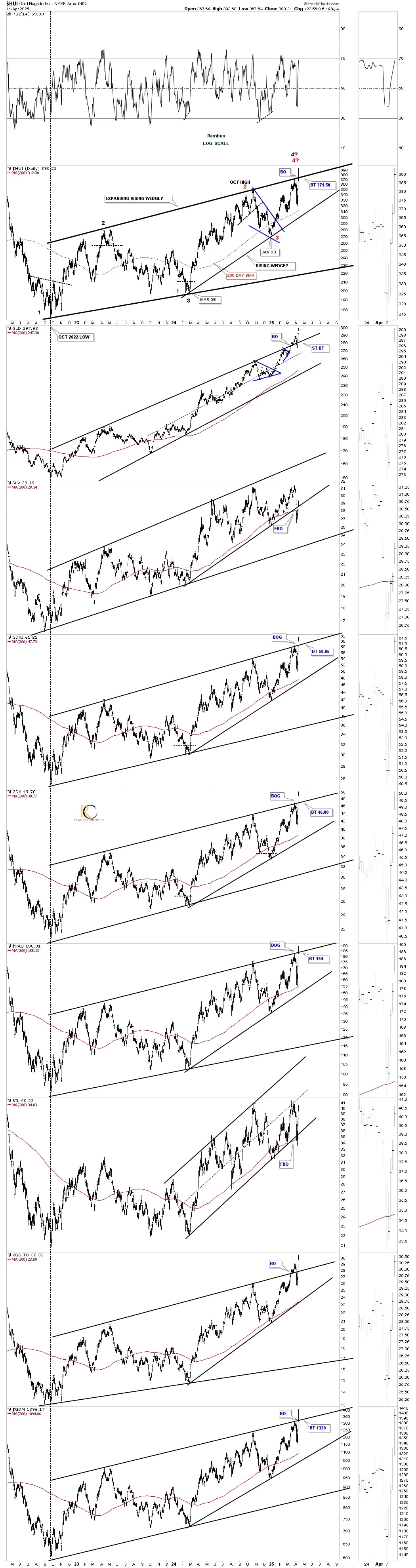
Let’s start with this daily combo chart we’ve been following very closely, which begins at the October 2022 low, which shows different varying degrees of rising channels and wedges with some channels expanding. Since the March 2024 low, the third reversal point on the HUI, the price action has been narrowing within the channel with a breakout above the top trendline on Friday and, in most cases, with a breakout gap.
If you recall, we were watching the 4th reversal point very carefully last week, where the black and red #4’s came together at the top trendline. That breakout gap above the top rail is strongly suggesting the pattern is complete. As is the usual case, we should look for a possible backtest before the impulse move really takes hold. Note how SLV and SIL showed a false breakout/bear trap below the bottom rail of their internal uptrend line but closed the week back above. This usually means a good move should now take place to the upside.
Last week, we looked at this weekly chart for the HUI, which finally showed the blue bullish rising wedge with that slight breach of the bottom rail and then the breakout above the top trendline on Friday.
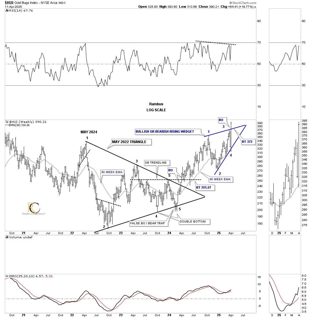
To put that blue bullish rising wedge into perspective, on the daily chart above, I colored it red on this longer-term weekly chart for the HUI, which shows the 2016 uptrend channel. Initially, when the blue 2020 bullish expanding falling wedge had its breakout, a smaller red bullish falling wedge formed as the backtest, which I left with the dashed trendlines. That smaller bullish falling wedge morphed into the bigger 6-month red bullish rising wedge with the breakout last week.
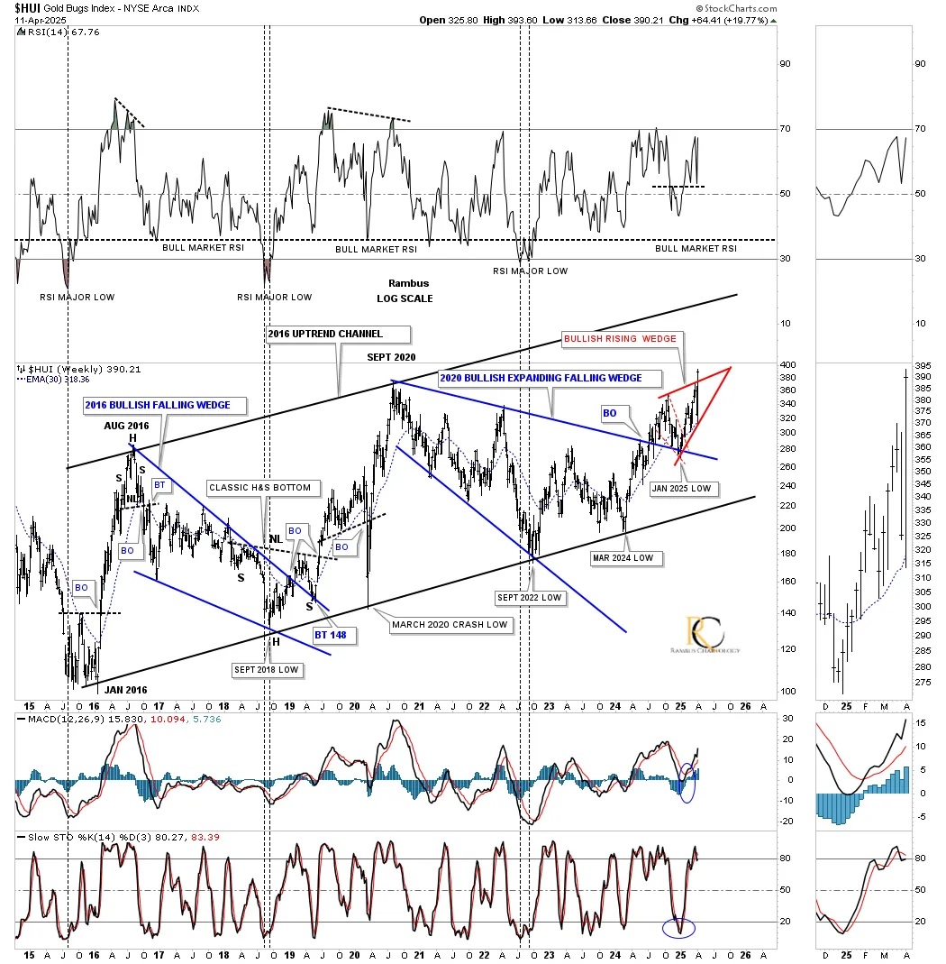
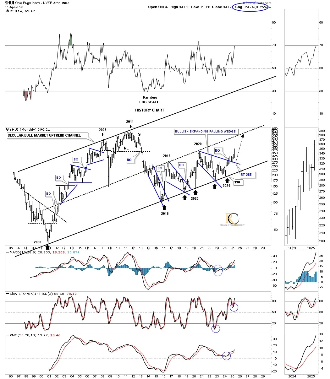
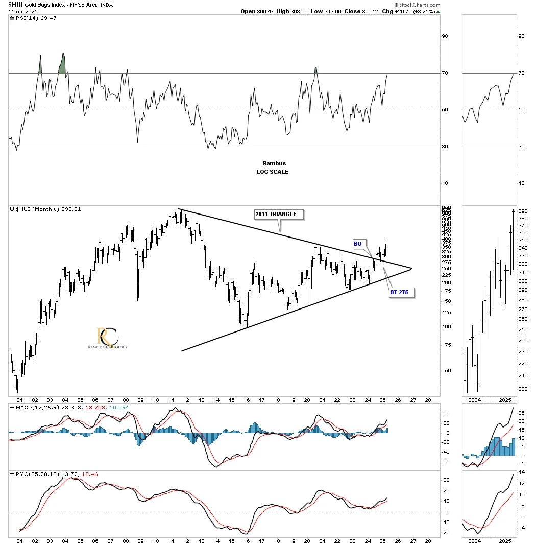
Next is the monthly history chart for the HUI, which shows all of its important trading ranges in its 2000 secular bull market uptrend channel. In large trading ranges like the 2020 bullish expanding falling wedge, sometimes the breaking out and backtesting process can take quite a long time. During the bull market years between 2000 and 2011, the backtests were very brief, including that very symmetrical 2011 H&S top. There is just no way to know how long a backtest may take or even if there will be one. As long as the top trendline holds support, one just needs to have patience, as you can see with the 2016 bullish falling wedge and the 2020 bullish expanding falling wedge
I mentioned previously that the beginning of last week was still short-term bearish, but that changed dramatically starting on Wednesday. By the end of the week, most of the PM complex formed a very large weekly outside reversal bar, or, as they would say in candlesticks, an engulfing candle.
This weekly combo chart shows you a clear picture of the 2020 bullish expanding falling wedges in most cases. Again, the silver area is still showing relative weakness as the rest of the PM complex made a new higher high last week. SIL and SILJ are getting close to completing their blue triangle consolidation pattern with just a little more work.
The CDNX threw us a bit of a curve ball over the last month or so. Initially, we saw that very symmetrical inverse H&S bottom forming with what looked like the breakout, FBO, but then the price action decided to make one more right shoulder, which actually makes the multi-year H&S base even more symmetrical, as shown by the neckline symmetry line and the double neckline. Note the massive reversal after last week’s right shoulder low.
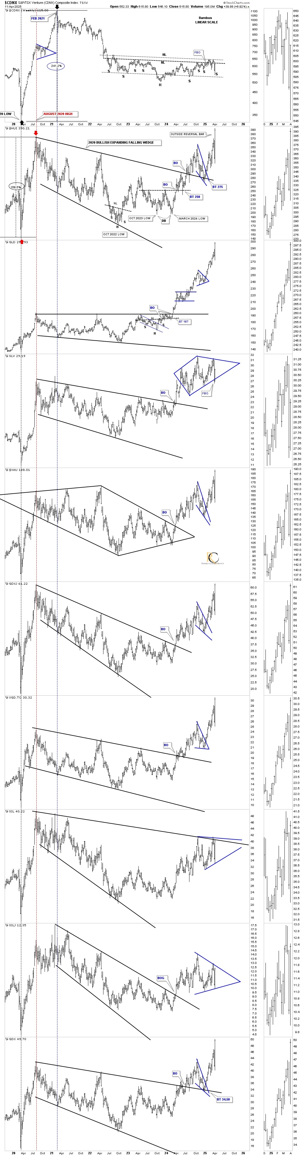
This long-term monthly chart for the PM complex shows you their 2011 triangle consolidation pattern in most cases. SIL is now testing the top trendline, while silver has already broken out from this long-term perspective. I’ve been mentioning, as we’ve been following this monthly combo chart, that the next step was to see a new higher high above the breakout high form, which we got in spades last week.
I realize how hard it may be for some of you to grasp how important these 2011 triangles are to the big picture, but they are just as valid as another triangle on another timeframe. If you didn’t see the date, you wouldn’t know if these triangles were on a minute, daily, or weekly chart. One of my favorite sayings is, “Big chart patterns lead to big moves,” and everything taking place in the PM complex is creating big patterns.
For those with patience, PPLT and PAL are still way undervalued vs. the rest of the PM complex, while gold, on the very bottom, led the PM complex higher when it broke out from its 2011 bullish rising wedge and hasn’t looked back.
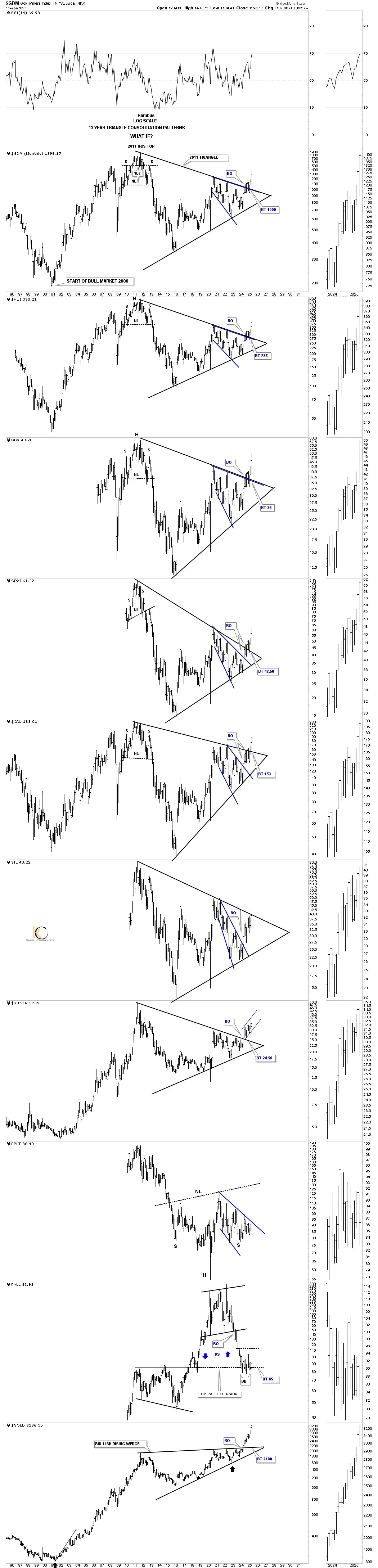
This monthly chart for the HUI just shows you the 2011 triangle up close and personal. What you are looking at is just the very beginning of the next impulse move to the upside now that the backtest has completed. To get an understanding of what lies ahead, just look at the rally on the left side of the chart with the strong impulse moves higher, followed by an area of consolidation, followed by the next impulse move up.
Let’s now look at some ratio and ratio combo charts to add another layer of confirmation that the current bull market is the real deal, which is going to lead to a very big move over the coming years.
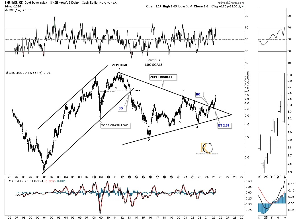
The US dollar is going to play a key role in the development of our current impulse move up in the PM complex. Below is a weekly ratio chart, which compares the HUI:US dollar. On the left side of the chart, note how the HUI outperformed the US dollar during that phase of the secular bull market. It took 13 years to consolidate that leg, with the ratio forming the 2011 triangle consolidation pattern with the breakout and backtest looking complete.
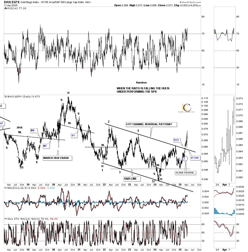
Below is the HUI:SPX, which shows the HUI is finally outperforming the SPX in a big way by breaking out from its 2022 five-point bullish channel reversal pattern. Note the breakout gap above the top trendline, which was no fluke and the attempted backtest which came up just short.
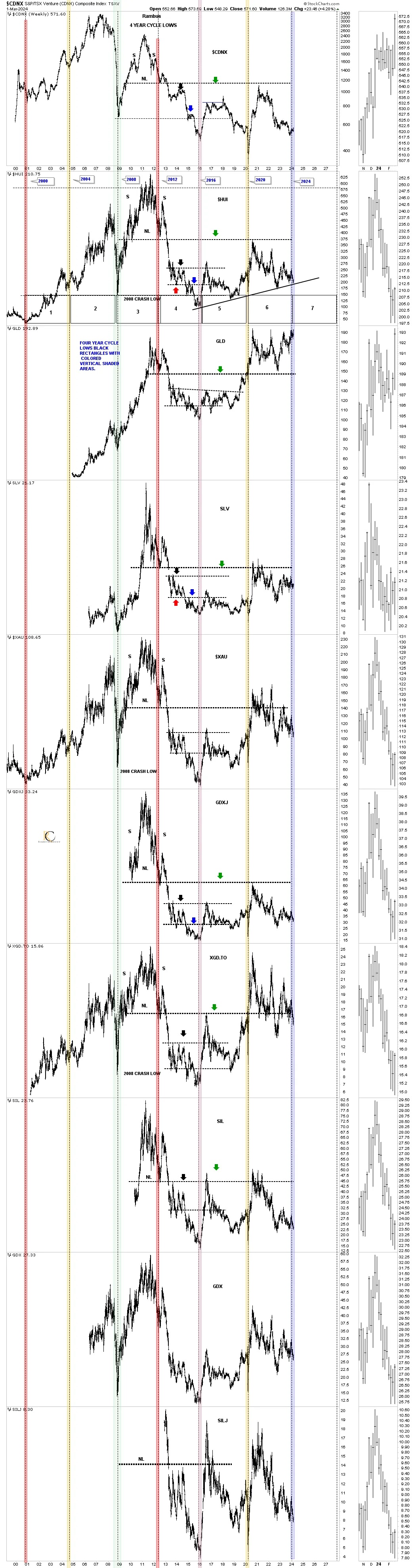
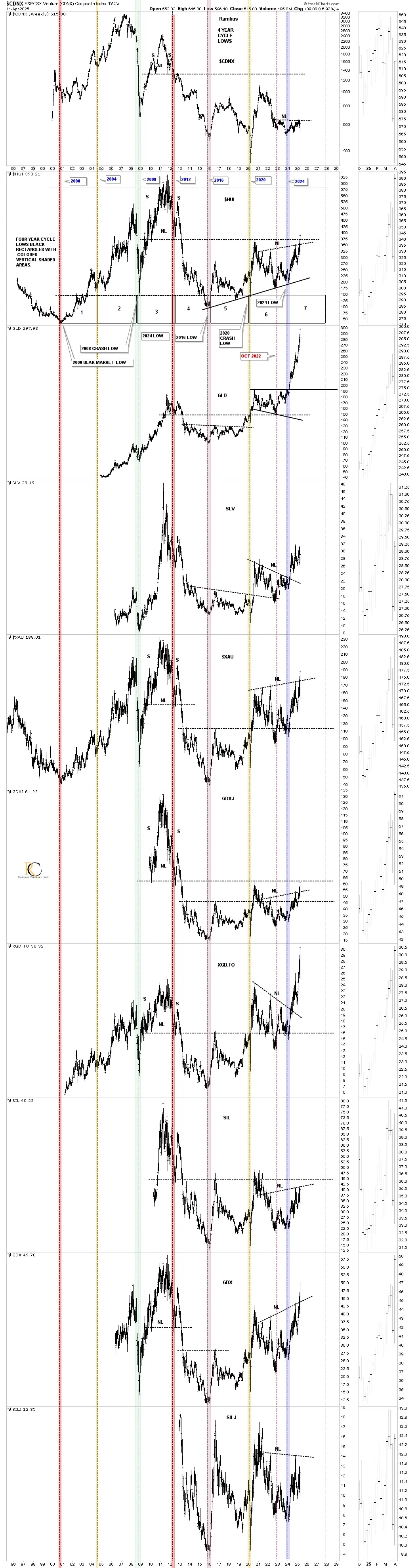
Back in March of last year, when the PM complex was putting in a low, we looked at this four-year cycle chart for the PM complex that goes back to the 2000 low. Just like clockwork, an important low shows up, and March 2024 was no different.
I made this comment on March 1, 2024, when we were looking at bottoming charts.
March 1, 2024
“If the four-year cycle is still in play, we should see a rally of sorts sometime in the not too distant future.”
Today, April 13, 2025:
It’s now a year later, and you can see how that 4-year cycle low held beautifully. I added the red vertical dashed line because that is where I believe the real bull market began, even though the actual low was in 2016, which I’ll show you a bit later when we look at the US dollar.
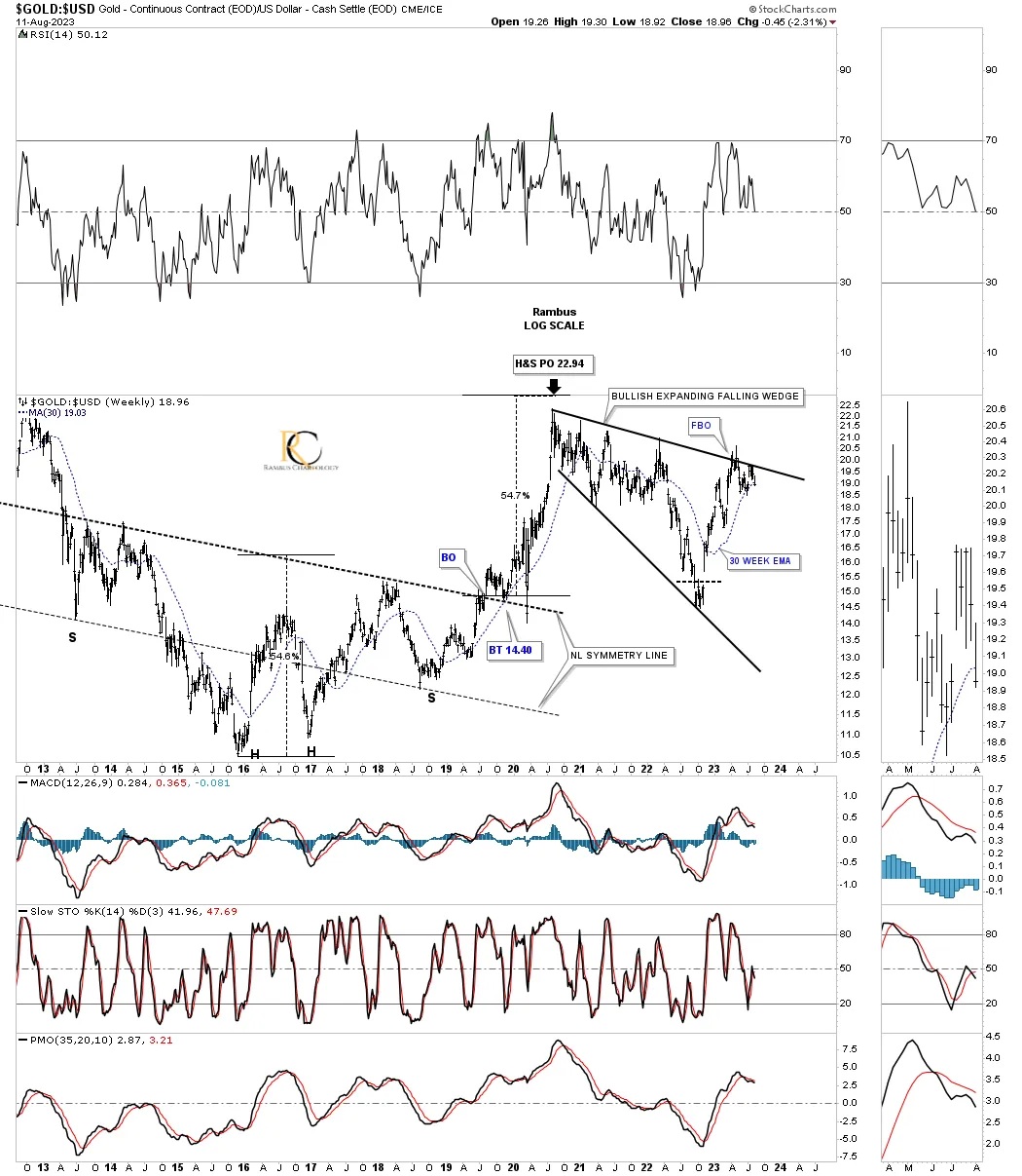
At the end of the Weekend Report back on August 13, 2023, I finished that report looking at the Gold:US dollar ratio, which again is key for the PM complex.
August 13, 2023:
I have two different long-term views for the Gold:US dollar ratio chart. This first one shows the massive inverse H&S bottom, which led to the last big rally in Gold, falling just shy of its measured move before the correction in 2020. Over the last 3 1/2 years or so, the ratio could be chopping out one of the most bullish consolidation patterns there is, the expanding falling wedge. As you can see, the top rail has been touched at least six times, telling us it is still very hot with the recent touch. The 30-week EMA is also being tested for possible support.
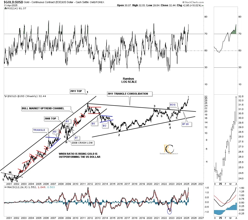
Today, April 13, 2025:
About a year and a half later, you can see how that bullish expanding falling wedge played out for the Gold:US dollar ratio chart we looked at above. It’s the psychological profile of the expanding falling wedge that makes this pattern so strong. Note how low the last reversal point is in the pattern. When that last reversal point low is made, anyone who wanted out has gotten out or been forced out. The opposite is true with a bearish expanding rising wedge, which can lead to a big move to the downside.
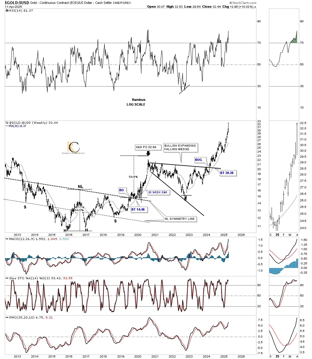
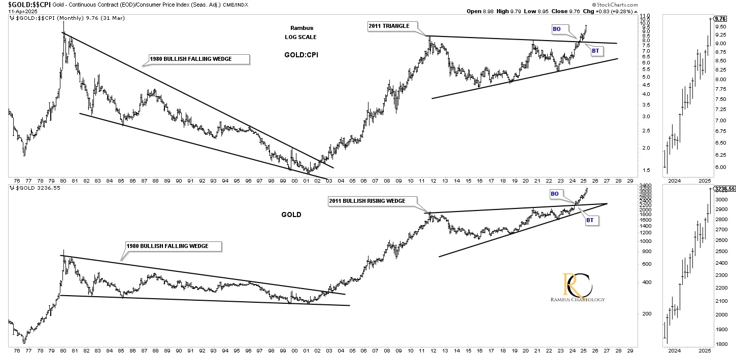
It was this ratio chart for Gold:US dollar that gave me the first clue that we could be witnessing a massive 2011 triangle consolidation pattern in the PM complex, which we just looked at above on the monthly combo chart.
August 13, 2023:
This longer-term weekly chart for the Gold:US dollar ratio shows the bull market years leading into the 2011 all-time high for the ratio and how Gold massively outperformed the US dollar, forming one consolidation pattern on top of the previous one. That triangle is right at 13 years in the making, and if it can ever break out topside, I would view it as a halfway pattern, as measured from the 2000 low to the 2011 high, adding that distance to the recent low made earlier this year in 2023 to get your price objective.
The charts above show several dynamic scenarios in which the PM complex can have a very large move in either direction. That may seem like a cop-out, but until we get more confirmation one way or the other, there is no worse feeling than being heavily invested in the wrong direction. Eventually, we will get our questions answered, but having the patience to wait for those answers can be very hard, as each rally will seem like the start of the next great bull market, which hasn’t been the case for the last three years, as every rally failed to deliver.
Today, April 13, 2025:
Well, we didn’t have to wait too long to get our answer to the question above. As you can see, the ratio broke to the upside with no backtest, and the impulse move is gaining strength.
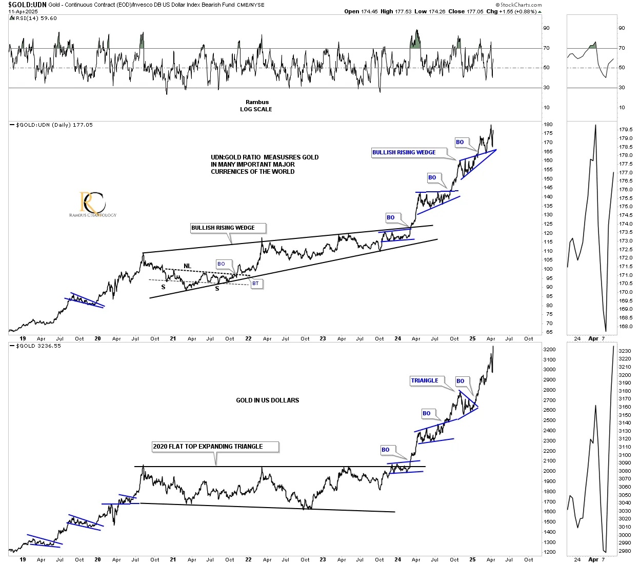
Next is a ratio combo chart, which has the Gold:UDN ratio on top with gold on the bottom. The Gold:UDN ratio shows how gold is doing in many important currencies around the world. Most of the time, these two move together, but other times, one can lead the other. The 2020 trading ranges show the ratio forming a bullish rising wedge, while gold in US dollars formed a 2020 flat-top expanding triangle. Just recently, you can now see that gold in US dollars on the bottom is outperforming the Gold:UDN ratio, as it just made a new all-time high.
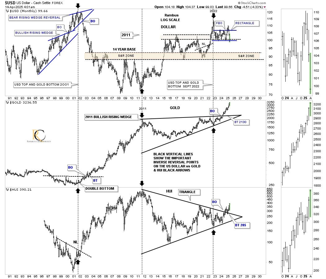
I mentioned previously that I thought the real bull market began in 2022 and not 2016, which is technically the bear market low. Below is a triple combo chart, which has the US dollar on top with gold in the middle and the HUI on the bottom. The black dashed vertical lines show the important highs in 2000, when the PM complex bottomed, the low in 2011, when they topped and began their bear market, and the 2022 high in the US dollar, when gold and the HUI both put in the last reversal point in their massive 2011 consolidation patterns. What will complete this very bullish setup of the PM complex is when the US dollar breaks below the top rail of its 2022 rectangle. This is probably one of the most important charts for a bullish PM complex.
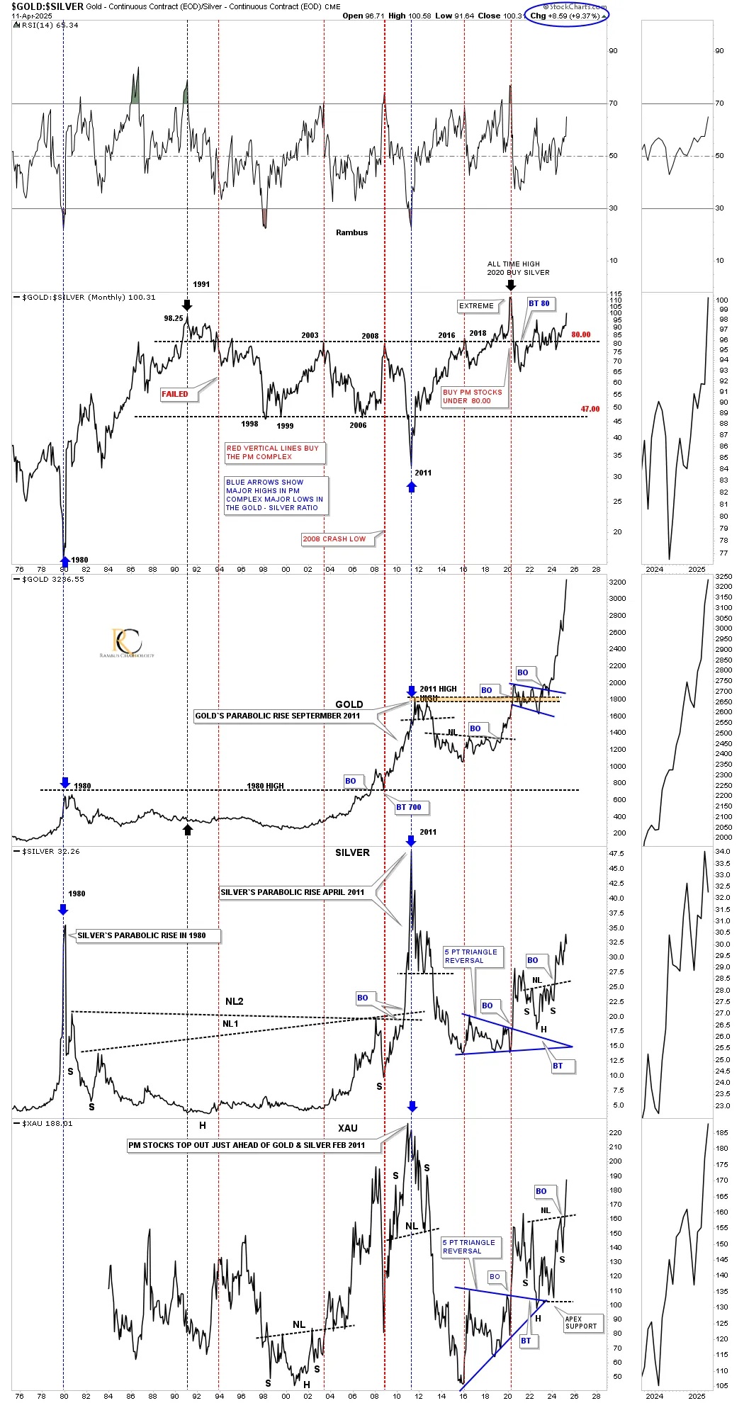
This next ratio combo chart has the Gold:Silver ratio on top, with gold below, followed by silver, with XAU on the bottom. Everyone has their own way of looking at this ratio, but generally, when the ratio starts to trade below 80, good things tend to happen for the PM complex, although that is not the case this time.
As you can see, the ratio is now trading close to its all-time high, made back in 2020, which gave us a good clue to get long the PM stocks back then, as the ratio was so far out of whack. As you would expect with the ratio this high, gold would have to be going nuts to the upside, which it is. Silver, on the other hand, is still struggling, but is getting close to making a new higher high. What’s really impressive is the XAU on the very bottom. Even though it’s still way below its all-time high, you can see it has recently completed a very large H&S consolidation pattern that formed on top of the previous blue 5-point triangle reversal pattern same as silver.
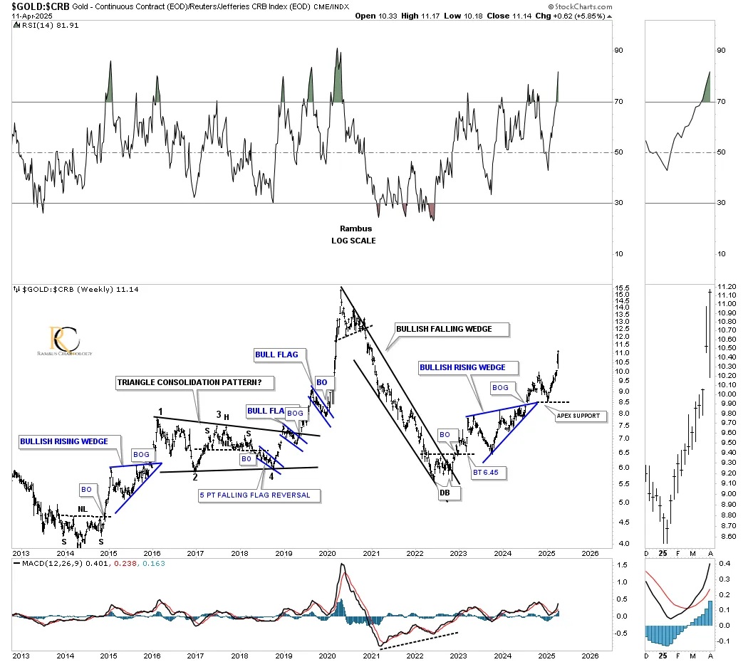
Since the 2022 low, gold has been outperforming the CRB index, which is always a good sign for the PM stocks.
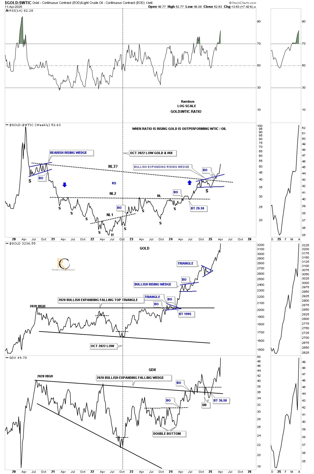
Another very good sign for the PM stocks is the Gold:WTIC ratio chart. I didn’t have time to put the before chart here, as we began following this ratio combo chart just before NL 2 was broken. The ratio went on to form a third neckline, which was just recently broken. You can see how gold and the GDX have been moving up with the ratio moving up. Again, this should be very beneficial for the individual PM stocks, as their overhead should be lower.
This next ratio combo chart has the Gold:PPI on top with Gold on the bottom. These two generally move in the same direction, which shows that when gold is outperforming inflation, the ratio is rising, and vice versa.
Below is a weekly chart for the GLD:SPX ratio, which finally shows GLD is outperforming the SPX. Note how the energy is being released from that 2022 blue rectangle. The key that indicated this time the breakout was going to occur is when the blue 5-point bullish rising wedge reversal pattern formed.
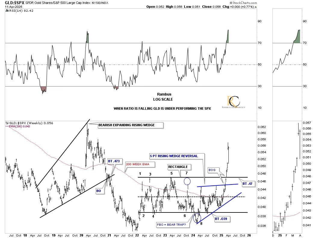
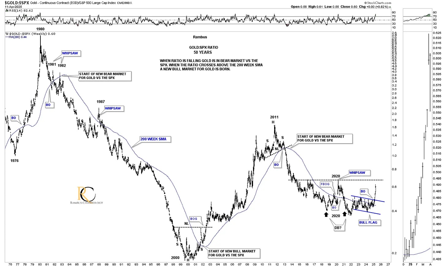
Below is the much longer-term 50-year look at the Gold:SPX ratio, which shows you in no uncertain terms when Gold is outperforming or underperforming the SPX by the way it trades against the 200-week SMA. Once the main trend gets established, it can run for many years. Just recently, the ratio broke out of the blue reversal pattern and is trading significantly above the 200-week SMA for the first time since the 2020 false breakout. Once the ratio can take out the overhead resistance line, it should be pretty clear sailing.
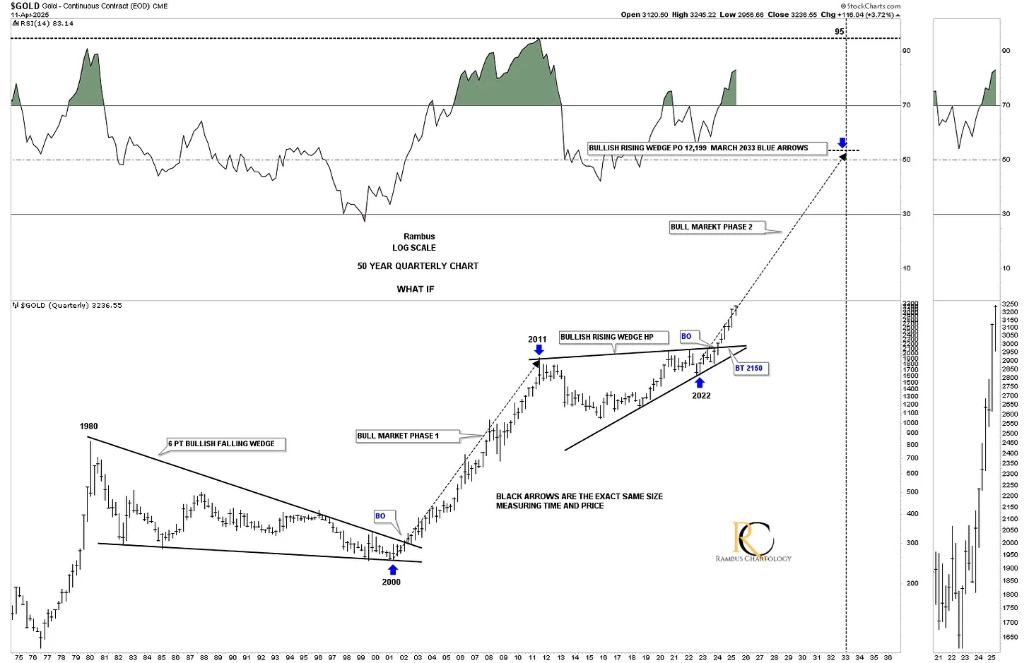
Back in March 2024, I posted this long-term chart for gold, speculating at the time if it would play out.
From the March 2024 Weekend Report:
We’ve looked at some long-term charts tonight, so let’s look at one more that I have been following for some time but was waiting for the right time to post it. Through the years, we’ve heard analysts calling for $10,000 gold or $20,000 gold, which I thought were crazy price objectives.
If you go back up to where I posted the Gold:USD ratio chart, which shows the 2011 triangle consolidation pattern, that is the chart I got the idea for this possible scenario below, which I know will sound ludicrous.
If we start at the 1980 all-time high to the 2000 bear market low, you can see a nearly perfect 6-point bullish falling wedge. How do we know it is a 6-point bullish falling wedge? Just look at the 11-year bull market that followed the breakout.
Just about every gold analyst knows about the 2020 trading range, with each giving the consolidation pattern their own name. I took it a step further and connected the 2011 high to the 2020 high to get the top trendline and then the two lows for the bottom trendline, which shows a bullish rising wedge with the breakout taking place this month. Again, markets are fractal in nature, so if the 2000 to 2011 bull market is one massive impulse move and the 2011 bullish rising wedge is the halfway pattern, we can measure the price objective that I like to use, as shown by the blue arrows.
I’m not saying this is absolutely going to play out, but it is something that I can now watch to see how the second leg of the secular bull market tracks the first leg up into the 2011 high.
From a Chartology perspective, I’m strongly suggesting that the next impulse move higher is now underway, where there will be consolidation patterns that form along the way, but they will be buying opportunities. As they say, we’ll know in the fullness of time.
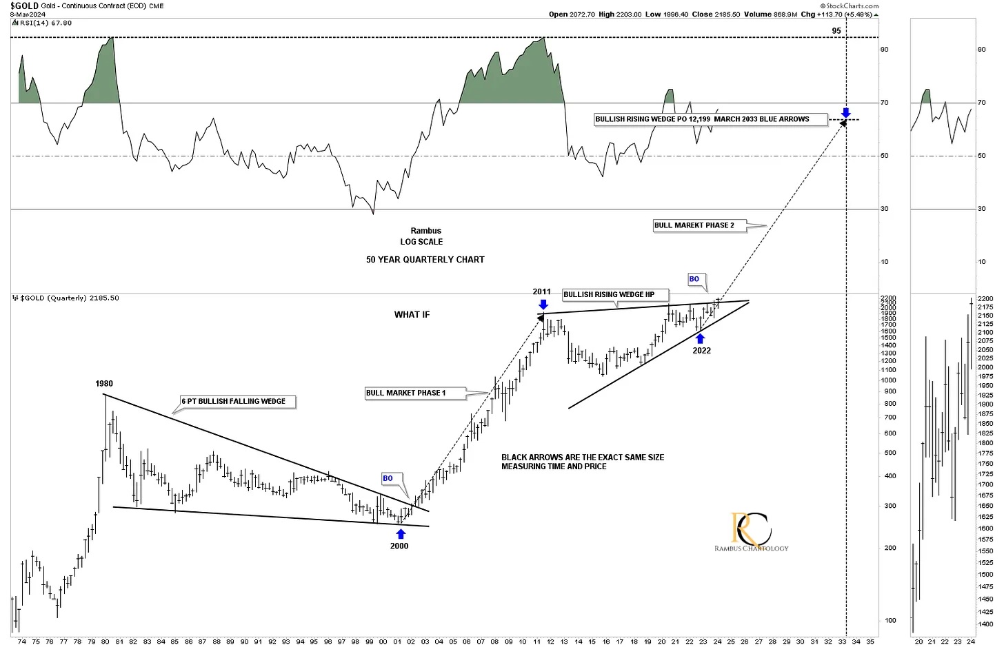
Today, April 13, 2025, one year later:
I couldn’t have asked for a more perfect outcome, as the price action has been following the same angle as the 2000 to 2011 bull market, as shown by the long black arrows.
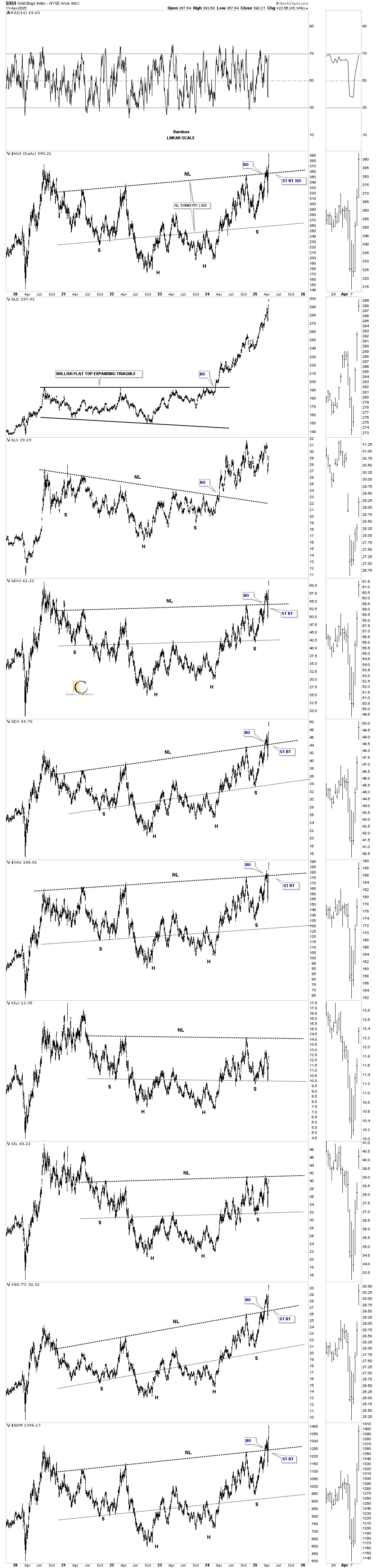
This last chart for tonight is a brand new daily combo chart going back to the 2020 high. I was looking at a long term linear scale chart for the HUI by itself and noticed a large rounding bottom type formation so I did a little more investigating and discovered a pretty symmetrical H&S bottom on just about all the PM stock indexes.
I was a bit hesitant to post this cart a few weeks ago when it looked like the neckline was giving way, but then we got the hard move down which looked like a failed breakout, but after last weeks dramatic move higher there is now on doubt in my mind that these H&S are authentic. Note how well the neckline symmetry line is showing us the low for the right shoulders.
We now have another very large consolidation pattern to add to our growing list which is strongly suggesting the PM complex has many years of life left in it and it’s time for things to start heating up in this once forgotten and beaten down sector. It’s finally happening. All the best…Rambus
********
 Meet Rambus, a seasoned trader and technical analyst renowned for his unbiased and insightful chart work. Through his website, Rambus Chartology, and Substack newsletter, Rambus shares his expertise with a global community of subscribers, providing daily updates, commentaries, and hands-on training in the art and science of chartology. With his calm, humble, and down-to-earth approach, Rambus demystifies complex market trends, helping his followers navigate the challenges of today's volatile markets. Join the Rambus Chartology community today and discover a unique blend of technical analysis, trading expertise, and time-tested protocols. Subscribe now at www.rambus1.com or https://rambuschartology.substack.com/


