A Look Back At Gold, Silver & The Stock Market
 share
share
 share
share
 share
share
 share
share
 share
share
Looking at Gold and Silver's post-credit crisis Bear's Eye View (BEV) Charts; Monday's decline wasn't much of a Bear mauling on the metals. Though panic in the gold market was heavily covered all day on CNBC, gold close down only 3.91% from its last all-time high, and is only 2.93% from a new all-time high at the close of today's trading (Tuesday). This is pathetic reporting, as gold could easily jump up 4% in a single trading session, and make a new all-time high. I'm not saying that's what will happen; I'm only noting that a 4% daily move in gold is not a historical outlandish possibility, and few people remember what is said on CNBC just a day or two after its broadcasted.
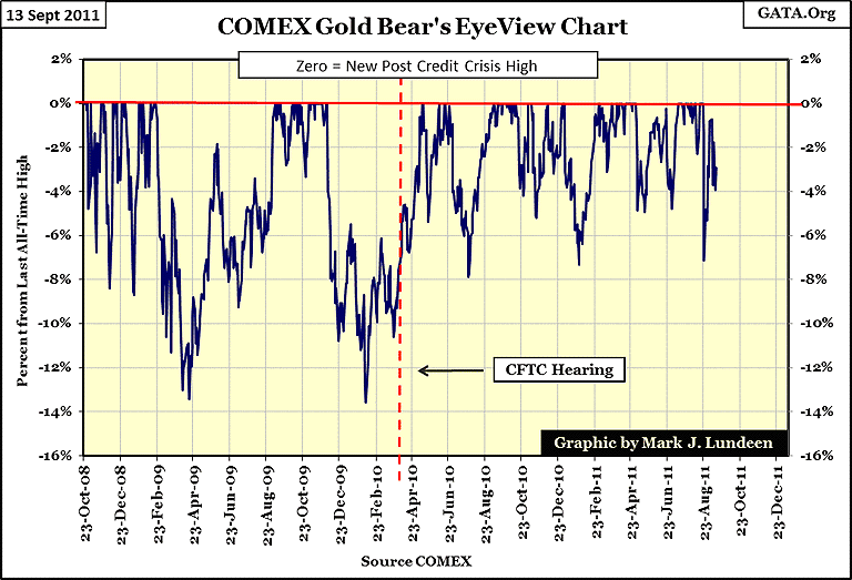
Silver too looks strong. It's still building a solid base to take out its stale, 1980 all-time high. Silver was the PM leader from about this time last year, until the end of April this year. My BEV chart doesn't show silver's price gains of the past twelve months; as each new high in a bull market is always equal to a Zero in Mr Bear's world view. But we do see the many BEV Zeros silver experienced in the past year, each one a new post credit-crisis high in silver, highs that took silver to $46.08 on 02-May-11 , from $19.92 on 03-September-2010. Remember, BEV plots record new highs, and percentage declines from previous highs in a range of data - NOT PRICES. So, May's 31% decline looks pretty bad in the BEV chart below, but the actual price of silver at the May's bottom was $33.49, or 68% higher than it was in September 2010.
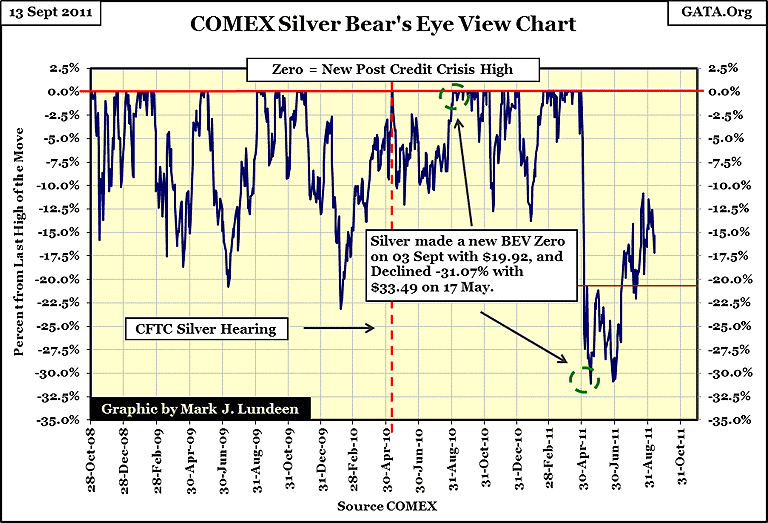
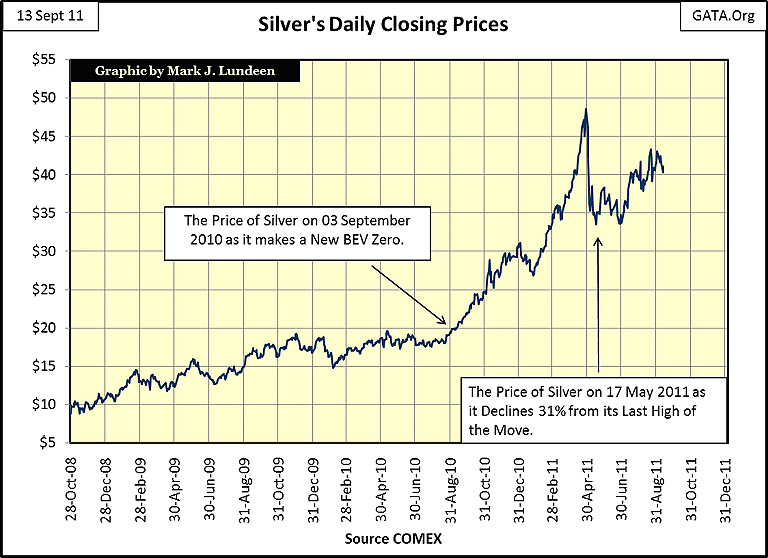
To help make clear what a Bear's Eye View chart is, and is not, I'm including a chart below which plots the same silver prices used in creating the above BEV plot for silver. Every time silver saw a new high of the move below, the BEV plot above registered it as a BEV Zero above - NEVER MORE. Each data point in the chart below that was * not * a new high of the move, is shown as a * precise-percentage decline * FROM its last high of the move in the BEV plot above.
Both views of silver are valid. But in my opinion, the Bear's Eye View of the market actually displays more useful information, if not the actual price gains in silver. In the price chart below, can you see that silver saw four double digit corrections before May 2010? Information of this nature is what a BEV chart is all about.
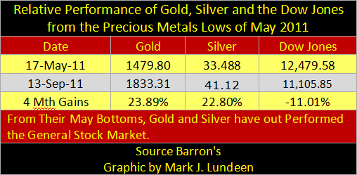
Since silver was whacked 31% in May, gold has been in the news, and silver became a lackluster asset, mostly ignored by media. However, as is so often the case with the financial news, things aren't always what they are reported to be. From the metals' May lows, silver is only 2.5% behind the gains seen in gold, as is evident in the table below. Obviously, in late April of this year, one would have been better off being in gold, as gold only saw a 7% decline in its price, where silver took a 31% decline. But we should note how energetically silver is coming back off its May lows. This cannot be said for the Dow Jones, which is still 11% below its highs of last spring.
But there are those who would say that I'm a biased gold-bug, who manipulated his results by picking an advantageous starting point. But the Dow too saw a correction in May that was quite similar to the decline in gold (a little more than 7%), from where it * TWICE * failed to make a new post credit-crisis high, after which it then broke down to a new low of the move. That the Dow's June low did not hold in August is not a good sign! Comparing the BEV charts of gold and silver above to the Dow Jones below, it's accurate saying that since May of this year, gold and silver have been much stronger than the general-stock market.
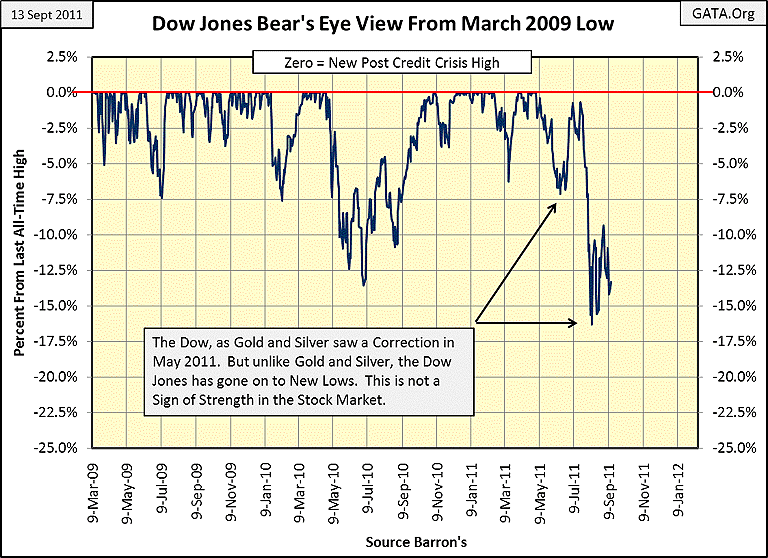
Also, we should keep in mind that with each Zero in gold's BEV plot, it is making * a new all-time high *, AND HAS BEEN DOING SO SINCE 19 September 2007. On the other hand, the Dow's last all-time high was seen on 09 October 2007, four years ago! The Dow's BEV Zeros seen below are * not * new all-time highs, but only new highs in the Dow from its credit crisis low of 09 March 2009. At its last high of the move (last BEV Zero = April 29 of this year) the Dow Jones was still 9.56% below its October 2007 high, and closed today (Tuesday, Sept 13) 21.59% from its highs of four years ago!
Remember, BEV plots are percentage derived from the price data used; it makes a huge difference where one begins the BEV series. Next is the Bear's Eye View of the Dow Jones going back to January 1996. As I read this chart, the Dow in September 2011 is more likely to test its lows of March 2009 than make a new attempt at its highs of October 2007. But I'm like everyone else, and will have to wait to see what actually happens. However, I also keep in mind that the causes for the 2007-09 credit-crisis were not resolved, merely monetized and "injected" back into an illiquid financial system. How anyone could be optimistic about the prospects for the stock market, and bearish on gold and silver is a mystery to me.

But as noted above, my BEV chart's * inability * to note the price gains in a data series is remarkable. So, let's take actual prices, and their percentage gains and losses from key dates, and actually see how the Dow has done, when compared to gold and silver over the last 9 years. My second table uses the Dow's low of 09 March 2009; the second deepest percentage decline since 1885, as a sample date for gold, silver and the Dow's performance.
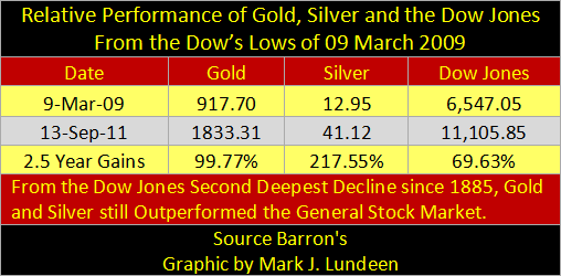
Once again, gold and silver have outperformed the general-stock market. But as gold and silver's credit-crisis lows were 23&28-October 2008, not March 2009, we should also compare all three assets to their respective credit-crisis lows, which were separated by five months. As we see in my third table, the Dow's gains since its credit-crisis lows are very respectable, but gold's, and especially silver's gain, have been spectacular!

The tech wreck bear market bottom occurred in October 2002, with the Dow Jones declining 37.85% from its highs of January 2000. Little remembered today, this bear market bottom was a historically significant market event, only missing the dreaded distinction of being a Dow Jones 40% bear market by an insignificant 2.15%. After its October 2002 lows, the Dow Jones then went on to new all-time highs for the next five years. But as good as the gains in the Dow Jones were from October 2002-07, the gains in gold and silver were superior!
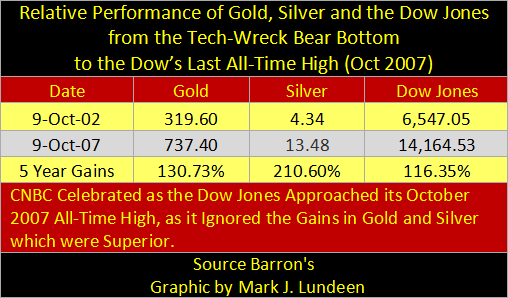
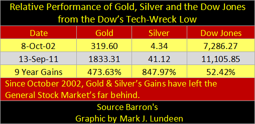
The above table is for October 2002-07, is where the Dow Jones saw its last hurrah. This is very evident when we look at the gains in gold, silver and the Dow Jones from October 2002, to Tuesday, 13-Sept-2011 in the table below.
But the Dow Jones is only 30 very large dividend paying blue-chip companies. How has gold and silver performed relative to other asset classes? Let's take a comparison using the Dow Jones Total Market Groups and other key economic indices. The data in the table below is based on weekly-closing prices, while the data above is daily. So, the percentages for gold, silver and the Dow Jones are close, but don't match exactly with those in the above tables. A few days can make a difference.
The unavoidable fact the financial media has avoided for almost a decade, are the wonderful investment returns old-fashioned basic materials have provided investors since the Dow's October 2002 bottom. For almost a full decade, high-tech and financials stocks have been absent in the stock market's top performance slots in the table below, while precious metals have taken the lead.

I admit, that there is always a genuine concern of risking money in an investment class that has been going up for many years; and gold, silver (copper too!) and their miners have been doing exactly that. But I think that this time, it really is different! Precious metals, and mining shares are still under owned by individuals and professionally managed portfolios, during a period of market history where counter-party risks for trillions of dollars in assets is huge. Central banks are once again buying gold for their reserves; for good reasons! Currently, reserve assets in pension funds and financial institutions are at record levels of toxicity. A return to the accounting standards of a few decades ago, would result in the vaporization of a significant percentage of the world's financial assets. As this is the case, should we be surprised that gold and silver, assets with no counter-party risk, have been outperforming stocks and bonds since 2002?
As with the tops in high-tech and real estate bubbles, gold will also peak in a public mania, fully covered and promoted by the financial media. In September 2011, who do you know that is boasting of their profits in precious metals? Most likely none; this tells us that gold, silver and mining shares have much further to go before we need to concern ourselves of a bubble top.
Much to the benefit of gold-bugs everywhere, the financial media has been very successful in keeping the public, and managed money, in high-tech, treasury bonds and financial shares, long after their days of glory, by marginalizing precious metal related investment as the investment of choice for "conspiracy theorists." Who wants to be a "conspiracy theorist?" Not me! If it wasn't for all the money I'm making on gold and silver, and the capital costs of being "respectably main-stream," I'd take a cue from Warren Buffet and buy some Bank of America.
Still, as frustrating as CNBC's coverage of gold and silver have been, I don't see their coverage of gold and silver as a conspiracy. I recognize that the financial media is based in New York and other global-financial centers. Much of any financial reporter's professional life is lived in an exclusive society based around banks and government; two inflationary entities extremely hostile to gold and silver, and to anyone who would promote precious metals to the general public as investments. If CNBC, and everyone else who values a good relationship with government regulators, and the big banks wants to have their phone calls returned, they must respect the world view of the little voices on the other end of the phone.
So, the current media bias against precious metals stems from little voices coming from telephones, and from chit-chat at important social events, where only the important people (politicians, bankers and reporters) are invited. To cover the financial markets as I do, data driven with no regard to high level chit-chat, would most likely result in social and professional isolation, if not a reporter's career. I know that financial reporters don't want to recommend loser investments to the public; because informing their viewers of profitable investments is in their interests. But they have made the conscious decision of not risking "conspiracy theorist" status in their social circle, and so, they have shied away from covering the best investments of the past decade. The truth of this is seen in my table above.
Hey, I don't sign their paychecks; they have my blessing to say and write what they want to. But if I were a CNBC talking head, I'd feel pretty stupid if I continued listening to the little voices coming from my telephone for my story lines, story lines that were so obviously self-serving, and will eventually place at risk my professional reputation with my audience. But most of the talking heads on TV know what they get paid for: to look attractive as they read from a teleprompter in front of a camera. The real question is:
"To be, or not to be, that is the question:
Whether 'tis nobler in the mind to suffer
the slings and arrows of outrageous market trends,
or to take arms against a sea of troubles,
and by opposing them risk ending an nice six figure job
with perks?"
- Shakespeare's Hamlet, with slight modifications by Lundeen
People employed by CNBC aren't super men and women; they're people with nice jobs with considerable status; and they like it that way. No one on TV is going to risk their employment and social positions at NBC, and elsewhere, by digging a little deeper into the markets than the teleprompter would have them do, when there is more pain, than gain, in doing so.
The key to success in the markets is to ignore the media, and focus on what the market is actually doing. Since October 2002, the real money has been made in precious metals and their miners'; while high-tech and financials stocks have long ago stopped being top market performers. Until gold, silver and mining shares become the must have investment on CNBC, which someday they will, this is the way things will most likely remain for a long time to come.
Mark J. Lundeen
[email protected]
[email protected]
share
share
share
share
share