How Overvalued is the Dow Jones?
 share
share
 share
share
 share
share
 share
share
 share
share
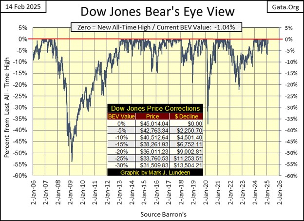
Every day this week, the Dow Jones closed in scoring position; Bear’s Eye View values spanning from -0.01% to -4.99%, closing the week with a BEV of -1.04%, or only 1.04% away from its last all-time high of 45,014.04, seen on December 4th. Why is this important? Because advances in the market occur in scoring position. As long as the Dow Jones, or other markets can remain in scoring position, they remain in a bull market.
So, what to think about all that? Looking at the Dow Jones BEV chart below, since 15 November 2023, it has been in scoring position for the majority of its daily closes. A few daily closes were below the BEV -5% line, but not many, and none below a BEV -6.0%. So, it appears below the Dow Jones has been in a bull market advance, and in fact it has been advancing for the past fifteen months.
During these fifteen months, the Dow Jones has seen fifty-five new all-time highs (BEV 0.00% = New All-Time High), or “BEV Zeros” in BEV lingo, taking the Dow Jones up from 34,991, to its last all-time high of 45,014. An advance of 28.64% since it first entered scoring position in November 2023.
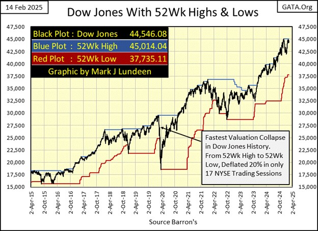
Let’s look at this advance in the Dow Jones plotted in the dollars its published in, with its 52Wk High and Low lines below. Same story as seen above, but in a more familiar format, how the Dow Jones has been pushing up to new all-time highs since November 2023, leaving its Red 52Wk Low Line far behind.
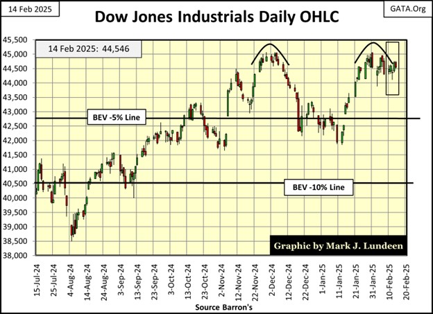
Next, we look at the Dow Jones in daily bars, where we see a very bearish double top, the first top in December 2024, and the second a month later in January. The top the Dow Jones has now failed to break above twice, with authority, is 45,000. If the Dow Jones can’t break above 45,000, and continue advancing, some day in our unknown future, that will be it for this advance. Then what?
Looking at the Dow’s daily closings for Thursday and Friday of this week, they look as if they didn’t take this double top too seriously.
I don’t either, and won’t until the Dow Jones breaks below its BEV -5% line (42,700) in a significant manner, say something like a daily close of a BEV -7.0%. That would be a Dow Jones close below 41,800. Keep in mind, I can’t see into the future, but until we see the Dow Jones with a BEV of -7.0%, or more, I’m going to stay bullish on the stock market.
Decades ago, the old market commentators stressed the difficulty of buying at the absolute bottom of a bear market, or selling at the absolute top of a bull market. As a group, they agreed that buying within 10% of a bottom, or selling within 10% of a market top, was an achievement for anyone; be they a professional money manager or retail investor. That has always seemed reasonable to me.
That is why I’m stressing should the Dow Jones decline below its BEV -10% line (40,500), people should seriously consider getting the heck out of this market, go to cash or precious metals investments, and don’t look back.
Everyone in the market is making money during a bull market advance. That isn’t a big thing. The big thing is; after the bull market reaches its ultimate top, and Mr Bear begins clawing back huge hunks of the bulls’ net worth, can someone say they walked away from the market with their profits, because they sold near the top of the former bull market advance?
In the history of Wall Street, most people have failed to do exactly that, because they have no exit plan from the bull market. It won’t be any different this time.
Below we see the major market indexes I follow, via BEV values. I see the NASDAQ 100 (#1) closed the week with a BEV of 0.00%, at a new all-time high, but nothing else did. Like the Dow Jones, most of these indexes continue closing in scoring position (Red Rectangle), but for months now, are having difficulty making new all-time highs.
Is that something to be concerned with? Not to my way of thinking. I’m thinking, if an index can manage to remain in scoring position, I have to remain optimistic, and believe new all-time highs are pending for that index.
What would cause me to change my bullish opinion on the stock market? Seeing the majority of these indexes deflate below their BEV -5% lines, would be concerning. Should these indexes begin to see BEVs of -10%, or more, it would be time to get the hell out of Dodge City, and lock in whatever profits one has by selling.
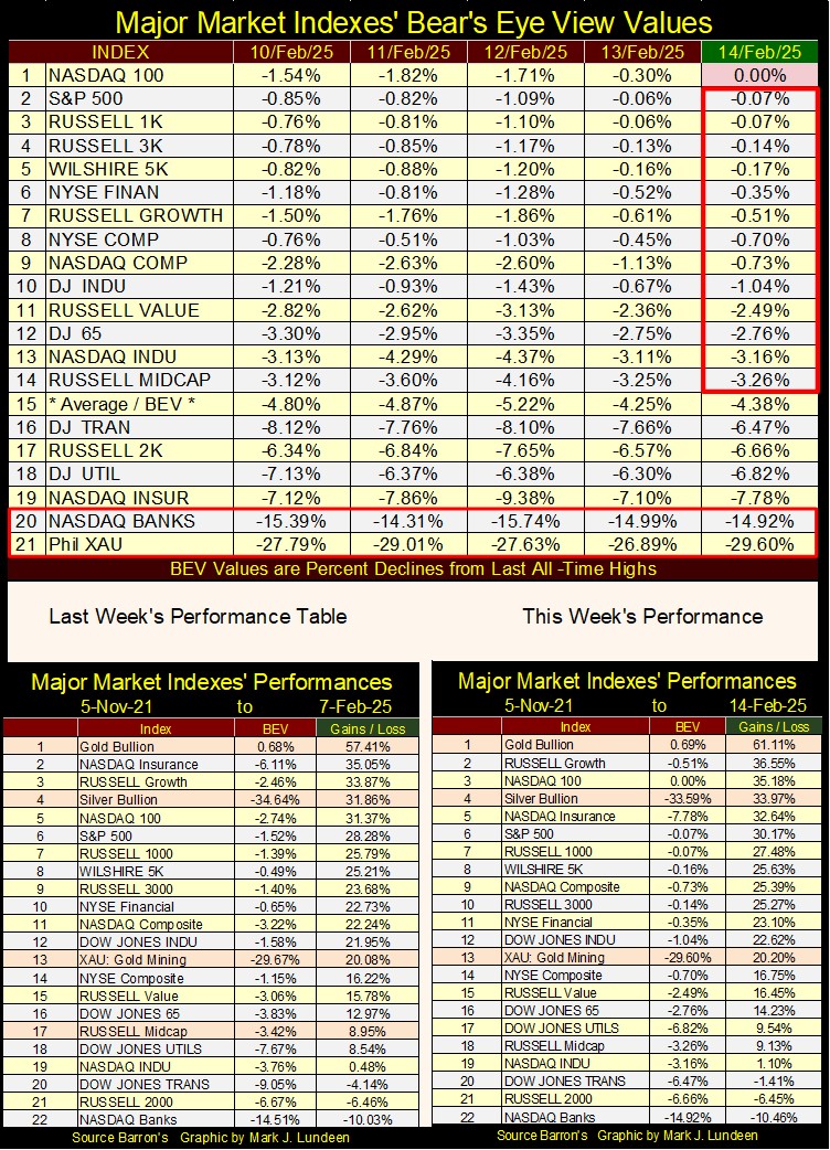
In the performance tables above, gold remains at #1, where it has been for a very long time. Silver is creeping upward, as is the XAU. The other indexes are doing nicely, except for the NASDAQ Banking index, which has yet to exceed its last all-time highs of November 2021.
The oddity of the data seen above, is that gold, silver and the XAU are doing so well as these major market indexes continue to advance in a bull market.
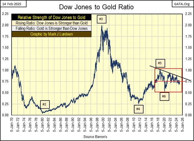
Here is a chart for the Dow Jones to Gold Ratio, showing the relative strength between the Dow Jones and gold;
- Rising ratio; Dow Jones outperforms gold
- Declining ratio; gold outperforms the Dow Jones
Since 1970, after gold was finally allowed to trade for over $35 an ounce, this ratio has seen huge swings, lasting years as gold, or the Dow Jones has outperformed the other. Yet since 2018, both gold and the Dow Jones have done nicely for their investors. Looking at the chart below, from 1970 to 2018, the Dow Jones or gold outperformed the other. This is a situation that won’t last forever.
One day, this ratio is going to stop tending sideways, and will either break upward, or downward in a big way. As the stock market valuations are so grossly inflated, I’m expecting to see this ratio break in gold’s favor – downward in a big way. But when? I wish I knew.
How Overvalued is the Dow Jones?
The Dow Jones Dividend Tells all!
Last week, I focused on how monetary inflation flowing from the Federal Reserve, which I frequently call the Federal Reserve Open Market Committee (FOMC), has distorted the price structure of the financial markets. To see how badly the idiots at the FOMC has distorted valuations in the stock market, we can use the Dow Jones’ dividend to see how it has changed in these past one hundred years.
Before I do that, let’s look at a historical comparison between stock dividends and bond yields. It’s common knowledge, increasing market risks should be compensated by higher yields. Before 1958, yields for the Dow Jones’ dividend were higher than yields for Barron’s Best Grade Bonds, as it was generally recognized risks to funds invested in the stock market, were greater than funds invested in best grade bonds.
Bonds are contracts for debt. A corporation desiring to fund a new factory would issue the appropriate amount of bonds, each guaranteed to payout to its owner $50 a year for the term of the bond’s contract. Pricing this bond at $1000, would see it yield 5%.
What makes bonds safer than stocks, is should a corporation fail to pay its bondholders its bonds payout, or fails to return the bond’s principle to its bondholders when the bond matures, renders that corporation bankrupt. The bond holders will then be first in line to liquidate the company’s assets for repayment in court. So, come hell or highwater, corporations are going to pay their bond holders their bond’s payout.
Stocks are partial ownership of the corporation. When people buy a company’s stock, they become partial owners of the company, and benefit from the company’s profitable operation via dividend payouts. This makes dividend payouts a profit-sharing program, not a legal obligation of the corporation to send a check to its shareholders.
Come hard times, a downturn in business, companies can, and will cut their dividend payout, with no legal recourse to their shareholders. Sensitivity to this market risk in dividend payouts, resulted in dividend yields to be higher than bond yields, or so it was before 1958.
Ultimately, what a stock dividend, or a bond yields, is fixed by the market itself. Should a bond or stock’s valuation increase, its yield will decrease. Should a bond or stock’s valuation decrease, its yield will increase. So, rising yields = declining prices, and declining yields = rising prices.
Today, for logical reasons, most retail investors ignore our era’s low yield dividend, focusing instead on profits from double-digit capital gains. But long ago, before market valuations were dominated by the FOMC, market considerations were different than what they are today.
The chart below plots the difference between the Dow Jones dividend yield and Barron’s Best-Grade Bonds yield. When this plot is above the Zero-line, Dow Jones dividend yield is higher than the yield for best-grade bonds. When below the Zero-line, Dow Jones dividend yield is lower than the yield for best-grade bonds.
We see this plot spike in 1938, and again in 1942. These spikes were from a 49% Dow Jones bear-market bottom in 1938, and a 52% Dow Jones bear-market bottom in 1942. These are examples of where market declines push up dividend yields, signaling excellent times for buying stocks.
However, the thing to note below is from 1937 to 1958, Dow Jones dividends were higher than yields for best-grade bonds.
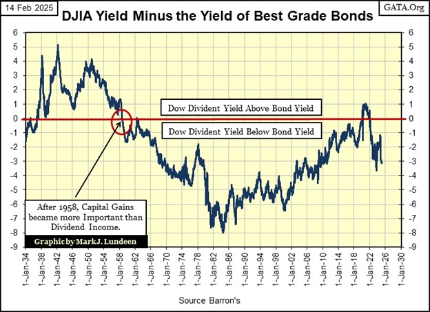
What happened in 1958 that would cause the yields for the Dow Jones and Barron’s Best-Grade Bonds to invert, made the market recognize that bonds were now risker assets than stocks?
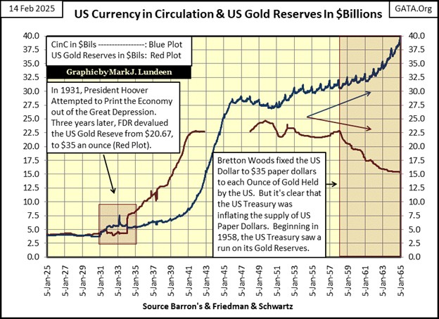
As seen in the chart below, over issuance of CinC (Blue Plot), far above the Bretton Wood’s $35 gold peg, resulted in a rush on the gold held at the US Treasury (Red Plot). Foreign central banks began redeeming their paper dollars for gold held at the US Treasury, at a rate of $35 paper dollars for one ounce of US gold. They did this because the US was printing more than $35 paper dollars for each ounce of gold held by the US Treasury, an inflationary monetary system.
In 1958, the market finally recognized the United States’ monetary policy was one of inflation. This made bonds, with their fixed income payable in a wasting asset; the US dollar, a risker financial assets than were stocks. The bond market began demanding an inflation premium, demanding higher yields before buying. This was done by bond buyers offering lower prices in the market, and so bond prices began falling, forcing yields up, and so it was until 1981.
This was not so for the Dow Jones, as its dividend payout is not fixed, as is a bond’s payout. Since 1958, dividend payouts for the Dow Jones have increased from $22.5, to $815, as its valuation has increased from 440 in 1958, to over 45,000 in 2025. So, from 1958 to 1981, for individuals, and money managers seeking income, ignoring bonds, choosing instead blue-chip, dividend yielding stocks for income, was the thing to do.
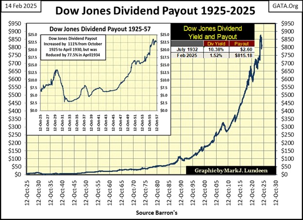
Next is a plot of the Dow Jones dividend yield going back to 1925, one hundred years of market history. For sixty-two years of this history (1925 to 1987) investors could, and did use the yield for Dow Jones to profitable time their entry and exit points in the stock market.
The rules for timing the market was simple;
- buy when the yield for the Dow Jones was over 6%,
- sell when the yield for the Dow Jones decline to 3%.
Using these simple rules of when to buy and sell, would have kept investors in the market during every bull market, and avoid every bear market, including the Great Depression Crash, from 1925 to 1987.
So, what happened in 1987? Alan Greenspan became Chairman of the Federal Reserve in August 1987, when the Dow Jones dividend yield hit a then historic low of 2.54%. I put his image in the chart below, as it seems appropriate Greenspan gets some credit for what he did to us while he was Fed Chairman.
Left to its own resources, the stock market in 1987 would have seen yet another bear market, as it should have. A Dow Jones yield of only 2.54% tells us the valuations in the Dow Jones, and the stock market, were overvalued to an extreme, and would be until once again, the Dow Jones was yielding something over 6%.
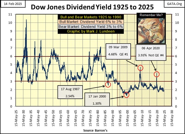
But as you can see above, that didn’t happen. The last time the Dow Jones saw a yield of over 6% was in 1982, forty-three years ago, because Greenspan didn’t do bear markets, his thing was rip-snorting bull markets, fueled with monetary inflation flowing from the FOMC.
During the 1990s, anytime the stock market advance appeared to be faltering, Greenspan would lower interest rates, and “inject liquidity” into the market. I always use quotation marks for “injecting liquidity,” as that is what Greenspan would say before he gave the stock market his next shot of heroin, to keep those market valuations inflated.
My readers with memories of the 1990s know exactly what I’m talking about! By January 2000, the yield for the Dow Jones had fallen to an incredible 1.30%, as stock market valuations had inflated far above any point of reason.
And so its been since 2000. Note in the chart above, since 2000, anytime the Dow Jones dividend has increased to something above 3%, the FOMC was forced to implement a QE;
- QE#1, March 2009,
- Not QE#4, April 2020,
as the financial markets were in a state of panic. As the idiots at the FOMC, like Greenspan before them, refuse to do bear markets, they chose instead to “inject” huge amounts of “liquidity” into the financial system to “stabilize market valuations.”
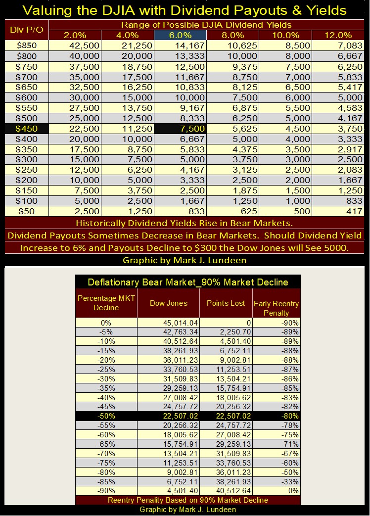
So, in February 2025, using the dividend data for my proxy for the broad stock market; the Dow Jones, how over valued is our stock market? Enough to shiver-me-timbers when I think of it!
On Friday’s close, the Dow Jones closed at;
- Valuation: 44,546,
- Dividend Payout: $815.19,
- Yield: 1.83%.
Above, the relationship between the Dow Jones valuation and its dividend is seen; the Dow Jones is currently yielding 1.83%, with its payout at $815.19, as its valuation is 44,546. But one can derive the Dow Jones valuation by using its dividend data, by dividing its payout with its yield, and that is what is done for you in the table below. Take a payout and yield, and see where they cross in the table.
Take a good look at the Dow Jones’ dividend yield chart above. Before 1987, seeing it yield 6% was typical of a bear market bottom. Historically, a Dow Jones bear-market bottom way typically a 40% to 45% decline in the Dow Jones, as seen in the BEV chart below, for the Dow Jones below going back to 1885.
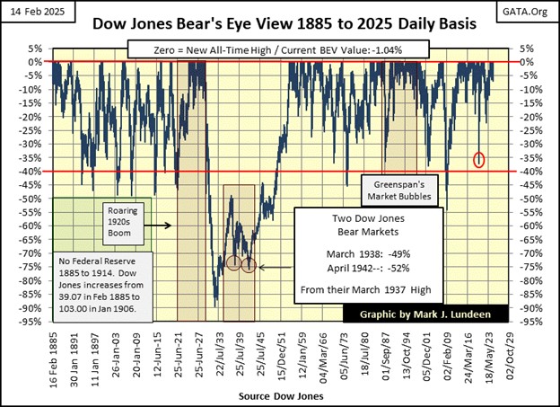
So, using a payout of $800 in the table below, about what the Dow Jones currently has, should the Dow Jones see a yield of 6%, that would require the Dow Jones to deflate down to 13,333. From its last all-time high of 45,014, the Dow Jones would have to decline by 70.38%. How devastating a 70% market decline that would be, can be seen in the BEV chart above.
But what if the Dow Jones payout declines during the next bear market. During the Great Depression’s market crash, the payout for the Dow Jones fell by 77.5%. We’ll just use a 25% reduction in payout, down to $600 in the table below with a yield of 6%. That gives us a Dow Jones valuation of 10,000 in the table, a 78% Dow Jones market crash.
But in a selling panic, don’t believe the Dow Jones can’t see a dividend yield of something above 6%. It peaked at over 10% in July 1932, as dividend payouts declined 77%, creating the crater seen in the Dow Jones BEV chart above, during the 1930s and 40s.
Of course, all the above is moot, should the idiots at the FOMC decide to “stabilize market valuations” once again with yet another quantitative easing (QE). Their last QE “injected” a few trillion dollars of monetary inflation into the financial system in only two months.
Should they do another QE again, it will take more than just a few trillion dollars of monetary inflation to “stabilize market valuations.” That, plus CPI inflation would increase, a lot, and the US dollar may cease being global reserve currency.
So, what is it to be;
- no QE; crashing prices on Wall Street,
- new QE; soaring prices for energy and consumer goods and food?
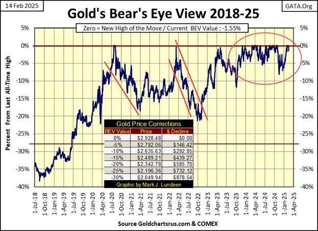
I don’t know. But in either case, you will be glad to have a position in gold and silver bullion, and their miners. So, let’s now look at gold’s BEV chart below.
As with the Dow Jones above, not much has changed with gold’s BEV chart since last week. Gold did make a new all-time high on Thursday this week, its 50th since entering scoring position in November 2023. On Friday, with gold closing in scoring position, I’m going to assume more BEV Zeros, new all-time highs are pending in the days, weeks and months to come for gold.
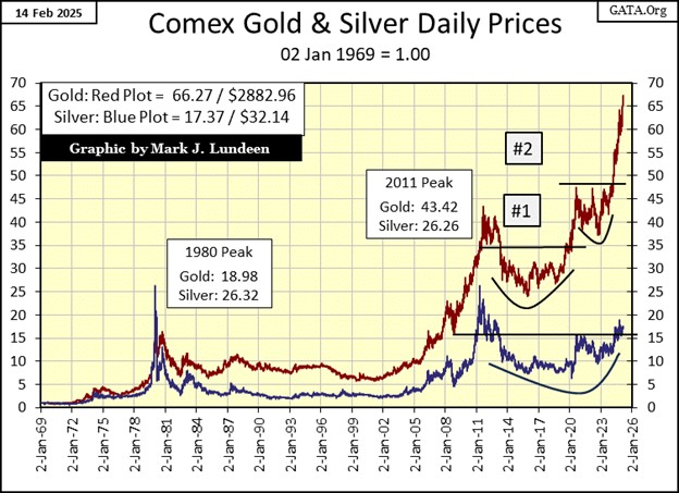
Below is a look at gold and silver, indexed to 1.00 = 02 January 1969. Indexing these data series allows us to compare them as if they were in a horse race.
The last time silver was in the lead, was way back in January 1980, when silver made its last all-time high. What other than silver, is cheaper today than it was in January 1980? Why is that? Silver has major industrial demand, as well as investment demand. Silver also has attractive supply and demand fundaments for bulls; that they are consuming above ground stocks of silver faster than they are mining it, or so people more knowledgeable of the silver market, that I trust, are telling me.
So, why can’t silver do what a dozen eggs, or a head of cabbage have done; increase to prices higher than they were in January 1980? I believe the price of silver has been manipulated, fixed in the paper futures markets, where tons of digital silver can be created with a few key strokes on a computer. When this fix comes undone, watch silver catch up, and possibly pass gold to the upside.
Of course, my long-time readers know I’ve been predicting that for over a decade. That doesn’t mean I’m wrong, only that I was early on seeing the scandalous activities going on at the COMEX silver pits.
Moving down to gold’s step sum table below, for over a month gold has been overbought; look at all those 15-counts of +7, with one count of +9. I usually note every time gold, or the Dow Jones below see a 15-count of +7 or more, that markets don’t like being overbought. We should soon expect a period of overwhelming down days in that market, to correct the overbought condition. However, since January 10th, gold has seen far more daily advances than declines, so we see the multitudes of +7s in its 15-count.
What is going on here? Could it be the beginning of a major bull market in gold? Maybe. This is interesting, let’s see how long gold can remain overbought in the weeks to come.
As far as the Dow Jones below goes, it is being dominated with daily declines, even as its valuation continues rising. How can that happen? This indicates that currently for the Dow Jones, one advancing day takes the Dow Jones up more than does two down days.
Whether a market is seeing up days overwhelm down days, or if down days overwhelm up days, is cyclical in the market. Seeing how the Dow Jones is advancing as it is currently seeing more down than up days is bullish for stock market. Let’s see how the Dow Jones performs when once again daily advances overwhelm daily declines. New all-time highs? That’s what I’m thinking.
Another metric that’s bullish for the Dow Jones is its Volatility’s 200D M/A is only 0.57%. Bull markets for the Dow Jones are low volatility markets. In fact, seeing this metric increase towards 1.00%, and then rise above it, historically is very bearish. Always has been, and always will be.
But that isn’t happening in February 2025, so, this is another reason to expect some additional new all-time highs for the Dow Jones in the not to distance future.
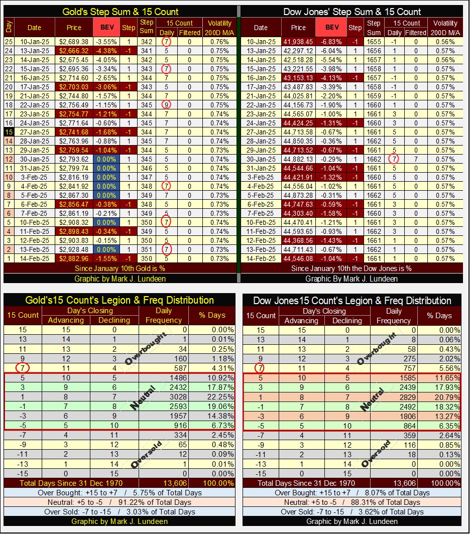
The above tables give the specifics for a step-sum 15-count, and how many of each there were for gold and the Dow Jones since 31 December 1970.
Mark J. Lundeen
*******
share
share
share
share
share