Review of the Bear’s Eye View
 share
share
 share
share
 share
share
 share
share
 share
share
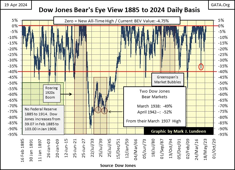
For the benefit of my newer readers, I’m going to do a quick review of the Dow Jones in the Bear’s Eye View (BEV), by looking at the Dow Jones from 1885 to the close of this week in the Bear’s Eye View.
Why the Bear’s Eye View? The Bear’s Eye View is how Mr Bear looks at a market;
- daily closes at a new all-time high = 0.00% (Big Fat Zeros, and never more, also called BEV Zeros),
- daily closes other than new all-time highs = negative percentage claw-backs from their previous all-time high.
In the late 19th century, when high-tech was a steam-locomotive engine, the Dow Jones was trading well under 100. So, when the Dow Jones closed at 61.98 on 09 January 1899, that was a new all-time high for the Dow Jones, a daily close that would have registered a 0.00%, a BEV Zero in the BEV chart below.
When plotting the Dow Jones in dollars, its last all-time high was on 28 March 2024, when the Dow Jones closed at 39,807,37. Though an all-time high in March 2024, is many, many times more dollars than an all-time high in January 1899, in the BEV plot below, they both are equal to 0.00%.
What is seen in the BEV chart below, are new all-time highs (BEV Zeros = 0.00%) and percentage claw-backs from those BEV Zeros. This is an excellent way to understand the past 139 years of the Dow Jones; in terms of all-time highs, and the percentage claw-backs from them.
Look at the Red BEV -40% line in the chart. No matter what the dollar value was, since 1885, any time the Dow Jones closed below its Red BEV -40% line, a bear market was approaching its bottom. This made all 40% declines in the Dow Jones, excellent times to consider returning to the stock market. The market may not yet be at its absolute bottom, but it was getting there!
The only exception (so far) to this -40% BEV Rule-of-Thumb, was the 1929 to 1932 Great Depression Crash, a market decline that formed the crater (the -89% Dow Jones crash) seen in the BEV chart below. Looking at the Dow Jones as Mr Bear does, each major Dow Jones market decline since 1885 stands out.
What also stands out in the BEV chart below, is the volume of BEV Zeros seen in the late 1920s, accumulating on the Red 0.00% line. Looking at this chart is seeing the market with 20/20 hindsight, but seeing this cluster of BEV Zeros form in the late 1920s, in retrospect proved to be problematic.
After the BEV Zero of 03 September 1929, the last BEV Zero of the 1920s boom, its Terminal Zero (TZ = last BEV Zero of a bull market advance), the Dow Jones didn’t see another BEV Zero until 23 November 1954; twenty-five years later.
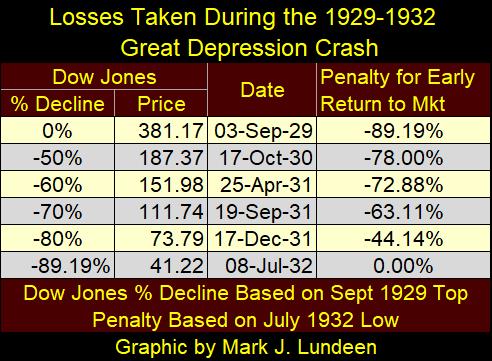
Attempting to re-enter the stock market anytime during the 1929 to 1932 market crash was dangerous. In the table below, we see Mr Bear’s grizzly mathematics of the Great Depression Market Crash.
Keep in mind the Dow Jones’ -40% rule; how the worse of a market decline was at hand when the Dow Jones had fallen below its BEV -40% line. Had someone bought when the Dow Jones was down by 50% in October 1930, they would have lost 78% of those invested funds, at the ultimate bear-market bottom in July 1932. Even after an 80% market decline in December 1931, an investor would have lost 44% of their invested funds, at the July 1932 bear-market bottom.
So, the Bear’s Eye View takes price data published in dollars, yen, euros, or whatever, and confines this price data within a range of only 100 possible percentage points, spanning from;
- 0.00% = new all-time high,
- -100% = total wipeout in valuation.
Looking at a market in terms of all-time highs, and percentage claw-backs from them, provides a unique insight into a market, that viewing it in terms of dollars does not.
If I were to list one insight into the Dow Jones that its Bear’s Eye View chart above gives to me, it would be the massive volume of BEV Zeros the Dow Jones has seen since Alan Greenspan became Chairman of the Federal Reserve in August 1987. A massive cluster of new all-time highs that has only grown since Bernanke, Yellen, and now Powell have also chaired the Fed.
In the frequency-tables below, I split these daily BEV values into a spectrum, with 0% (top-row = new all-time highs), -95% row at the bottom, and spread the other rows in increments of 5%. The exception to that is the -0.0001% row.
This -0.0001% row is necessary to isolate new all-time highs from the other daily closes, daily closes ranging from 0.00% down to -4.99%. With this -0.0001% row in place, only new all-time highs will be counted in the top 0% row, with all other daily closings, from -0.01% down to -4.99%, are bundled into the -0.0001% row.
I call the daily closings found in the -0.0001% row; daily closings in scoring position, as that is what they are. In any advance taking the Dow Jones into new all-time highs, not every daily closing will be a new all-time high. During any advance into market history, most daily closings will actually be in scoring position; -0.01% to -4.99% from their last all-time high. That is just how all advances into market history go.
So, until the Dow Jones declines below its scoring position, below -4.99% (or -5% and greater), its best to think of the Dow Jones as an advancing market.
This concept of scoring position in a BEV plot provides an interesting insight into the market. In the three tables below, add the percentage of total days in the 0% (new all-time highs), and -0.0001% (inside scoring position) rows, rows located inside the red box, to see the percentage of daily closings the Dow Jones was advancing in a bull market;
- All daily closings since 1885; 26.12% of all daily closings,
- 16 Feb 1885 to 12 August 1982; 16.75% of all daily closings,
- 13 August 1982 to 19 April 2024; * 50.68% * of all daily closings: Jeeze Louise!
I used August 1982 as a separator between the last two tables, as the Dow Jones began a mega bull market in August 1982, a market advance that continues to this day.
Take a quick look at the Dow Jones’ BEV chart above, from 1982 to today, and compare that to the far-right table below. This data indicates, to me if no one else, that the Dow Jones has been in a market advance for the past forty-two years, with 50.68% of the 10,508 daily closings since August 1982, either making new all-time highs, or closing in scoring position.
How is that possible?
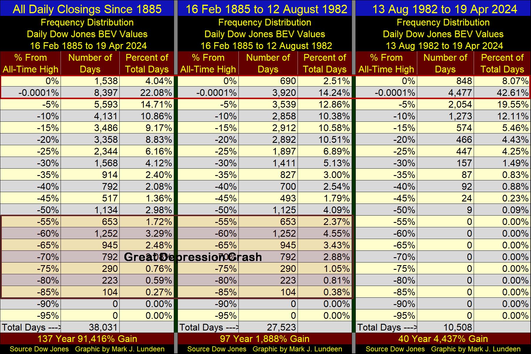
The Dow Jones has been in a continuous bull market advance since August 1982, because of the “monetary policy” of a bunch of idiots at the FOMC. So, because of this, I believe the stock market has for decades been grossly overvalued, and the day is coming when Mr Bear is going to claw-back most of the market valuations the FOMC has inflated into it, before the next big bear market comes to a bottom. I also anticipated this pending bear market bottom will rival, and possibly exceed the -89% valuation collapse seen in the Great Depression Crash.
But then maybe not. The idiots at the FOMC may decide to “stabilize market valuation” with additional QEs, which would keep market valuations within their “policy parameters,” but totally destroy the US dollar as an economic asset. In either case;
- a wipe out in the stock and bond markets,
- a wipe out in the US dollar,
the prospects for wealth in the financial markets seems grim to me in the coming years. So, I’m a big believer in gold and silver bullion, as well as the miners of gold and silver.
That’s it for my historic review of the Dow Jones via the Bear’s Eye View, so let’s now go on to this week’s BEV chart for the Dow Jones.
The Dow Jones closed the week in scoring position, but just barely, with a BEV of -4.57%. In fact, Friday was the only day of the week that had the Dow Jones close above -5%. So, is the advance over? I’m going to say it isn’t, but it could be. But even should the Dow Jones break below its BEV -10% line, it may only be a correction in the advance, with additional BEV Zeros to follow. Look at the BEV chart below; this has happened before.
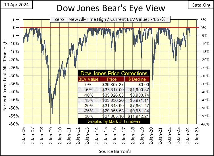
Here is the Dow Jones in daily bars. Every day this week, it was hugging its BEV -5% line, as if it couldn’t go up, but refused to go down. Give it some time to allow it to make up its mind what it wants to do next. Be that either up, or be that down, it’s not a big thing for me, as I’m out of this market.
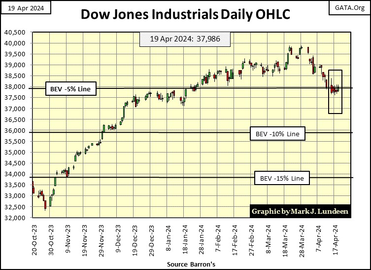
Looking at my table of major market indexes’ BEV values below, the week closed with seven indexes in scoring position. But if you look at these indexes during this week’s action; each of them closed below scoring position (below -4.99%) for at least one day last week.
I’m going to assume the current decline in the market is only a correction, that in the weeks to come we’ll see additional BEV Zeros, new all-time highs in the table below. But, I have to note I’ve been wrong before on my market calls.
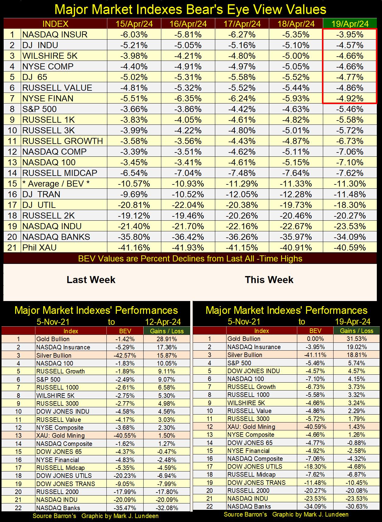
In the market performance tables above, gold is the #1 performer, with silver at #3. What is with the NASDAQ Insurance Index? It’s been at the top of this table for a long time. Are they selling their policies door to door?
What is odd about these performance tables is the XAU (#12). With gold and silver bullion doing so well, their miners should be climbing the list to join them. But they aren’t, and why aren’t they?
The sad fact is; we live in a corrupt world, and there are powerful people in high-finance that don’t share the same enthusiasm about gold and silver mining, that many people reading my comments do.
Below is an hour-long video, a different video from the one I posted last week on the unlimited naked short selling currently happening in the Canadian stock market, that is impacting share valuations in the junior mining industry. This is most likely also happening in the American stock market too.
I can’t say that as a fact, but with gold and silver finally outperforming the broad-stock market, as seen in the performance tables above, these miners and exploration companies should be outperforming gold and silver. But they aren’t. Unlimited naked short selling could very well be the reason why they aren’t. Watch the video. Who do these people, and the lazy politicians, and market regulators that allow this to happen, think they are?
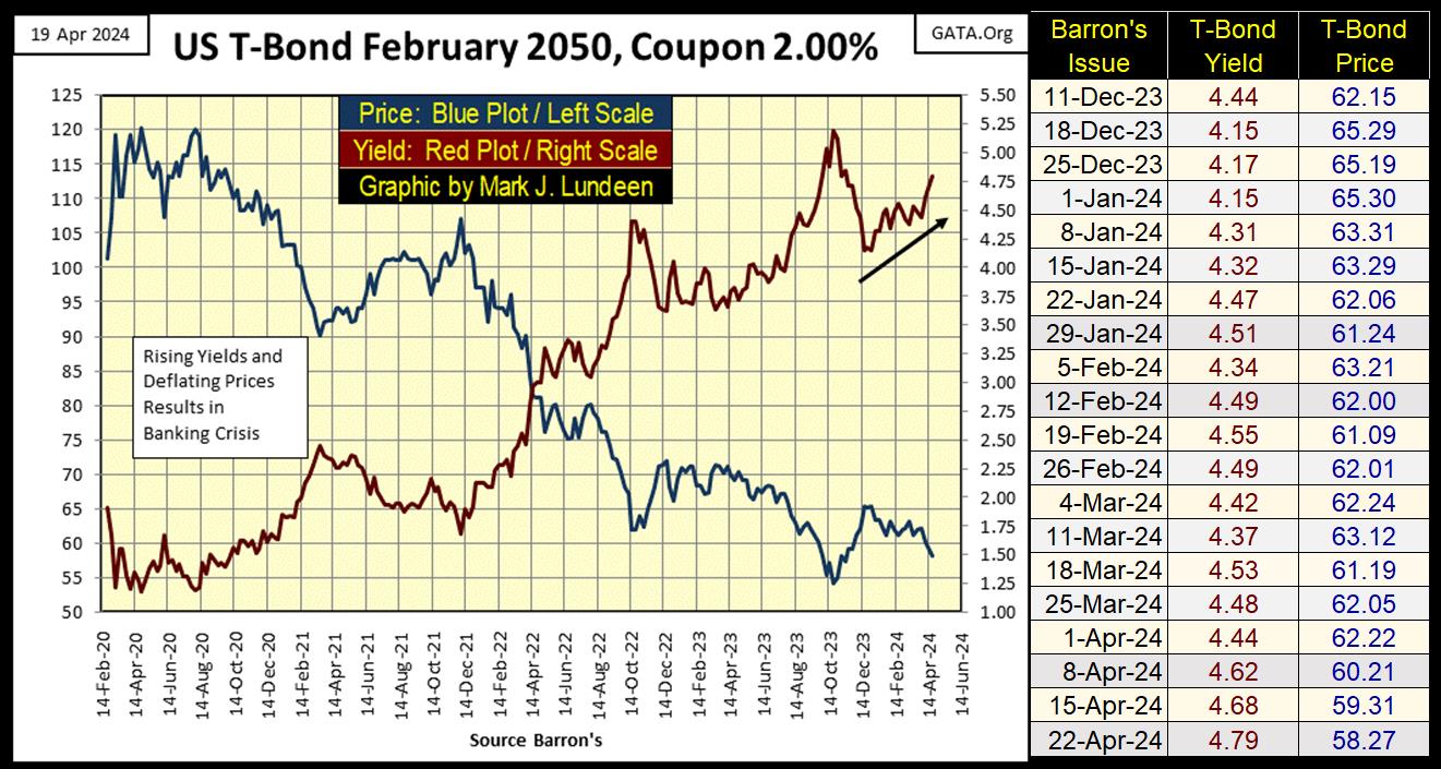
Here is my chart for a 30yr T-bond issued in February 2020. The red plot is for its current yield, the blue plot its valuation. The yield continues creeping up, as its valuation continues to deflate. But then, that must be a description of the entire US national debt, a fact well known to all who hold it, for whatever reason.
Below is a table of some corporate and T-bond yields, with the 30yr mortgage rate and a muni-bond index’s yield. Green boxes are the low yield for the past four months, red the high yields.
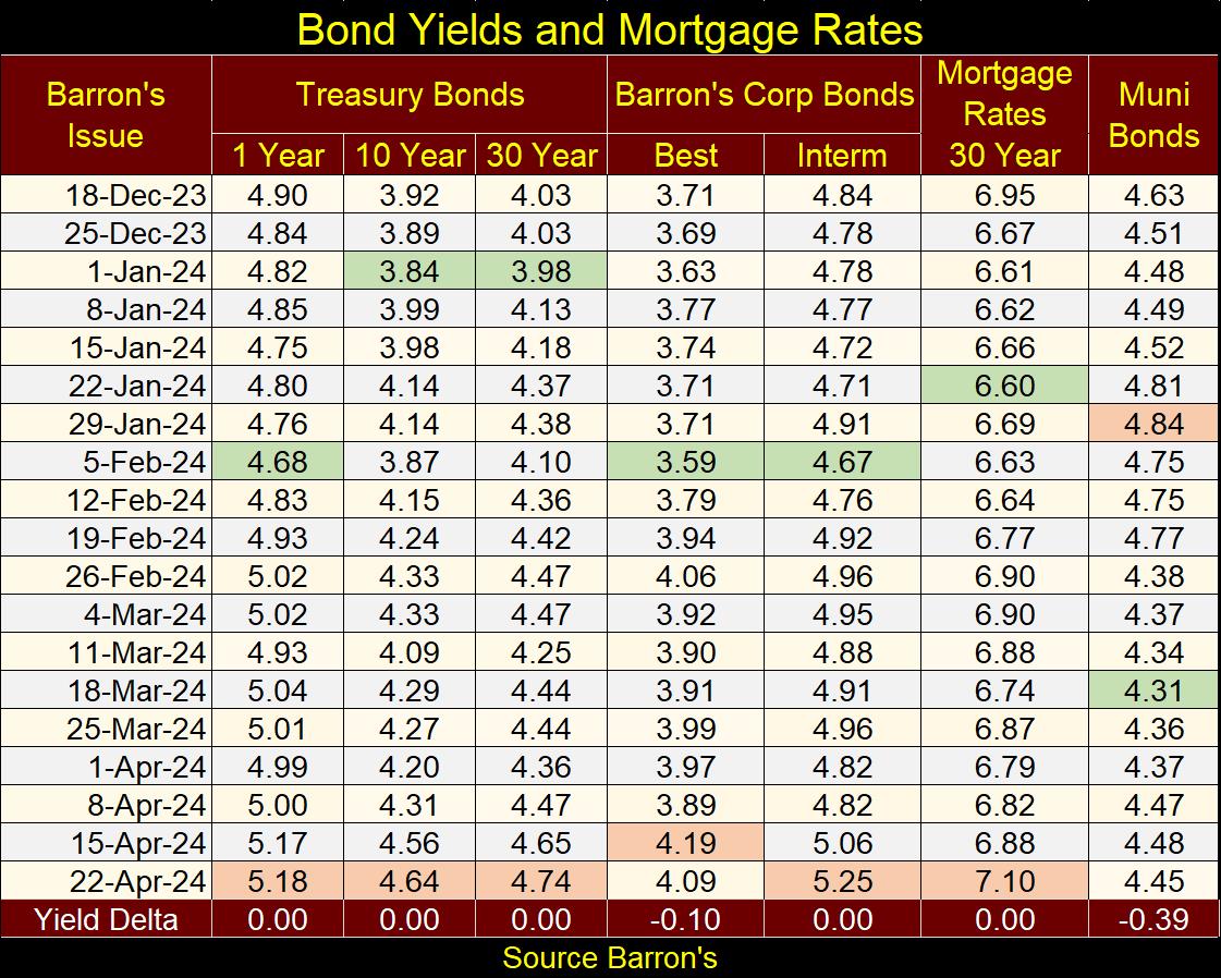
You don’t have to be a “market expert” to see yields in the debt markets are rising. Should this trend continue, and it should, it will impact the financial and real estate markets in a significant way. But when? Hopefully, sometime after I come back from my two-week vacation – three weeks from now. What can I say, it’s nice working for oneself.
Here is a pretty chart, gold’s BEV chart. Gold has been in scoring position since last November, and finally, the BEV Zeros are coming fast and furiously. We saw this advance’s 19th and 20th new all-time highs this week.
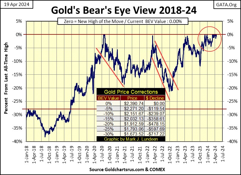
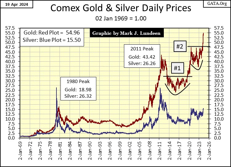
Gold and silver in their indexed chart below are not disappointing. Gold is really on a tear. A month ago, I predicted it may break above its 55 line ($2400) by the end of August. Gee, it’s going to do that by the end of April, or so it appears to be ready to do, closing the week at 54.96.
Silver is lagging gold, but it finally broke above its 15 line, closing the week at 15.50. We may see something wonderful in the silver market before this summer is over. Anything over the 26.32 from January 1980 would be a new all-time high for silver, its first in over 44 years.
Last, but not least for this week is my step sum tables for gold and the Dow Jones.
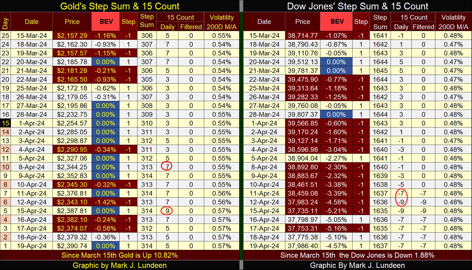
Look at all those BEV Zero on gold’s side of the table. But can gold keep that up for much longer? It would be nice if it did, but if it doesn’t, well, that is how it goes sometimes, as nothing ever goes straight up. There are always corrections in any market advance.
The Dow Jones hasn’t seen a BEV Zero since March 28th, but has seen lots of daily declines. But for all that selling pressure, the Dow Jones did close the week in scoring position. That is what a correction in a market advance looks like.
So, let’s see what the Dow is going to do for us in the next three weeks I’ll be away. After seeing all those down days in the table above, the Dow Jones is due for a period of overwhelming daily advances. If it makes some additional BEV Zeros as it does so, the bull market is back on track. As will I be, come the weekend of May 10th.
Mark J. Lundeen
********
share
share
share
share
share